Tutorial 13.1 - Multivatiate data
11 Mar 2015
Overview
Most of the topics up to this point have been concerned with patterns involving a single response variable. This is fine when this response represents some single measurable aspect of the population. However, what if what we are really after is not a single response but a series of responses. For example, we could measure a specific physiological response (such as blood pressure) to a treatment or alternatively we could measure a series of physiological responses (blood pressure, heart rate, blood cell count, hemoglobin loading, white blood cell count, stress hormone levels etc). Whereas in the former case we are specifically interested in the effects on this single response, in the latter we might be more interested in the effect on the 'physiology' more so that the effects on any single aspect of the physiology.
Similarly, in ecological studies, we are often interested in community patterns - that is how a community responds, rather than how a single individual responds.
Obviously there is no one measure or way to characterize a community or individual and the picture you build up of a community is dependent on the measures taken. For example, you could attempt to describe a vegetation community on the basis of (yet not limited to):
- the presence/absence of a particular species (univariate)
- the abundance of a particular species (univariate)
- the abundances of the dominant over-story tree species (multivariate)
- the abundances of the ground cover (multivariate)
- the abundances of all above ground plant species (multivariate)
If we had measured the abundances of the dominant over-story tree species (five species) at a number of locations across a landscape (say across a mountain range) and then explored the geographic patterns of abundance of each species separately we are likely to observe:
- the abundance of any single species will not be homogeneous across the geographic range
- the geographic patterns of abundances of some species will be similar to the patterns of other species (the abundances of some species will be positively correlated) as species often respond to similar environmental gradients.
- the abundances of some species will be negatively correlated - where one species is in relatively high abundance, the other is in low abundance and vice verse.
To assist with this discussion, some fabricated species abundance data could be useful.
> set.seed(10)
> MEANS <- c(5,10,20,10,5)
> SIGMA <- matrix(c(
+                  1,0.9,0.0,0.0,0.0,
+                  0.9,1.0,0.0,0.0,0.0,
+                  0.0,0.0,1,0.8,-0.8,
+                  0.0,0.0,0.8,1,-0.9,
+                  0.0,0.0,-0.8,-0.9,1.0
+                  ),5,5)
> library(mvtnorm)
> x <- rmvnorm(n=100, mean=MEANS, sigma=SIGMA)
> x <- round(x,0)
> data <- data.frame(Sp1=x[,1],Sp2=x[,2],Sp3=x[,3],Sp4=x[,4],Sp5=x[,5])
> data[1:10,]
   Sp1 Sp2 Sp3 Sp4 Sp5
1    5  10  19   9   6
2    5   9  19   9   6
3    6  11  20  10   5
4    5   9  20  10   5
5    3   8  19   9   5
6    4   9  19  10   5
7    3   9  21  11   3
8    4  10  19   9   5
9    6  10  20  11   4
10   5  10  19   9   6
If we now construct a scatterplot matrix of the abundance of each species against each other species, we can explore the univariate trends.
> pairs(data,upper.panel=NULL, pch=16)

> cor(data)
         Sp1     Sp2      Sp3     Sp4
Sp1  1.00000  0.8352 -0.06046 -0.1172
Sp2  0.83521  1.0000 -0.04320 -0.0591
Sp3 -0.06046 -0.0432  1.00000  0.7834
Sp4 -0.11719 -0.0591  0.78339  1.0000
Sp5  0.19710  0.1574 -0.76441 -0.8196
        Sp5
Sp1  0.1971
Sp2  0.1574
Sp3 -0.7644
Sp4 -0.8196
Sp5  1.0000
- Species 1 and 2 are positively correlated
- Species 3, 4 and 5 are correlated to one another
For the purpose of describing patterns of communities, species that have very similar geographical patterns of abundances (such as Sp1 and Sp2) could be combined in some way so as to represent a single amalgam or overall measure. Since abundance correlations (positive or negative) are likely to be the result of responses to a common underlying gradient (such as temperature, levels of rainfall, soil composition etc), this amalgam can be interpreted as a community response to that gradient (albeit perhaps unknown).
Since communities are typically driven by multiple underlying gradients of varying degrees of influence, there are likely to be multiple amalgams. In the above example, there does seem to be two main species responses (Sp1,Sp2 and Sp3,Sp4,Sp5). This is an important finding for two reasons:
- Firstly, the general patterns across all species provide an indication of the presence and the number of underlying ecological gradients. This could lead to further explorations of the data, perhaps including an exploration of what these underlying gradients might correspond to.
- It can also help us determine which species are most strongly aligned with each of the major gradients and which species do not seem to respond consistently with others and thus provide a starting block for further investigating the ecological processes in greater detail.
Creating amalgams - new axes
Just eyeballing the data cloud in the scatterplot of Sp1 against Sp2, we notice that rather than being a spherical shape (which would indicate no correlation between the two species), it is diagonally elongated. If we were to be able to put some form of line of best fit through that data cloud, then it would become a new amalgam variable and the one-dimensional coordinates of the points on this axis, would become the values of this amalgam.
Since this new axis is just a single dimension (and not all the points lye exactly on this line), it does not contain all the information that the two original Species abundance variables had, yet it is likely to do a reasonably good job at capturing most of the essence of the two variables into a single amalgam.
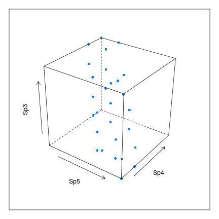
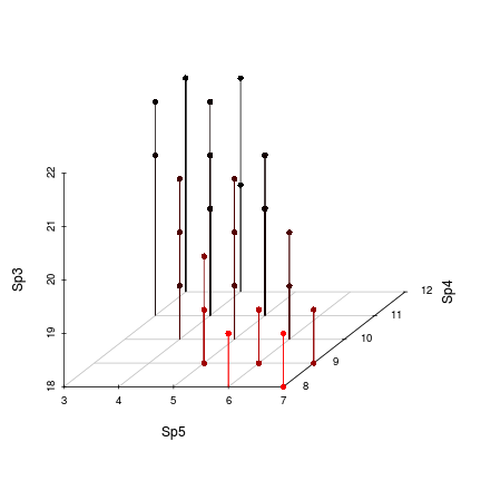
We could apply a similar principle to create an amalgam between Species 3, 4 and 5.5 Of course this would be a single plain through a three dimensional cloud.
> library(lattice)
> cloud(Sp3~Sp5+Sp4, data, type="p",screen=c(x=-55,y=-30,z=-20),zlab=list(rot=90), pch=16)

> library(scatterplot3d)
> with(data, scatterplot3d(Sp5,Sp4,Sp3, type="h", pch=16,highlight.3d=TRUE, box=FALSE))

In the current example, we made an arbitrary decision to amalgamate Species 1 and 2 as well as Species 3, 4 and 5.5 on the grounds that there appeared to be two strong groups with those memberships. However, the groups are not always as clear cut as this and deciding whether or not a particular species should be amalgamated in with others could be very arbitrary. Moreover, just because a species responds most strongly to one underlying gradient, it does not mean that it does not respond to other gradients. Therefore, each species should be able to contribute something to each amalgam.
In order to construct these amalgams (new variables or axes) in which each of the original variables (species abundances) contribute to each of the new amalgams, the plains of best fit need to be fit through multi-dimensional data clouds. Hence, it is necessary to start conceptualizing the data in more than two or three dimensions. It is not the univariate relationships that defines a community , but rather it is all the complex inter-relationships that exist between all the species.
There are numerous ways in which multiple variables can be recombined into a smaller number of new variables that hopefully represent the major patterns (and thus the underlying environmental gradients). This is the field of multivariate analyses. Whilst it is not possible to visualize the patterns of communities in using more than 3 characteristics (dimensions), with the use of multivariate analyses, it might be possible to reduce the number of important characteristics down to 2 or three that can then be visualized in a relatively simple manner.
Objects and variables
Multivariate data are a collection of observations organized into a table (data frame) comprising:
- Variables (such as species abundances) in columns. The variables are the observed characteristics of the communities (or individuals) that can be used to describe the communities. In ecological studies, the variables are usually either species abundances or environment measurements (water temperature). In taxonomic studies, the variables are the features (antennae length, etc) used to classify organisms.
- Objects (such as sites) in rows. The objects are the units from which the variables are collected and are the entities that you are interested in comparing. Typically they are spatial units such as sites, habitats etc. In taxonomic studies, objects are the organisms.
Multivariate analysis methods
Creating the amalgams is essentially creating a new linear combination of predictors that encapsulates as much of the original variance as possible. If we start with p original variables, then we create p new variables, except that most of the variance should be consolidated within the first few variables. Recall that the first new amalgamated variable is defined as that which represents the strongest plane (that explaining the greatest amount of variance) through the multidimensional data cloud. The next variable represents the next strongest plane that is orthogonal (completely uncorrelated) to the first and so on.
Broadly speaking, multivariate patterns amongst objects can either be quantified on the basis of the associations (correlation or covariance) between variables (species) on the basis of similarities between objects. The former are known as R-mode analyses and the later Q-mode analyses.
Ordination
Once the new amalgamated variables (axes) have been created, there values can be used as coordinates of points on a scatterplot. That is, the new variables become the axes of a scatterplot. The points on such a plot (called a ordination plot) represent the objects (e.g. sites) and the distances between points reflect the degree of similarity (actually dissimilarity) of the communities (species composition). Points that are closer together correspond to objects that share the most in common.
So the purpose of multivariate analyses are generally one or more of the following:
- to graphically explore multivariate (community) patterns in a reduced dimensional space (such as 2D)
- to reduce many characteristics of a community down to a smaller number of major amalgamated patterns that can be used to represent the community in further analyses.
- to test inferences involving multivariate (communities) responses.
