Tutorial 5.1 - Traditional R Graphics
27 Mar 2017
This Workshop has been thrown together a little hastily and is therefore not very well organized - sorry! Graphical features are demonstrated either via tables of properties or as clickable graphics that reveal the required R code. Click on a graphic to reveal/toggle the source code.
High level plotting functions
Most graphics in R are performed by issuing a series (one or more) graphical statements that sequentially add additional features to a graphical device. A graphical device is any device capable of receiving and interpreting graphical statements. Common examples
- A window within R
- A graphics file (such as a pdf, jpg, png etc)
I will cover more on graphical devices here
The plot() function
The plot() function is an overloaded function, the output of which depends on the class of object(s) taken as input. That said, the most common use of the plot() function is to prepare a plotting device (define the axes limits etc) and to apply very basic plot characteristics (axes, points, labels etc) to the device.
The plot() function typically requires at least one parameter - object containing data (vector, matrix, dataframe, etc). From these data, it can determine the type of graphic that is most likely to be suitable along with the scaling and labelling of axes.
To illustrate plotting, we will make use of some of the many datasets that comes with R. The first dataset we will use is BOD. The BOD (Biochemical Oxygen Demand) data frame has 6 rows and 2 columns giving the biochemical oxygen demand versus time in an evaluation of water quality.

plot(BOD)
The type parameter
The type parameter controls how the data points are represented on the graph.
 plot(BOD,type="p",main="Type='p'") |
 plot(BOD,type="l",main="Type='l'") |
 plot(BOD,type="b",main="Type='b'") |
 plot(BOD,type="o",main="Type='o'") |
 plot(BOD,type="h",main="Type='h'") |
 plot(BOD,type="s",main="Type='s'") |
 plot(BOD,type="n",main="Type='n'") |
The xlim and ylim parameters
These parameters control the range or span of the axes.
 # Same as the default plot(BOD,xlim=NULL,main="xlim=NULL") |
 # Minimum of zero, maximum of 10 plot(BOD,xlim=c(0,10),main="xlim=NULL") |
The xlab and ylab parameters
These define the axes titles.
 # Blank - no axes title plot(BOD,xlab="",main="xlab=' '") |
 # Custom axis title plot(BOD,xlab="Time (days)",main="xlab='Time (days)'") |
The axes and ann parameters
These are logical parameters that indicates whether (=TRUE) or not (=FALSE) to plot axes and axes titles respectively.
 # Suppress axes plot(BOD,axes=F,main="axes=F") |
 # Suppress axes titles (including main title) plot(BOD,ann=F,main="axes=F") |
The log parameter
These are logical parameters that indicates which (if any) of the axes should be plotted on a logarithmic scale.
 # log x-axis plot(BOD,log="x") |
 # log y-axis plot(BOD,log="y") |
 # log y-axis plot(BOD,log="xy") |
Other high level plotting functions
I now present a selection of commonly used high-level plotting functions. These functions typically provide quick and convenient graphical representations primarily for data exploration and diagnostics. As such, the aesthetics of these graphics is of little concern.
 |
 |
 |
 |
 |
 |
 |
 |
 |
 |
 |
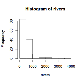
The hist() function
For this example, we will use the rivers dataset which provides the lengths (in miles) of 141 'major' rivers
in North America.
# Histogram
hist(rivers)
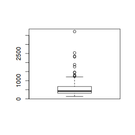
The boxplot() function
# Boxplot of river lengths boxplot(rivers) |
 # Boxplot of river lengths boxplot(rivers, horizontal=TRUE) |
 # Boxplot of the number of breaks against wool type boxplot(breaks~wool, data=warpbreaks) |
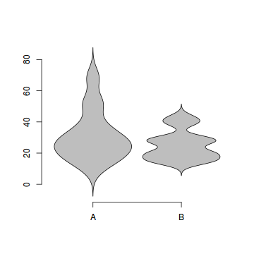
The violin() function
Violin plots are an alternative to boxplots. Arguably, these plots hide less of the underlying data than do boxplots.
# Violin plot of the number of breaks against wool type.
library(UsingR)
simple.violinplot(breaks~wool, data=warpbreaks, col="grey", bw="SJ")
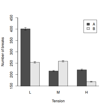
Bargraphs
Since the barplot function accepts a matrix of values to represent the heights of bars, this function can be coerced into producing a bargraph (dynamite plot). We simply provide a matrix of means instead of totals. Thereafter, we can add other features such as error bars. When you call the barplot function, it returns a matrix of bar mid-point coordinates which are very useful for allowing us to specify the x-coordinates of the other features.
# the mean number of breaks in each wool type and tension category.
means<-with(warpbreaks,tapply(breaks,list(wool,tension), sum))
sem<-with(warpbreaks,tapply(breaks,list(wool,tension), function(x) sd(x)/sqrt(length(x))))
b<-barplot(means,ylim=c(min(pretty(means-sem)),max(pretty(means+sem))),beside=T,xpd=F,ylab="Number of breaks",xlab="Tension",legend=rownames(means))
arrows(b,means-sem,b,means+sem, angle=90,code=3, length=0.05)
box(bty="l")
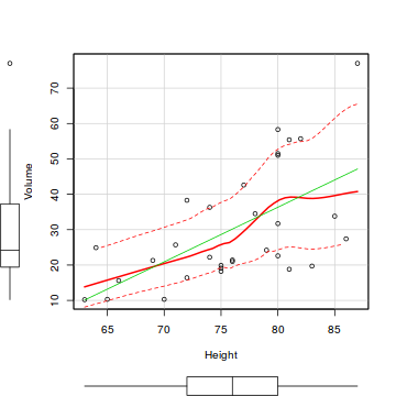
The scatterplot() function
As we have seen, the plot() function already creates scatterplots.
In the spirit of exploratory data analysis, we will illustrate the scatterplot() function in the
car package. In addition to plotting the raw data, the scatterplot() function also includes
a number of useful regression diagnostics including marginal boxplots, the line of best fit (fitted regression line)
and a lowess smoother.
# Scatterplot of the relationship between black cherry tree volume and height.
library(car)
scatterplot(Volume~Height, data=trees)
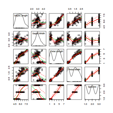
Scatterplot matrices
Scatterplot matrices are an extension of scatterplots in which each variable is plotted against each other variable in a gridded arrangement. They are useful for visually exploring the relationships amongst multiple variables simultaneously.
# ScatterplotMatrix of various petal and sepal dimensions of iris flowers
library(car)
scatterplotMatrix(~Sepal.Length+Sepal.Width+Petal.Length+Petal.Width+Species, data=iris)
Interaction plots
# Interaction plot of tooth length against vitamin dose and supplement delivery method library(car) with(ToothGrowth,interaction.plot(dose,supp,len)) |
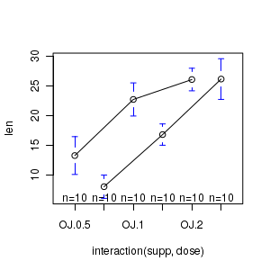
library(gplots) plotmeans(len~interaction(supp,dose), data=ToothGrowth, connect=list(c(1,3,5),c(2,4,6))) dev.off() |
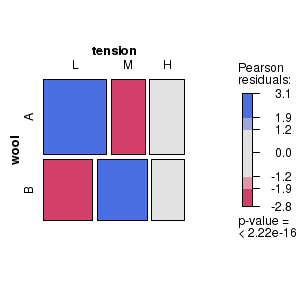
Mosaic and association plots
Mosaic and association plots are both conditioning plots that represent contingency table frequencies as a matrix of rectangles, the dimensions of which are proportional to the observed frequencies of each cross-classification. Furthermore, shading reflects the magnitudes of the Pearson's residuals. The main difference between mosaic and association plots is that the rectangles in association plots also indicate the polarity of the differences between observed and expected frequencies.
# Mosaic plot for the number of wool breaks tabulated according to wool type and level of tension classifiers # Indicates (for example) that there were more breaks of wool type A under low tension and type B under medium tension than would be expected in the absence of an association between wool type and tension. library(vcd) wb.xtab<-xtabs(breaks ~ wool + tension, data = warpbreaks) strucplot(wb.xtab, gp=shading_max) dev.off() |
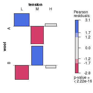 # Association plot for the number of wool breaks tabulated according to wool type and level of tension classifiers # Indicates (for example) that there were more breaks of wool type A under low tension and type B under medium tension than would be expected in the absence of an association between wool type and tension. library(vcd) wb.xtab<-xtabs(breaks ~ wool + tension, data = warpbreaks) assoc(wb.xtab, gp=shading_max) dev.off() |
(Partial) effects plots
Partial effects plots (also known as term plots) plot the relationship between the response variable and one of the predictor variables holding all other predictors constant (hence why they are referred to as partial effects - they only really depict the relationship at the average level of the other predictor(s).
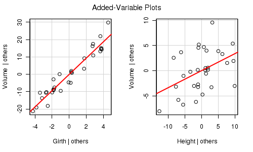
library(car)
trees.lm <- lm(Volume~Girth+Height, data=trees)
avPlots(trees.lm)
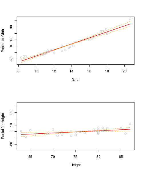
trees.lm <- lm(Volume~Girth+Height, data=trees)
par(mfrow=c(2,1))
termplot(trees.lm, partial.resid=TRUE, se=TRUE, ask=F)
library(effects)
trees.lm <- lm(Volume~Girth+Height, data=trees)
plot(effect("Height",trees.lm))

library(effects)
trees.lm <- lm(Volume~Girth+Height, data=trees)
plot(allEffects(trees.lm),ask=F)
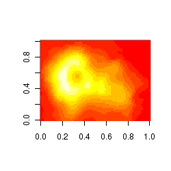
Gridded (raster-like) images
Gridded raster images are a good way of visualizing the distribution of values within gridded data (particularly spatial). For example, the abundance of a species throughout the landscape. The image() function takes either a matrix with three columns or three separate vectors representing the x and y coordinates along with value of y being represented. In the example illustrated, the z value corresponds to elevation such that the raster image represents the 3-D shape of a volcano (Maunga Whau (Mt Eden - Aukland) in a 2-D view.
image(volcano)
Contour images
Similar to the gridded images above, contour plots depict the distribution of a vector throughout a xy gridded matrix. The value of z is represented by contours.
contour(volcano)
Graphical parameters - more control
Graphical parameters apply to an entire graphical device (are global) and provide additional aesthetics control over many of the characteristics of all the high and low level plotting functions applied in that device. That is, rather than specify a particular setting (such as font size) for each graphical function, the global parameters can be specified once and apply across all functions (although they can be individually overridden by any subsequent high or low level plotting function.
Graphical parameters can also control the layout, margins and spacing within a graphical device.
Global graphical parameters are specified in the par() function. When the par() function is used to alter a global graphical setting, it returns a list containing the previous settings (the settings that applied before the current change(s) were made) that applied to any of the altered parameters. Using this list as an argument to a subsequent par() function thereby restore the previous graphical parameters on the current device.
# examine current margin dimensions
par()$mar
[1] 5.1 4.1 4.1 2.1
# set the plot margins of the current device to be four, five, one and one text lines from the bottom, left, top and right of the figure boundary. Then print out the original settings for the altered parameters.
opar <- par(mar=c(4,5,1,1))
opar
$mar
[1] 5.1 4.1 4.1 2.1
# examine the new current dimensions
par()$mar
[1] 4 5 1 1
# Restore the original plotting settings
par(opar)
# confirm that the margin dimensions have been restored
par()$mar
[1] 5.1 4.1 4.1 2.1
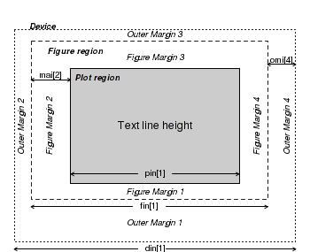
Plot dimensions and layout parameters
|
|
| Parameter | Value | Description |
|---|---|---|
| din,fin,pin | =c(width,height) | Dimensions (width and height) of the device, figure and plotting regions (in inches) |
| fig | =c(left,right,bottom,top) | Coordinates of the figure region within the device. Coordinates expressed as a fraction of the device region. |
| mai,mar | =c(bottom,left,top,right) | Size of each of the four figure margins in inches and lines of text (relative to current font size). |
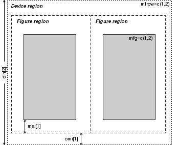
| mfg | =c(row,column) | Position of the currently active figure within a grid of figures defined by either mfcol or mfrow. |
| mfcol,mfrow | =c(rows,columns) | Number of rows and columns in a multi-figure grid. |
| new | =TRUE or =FALSE | Indicates whether to treat the current figure region as a new frame (and thus begin a new plot over the top of the previous plot (TRUE) or to allow a new high level plotting function to clear the figure region first (FALSE). |
| oma,omd,omi | =c(bottom,left,top,right) | Size of each of the four outer margins in lines of text (relative to current font size), inches and as a fraction of the device region dimensions |
| plt | =c(left,right,bottom,top) | Coordinates of the plotting region expressed as a fraction of the device region. |
| pty | ="s" or "m" | Type of plotting region within the figure region. Is the plotting region a square (="s") or is it maximized (="m") to fit within the shape of the figure region. |
| usr | =c(left,right,bottom,top) | Coordinates of the plotting region corresponding to the axes limits of the plot. |
| Altered margins | Multiple figures | Figures within figures |
|---|---|---|
 |
 |
 |
# Boxplot of the number of breaks against wool type with wider margins
par(mar=c(5,5,0,0))
boxplot(breaks~wool, data=warpbreaks, xlab="Wool type",ylab="Number of breaks")
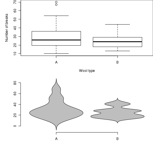
par(mfrow=c(2,1),mar=c(5,5,0,0))
# Boxplot of the number of breaks against wool type with wider margins
boxplot(breaks~wool, data=warpbreaks, xlab="Wool type",ylab="Number of breaks")
library(UsingR)
simple.violinplot(breaks~wool, data=warpbreaks, col="grey", bw="SJ")
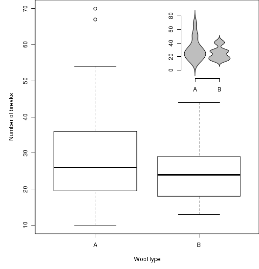
# Boxplot of the number of breaks against wool type with wider margins
opar<-par(mar=c(5,5,0,0))
boxplot(breaks~wool, data=warpbreaks, xlab="Wool type",ylab="Number of breaks")
par(mar=c(5,5,0,0),new=TRUE, pin=c(1.5,2),fig=c(0.65,0.95,0.69,0.99))
library(UsingR)
simple.violinplot(breaks~wool, data=warpbreaks, col="grey", bw="SJ")
par(opar)
More on layout
In addition to splitting a graphics device up into a matrix of figures with the mfrow and mfcol graphical parameters, it is also possible to specify the size and arrangement of figures in a matrix with the layout() function. However, unlike the mfrow/mfcol parameters, the layout function does not force each row to have the same number of columns and vice verse.
 nc <- matrix(c(1,1,2,3),ncol=2,byrow=T) lay <- layout(nc) layout.show(lay) |
 par(mar=c(4,4,1,1)) nc <- matrix(c(1,1,2,3),ncol=2,byrow=T) lay <- layout(nc) library(car) plot(Sepal.Length~Petal.Length, data=iris) boxplot(Sepal.Length~Species, data=iris, ylab="Sepal length", xlab="Species") boxplot(Petal.Length~Species, data=iris, ylab="Petal length", xlab="Species") |
Axes characteristics
| Parameter | Value | Description |
|---|---|---|
| ann,axes | =T or =F | High level plotting parameters that specify whether or not titles (main, sub and axes) and axes should be plotted. |
| bty | ="o","l","7","c","u" or "]" | Single character whose upper case letter resembles the sides of the box or axes to be included with the plot. |
| lab | =c(x,y,length) | Specifies the length and number of tickmarks on the x and y axes. |
| las | =0, 1, 2 or 3 | Specifies the style of the axes tick labels. 0 = parallel to axes, 1 = horizontal, 2 = perpendicular to axes, 3= vertical. |
| mgp | =c(title,labels,line) | Distance (in multiples of the height of a line of text) of the axis title, labels and line from the plot boundary. |
| tck,tcl | =length | The length of tick marks as a fraction of the plot dimensions (tck) and as a fraction of the height of a line of text (tcl) |
| xaxp,yaxp | =c(min,max,num) | Minimum, maximum and number of tick marks on the x and y axes |
| xaxs,yaxs | ="r" or ="i" | Determines how the axes ranges are calculated. The "r" option results in ranges that extend 4% beyond the data ranges, whereas the "i" option uses the raw data ranges. |
| xlog,ylog | =FALSE or =TRUE | Specifies whether or not the x and y axes should be plotted on a (natural) logarithmic scale. |
| xpd | =FALSE, =TRUE or ='NA' | Specifies whether plotting is clipped to the plotting (=FALSE), figure (=TRUE) or device (='N') region |
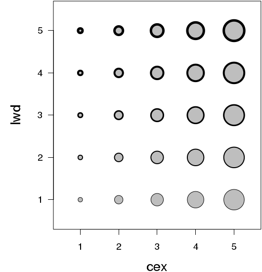
Character sizes
Rather than specify the exact point size of each set of characters in a figure, R defines a base size (by default, 12pt), and thereafter, character sizes of elements are defined relative to this base size. For example, if you wanted a label to be in 6pt, this would be 0.5 (half) the base point size. If you wanted the font to be 18pt, this would be 1.5 times the base size. Hence, character sizes are defined via character expansion (cex) factors.
The advantage of this system is the font sizes are scalable. That is, if you later decide to increase the size of a figure also want to increase the font sizes, you only need to alter the base point size for that device. I will discuss more of graphical devices here.
| Parameter | Applies to |
|---|---|
| cex | All subsequent characters |
| cex.axis | Axis tick labels |
| cex.lab | Axes titles |
| cex.main | Main plot title |
| cex.sub | Plot sub-titles |
| Axes titles | Tick mark labels | Plotting character |
|---|---|---|
 |
 |
 |
plot(BOD,type="p",cex.lab=1.5)
plot(BOD,type="p",cex.axis=1.5)
plot(BOD,type="p",cex=1.5)
Line characteristics
| Parameter | Description | Examples |
|---|---|---|
| lty | The type of line. Specified as either a single integer in the range of 1 to 6 (for predefined line types) or as a string of 2 or 4 numbers that define the relative lengths of dashes and spaces within a repeated sequence. |  |
| lwd | The thickness of a line as a multiple of the default thickness (which is device specific). | 
|
| lend | The line end style (square, butt or round). |  |
| ljoin | The line end style (square, butt or round). |  |
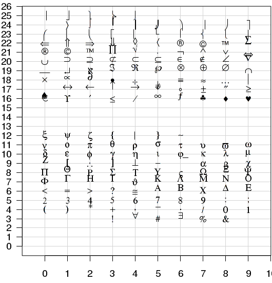
Plotting character - pch
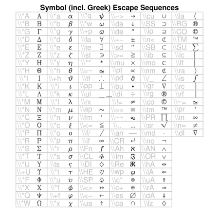
The plotting character (pch) can be of the following forms:
- a number from 1 to 25 corresponding to one of the 25 basic plotting symbols
- when used with font=5 (extended symbol font), Adobe symbol encoding can be specified. This encoding system uses integers between 1:128 and 160:254. In the Extended plotting characters figure below, the y-axis shows the first two digits of the Adobe symbol encoding, and the x-axis shows the third digit.
- a quoted keyboard printing character (letter, number or punctuation)
| Basic plotting characters | Extended plotting characters - used with font=5 | |
|---|---|---|
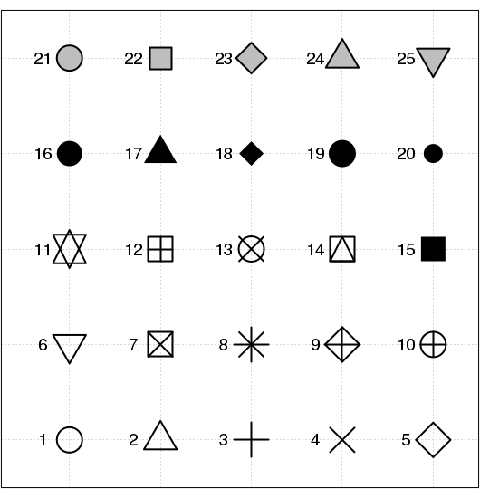
|
To plot the heart symbol: .., pch=169, font=5,..
|
| Basic symbols | Tick mark labels | Plotting character |
|---|---|---|
 |
 |
 |
plot(rnorm(5,0,1), rnorm(5,0,1), pch=16, axes=F, ann=F, cex=4)
plot(rnorm(5,0,1), rnorm(5,0,1), pch=167, cex=4, font=5, axes=F, ann=F)
plot(rnorm(5,0,1), rnorm(5,0,1), pch="A", axes=F, cex=4,ann=F)
The size of plotting symbols is controlled by the character expansion (cex) parameter and the style of the of the lines that make up the plotting symbols is controlled by other line characteristics.
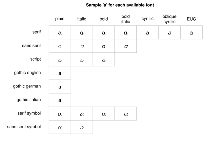
Fonts
The shape of text characters is controlled by the family (the typeface) and the font (the shape of the typeface). The families supported varies for each graphical device as do the names by which they are referred.
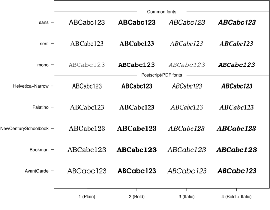
To get a list of the available font families for a specific device on your system,
issue a command whose name starts with the name of the device and ends with "Fonts".
For example, to query the available fonts for a pdf device on your system:
pdfFonts()
Different fonts can also be applied to each of the main plotting components (font.axis: axes labels, font.lab: axes titles, font.main: Main plot title and font.sub: plot sub-title).
 |
 |
plot(rnorm(5,0,1), rnorm(5,0,1), pch="A", family="serif",
  font=4, xlab="Predictor", ylab="Response")
plot(rnorm(5,0,1), rnorm(5,0,1), pch="A", family="serif",
   font=4, font.lab=2, xlab="Predictor", ylab="Response")
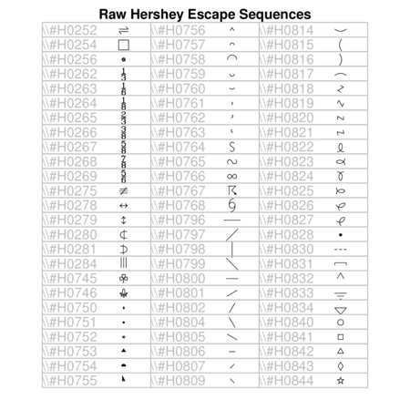
Hershey (vector) fonts
R also supports Hershey (vector) fonts that greatly extend the range of characters and symbols available. In contrast to regular (bitmap) fonts that consist of a set of small images (one for each character of each style and size), vector fonts consist of the coordinates of each of the curves required to create the character. That is, vector fonts store the information on how to draw the character rather than store the character itself. Hershey fonts can therefore be scaled to any size without distortion. Unfortunately however, Hershey fonts cannot be combined with regular fonts in a single plotting statement and thus they cannot be easily incorporated into mathematical formulae.
Text orientation and justification
| Parameter | Description | Examples |
|---|---|---|
| adj | Specifies the justification of a text string relative to the coordinates of its origin. A single number between 0 and 1 specifies horizontal justification. A vector of two numbers (=c(x,y)) indicates justification in horizontal and vertical directions. |

|
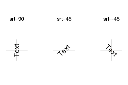
| crt,srt | Specifies the amount of rotation (in degrees) of single characters (crt) and strings (srt) |
|
Colors
The color of most plotting elements is controlled by the col parameter. There are also separate parameters that control the color of each of the major components of a figure (col.axis: the axes tick labels, col.lab: the axes titles, col.main: the main plot title, col.sub: plot sub-titles) and when specified, take precedence over the col parameter. Two additional parameters, bg and fg can be used to control the color of the background and foreground (boxes and axes) respectively.
Here are a few of the ways in which colors can be specified
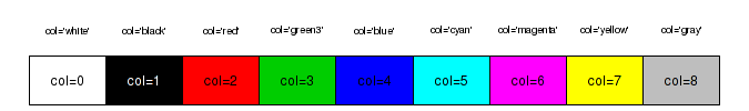
- by an index (numbers 0-8) to a small palette of eight colors (0 indicates the background color). The colors in this palette can be reviewed with the palette() (color palette) function
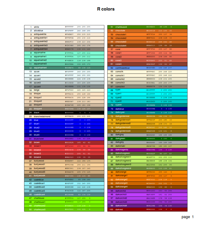
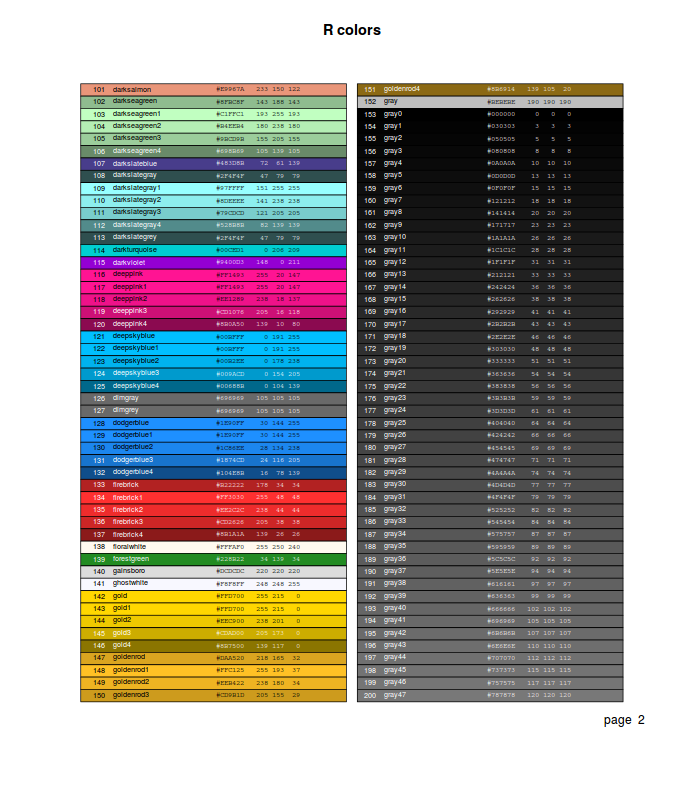
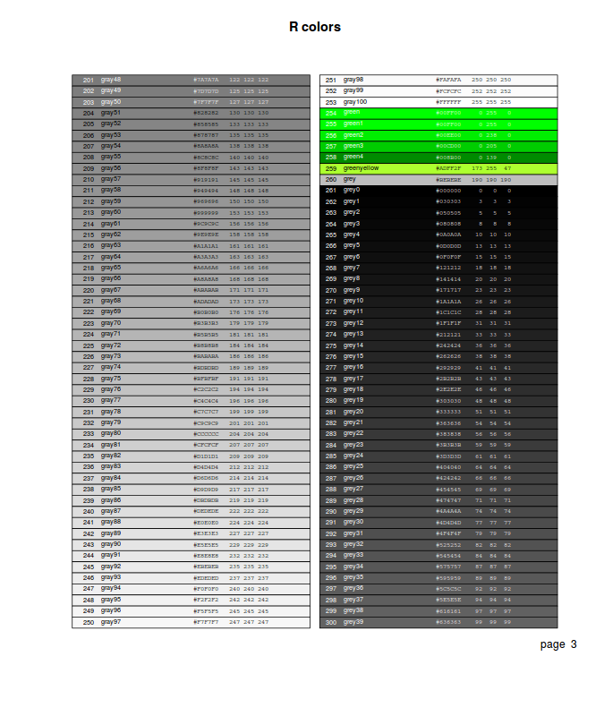
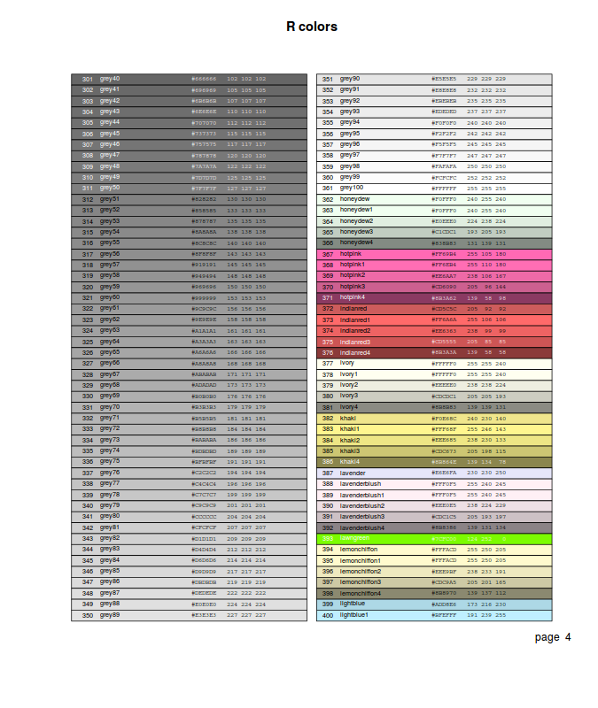
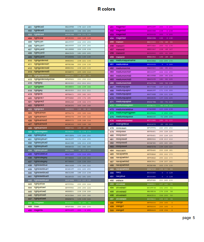
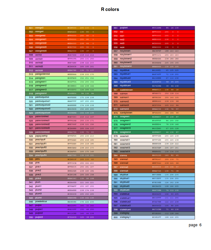
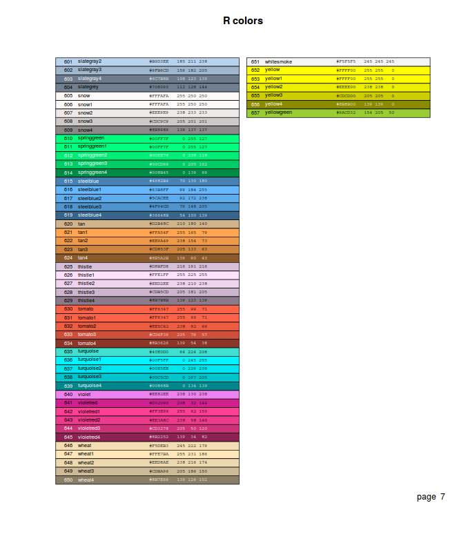
- by name. The names of the 657 defined colors can be reviewed with the colors() (color palette) function. The epitools package provides the colors.plot() (display palette) function which generates a graphic that displays a matrix of all the colors. When used with the locator=TRUE argument, a series left mouse clicks on the color squares, terminated by a right mouse click, will result in a matrix of corresponding color names.
- via one of the other built-in color palettes that essentially sets of colors within themes.
These palettes return n number of colors and the color transparency/opacity
is controlled via a alpha parameter (values between 0 and 1, where 1 is completely opaque).
- rainbow(n) - Red->Violet
- heat.colors(n) - White->Orange->Red
- terrain.colors(n) - White->Brown->Green
- topo.colors(n) - White->Brown->Green->Blue
- grey(n) - White->Black
- by direct specification of the red, green and blue components of the RGB spectrum as a character string in the form "#RRGGBB". This string consists of a # followed by a pair of hexadecimal digits in the range 00:FF for each component. For those devices supporting transparency, two additional digits can be added on the end of the hex code to indicate the degree of transparency/opacity (00: fully transparent, 99: fully opaque).
- via rgb(), hsv(), hcl() and col2rgb() also provide other ways to specify colors.
Enhancing and customizing plots with low-level plotting functions
Having set up a plotting device (typically by calling a high level plotting function), additional graphical elements can be manually added to a plot via specific low-level plotting functions. The most aesthetically pleasing graphics are typically produced by preparing a blank plotting device (essentially defining the size, layout and axes limits), and then manually building up the desired features via low-level plotting functions.
In addition to their specific parameters, each of the following functions accept many of the graphical parameters. In the function definitions, these capabilities are represented by three consecutive dots (...). Technically, ... indicates that any supplied arguments that are not explicitly part of the definition of a function are passed on to the relevant underlying functions (in this case, par()).
Adding points - points()
Points can be added to a plot using the points(x, y, pch, ...) function. This function plots a plotting character (specified by the pch parameter) at the coordinates specified by the vectors x,y. Alternatively, the coordinates can be passed as a formula of the form, y~x

# plot two series of random data
opar<-par(mar=c(4,5,0,0))
  set.seed(1)
  X<-seq(9,12,l=10)
  Y1<-(1*X+2)+rnorm(10,3,1)
  Y2<-(1.2*X+2)+rnorm(10,3,1)
  plot(c(Y1,Y2)~c(X,X),type="n",axes=T, ann=F, bty="l", las=1)
  points(Y1~X,pch=21, type="b")
  points(Y2~X,pch=16, type="b")
  par(opar)
Adding text - text()
The text() function adds text strings (labels parameter) to the plot at the supplied coordinates (x,y) and is defined as:
| Parameter | Description | Examples |
|---|---|---|
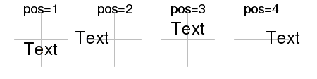
| pos | Simplified text justification that overrides the adj parameter. 1=below, 2=left, 3=above and 4=right. |
|
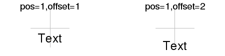
| offset | Offset used by pos as a fraction of the width of a character. |
|
| vfont | Provision for Hershey (vector) font specification (vfont=c(typeface, style). |

|
opar<-par(mar=c(0,0,0,0),oma=c(0,0,0,0))
  plot(c(0,1), c(.7,.9),type="n",axes=F, ann=F)
opar<-par(mar=c(0,0,0,0),oma=c(0,0,0,0))
  plot(c(0,1), c(.7,.9),type="n",axes=F, ann=F)
opar<-par(mar=c(0,0,0,0),oma=c(0,0,0,0))
  plot(c(0,1), c(.6,.9),type="n",axes=F, ann=F)
Constructing character strings - paste()
The paste() function concatenates vectors together after converting each of the elements to characters. This is particularly useful for making labels and is equally useful in non-graphical applications. Paste has two other optional parameters (sep and collapse) which define extra character strings to be placed between strings joined. sep operates on joins between paired vector elements whereas collapse operates on joints of elements within a vector.
temp <- c("H","M","L")
temp
[1] "H" "M" "L"
paste(temp, 1:3, sep=":") [1] "H:1" "M:2" "L:3" |
paste(temp, collapse=":") [1] "H:M:L" |
paste(temp, 1:3, sep="-",collapse=":") [1] "H-1:M-2:L-3" |
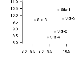
  set.seed(10)
  X<-rnorm(5,10,1)
  Y<-rnorm(5,10,1)
  plot(X,Y,type="n",axes=T, ann=F, bty="l", las=1, xlim=c(8,11),ylim=c(8,11))
  points(X,Y,col="grey", pch=16)
  text(X,Y,paste("Site",1:5,sep="-"), cex=1,pos=4)
Adding text to plot margins - mtext()
The mtext() function adds text (text) to the plot margins and is typically used to create fancy or additional axes titles. The mtext() function is defined as:
| Parameter | Description | Examples |
|---|---|---|
| side | Specifies which margin the title should be plotted in. 1=bottom, 2=left, 3=top and 4=right. |

|
| line | Number of text lines out from the plot region into the margin to plot the marginal text. |

|
| outer | For multi-plot figure, if outer=TRUE, put the marginal text in the margin (if there is one). | |
| at | Position along the axis (in user coordinates) of the text |

|
| adj,padj | Adjustment (justification) of the position of the marginal text parallel (adj) and perpendicular (padj) to the axis. Justification depends on the orientation of the text string and the margin (axis). |
 
|
Adding a legend - legend()
The legend() function brings together a rich collection of plotting functions to produce highly customizable figure legends in a single call. A sense of the rich functionality of the legend function is reflected in Table table below and the function definition:
| Parameter | Description | Examples |
|---|---|---|
| legend | A vector of strings or expressions to comprise the labels of the legend. | |
| title | A string or expression for a title at the top of the legend |

|
| bty, box.lty, box.lwd |
The type ("o" or "n"), line thickness and line style of box framing the legend. |

|
| bg, text.col |
The colors used for the legend background and legend labels |

|
| horiz | Whether or not to produce a horizontal legend instead of a vertical legend. |

|
| ncol | The number of columns in which to arrange the legend labels. |

|
| cex | Character expansion for all elements of the legend relative to the plot cex graphical parameter. | |
| Boxes | If any of the following parameters are set, the legend labels will be accompanied by boxes. | |
| fill | Specifies the fill color of the boxes. A vector of colors will result in different fills. |

|
| angle, density |
Specifies the angle and number of lines that make up the stripy fill of boxes. Negative density values result in solid fills. |

|
| Points | If any of the following parameters are set, the legend labels will be accompanied by lines. | |
| pch | Specifies the type of plotting character. |

|
| pt.cex, pt.lwd |
Specifies the character expansion and line width of the plotting characters. |

|
| col, pt.bg |
Specifies the foreground and background color of the plotting characters (and lines for col). |

|
| Lines | If any of the following parameters are set, the legend labels will be accompanied by lines. | |
| lwd, lty |
Specifies the width and type of lines. |

|
| merge | Whether or not to merge points and lines. |

|
More advanced text formatting
The text plotting functions described above (text(), mtext() and legend()) can also build plotting text from objects that constitute the R language itself. These are referred to as language objects and include:
- names - the names of objects
- expressions - unevaluated syntactically correct statements that could otherwise be evaluated at the command prompt
- calls - these are specific expressions that comprise of an unevaluated named function (complete with arguments)
Any language object passed as an argument to one of the text plotting functions described above (text(), mtext() and legend()) will be coerced into an expression and evaluated as a mathematical expression prior to plotting. In so doing, the text plotting functions will also apply TeX-like formatting (the extensive range of which can be sampled by issuing the demo(plotmath) command) where appropriate.
Hence, advanced text construction, formatting and plotting is thus achieved by skilled use of a variety of functions (described below) that assist in the creation of \textit{language objects} for passing to the text plotting functions.
Complex expressions - expression()
The expression function is used to build complex expressions that incorporate TeX-like mathematical formatting. Hence, the expression function is typically nested within one of the text plotting functions to plot complex combinations of characters and symbols.
 |
 |
# plot two series of random data
opar<-par(mar=c(4,6,0,0), cex=1.5, cex.lab=1.2)
  set.seed(10)
  X<-rnorm(5,10,1)
  Y<-rnorm(5,10,1)
  plot(X,Y,type="p",axes=T, ann=F, bty="l", las=1)
  mtext(expression(Temperature~(degree*C)),1, line=3, cex=1.5)
  mtext(expression(Respiration~(mL~O[2]~h^-1)),2, line=3.5, cex=1.5)
  par(opar)
# plot two series of random data
opar<-par(mar=c(4,6,0,0), cex=1.5, cex.lab=1.2)
  set.seed(10)
  X<-rnorm(5,10,1)
  Y<-rnorm(5,10,1)
  plot(X,Y,type="p",axes=T, ann=F, bty="l", las=1)
  text(9.3,10,expression(f(y) == frac(1,sqrt(2*pi*sigma^2))*e^frac(-(y-mu)^2,2*sigma^2)), cex=1.5)
  par(opar)
Complex expressions - bquote()
The bquote() function generates a language object by converting the argument after first evaluating any objects wrapped in `.()'. This provides a way to produce text strings that combine mathematical formatting and the output statistical functions.
In the example below, note the required use of the tilde (~) character to allow a space between the words corr and coef. Alternatively, a space can be provided by the keyword phantom(char), where char is a character whose width is equal to the amount of space required. Had we have put a space between
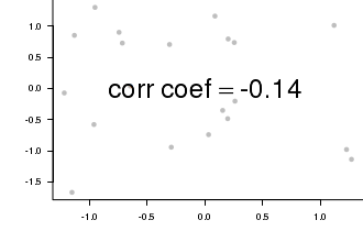
# Combining strings and R objects into a text label
opar<-par(mar=c(4,5,0,0))
  set.seed(3)
  X<-rnorm(20,0,1)
  Y<-rnorm(20,0,1)
  cc<-cor(X,Y)
  plot(X,Y,type="n",axes=T, ann=F, bty="l", las=1)
  points(X,Y,col="grey", pch=16)
  text(0,0,bquote(corr~coef==.(round(cc,2))), cex=3)
  par(opar)
Complex expressions - substitute()
Alternatively, for situations in which substitutions are required within non-genuine mathematical expressions (such as straight character strings), the substitute() function is useful.

# Combining strings and R objects into a text label
opar<-par(mar=c(4,5,0,0))
  X<-c(2,4,6,10,14,18,24,30,36,42)
  Y<-c(5,8,10,11,15,18,16,15,19,16)
  n<-nls(Y~SSasymp(X,a,b,c))
  plot(Y~X,type='p', ann=F)
  lines(1:40,predict(n,data.frame(X=1:40)))
  a<-round(summary(n)$coef[1,1],2)
  b<-round(summary(n)$coef[2,1],2)
  c<-round(summary(n)$coef[3,1],2)
  text(40,8,substitute(y == a - b*e^{c*x},list(y="Nutrient uptake",a=a,b=b,c=c,x="Time")),cex=1.25,pos=2)
  mtext("Time (min)",1,line=3)
  mtext(expression(Nutrient~uptake~(mu~mol~g^-1)),2,line=3)
  par(opar)
Combinations of advanced text formatting functions
It is possible to produce virtually any text representation on an R plot, however, some representations require complex combinations of the above functions. Whilst, these functions are able to be nested within one another, the combinations often appear to behave counter-intuitively. Great understanding and consideration of the exact nuances of each of the functions is required in order to successfully master their combined effects. Nevertheless, the following scenarios should provide some appreciation of the value and uses of some of these combinations.
For example, the formula for calculating the mean of a sample
mu == frac(sum(y[i]),n) == .(meanY) .
Building such an expression is achieved by combining the bquote() \textit{function} with a paste() function.
The more observant and discerning reader may have noticed the y-axis label in the substitute() example above had a space between the μ and the word `mol'. Using just the expression() function, this was unavoidable. A more eligant solution would have been to employ a expression(paste()) combination.
 |
 |
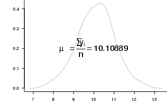
# plot two series of random data
opar<-par(mar=c(4,5,0,0))
  set.seed(1)
  Y<-rnorm(100,10,1)
  plot(density(Y),type="l",axes=T, ann=F, bty="l", las=1, col="grey")
  text(10,0.2,bquote(paste(mu == frac(sum(y[i]),n)) == .(mean(Y))),cex=2)
  par(opar)
dev.off()
# plot two series of random data
opar<-par(mar=c(4,5,0,0))
  X<-c(2,4,6,10,14,18,24,30,36,42)
  Y<-c(5,8,10,11,15,18,16,15,19,16)
  n<-nls(Y~SSasymp(X,a,b,c))
  plot(Y~X,type='p', ann=F)
  lines(1:40,predict(n,data.frame(X=1:40)))
  a<-round(summary(n)$coef[1,1],2)
  b<-round(summary(n)$coef[2,1],2)
  c<-round(summary(n)$coef[3,1],2)
  text(40,8,substitute(y == a - b*e^{c*x},list(y="Nutrient uptake",a=a,b=b,c=c,x="Time")),cex=1.25,pos=2)
  mtext("Time (min)",1,line=3)
  mtext(expression(paste("Nutrient uptake"," (",mu,"mol.",g^-1,")",sep="")),2,line=3)
  par(opar)
Adding axes - axis()
Although most of the high-level plotting functions provide some control over axes construction (typically via graphical parameters), finer control over the individual axes is achieved by constructing each axis separately with the axis() function. The axis() function is defined as:

# plot two series of random data
opar<-par(mar=c(4,1,0,0))
  set.seed(1)
  X<-rnorm(200,10,1)
  m<-mean(X)
  s<-sd(X)
  plot(density(X),type="l",axes=F, ann=F)
  axis(1,at=c(0,m,m+s,m-s,m+2*s,m+2*-s,100), lab=expression(NA,mu,1*sigma,-1*sigma,2*sigma,-2*sigma,NA), pos=0, cex.axis=2)
  par(opar)
| Parameter | Description | Examples |
|---|---|---|
| side | Simplifies which axis to construct. 1=bottom, 2=left, 3=top and 4=right. | |
| at | Where the tick marks are to be drawn. Axis will span between minimum and maximum values supplied. |

|
| labels | Specifies the labels to draw at each tickmark.
|

|
| tick | Specifies whether or not (TRUE or FALSE) the axis line and tickmarks should be drawn |

|
| line | Specifies the number of text lines into the margin to place the axis (along with the tickmarks and labels). |

|
| pos | Specifies where along the perpendicular axis, the current axis should be drawn. |

|
| outer | Specifies whether or not (TRUE or FALSE) the axis should be drawn in the outer margin. | |
| font | The font used for the tickmark labels. | |
| lwd, lty, col |
Specifies the line width, style and color of the axis line and tickmarks. |
|
| hadj, padj |
Specifies the parallel and perpendicular adjustment of tick labels to the axis. Units of movement (for example) are padj=0: right or top, padj=1: left or bottom. Other values are multipliers of this justification. |

|
Adding lines and shapes to a plot
There are a number of low-level plotting functions for plotting lines and shapes. Individually and collectively, they provide the tools to construct any custom graphic.
The following demonstrations will utilize a dataset by Christensen et al. (1996) that consists of course woody debris (CWD) measurements as well as a number of human impact/land use characteristics for riparian zones around freshwater lakes in North America.
Download Christensen data setStraight lines - abline()}
The low-level plotting abline() function is used to fit straight lines with a given intercept (a) and gradient (b) or single values for horizontal (h) or vertical (v) lines. The function can also be passed a fitted linear model (reg) or coefficient vector from which it extracts the intercept and slope parameters.
The definition of the abline() function is:

# plot two series of random data
opar<-par(mar=c(4,5,1,1))
plot(CWDDENS ~ RIPDENS, data=christ1)
abline(lm(CWDDENS ~ RIPDENS, data=christ1))
abline(h=mean(christ1$CWDDENS), lty=2)
par(opar)
Lines joining a succession of points - lines()}
The lines() function can be used to add lines between points and is particularly useful for adding multiple trends (or non-linear trends, see section on smoothers) through a data cloud. As with the points() function, the lines() function is a generic function whose actions depend on the type of objects passed as arguments. Notably, for simple coordinate vectors, the points() and lines() functions are virtually interchangeable (accept in the type of points they default to). Consequently, a more complex example involving the predict() (predicted values)|(} function (a function that predicts new values from fitted models) will be used to demonstrate the power of the lines function.
Assessing departures from linearity and homogeneity of variance can be assisted by fitting a linear (least squares regression) line through the data cloud.

# this example also uses the cut() function to create a categorical variable by partitioning a continuous variable.
opar<-par(mar=c(4,5,1,1))
  plot(CWDDENS ~ RIPDENS, data=christ1, typ="p")
  area <- cut(christ1$AREA,2, lab=c("small","large"))
  lm.small <- lm(CWDDENS ~ RIPDENS, data=christ1,subset=area=="small")
  lm.large <- lm(CWDDENS ~ RIPDENS, data=christ1,subset=area=="large")
  lines(christ1$RIPDENS[area=="small"], predict(lm.small))
  lines(christ1$RIPDENS[area=="large"], predict(lm.large), lty=2)
  legend("bottomright",title="Area",legend=c("small","large"),lty=c(1,2))
         par(opar)
dev.off()
Lines between pairs of points - segments()}
The segments \textit{function} draws straight lines between points ((x0,y0) and (x1,y1)). When each of the coordinates are given as vectors, multiple lines are drawn.
Assessing departures from linearity and homogeneity of variance can also be further assisted by adding lines to represent the residuals (segments that join observed and predicted responses for each predictor). This example also makes use of the with() \textit{function} which evaluates any expression or call (in this case the segments function) in the context of a particular data frame (christ) or other environment.

# this example also uses the cut() function to create a categorical variable by partitioning a continuous variable.
opar<-par(mar=c(4,5,1,1))
  plot(CWDDENS ~ RIPDENS, data=christ1, type="p")
  christ.lm <- lm(CWDDENS ~ RIPDENS, data=christ1)
  abline(christ.lm)
  with(christ1, segments(RIPDENS, CWDDENS, RIPDENS, predict(christ.lm), lty=2))
  par(opar)
dev.off()
Arrows and connectors - arrows()}
The arrows() function builds on the segments function to add provisions for simple arrow heads. Furthermore, as the length, angle and end to which the arrow head applies are all controllable, the arrows() function is also particularly useful for annotating figures and creating flow diagrams. The function can also be useful for creating customized error bars (as demonstrated in the following example).
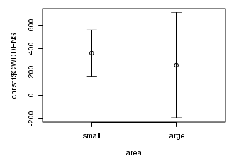
# this example also uses ci() function from the gmodels package to calculate confidence intervals
opar<-par(mar=c(4,5,1,1))
  area<-cut(christ1$AREA,2, lab=c("small","large"))
  library(gmodels)
  s<-tapply(christ1$CWDDENS, area,ci)
  plot(christ1$CWDDENS ~ area, border="white",ylim=range(s))
  points(1,s$small["Estimate"])
  points(2,s$large["Estimate"])
  with(s, arrows(1,small["CI lower"],1,small["CI upper"],length=0.1, angle=90,code=3))
  with(s, arrows(2,large["CI lower"],2,large["CI upper"],length=0.1, angle=90,code=3))
  par(opar)
dev.off()
Arrows and connectors - arrows()
The rect() function draws rectangles from left-bottom, right-top coordinates that can be filled with solid or striped patterns (according to the line type, width, angle, density and color):
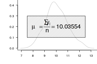
opar<-par(mar=c(4,5,0,0))
  set.seed(1)
  Y<-rnorm(200,10,1)
  plot(density(Y),type="l",axes=T, ann=F, bty="l", las=1, col="grey")
  rect(7.5,.1,12.5,.3, ang=45,density=20, col="grey", border="black")
  text(10,0.2,bquote(paste(mu == frac(sum(y[i]),n)) == .(mean(Y))),cex=2)
  par(opar)
dev.off()
Smoothers
Smoothing functions can be useful additions to scatterplots, particularly for assessing (non)linearity and the nature of underlying trends. There are many different types of smoothers, including loess and lowess (locally weighted smoothers), kernel smoothers and splines.
Smoothers are added to a plot by first fitting the smoothing function (loess(), ksmooth()) to the data before plotting the values predicted by this function across the span of the data.

# this example fits loess smoother and kernel smoothers through the data
opar<-par(mar=c(4,5,1,1))
plot(CWDDENS ~ RIPDENS, data=christ1)
christ.loess<-loess(CWDDENS ~ RIPDENS, data=christ1)
xs<-sort(christ1$RIPDENS)
lines(xs,predict(christ.loess, data.frame(RIPDENS=xs)))
christ.kern <- ksmooth(christ1$RIPDENS,christ1$CWDDENS, "norm", bandwidth=200)
lines(christ.kern, lty=2)
par(opar)
Confidence ellipses - matlines()
Confidence bands and ellipses can be added to a plot using the lines function. However, the matlines() function, along with the similar matplot() and matpoints() functions plot multiple columns of matrices against one another, thereby providing a convenient means to plot predicted trends and confidence intervals in a single statement.
Confidence bands are added by using the value(s) returned by a predict() function as the second argument to the matlines() function.

# this example fits loess smoother and kernel smoothers through the data
opar<-par(mar=c(4,5,1,1))
  plot(CWDDENS ~ RIPDENS, data=christ1)
  christ.lm<-lm(CWDDENS ~ RIPDENS, data=christ1)
  xs<-with(christ1, seq(min(RIPDENS),max(RIPDENS), l=1000))
  matlines(xs, predict(christ.lm, data.frame(RIPDENS=xs), interval="confidence"), lty=c(1,2,2), col=1)
  par(opar)
Exporting graphics - graphical devices
Graphics can also be written to several graphical file formats via specific graphics devices which oversee the conversion of graphical commands into actual graphical elements. In order to write graphics to a file, an appropriate graphics device must first be `opened'. A graphics device is opened by issuing one of the device functions listed below and essentially establishes the devices global parameters and readies the device stream for input. Opening such a device also creates (or overwrites) the nominated file.
As graphical commands are issued, the input stream is evaluated and accumulated. The file is only guaranteed to be fully written to disk when the device is closed via the dev.off() (close device) function.
Note that as the capabilities and default global parameters of different devices differ substantially, some graphical elements may appear differently on different devices. This is particularly true of dimensions, locations, fonts and colors.
By default, R uses the window() graphical device (X11() in UNIX/Linux and typically quartz() in MacOSX), which provides a representation of graphics on the screen within the R application. However, it is often necessary to produce graphics that can be printed or used within other applications. This is achieved by starting an alternative device (such as a graphics file) driver, redirecting graphical commands to this alternative device, and finally completing the process by closing the alternative device driver. The device driver is responsible for converting the graphical command(s) into a format that is appropriate for that sort of device.
Most installations of R come complete with a number of alternative graphics devices, each of which have their own set of options. A list of graphics devices available on your installation can be obtained by examining the Devices help file after issuing the following command:
?Devices
This will bring up a help file listing all the devices available on your system along with pointers to additional information about the capabilities of each device.
| Device | Example of use | Comments |
|---|---|---|
| Screen devices | ||
| X11 (Linux) |
X11(width=6,height=4, pointsize=12, type="cairo", ...) |
device units are inches, specific device type. |
| windows (Windows) |
windows(width=6,height=4, pointsize=12, ...) |
device units are inches. |
| quartz (Mac OSX) |
quartz(width=6,height=4, pointsize=12, ...) |
device units are inches. |
| File devices | ||
| jpeg |
# default dimensions in pixels jpeg(file="fig.jpg",width=10,height=6.67, units="mm",pointsize=12, quality=75,...) dev.off() |
dimension units can be "px","in", "cm", "mm". Quality controls compression. |
| png |
# default dimensions in pixels png(file="fig.png",width=10,height=6.67, units="mm",pointsize=12, res=100,...) dev.off() |
dimension units can be "px","in", "cm", "mm". Resolution. |
| postscript |
jpeg(file="fig.ps",width=10,height=6.67,pointsize=12, paper="special",horiz=F,family="Helvetica",...) dev.off() |
device units are inches when used with paper='special'. Portrait orientation. Font family. |
jpeg(file="fig.pdf",width=10,height=6.67,pointsize=12,family="Helvetica",...) dev.off() |
device units are inches. Font family. | |
Whilst there are a greater variety of devices and options than demonstrated in the table above, the ones listed are the most commonly used. Files will be created in the current working directory. The full capabilities (options) of a specific device on your system can be queried by entering the name of the device proceeded by a question mark.
Multiple graphical devices
It is possible to have multiple graphical devices (of the same or different type) open simultaneously, thereby enabling multiple graphics to be viewed and/or modified concurrently. However, only one device can be active (receptive to plotting commands) at a time. Once a device has been opened, the device object is given an automatically iterated reference number in the range of 1 to 63. Device 1 will always be a null device that cannot accept plotting commands and is essentially just a placeholder for the device counter.
The set of functions for managing multiple devices are described in the following Table.
| Function | Description | Example |
|---|---|---|
| dev.list() | Returns the numbers of open devices (with device types as column headings). | X11 X11 2 3 |
| dev.cur() | Returns the number (and name) of the currently active device. | X11 3 |
| dev.next() | Returns the number (and name) of the next available device after the device specified by the which= argument (after current if which= absent). | X11 2 |
| dev.pred() | Returns the number (and name) of the previous available device after the device specified by the which= argument (before current if which= absent). | X11 2 |
| dev.set() | Makes the device specified by the which= argument the currently active device and returns the number (and name) of this device. If which= argument absent, it is set to the next device. | X11 2 |
| dev.copy(which=3) | Copies the graphic on one device to the third device (device specified by the which= argument) | X11 3 |
| dev.copy(device=pdf,...) | Copies the graphic on one device to a named device type (device specified by the device= argument). Other options can be supplied to control device sizes etc. | X11 3 |
| dev.off() | Closes the device specified by the which= argument (or current device if which= argument absent), makes the next device active and returns the number (and name) of this device. | X11 3 |