Tutorial 5.2 - The Grammar of Graphics in R (ggplot2)
24 Jun 2017
This Tutorial has been thrown together a little hastily and is therefore not very well organized - sorry! Graphical features are demonstrated either via tables of properties or as clickable graphics that reveal the required R code. Click on a graphic to reveal/toggle the source code or to navigate to an expanded section.
This tutorial is intended to be viewed sequentially. It begins with the basic ggplot framework and then progressively builds up more and more features as default elements are gradually replaced to yeild more customized graphics.
Having said that, I am going to start with a sort of showcase of graphics which should act as quick navigation to entire sections devoted to the broad series of graphs related to each of the featured graphics. I have intentionally titled each graph according to the main feature it encapsulates rather than any specific functions that are used to produce the features as often a single graphic requires a combination of features and thus functions. Furthermore, the grammar of graphics specifications are sufficiently unfamiliar to many that the relationships between the types of graphical features a researcher wishes to produce and the specific syntax required to achieve the desired result can be difficult to recognize.
Each graphic is intended to encapsulate a broad series of related graph types.
Basic plot typesBoxplots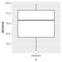 |
Histograms |
Density plots |
Scatterplots |
Line graphs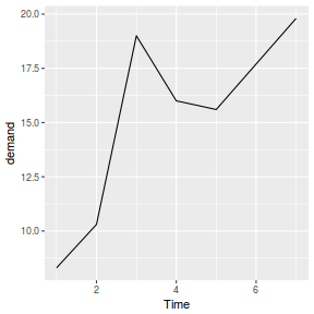 |
Smoothers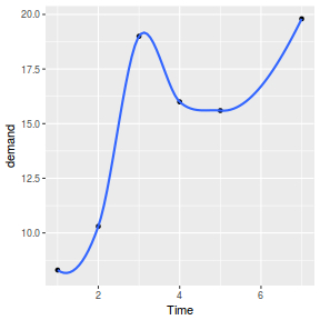 |
Trendlines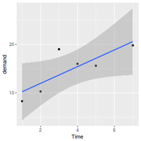 |
Bar charts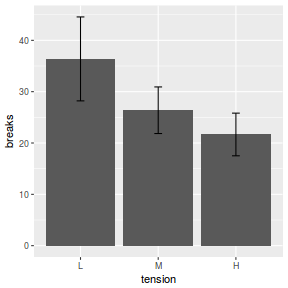 |
Stacked bar charts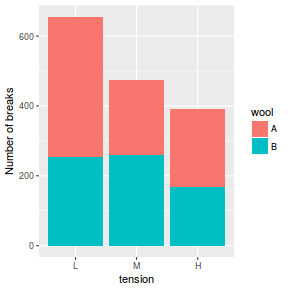 |
Bar graphcs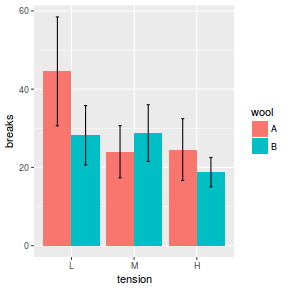 |
Interaction plots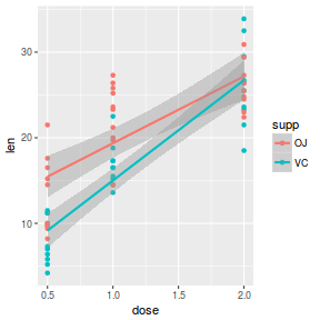 |
Scatterplot matrix |
Heat maps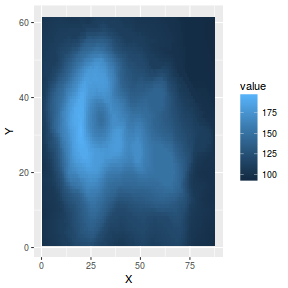 |
Contour maps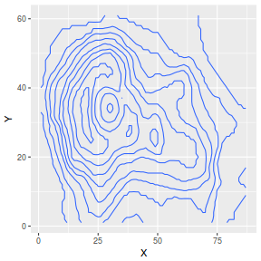 |
Segments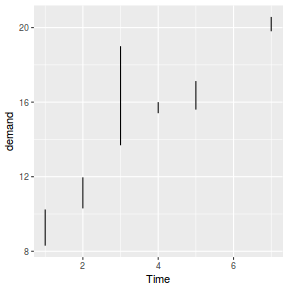 |
Confidence bands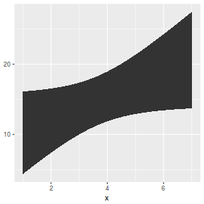 |
Error bars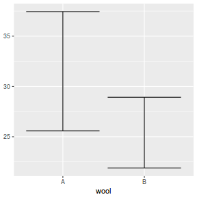 |
Horizontal lines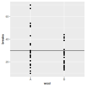 |
Vertical lines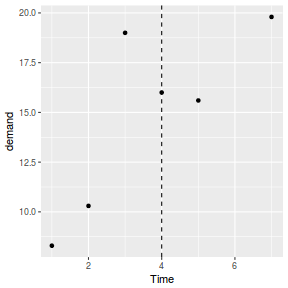 |
Range bars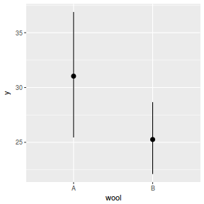 |
Axes rugs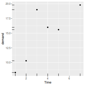 |
Text plots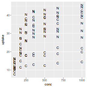 |
Axes scales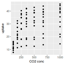 |
Colours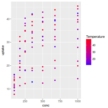 |
Line types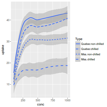 |
Plotting symbols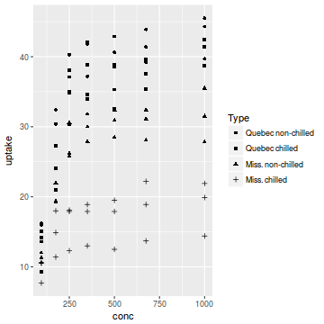 |
Transparency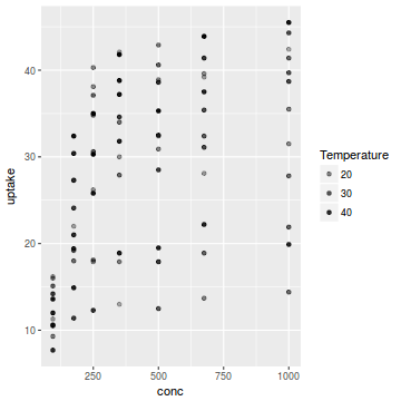 |
Sizes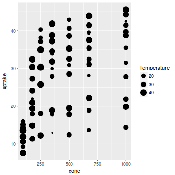 |
facet_wrap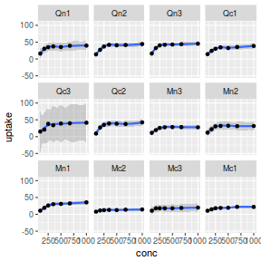 |
facet_grid |
grids and viewports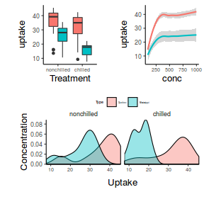 |
The Grammar of Graphics
The Grammar of Graphics was first introduced/presented by Wilkinson and Wills (2006) as a new graphics philosophy that laid down a series of rules to govern the production of quantitative graphics. Essentially the proposed graphics infrastructure considers a graphic as comprising a plot (defined by a coordinate system, scales and panelling) over which one or more data layers are applied.
Each layer is defined as:
- the data - a data frame
- mapping specifications that establish the visual aesthetics (colour, line type and thickness, shapes etc) of each variable
- statistical methods that determine how the data rows should be summarised (stat)
- geometric instructions (geom) on how each summary should be represented (bar, line, point etc)
- positional mechanism for dealing with overlapping data (position)
Following a very short example, the next section will largely concentrate on describing each of the above graphical components. Having then established the workings of these components, we can then put them together to yield specific graphics.
Hadley Wickham's interpretation of these principals in
an R context is implimented via the ggplot2
package. In addition the following packages are also commonly used alongside ggplot
so as to expand on the flexibility etc.
gridgridExtrascales
library(ggplot2)
library(tidyverse)
library(grid)
library(gridExtra)
The following very simple graphic will be used to illustrate the above specification by implicitly stating many of the default specifications. It will use a cartesian coordinate system, continuous axes scales, a single facet (panel) and then define a single layer with a dataframe (BOD), with red points, identity (no summarisation) statistic visualised as a point geometric.
 |
 p <- ggplot() +
  coord_cartesian() + #cartesian coordinates
  scale_x_continuous() + #continuous x axis
  scale_y_continuous() + #continuous y axis
  #single layer
  layer( data=BOD, #data.frame
    mapping=aes(y=demand,x=Time),
    stat="identity", #use original data
    geom="point", #plot data as points
    position="identity" # how to handle overlapping data
  )+
  layer( data=BOD, #data.frame
    mapping=aes(y=demand,x=Time),
    stat="identity", #use original data
    geom="line", #plot data as a line
    position="identity" # how to handle overlapping data
  )
p #print the plot
OR, by leaving out all the default stuff p <- ggplot(data=BOD, map=aes(y=demand,x=Time)) + geom_point()+ geom_line() p |
Note, the following important features of the grammar of graphics as implemented in R:
- the order in which each of the above components in the first code snippet were added is unimportant. They each add additional information to the overall graphical object. The object itself is evaluated as a whole when it is printed.
- multiple layers are laid down in the order that they appear in the statement
- in the second code snippet (the shorter version), a layer is created for each of the two geoms
- the data and mapping used by both
geom_point()andgeom_lineare inherited from the mainggplot()function. - since layers are ordered, the points are drawn first and the line over the top
In an attempt to illustrate the use of ggplot for elegant graphics, we will drill down into each of the plot and layer specifications. Although the geoms and thus layers are amongst the last features to be constructed by the system, the data and aesthetic features of the data impact on how the coordinate system, scales and panelling work. Therefore, we will explore the geoms first.
Geometric objects - geom_ and stat_
Geometric objects (geoms) are visual representations of observations. For example, there is a geom to represent points based on a set of x,y coordinates.
All graphics need at least one geom and each geom is mapped to
its own layer. Multiple geoms can be added to a graphic and the order that they are added to the expression determines the order that their respective
layer is constructed.
When a ggplot expression is being evaluated, geoms are coupled together with a stat_ function. This function is responsible
for generating data appropriate for the geom. For example, the stat_boxplot is responsible for generating the quantiles, whiskers
and outliers for the geom_boxplot function.
In addition to certain specific stat_ functions, all geoms can be coupled to a stat_identity function.
In mathematical contexts, identity functions map each element to themselves - this essentially means that each element passes straight through
the identity function unaltered. Coupling a geom to an identity function is useful when the characteristics of the data that you wish to
represent are present in the data frame. For example, your dataframe may contain the x,y coordinates for a series of points and you
wish for them to be used unaltered as the x,y coordinates on the graph. Moreover, your dataframe may contain pre-calculated information
about the quantiles, whiskers and outliers and you wish these to be used in the construction of a boxplot (rather than have the internals of ggplot perform the calculations on raw data).
Since geom_ and stats_ functions are coupled together, a geometric representation can be expressed from either a geom_ function OR a stats_ function. That is, you either:
- specify a geom_ function that itself calls a stat_ function to provide the data for the geom function..
ggplot(CO2)+geom_smooth(aes(x=conc,y=uptake), stat="smooth")
- specify a stat_ function that itself calls a geom_ function to visually represent the data..
ggplot(CO2)+stat_smooth(aes(x=conc,y=uptake), geom="smooth")
The geom_ functions all have numerous arguments, many of which are common to all geoms_.
- data - the data frame containing the data. Typically this is inherited from the ggplot function.
- mapping - the aesthetic mapping instructions. Through the aesthetic mapping the aesthetic visual characteristics of the geometric features
can be controlled (such as colour, point sizes, shapes etc). The aesthetic mapping can be inherited from the ggplot function.
Common aesthetic features (mapped via a aes function) include:
- alpha - transparency
- colour - colour of the geometric features
- fill - fill colour of geometric features
- linetype - type of lines used in geometric features (dotted, dashed, etc)
- size - size of geometric features such as points or text
- shape - shape of geometric features such as points
- weight - weightings of values
- stat - the stat_ function coupled to the geom_ function
- position - the position adjustment for overlapping objects
- identity - leave objects were they are
- dodge - shift objects to the side to prevent overlapping
- stack - stack objects on top of each other
- fill - stack objects on top of each other and standardize each group to equal height
Currently, there are a large number of available geoms_ and stat_ functions within the ggplot system. This tutorial is still a work in progress and therefore does not include all of them - I have focused on the more commonly used ones.
In an attempt to break up the set of geoms_ and stat_ functions, I have somewhat arbitrarily divided them up into primary and secondary geometric features. Primary geometric features are those that could be viewed as graphics in their own right, whereas secondary geometric features are those that are added to other geometric features to provide additional information (but would rarely be considered a graphic in their own right).
Primary geometric objects
The following icon matrix provides navigation and an overview to the geometric features described in this section.geom_bar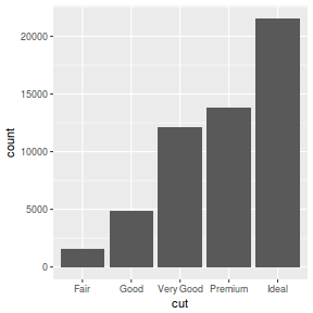 |
geom_bar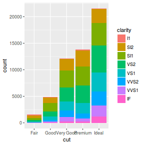 |
geom_bar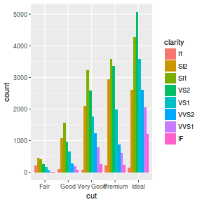 |
geom_bar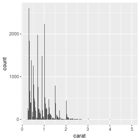 |
geom_boxplot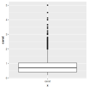 |
geom_density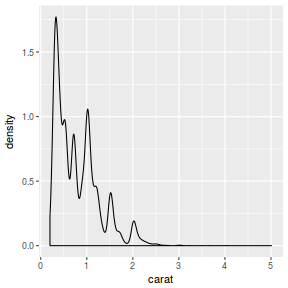 |
geom_point |
geom_line |
geom_smooth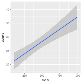 |
geom_smooth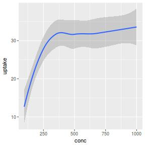 |
geom_tile |
geom_contour |
geom_bar and stats_bin
geom_bar constructs barcharts and histograms. By default, the bins of each bar along with the associated bar heights
are calculated by the stats_bin function.
The following list describes the mapping aesthetic properties
associated with geom_bar and stats_bin. The entries in bold are compulsory.
| geom_bar | stat_bar |
|---|---|
|
|
The following table illustrates the first six rows of the diamonds dataset (comes with R) that will be used for the following examples.
| carat | cut | color | clarity | depth | table | price | x | y | z | |
|---|---|---|---|---|---|---|---|---|---|---|
| 1 | 0.23 | Ideal | E | SI2 | 61.50 | 55.00 | 326 | 3.95 | 3.98 | 2.43 |
| 2 | 0.21 | Premium | E | SI1 | 59.80 | 61.00 | 326 | 3.89 | 3.84 | 2.31 |
| 3 | 0.23 | Good | E | VS1 | 56.90 | 65.00 | 327 | 4.05 | 4.07 | 2.31 |
| 4 | 0.29 | Premium | I | VS2 | 62.40 | 58.00 | 334 | 4.20 | 4.23 | 2.63 |
| 5 | 0.31 | Good | J | SI2 | 63.30 | 58.00 | 335 | 4.34 | 4.35 | 2.75 |
| 6 | 0.24 | Very Good | J | VVS2 | 62.80 | 57.00 | 336 | 3.94 | 3.96 | 2.48 |
| Feature | geom | stat | position | Aesthetic parameters / Notes | Example |
|---|---|---|---|---|---|
| barchart | _bar |
_bin |
stack | x,y,size,linetype,colour,fill,alpha, weight bar heights represent number of items in each level of the categorical vector |
|
ggplot(diamonds) + geom_bar(aes(x = cut)) |
|||||
| barchart | _bar |
_bin |
stack | Bar heights represent the number of items in each level of a categorical vector and stacked according to another categorical vector |
|
ggplot(diamonds) + geom_bar(aes(x = cut, fill = clarity)) |
|||||
| barchart | _bar |
_bin |
dodge | bar heights represent the number of items in each combination of levels of multiple categorical vectors displayed side by side |
|
ggplot(diamonds) + geom_bar(aes(x = cut, fill = clarity), position = "dodge") |
|||||
| barchart | _bar |
_identity |
stack | bar heights represent value of y for each x |
 |
diamonds1 <- as.data.frame(table(diamonds$cut)) ggplot(diamonds1) + geom_bar(aes(x = Var1, y = Freq), stat = "identity") |
|||||
| bargraph | _bar |
_summary |
stack | bar heights represent mean y within each level of categorical vector |
 |
ggplot(diamonds) + geom_bar(aes(x = cut, y = carat), stat = "summary", fun.y = mean) |
|||||
| histogram | _bar |
_bin |
stack | bar heights represent counts within a binned continuous vector |
|
ggplot(diamonds) + geom_bar(aes(x = carat)) |
|||||
geom_boxplot and stat_boxplot
geom_boxplot constructs boxplots. The values of the various elements of the boxplot (quantiles, whiskers etc)
are calculated by its main pairing function (stat_boxplot). The following list describes the mapping aesthetic properties
associated with geom_boxplot. The entries in bold are compulsory.
Note that boxplots are usually specified via the geom_boxplot function which will engage the stat_boxplot
to calculate the quantiles, whiskers and outliers. Therefore, confusingly, when calling geom_boxplot, the compulsory paramters
are actually those required by stat_boxplot (unless you indicated to use stat_identity).
| geom_boxplot | stat_boxplot |
|---|---|
|
|
| Feature | geom | stat | position | Notes, additional parameters | Example |
|---|---|---|---|---|---|
| boxplot | _boxplot |
_boxplot |
dodge | Plot of quantiles, whiskers and outliers
|
|
ggplot(diamonds) + geom_boxplot(aes(x = "carat", y = carat)) |
|||||
geom_density and stat_density
geom_density constructs smooth density distributions from continuous vectors. The actual smoothed densities are
calculated by its main pairing function (stat_density). The following list describes the mapping aesthetic properties
associated with geom_density and stat_density. The entries in bold are compulsory.
Note that density plots are usually specified via the geom_density function which will engage the stat_density.
Therefore, confusingly, when calling geom_density, the compulsory paramaters
are actually those required by stat_density (unless you indicated to use stat_identity).
| geom_density | stat_density |
|---|---|
|
|
| Feature | geom | stat | position | Notes, additional parameters | Example |
|---|---|---|---|---|---|
| density | _density |
_density |
dodge | Density plot of a distribution of a vector
|
|
ggplot(diamonds) + geom_density(aes(x = carat)) |
|||||
geom_point
geom_point draws points (scatterplot). Typically the stat used is stat_identity as we wish to use the values
in two continuous vectors as the coordinates of each point. The following list describes the mapping aesthetic properties
associated with geom_point. The entries in bold are compulsory.
| geom_point |
|---|
|
geom_point with other stats (such as stat_summary), so as to
plot summaries of the data rather than raw data.
| Feature | geom | stat | position | Notes, additional parameters | Example |
|---|---|---|---|---|---|
| point | _point |
_identity |
identity | Scatterplot |
|
ggplot(BOD) + geom_point(aes(x = Time, y = demand)) |
|||||
| means point | _point |
_summary |
identity | Means plot |
 |
ggplot(CO2) + geom_point(aes(x = conc, y = uptake), stat = "summary", fun.y = mean) |
|||||
geom_line
geom_line draws lines joining coordinates. Typically the stat used is stat_identity as we wish to use the values
in two continuous vectors as the coordinates of each line segment. The following list describes the mapping aesthetic properties
associated with geom_line. The entries in bold are compulsory.
| geom_line |
|---|
|
geom_line with other stats (such as stat_summary), so as to
plot summaries of the data rather than raw data.
| Feature | geom | stat | position | Notes, additional parameters | Example |
|---|---|---|---|---|---|
| line | _line |
_identity |
identity | Line plot |
|
ggplot(BOD) + geom_line(aes(x = Time, y = demand)) |
|||||
| means line | _line |
_summary |
identity | Means line plot |
 |
ggplot(CO2) + geom_line(aes(x = conc, y = uptake), stat = "summary", fun.y = mean) |
|||||
geom_smooth and stat_smooth
geom_smooth draws smooths lines (and 95% confidence intervals) through data clouds. Typically the stat used is stat_smooth which in turn
engages one of the available smoothing methods (e.g. lm, glm, gam, loess or rlm).
The following list describes the mapping aesthetic properties
associated with geom_smooth and stat_smooth. The entries in bold are compulsory.
| geom_smooth | stat_smooth |
|---|---|
|
|
stat_smooth also has the following optional arguments:
- method - the smoothing method (function). One of "lm", "glm", "gam", "loess" or "rlm"
- formula - the formula for the smoothing function, expressed relative to x and y. E.g. "y~x", "y~s(x)"
- se - whether to display confidence intervals
- fullrange - whether the fit should span the full range of the data
- level - confidence level (e.g. 0.95)
- n - number of points to evaluate smoother at
| Feature | geom | stat | position | Notes, additional parameters | Example |
|---|---|---|---|---|---|
| smooth | _smooth |
_identity |
identity | Linear smoother |
|
ggplot(CO2) + geom_smooth(aes(x = conc, y = uptake), method = "lm") |
|||||
| Lowess smoother | _smooth |
_stat |
identity | Lowess smoother |
|
ggplot(CO2) + geom_smooth(aes(x = conc, y = uptake), method = "loess") |
|||||
| Gam smoother | _smooth |
_stat |
identity | Cupic regression spline smoother |
 |
library(mgcv) ggplot(CO2) + geom_smooth(aes(x = conc, y = uptake), method = "gam", formula = y ~ s(x, bs = "cr", k = 4)) |
|||||
geom_tile and geom_raster
geom_tile constructs heat maps given x,y coordinates and a z value to associate with the fill of each tile.
The following list describes the mapping aesthetic properties
associated with geom_tile and stat_tile.
Similarly, geom_raster generates heat maps, however, unlike geom_tile, geom_raster
is applied when all the tiles are the same size and is able to interpolate when the grid is not regular - however this can
be very slow for large grids.
The entries in bold are compulsory.
| geom_tile and geom_raster |
|---|
|
| Feature | geom | stat | position | Notes, additional parameters | Example |
|---|---|---|---|---|---|
| tile | _tile |
_identity |
identity | Heat map |
|
volcano.df <- reshape2:::melt(volcano, varnames = c("X", "Y")) ggplot(volcano.df) + geom_tile(aes(x = X, y = Y, fill = value)) |
|||||
| raster | _raster |
_identity |
identity | Heat map |
 |
volcano.df <- reshape2:::melt(volcano, varnames = c("X", "Y")) ggplot(volcano.df) + geom_raster(aes(x = X, y = Y, fill = value)) |
|||||
geom_contour and stat_contour
geom_contour constructs contour maps given x,y coordinates and a z value from which to calculate each contour.
The following list describes the mapping aesthetic properties
associated with geom_contour and stat_contour. The entries in bold are compulsory.
| geom_contour | stat_contour |
|---|---|
|
|
| Feature | geom | stat | position | Notes, additional parameters | Example |
|---|---|---|---|---|---|
| contour | _contour |
_contour |
identity | Heat map |
|
volcano.df <- reshape2:::melt(volcano, varnames = c("X", "Y")) ggplot(volcano.df) + geom_contour(aes(x = X, y = Y, z = value)) |
|||||
Secondary geometric objects
| geom_segment |
geom_ribbon |
geom_errorbar |
geom_hline |
geom_vline |
geom_pointrange |
| geom_rug |
geom_text |
geom_segment
geom_segment draws segments joining coordinates. The following list describes the mapping aesthetic properties
associated with geom_segment. The entries in bold are compulsory.
| geom_segment |
|---|
|
geom_segment also has the following optional arguments:
- arrow - specification of how arrows should be constructed
- lineend - style of the line end
| Feature | geom | stat | position | Notes, additional parameters | Example |
|---|---|---|---|---|---|
| segment | _segment |
_identity |
identity | Segments on a plot - useful for drawing lots of lines or arrows |
|
BOD.lm <- lm(demand ~ Time, data = BOD) BOD$fitted <- fitted(BOD.lm) BOD$resid <- resid(BOD.lm) ggplot(BOD) + geom_segment(aes(x = Time, y = demand, xend = Time, yend = fitted)) |
|||||
| segment | _identity |
_identity |
identity | Segments on a plot - useful for drawing lots of lines or arrows |
 |
BOD.lm <- lm(demand~Time, data=BOD) BOD$fitted <- fitted(BOD.lm) BOD$resid <- resid(BOD.lm) ggplot(BOD)+geom_segment(aes(x=Time,y=demand, xend=Time,yend=fitted), arrow = arrow(length=unit(0.5, "cm"))) |
|||||
geom_ribbon
geom_ribbon draws ribbons based on upper and lower levels of y associated with each level of x.
The following list describes the mapping aesthetic properties
associated with geom_ribbon. The entries in bold are compulsory.
| geom_ribbon |
|---|
|
| Feature | geom | stat | position | Notes, additional parameters | Example |
|---|---|---|---|---|---|
| ribbon | _identity |
_identity |
identity | Ribbons on a plot - useful for depicting confidence envelopes |
|
BOD.lm <- lm(demand ~ Time, data = BOD) xs <- seq(min(BOD$Time), max(BOD$Time), l = 100) pred <- data.frame(predict(BOD.lm, newdata = data.frame(Time = xs), interval = "confidence")) pred$x <- xs ggplot(pred) + geom_ribbon(aes(x = x, ymin = lwr, ymax = upr)) |
|||||
geom_errorbar
geom_errorbar draws errorbars based on upper and lower levels of y associated with each level of x.
The following list describes the mapping aesthetic properties
associated with geom_errorbar. The entries in bold are compulsory.
| geom_errorbar |
|---|
|
| Feature | geom | stat | position | Notes, additional parameters | Example |
|---|---|---|---|---|---|
| errorbar | _identity |
_identity |
identity | Error bars on a plot - useful for adding to means plots etc |
|
warpbreaks.df = warpbreaks %>% group_by(wool) %>% do({ mean_cl_boot(.$breaks) }) ggplot(warpbreaks.df) + geom_errorbar(aes(x = wool, ymin = ymin, ymax = ymax)) |
|||||
| errorbar | _identity |
_summary |
identity | Error bars on a plot - useful for adding to means plots etc |
 |
ggplot(warpbreaks) + geom_errorbar(aes(x = wool, y = breaks), stat = "summary", fun.data = "mean_cl_boot") |
|||||
geom_hline and geom_vline
geom_hline draws a horizontal line based on a yintercept.
The following list describes the mapping aesthetic properties
associated with geom_hline. The entries in bold are compulsory.
| geom_hline and geom_vline |
|---|
|
| Feature | geom | stat | position | Notes, additional parameters | Example |
|---|---|---|---|---|---|
| hline | _hline |
_identity |
identity | Horizontal line(s) on a plot |
|
ggplot(warpbreaks) + geom_point(aes(y = breaks, x = wool)) + geom_hline(yintercept = 30) |
|||||
| vline | _vline |
_identity |
identity | Vertical line(s) on a plot |
|
ggplot(BOD) + geom_point(aes(y = demand, x = Time)) + geom_vline(xintercept = 4, linetype = "dashed") |
|||||
geom_pointrange and geom_linerange
geom_linerange draws vertical lines representing intervals similar to errorbars, yet without the horizontal ends.
In addition to the interval, geom_pointrange draws a point.
The following list describes the mapping aesthetic properties
associated with geom_pointrange and geom_linerange. The entries in bold are compulsory.
| geom_pointrange and geom_linerange |
|---|
|
| Feature | geom | stat | position | Notes, additional parameters | Example |
|---|---|---|---|---|---|
| pointrange | _pointrange |
_identity |
identity | Horizontal line(s) on a plot |
|
warpbreaks.df = warpbreaks %>% group_by(wool) %>% do({ mean_cl_boot(.$breaks) }) ggplot(warpbreaks.df) + geom_pointrange(aes(x = wool, y = y, ymin = ymin, ymax = ymax)) |
|||||
| pointrange | _pointrange |
_summary |
identity | Error bars on a plot - useful for adding to means plots etc |
 |
ggplot(warpbreaks) + geom_pointrange(aes(x = wool, y = breaks), stat = "summary", fun.data = "mean_cl_boot") |
|||||
geom_rug
geom_rug draws small marks along an axis to mark the presence of observations.
The following list describes the mapping aesthetic properties
associated with geom_rug. The entries in bold are compulsory.
| geom_rug |
|---|
|
geom_rug also has the following optional arguments:
- side - indicating which axes the rug should be drawn on ('t','b','l','r','bl','tblr',etc)
| Feature | geom | stat | position | Notes, additional parameters | Example |
|---|---|---|---|---|---|
| rug | _identity |
_identity |
identity | Rug on a plot - useful for depicting the location of observations |
|
ggplot(BOD, aes(x = Time, y = demand)) + geom_point() + geom_rug(side = "tblr") |
|||||
| rug | _identity |
_identity |
identity | Rug on a plot - useful for depicting the location of observations |
 |
ggplot(BOD, aes(x = Time, y = demand)) + geom_point() + geom_rug(side = "tblr") |
|||||
geom_text
geom_text adds text at given coordinates.
The following list describes the mapping aesthetic properties
associated with geom_text. The entries in bold are compulsory.
| geom_text |
|---|
|
| Feature | geom | stat | position | Notes, additional parameters | Example |
|---|---|---|---|---|---|
| text | _identity |
_identity |
identity | Text on a plot - useful for depicting the location of observations |
 |
ggplot(CO2, aes(x = conc, y = uptake)) + geom_text(aes(label = Treatment)) |
|||||
| text | _identity |
_identity |
identity | Text on a plot - useful for depicting the location of observations |
|
ggplot(CO2, aes(x = conc, y = uptake)) + geom_text(aes(label = toupper(substr(Treatment, 1, 1)))) |
|||||
geom_label
geom_label adds text surrounded by a box at given coordinates.
The following list describes the mapping aesthetic properties
associated with geom_text. The entries in bold are compulsory.
| geom_text |
|---|
|
| Feature | geom | stat | position | Notes, additional parameters | Example |
|---|---|---|---|---|---|
| label | _identity |
_identity |
identity | Label on a plot - useful for depicting the location of observations |
 |
ggplot(CO2, aes(x = conc, y = uptake)) + geom_label(aes(label = Treatment)) |
|||||
| label | _identity |
_identity |
identity | Label on a plot - useful for depicting the location of observations |
 |
iris.sum = iris %>% group_by(Species) %>% summarize_at(vars(Sepal.Length, Sepal.Width), mean) %>% ungroup %>% mutate_at(vars(Sepal.Length, Sepal.Width), funs(m = mean)) ggplot(iris, aes(y = Sepal.Length, x = Sepal.Width)) + geom_point(aes(color = Species)) + geom_segment(data = iris.sum, aes(yend = Sepal.Length_m, xend = Sepal.Width_m), arrow = arrow(end = "first", length = unit(0.5, "lines"))) + geom_label(data = iris.sum, aes(label = Species, fill = Species), vjust = "outward", hjust = "outward", alpha = 0.5) |
|||||
Coordinate system - coord
The coordinate system controls the nature and scale of the axes.| System | Parameters | Example |
|---|---|---|
| Regular cartesian coordinate system coord_cartesian |
xlim - x limits ylim - y limits |
 |
ggplot(BOD) + coord_cartesian()+geom_line(aes(y=demand,x=Time)) |
||
| Polar coordinate system coord_polar |
theta="x" - angle variable start=0 - initial angle from 12 oclock direction=1 - 1=clockwise, -1=anticlockwise |
 |
ggplot(BOD) + coord_polar()+geom_line(aes(y=demand,x=Time)) |
||
| Flipped the axes coord_flip |
xlim=NULL - y limits ylim=NULL - x limits |
 |
ggplot(BOD) + coord_flip()+geom_line(aes(y=demand,x=Time)) |
||
| Fix the ratio of axes dimesions coord_fixed |
ratio=1 - y/x ratio xlim=NULL - x limits ylim=NULL - y limits |
 |
ggplot(BOD) + coord_fixed(ratio=0.25)+geom_line(aes(y=demand,x=Time)) |
||
| 1:1 (equal) ratio of axes dimesions same as coord_fixed(ratio=1) coord_equal |
xlim=NULL - x limits ylim=NULL - y limits |
 |
ggplot(BOD) + coord_equal()+geom_line(aes(y=demand,x=Time)) |
||
| Map projection coordinate system coord_map |
projection="mercator" - mapping projection orientation=c(90,0,mean(range(x))) - map orientation |
 |
#get high resolution map of Australia (and islands) data library(maps) library(mapdata) aus <- map_data("worldHires", region="Australia") #Orthographic coordinates ggplot(aus, aes(x=long, y=lat, group=group)) + coord_map("ortho", orientation=c(-20,125,23.5))+geom_polygon() |
||
Altering the axes scales via the coordinate system
Modifying scales with coords affects the zoom on the graph. That is, it defines the extent and nature of the axes coordinates. By contrast, altering limits via scale_ routines will alter the scope of data included in a manner analogous to operating on a subset of the data.
| Default scale | Scale via coord_ (Zoom) | Scale via scale_ |
|---|---|---|
 |
 |
 |
# Default scales
ggplot(BOD,aes(y=demand,x=Time)) +
geom_point()+geom_smooth(method="lm")
# Zoom on x-axis ggplot(BOD,aes(y=demand,x=Time)) + coord_cartesian(xlim=c(2,6))+ geom_point()+geom_smooth(method="lm") # Scale (subset) the x data ggplot(BOD,aes(y=demand,x=Time)) + scale_x_continuous(limits=c(2,6))+ geom_point()+geom_smooth(method="lm") |
||
In addition to altering the zoom of the axes, axes (coordinate system) scales can be transformed to other scales via the coord_trans function. Transformations of the coordinate system take place after statistics have been calculated and geoms derived. Therefore the shape of geoms are altered.
The coord_trans() function has the following argments:
- x
- a transformer that will operate on the x scale
- y
- a transformer that will operate on the y scale
- limx
- limits of the x axis
- limy
- limits of the y axis
A transformer is a function that defines a transformation along with its inverse and rules on how to generate pretty breaks (tick marks) and their labels
To illustrate the distinction between coord_trans and scale_, we will generate some curvilinear data.set.seed(1) n<-50 dat <- data.frame(x = exp((1:n+rnorm(n,sd=2))/10), y = 1:n+rnorm(n,sd=2))
| Linear scales | coord_trans | scales_ |
|---|---|---|
 |
 |
 |
ggplot(dat, aes(y=y,x=x)) + geom_point() ggplot(dat, aes(y=y,x=x)) + geom_point()+coord_trans(x=log10_trans()) ggplot(dat, aes(y=y,x=x)) + geom_point()+scale_x_continuous(trans=log10_trans()) |
||
 |
 |
 |
ggplot(dat, aes(y=y,x=x)) + geom_point()+geom_smooth(method="lm") ggplot(dat, aes(y=y,x=x)) + geom_point()+geom_smooth(method="lm")+coord_trans(x=log10_trans()) ggplot(dat, aes(y=y,x=x)) + geom_point()+geom_smooth(method="lm")+scale_x_continuous(trans=log10_trans()) |
||
Transformers
trans_new
The trans_new function itself defines and returns a list structure comprising;
- name
- transform
- inverse
- breaks
- format
- domain
- A name to be given to the transformation
- a function (or name of a function) that performs the transformation
- a function (or name of a function) that performs the inverse of the transformation
- a function that generates tick breaks. Operates on the raw data
- a function that formats labels for the breaks.
- the range over which the transformation is valid
To illustrate the trans_new function, lets define a natural log (ln) transformer to apply to our artificial data.
ggplot(dat, aes(y=y,x=x)) + geom_point() + geom_smooth(method="lm") + scale_x_continuous(trans=trans_new(name="ln", transform=function(x) log(x), inverse=function(x) exp(x), breaks=function(x) pretty(x), domain=c(1e-100,Inf))) |
 |
ln_trans <- function() { name <- "ln" trans <- function(x) log(x) inv <- function(x) exp(x) breaks <- function(x) pretty(x) format <- function(x) x domain <- c(1e-100,Inf) trans_new(name,transform=trans,inverse=inv, breaks=breaks, domain=domain) } ggplot(dat, aes(y=y,x=x)) + geom_point()+ geom_smooth(method="lm")+ scale_x_continuous(trans=ln_trans()) |
 |
Finer control of the transformation can be exersized. Consider the following examples using the same dataset.
In order to be able to use trans_new effectively, it is necessary to understand the data parsed to each of the functions within the transformer. In the following demonstration, I have placed print statements within each of the functions so as to illustrate the sequence in which the functions are called (relative to each other and other external functions) as well as the input data of each function. Note for this demonstration, I have ommitted the smoother as it would also result in calls to these functions and therefore compound the sequencing.
p<-ggplot(dat, aes(y=y,x=x)) + geom_point()+# + geom_smooth(method="lm") +
  scale_x_continuous(trans=trans_new(name="",transform=function(x) {
     cat("**Tranform begin**\n");
     print(x);
     log10(x);
         },
                                inverse=function(x) {
     cat("**Inverse**\n");
     print(x);
     10^(x);
     },
                                breaks=function(x) {
         cat("**Breaks**\n");
     print(x);
         pretty(x);
     },
                            format=function(x) {cat("**Format**\n");print(x);x;},
                                domain=c(1e-100,Inf)))
p+ theme(plot.background = element_rect(fill = "transparent",colour = NA))

**Tranform begin**
 [1]   0.9750264   1.2670973   1.1421064
 [4]   2.0524951   1.7610347   1.5463639
 [7]   2.2199525   2.5796789   2.7597946
[10]   2.5572241   4.0647662   3.5893411
[13]   3.2405786   2.6040294   5.6124435
[16]   4.9087203   5.4562511   7.3065210
[19]   7.8793407   8.3209819   9.8138581
[22]  10.5531803  10.1240421   7.4048091
[25]  13.7902959  13.3134427  14.4232415
[28]  12.2539646  16.5166669  21.8366186
[31]  29.1290486  24.0333501  29.2984415
[34]  29.6433848  25.1432152  33.6832637
[37]  37.3802320  44.1740415  61.5595546
[40]  63.6013788  58.3871179  63.3913657
[43]  84.7234714  91.0430653  78.4333219
[46]  86.3579587 118.2636427 141.6992119
[49] 131.3060368 177.0127113
**Inverse**
[1] -0.123933  2.360954
**Breaks**
[1]   0.7517388 229.5904709
**Tranform begin**
[1]   0.7517388 229.5904709
**Tranform begin**
[1]   0  50 100 150 200 250
**Inverse**
[1]       NA 1.698970 2.000000 2.176091 2.301030
[6]       NA
**Format**
[1]  NA  50 100 150 200  NA
- The first call to the **Transform** function is parsed the raw data
- The first call to the **Inverse** function is parsed the computed axes limits (on the log10 scale). These originate in another part of the ggplot engine. Following the action of the transformation function, other functions determine the limits of the axes based on the transformed data as well as the nominated axis expansion factor (places a buffers beyond the data such that geoms do not overlapp axes). The inverse function then converts these limits into limits in the original raw data scale.
- The first call to the **Breaks** function is parsed the axes limits on the scale of the raw data and defines the spacing of axes tick marks
- The second call to the **Transform** function takes the axis limits and rescales them into the log10 scale
- The third call to the **Transform** function takes the axis tick mark spacing from **Breaks** and rescales them into the log10 scale
- The second call to the **Inverse** function takes the axis tick marks spacing on the log10 scale and rescales into the scale of the raw data
- Finally, the **Format** function is used to define the labels to be applied to the tick marks
| Axes in the scale of observations | ||
|---|---|---|
 |
 |
 |
| Axes in the scale of logarithms | ||
 |
 |
 |
*_trans transformers
The _trans family of transformers are convienient wrappers for the trans_new function.
| Transformer | Desciption |
|---|---|
| asn_trans() | Arc-sin square-root transformation (of proportions/percentages). |
| atanh_trans() | Arc-tangent transformation |
| boxcox_trans(p) | Box-Cox power transformation When the power exponent (p) is equal to 0, values are logged For exponents other than zero, 1 is subtracted from the value are raised to the power of the exponent and this is then divided by the exponent. |
| date_trans | |
| exp_trans | |
| identity_trans | |
| log10_trans | |
| log1p_trans | |
| log2_trans | |
| log_trans | |
| logit_trans | |
| probability_trans | |
| probit_trans | |
| reciprocal_trans | |
| reverse_trans | |
| sqrt_trans | |
| time_trans |
| Transform axes scale (logs) | 1:1 axes scales |
|---|---|
# log10 axes scales ggplot(BOD) + coord_trans(xtrans="log10",ytrans="log10")+geom_line(aes(y=demand,x=Time)) |
|

Modifying scales with coords affects the zoom on the graph. That is, it defines the extent and nature of the axes coordinates. By contrast, altering limits via scale_ routines will alter the scope of data included in a manner analogous to operating on a subset of the data.
Scales
The idea of scales is that you present the plotting engine with data or characteristics in one scale and use the variousscale_ functions to convert those data into
another scale. In the grammar of graphics, scales are synonymous for units of data, colors, shapes, sizes etc of plotting features
and the axes and guides (legends) provide a visual cue for what the scales are. For example;
- you might include data that ranges from 10 to 20 units, yet you wish to produce a plot that zooms in on the range 12-16.
- you have presented grouped data (data with multiple trends) and instructed the graphing engine to assign different colour codes to each trend. You can then define a colour scale to adjust the exact colours rendered.
- similarly, you might have indicated how plotting symbol shape and size are to be distinguished in your data set. You can then assign scales that define the exact shapes and symbol sizes rendered.
Technically, scales determine how attributes of the data are mapped into aesthetic geom properties.
The majority of geom's (geometric objects) have the following aesthetic properties:
- x - the x position (coordinates) of the geom
- y - the y position (coordinates) of the geom
- size - the size of the geom (e.g. the size of a point)
- shape - the shape of the geom
- linetype - the type of line associated with the geom's outline (solid, dashed etc)
- colour - the colour of the geom's outline (note the English spelling of the word colour)
- fill - the colour of the geom's fill
- alpha - the transparency of the geom (0=transparent, through to 1=opaque)
In turn, each of these properties are mapped to a scale - the defaults of which are automatically selected according to what is appropriate for the sort of data. For example, data can be on a continuous or discrete (categorical) scale. Most data type have the following possible scales for each of the above properties:
_continuous- when you want the scale increments (such as the different point sizes, colours etc) to be determined from a continuous vector in your data frame._discrete- when you want the scale increments (such as the different point sizes colours etc) to be determined from a categorical vector in your data frame._manual- is a variation on_discreteand is used when you wish to manually indicate the characteristic of each increment. You need to provide as many values as there are levels of your discrete vector._identity- is another variation on_discreteand is used when you wish for the values in your categorical vector to be used un-scaled as the characteristics of the data. For example, your data frame might contain a vector of colour names or point sizes.
Some properties, such as colour also have additional scales that are specific to the characteristic. The scales effect not only the characteristics of the geoms, they also effect the guides (legends) that accompany the geoms.
Scaling functions comprise the prefix scale_, followed by the name of an aesthetic property and suffixed by the type of scale.
Hence a function to manually define a colour scale would be scale_colour_manual.
name- a title applied to the scale. In the case of scales forxandy(the x,y coordinates of geoms), the name is the axis title. For all other scales, the name is the title of the guide (legend).breaks- the increments on the guide. Forscale_x_andscale_y_, breaks are the axis tick locations. For all other scales, the breaks indicate the increments of the characteristic in the legend (e.g. how many point shapes are featured in the legend).labels- the labels given to the increments on the guide. Forscale_x_andscale_y_, labels are the axis tick labels. For all other scales, the labels are the labels given to items in the legend.limits- the span/range of data represented in the scale. Note, if the range is inside the range of the data, the data are sub-setted.trans- scale transformations applied - obviously this is only relevant to scales that are associated with continuous data.
Scaling the x and y values (scale_x_)
The scale_x_ and scale_y_ scales control the x and y axes and in addition to the common arguments listed above,
the following optional arguments available for specific scales:
expand- a vector of length two that indicates multiplicative and additive constants used to expand the axes away from the data thereby ensuring that geoms do not intersect with the axes.minor_breaks- the increments for the minor breaks along the axis. The minor breaks have a grid line yet no tick marks or labels.
scale_x_continuous | scale_x_continuous | scale_x_continuous |
|---|---|---|
| linear scaling | linear with nice title | linear with more space |
|
|
 |
 |
#Linear axes scales with altered axis title
ggplot(CO2, aes(y=uptake,x=conc)) + geom_point()+
  scale_x_continuous(name="CO2 conc")
#Linear axes scales with more complex title ggplot(CO2, aes(y=uptake,x=conc)) + geom_point()+ scale_x_continuous(name=expression(paste("Ambient ",CO[2]," concentration (mg/l)", sep=""))) #Linear axes scales with more space along the x axis ggplot(CO2, aes(y=uptake,x=conc)) + geom_point()+ scale_x_continuous(name="CO2 conc", expand=c(0,200)) |
||
scale_x_log10 | scale_x_sqrt | scale_x_reverse |
| Log10 scale | Square-root scale | Reverse scale |
 scale_x_continuous(trans=
|
 scale_x_continuous(trans=
|
 |
# log10 axes scales
ggplot(CO2, aes(y=uptake,x=conc)) + geom_point()+
  scale_x_log10(name="CO2 conc", breaks=as.vector(c(1,2,5,10) %o% 10^(-1:2)))
# square-root transformation ggplot(CO2, aes(y=uptake,x=conc)) + geom_point()+ scale_x_sqrt(name="CO2 conc") # reverse the data ggplot(CO2, aes(y=uptake,x=conc)) + geom_point()+ scale_x_reverse(name="CO2 conc") |
scale_x_date | scale_x_datetime | scale_x_discrete |
 date_breaksFor more date formats see strptime
|
 date_breaksFor more date formats see strptime
|
 |
# Date format
library(scales)
CO2$Date <- as.Date(paste(2000+as.numeric(as.factor(CO2$conc)), "-01-01", sep=""))
ggplot(CO2, aes(y=uptake,x=Date)) + geom_point()+
  scale_x_date(name="Year", date_breaks="2 years", date_minor_breaks="6 month", labels=date_format("%Y"))
# POSIX format library(scales) CO2$DateTime <- as.POSIXct(paste(2000, "-0",as.numeric(as.factor(CO2$conc)),"-01 09:00:00", sep="")) ggplot(CO2, aes(y=uptake,x=DateTime)) + geom_point()+ scale_x_datetime(name="Time (days)", date_breaks="2 months", date_minor_breaks="1 months", labels=date_format("%b")) # categorical axis ggplot(CO2, aes(y=uptake,x=Treatment)) + geom_point()+ scale_x_discrete(name="Treatment") |
||
Scaling the size of geoms (scale_size_)
The scale_size_ scales control the size of geoms (such as the size of points) and in addition to the common scale arguments, the following optional arguments available:
range- the minimum and maximum sizevalues- the specific sizes to use (for_manualscale)guide- whether to include a guide and what sort of guide to include (e.g. "legend")
scale_size_continuous | scale_size_discrete | scale_size_manual |
|---|---|---|
| Scale the geoms according to a continuous vector | Scale the geoms according to a categorical vector | Manually determine the size of geoms |
range - minimum and maximum geom size
|
 |
 values - a set of values to use for sizes
|
# size determined by continuous covariate
set.seed(123)
CO2$cv<- runif(nrow(CO2),10,50)
ggplot(CO2, aes(y=uptake,x=conc)) + geom_point(aes(size=cv))+
  scale_size_continuous(name="Temperature")
# Discrete sizes ranging in size from 2 to 4 ggplot(CO2, aes(y=uptake,x=conc)) + geom_point(aes(size=Type))+ scale_size_discrete(name="Type", range=c(2,4)) # Manual sizes of exactly 2 and 4 ggplot(CO2, aes(y=uptake,x=conc)) + geom_point(aes(size=Type))+ scale_size_manual(name="Type", values=c(2,4)) |
scale_size_identity | scale_size | scale_area |
| Size the geoms according to the values of a continuous vector (don't scale) | Size geoms according to the values of a continuous vector (with legend) | Size geoms (area) according to the values of a continuous vector (with legend) |
 guide - whether to include a guide (legend)
|
 guide - whether to include a guide (legend)
|
 guide - whether to include a guide (legend)
|
# Sizes provided by a covariate set.seed(123) CO2$Count <- runif(nrow(CO2),0,10) ggplot(CO2, aes(y=uptake,x=conc)) + geom_point(aes(size=Count))+ scale_size_identity(name="Type") |
||
# Sizes provided by a covariate set.seed(123) CO2$Count <- runif(nrow(CO2),0,10) ggplot(CO2, aes(y=uptake,x=conc)) + geom_point(aes(size=Count))+ scale_size(name="Type", guide='legend') |
||
# Sizes provided by a covariate set.seed(123) CO2$Count <- runif(nrow(CO2),0,10) ggplot(CO2, aes(y=uptake,x=conc)) + geom_point(aes(size=Count))+ scale_size_area(name="Type", guide='legend') |
||
Scaling the shape of geoms (scale_shape_)
The scale_shape_ scales control the shape of geoms (such as the shape of the plotting point) an in addition to all of the regular arguments, the following optional arguments are available:
solid- whether the shapes should be solid (TRUE) or outlined (FALSE)
scale_shape_discrete | scale_shape_manual | scale_shape_identity |
|---|---|---|
| Geom shapes determined (scaled) by categorical variable | Geom shapes determined (scaled) manually | Geom shapes determined by categorical variable (no scaling) |
|
|
 values - a set of values (or shape names) to use for shapes
|
 |
# Discrete shapes determined by the combination of Type and Treatment
# The items in the guide are then rearranged and re-labelled
CO2$Comb <- interaction(CO2$Type,CO2$Treatment)
ggplot(CO2, aes(y=uptake,x=conc)) + geom_point(aes(shape=Comb))+
  scale_shape_discrete(name="Type", breaks=c("Quebec.nonchilled","Quebec.chilled","Mississippi.nonchilled","Mississippi.chilled"),
  labels=c("Quebec non-chilled","Quebec chilled","Miss. non-chilled","Miss. chilled"))
# Manual shapes ggplot(CO2, aes(y=uptake,x=conc)) + geom_point(aes(shape=Treatment), size=2)+ scale_shape_manual(name="Treatment", values=c(16,21)) # Identity shapes set.seed(123) CO2$Count <- cut(runif(nrow(CO2),0,10), breaks=5) ggplot(CO2, aes(y=uptake,x=conc)) + geom_point(aes(shape=Count))+ scale_shape(name="Species", guide="legend") |
||
Scaling the linetype associated with geoms (scale_linetype_)
The scale_size_ scales control the type of lines used in geoms and have the following additional optional arguments available:
values- values supplied to manually determine the line types
scale_linetype_discrete | scale_linetype_manual | scale_linetype_identity |
|---|---|---|
| Geom linetypes determined (scaled) by categorical variable | Geom linetypes determined (scaled) manually | Geom linetypes determined by categorical variable (no scaling) |
|
|
 values - a set of values (or linetype names) to use for linetypes
|
 |
# Discrete shapes determined by the combination of Type and Treatment
# The items in the guide are then rearranged and re-labelled
CO2$Comb <- interaction(CO2$Type,CO2$Treatment)
ggplot(CO2, aes(y=uptake,x=conc)) + geom_smooth(aes(linetype=Comb))+
  scale_linetype_discrete(name="Type", breaks=c("Quebec.nonchilled","Quebec.chilled","Mississippi.nonchilled","Mississippi.chilled"),
  labels=c("Quebec non-chilled","Quebec chilled","Miss. non-chilled","Miss. chilled"))
# Manual linetypes ggplot(CO2, aes(y=uptake,x=conc)) + geom_smooth(aes(linetype=Treatment))+ scale_linetype_manual(name="Treatment", values=c("dashed","dotted")) # Identity linetypes CO2$Lines <- factor(CO2$Treatment, levels=c("nonchilled","chilled"), labels=c("dotted","dashed")) ggplot(CO2, aes(y=uptake,x=conc)) + geom_smooth(aes(linetype=Lines))+ scale_linetype_identity(name="Temperature", guide="legend",breaks=c("dotted","dashed"), labels=c("Low","High")) |
||
Scaling the colour (or fill) associated with geoms (scale_colour_ & scale_fill_)
The scale_size_ scales control the colour of geoms and have the following additional optional arguments available:
low- colour of low end of the colour spectrumhigh- colour of high end of the colour spectrumguide- what sort of legend (e.g. colorbar)
scale_colour_continuous | scale_colour_gradient | scale_colour_gradient2 |
|---|---|---|
| Geom colours determined (scaled) by continuous variable | Geom colours determined (scaled) palette | Geom colours determined by a different palette |
|
|
 |
 |
# colour determined by continuous covariate
set.seed(123)
CO2$cv<- runif(nrow(CO2),10,50)
ggplot(CO2, aes(y=uptake,x=conc)) + geom_point(aes(colour=cv))+
  scale_colour_continuous(name="Temperature", low="blue", high="red")
# colour determined by continuous covariate set.seed(123) CO2$cv<- runif(nrow(CO2),10,50) ggplot(CO2, aes(y=uptake,x=conc)) + geom_point(aes(colour=cv))+ scale_colour_gradient(name="Temperature") # colour determined by continuous covariate set.seed(123) CO2$cv<- runif(nrow(CO2),10,50) ggplot(CO2, aes(y=uptake,x=conc)) + geom_point(aes(colour=cv))+ scale_colour_gradient2(name="Temperature") |
scale_colour_gradientn | scale_colour_gradientn (own palette) |
| Geom colours determined (scaled) by a specific palette | Geom colours determined (scaled) by a user defined palette | |
 |
 |
|
# colour determined by continuous covariate
# use a predefined gradient based colour palette
set.seed(123)
CO2$cv<- runif(nrow(CO2),10,50)
ggplot(CO2, aes(y=uptake,x=conc)) + geom_point(aes(colour=cv))+
  scale_colour_gradientn(name="Temperature", colours=terrain.colors(5))
# colour determined by continuous covariate # use a own gradient based colour palette my_palette = colorRampPalette(colors=c('red','green','blue')) set.seed(123) CO2$cv<- runif(nrow(CO2),10,50) ggplot(CO2, aes(y=uptake,x=conc)) + geom_point(aes(colour=cv))+ scale_colour_gradientn(name="Temperature", colours=my_palette(5)) | ||
scale_colour_hue | scale_colour_grey | scale_colour_brewer |
|---|---|---|
| Evenly spaced geom colours determined (scaled) by hue | Geom colours determined (scaled) palette | Geom colours determined by a different palette |
 |
 |
 |
# Discrete colours for hue
set.seed(123)
CO2$cv <- runif(nrow(CO2),0,100)
CO2$Temp <- cut(CO2$cv,breaks=c(0,33,66,100), labels=c("Low","Medium","High"))
ggplot(CO2, aes(y=uptake,x=conc)) + geom_point(aes(colour=Temp))+
  scale_colour_hue(name="Temperature", l=80,c=130)
# Discrete colours set.seed(123) CO2$cv <- runif(nrow(CO2),0,100) CO2$Temp <- cut(CO2$cv,breaks=c(0,33,66,100), labels=c("Low","Medium","High")) ggplot(CO2, aes(y=uptake,x=conc)) + geom_point(aes(colour=Temp))+ scale_colour_grey(name="Temperature", start=0.2, end=0.8) # Discrete colours selected from a colour brewer palette # it automatically knows how many colours are required set.seed(123) CO2$cv <- runif(nrow(CO2),0,100) CO2$Temp <- cut(CO2$cv,breaks=c(0,33,66,100), labels=c("Low","Medium","High")) ggplot(CO2, aes(y=uptake,x=conc)) + geom_point(aes(colour=Temp))+ scale_colour_brewer(name="Temperature", type="seq", palette="Reds") |
scale_colour_manual | scale_colour_identity |
| Geom colours determined (scaled) a specific palette | ||
 |
 |
|
# Manual colours
set.seed(123)
CO2$cv <- runif(nrow(CO2),0,100)
CO2$Temp <- cut(CO2$cv,breaks=c(0,33,66,100), labels=c("Low","Medium","High"))
ggplot(CO2, aes(y=uptake,x=conc)) + geom_point(aes(colour=Temp))+
  scale_colour_manual(name="Temperature", values=c("red","#00AA00",1))
#identity colours set.seed(123) CO2$cv <- runif(nrow(CO2),0,100) CO2$Temp <- cut(CO2$cv,breaks=c(0,33,66,100), labels=c("red","#00AA00",1)) ggplot(CO2, aes(y=uptake,x=conc)) + geom_smooth(aes(colour=Temp))+ scale_colour_identity(name="Temperature", guide="legend",labels=c("Low","Medium","High")) | ||
Scaling the alpha level of colour associated with geoms (scale_alpha_)
The scale_alpha_ scales control the transparency of geoms and have the following additional optional arguments available:
range- the alpha range (0,1)values- alpha values between 0 and 1guide- what sort of legend (e.g. colorbar)
scale_alpha_continuous | scale_alpha_discrete | scale_alpha_manual |
|---|---|---|
| Evenly spaced geom alphas determined (scaled) by continuous | Geom alphas determined (scaled) palette | Geom alphas determined by a different palette |
|
|
 |
 |
# colour determined by continuous covariate
set.seed(123)
CO2$cv<- runif(nrow(CO2),10,50)
ggplot(CO2, aes(y=uptake,x=conc)) + geom_point(aes(alpha=cv))+
  scale_alpha_continuous(name="Temperature", range=c(0.3,1))
# Discrete alphas set.seed(123) CO2$cv <- runif(nrow(CO2),0,100) CO2$Temp <- cut(CO2$cv,breaks=c(0,33,66,100), labels=c("Low","Medium","High")) ggplot(CO2, aes(y=uptake,x=conc)) + geom_point(aes(alpha=Temp))+ scale_alpha_discrete(name="Temperature") # Manual alphas set.seed(123) CO2$cv <- runif(nrow(CO2),0,100) CO2$Temp <- cut(CO2$cv,breaks=c(0,33,66,100), labels=c("Low","Medium","High")) ggplot(CO2, aes(y=uptake,x=conc)) + geom_point(aes(alpha=Temp))+ scale_alpha_manual(name="Temperature", values=c(0.3,0.6,0.95)) |
scale_alpha_identity | |
| Geom alphas determined (scaled) a specific palette | ||
 |
||
# Identity alphas set.seed(123) CO2$Alpha <- runif(nrow(CO2),0,1) ggplot(CO2, aes(y=uptake,x=conc)) + geom_point(aes(alpha=Alpha))+ scale_alpha_identity(name="Temperature") | ||
Facets (panels)
Faceting splits the data up into a matrix of panels on the basis of one or more categorical vectors. Since facets display subsets of the data, they are very useful for examining trends in hierarchical designs.There are two faceting function, that reflect two alternative approaches:
facet_wrap(~cell)- creates a set of panels based on a factor and wraps the panels into a 2-d matrix. cell represents a categorical vector or set of categorical vectorsfacet_wrap(row~column)- creates a set of panels based on a factor and wraps the panels into a 2-d matrix. row and column represents the categorical vectors used to define the rows and columns of the matrix respectively
| facet_wrap |
facet_grid |
| facet_wrap | facet_grid |
|---|---|
|
|
| Facet | Notes, additional parameters | Example |
|---|---|---|
_wrap |
Matrix of panels split by a single categorical vector |
|
ggplot(CO2, aes(y=uptake, x=conc)) + geom_smooth() + geom_point() + facet_wrap(~Plant) |
||
_wrap |
Matrix of panels split by a single categorical vector with different y-axis scale range for each panel |
 |
ggplot(CO2, aes(y=uptake, x=conc)) + geom_smooth() + geom_point() + facet_wrap(~Plant, scales="free_y") |
||
_grid |
Matrix of panels split by a single categorical vector with different y-axis scale range for each panel |
|
ggplot(CO2, aes(y=uptake, x=conc)) + geom_smooth() + geom_point() + facet_grid(Type~Treatment) |
||
_grid |
Matrix of panels split by a single categorical vector with different y-axis scale range for each panel |
 |
ggplot(CO2, aes(y=uptake, x=conc)) + geom_smooth() + geom_point() + facet_grid(Type~Treatment, scales="free_y") |
||
More complex arrangements of multiple panels and figures are discussed in the section on arranging multiple figures on a page
Themes
Themes govern the overall style of the graphic. In particular, they control:
- the look and positioning of the axes (and their ticks, titles and labels)
- the look and positioning of the legends (size,alignment, font, direction)
- the look of plots (spacing and titles)
- the look of panels (background, grid lines)
- the look of panels strips (background, alignment, font)
| Theme | Notes, additional parameters | Example |
|---|---|---|
_bw |
Black and white theme |
 |
ggplot(CO2, aes(y = uptake, x = conc)) + geom_smooth() + geom_point() + theme_bw() |
||
_classic |
Classic theme |
 |
ggplot(CO2, aes(y = uptake, x = conc)) + geom_smooth() + geom_point() + theme_classic() |
||
_grey |
Grey theme |
 |
ggplot(CO2, aes(y = uptake, x = conc)) + geom_smooth() + geom_point() + theme_grey() |
||
_minimal |
Minimal theme |
 |
ggplot(CO2, aes(y = uptake, x = conc)) + geom_smooth() + geom_point() + theme_minimal() |
||
Along with these pre-fabricated themes, it is possible to create your own theme. This is done via the theme() function.
Each themable element comprises of either a line, rectangle or text. Therefore, they can all be modified via one of the following functions:
- element_blank() - remove the element
- element_line() - set the properties of a line
- element_rect() - set the properties of a rectangle
- element_text() - set the properties of text
library(gridExtra)
ggplot(CO2, aes(y=uptake, x=conc)) + geom_smooth(aes(colour=Type)) + geom_point() +
theme(panel.grid.major = element_blank(), # no major grid lines
  panel.grid.minor = element_blank(), # no minor grid lines
  panel.background = element_blank(), # no background
  panel.border = element_blank(), # no plot border
  axis.title.y=element_text(size=15, vjust=0,angle=90), # y-axis title
  axis.text.y=element_text(size=12), # y-axis labels
  axis.title.x=element_text(size=15, vjust=-2), # x-axis title
  axis.text.x=element_text(size=12), # x-axis labels
  axis.line = element_line(),
  legend.position=c(1,0),
  legend.justification=c(1,0),
  plot.margin=unit(c(0.5,0.5,2,2),"lines")) # plot margins

Exporting graphics
By default, all graphics are sent to the screen graphics device (X11, quartz or windows depending on your operating system and configurations). This is fine for developing a figure, however, in order to share the figures or incorporate them into other documents, it is necessary to output them to one of a number of graphics formats.
The available formats differs according to what graphics devices are available on your system. Nevertheless, most systems support the generation of pdf's (a scalable vector graphics format) and png's (a bitmap format), therefore we will focus on these two formats.
Although it is possible to export graphics instructions to a graphics device using the traditional method:
pdf(file = "test.pdf", width = 6, height = 6)
...
dev.off()
Portable Document Format (PDF)
## Generate the ggplot plotting instructions
p <- ggplot(data = BOD, map = aes(y = demand, x = Time)) +
    geom_point() + geom_line()
## Export to 6x6 inch pdf
ggsave(file = "test.pdf", p, width = 6, height = 6,
    units = "in")
Portable Network Graphics (PNG)
## Generate the ggplot plotting instructions
p <- ggplot(data = BOD, map = aes(y = demand, x = Time)) +
    geom_point() + geom_line()
## Export to 6x6 inch png (at 300dpi)
ggsave(file = "test.png", p, width = 6, height = 6,
    units = "in", dpi = 300)
Arranging multiple figures on a page
Whilst faceting does provide a way to arrange multiple graphs together on a single page, there are numerous restrictions imposed to ensure consistency of style etc.
More complex graphical manipulations require a more thorough understanding of the
the grid framework on which ggplot is built. This framework comprises:
Viewports: these describe (by location and size) a rectangular region on the
graphical device in which objects can be drawn. Note, the viewport() function
only describes the context for the graphics instructions. Before it can be used, it must be
'pushed to the tree' with the pushViewport() function.
The tree can be flushed clean for a new graphic by issuing the grid.newpage()
function.
library(grid)
grid.newpage()
vp = viewport()
pushViewport(vp)

library(grid) vp = viewport() grid.show.viewport(vp)  |
library(grid) vp = viewport(x = unit(0.6, "npc"), y = unit(0.5, "npc"), width = unit(2, "in"), height = unit(3, "in")) grid.show.viewport(vp)  |
Shapes and grobs: all shapes drawn on a viewport are graphical objects (grobs) and each grob contains a description of the shape including its col, cex, lwd etc (think base graphics parameters, see get.gpar() for a list of graphical object parameters). There are many primative grobs that can be generated using either grid. of .grob functions
library(grid)
grid.newpage()
vp = viewport()
pushViewport(vp)
grid.rect(width = unit(0.5, "npc"), height = unit(0.4,
    "npc"), gp = gpar(fill = "red"))

There are numerous other functions for generating primative shapes (including circles, polygons, lines, point, text) as well features such as axes and legends. With these functions, it is possible to construct a graph..
library(grid)
grid.newpage()
vp = viewport(x = 0.5, y = 0.5, width = 0.8, height = 0.8,
    xscale = c(0, 10))
pushViewport(vp)
grid.xaxis()
grid.yaxis()
set.seed(1)
grid.points(x = 1:9, y = 0.2 + 0.05 * 1:9 + rnorm(9,
    0, 0.3))

The same thing can be achieved by packaging all the grobs together into a grob tree, defining the viewport and finally issuing the grid.draw() function to trigger the drawing of all the shapes from the grob tree.
library(grid)
xaxis = xaxisGrob()
yaxis = yaxisGrob()
pts = pointsGrob(x = 1:9, y = 0.2 + 0.05 * 1:9 + rnorm(9,
    0, 0.3))
g = grobTree(xaxis, yaxis, pts)
grid.newpage()
vp = viewport(x = 0.5, y = 0.5, width = 0.8, height = 0.8,
    xscale = c(0, 10))
pushViewport(vp)
grid.draw(g)

Although constructing graphics this way does give extrordinary flexibility and power, it does require you to control all aspects of the graphing including the scaling of the coordinate system and aesthetics. The ggplot framework sits on top of this grid framework and looks after all these aspects in a manner consistent with the grammar of graphics. As a minimum, all we need to do is map data to specific features and scales and the ggplot framework will take care of the rest.
Now in order to demonstrate arranging separate figures together into a multifigure plot, I will use colored squares to represent separate figures. Multiple figures are arranged together using the grid.arrange() (or similarly, arrangeGrob()) function. There are numerous arguments that can be supplied to the grid.arrange() function (see below) and many of these will seem daunting. The following examples will help illustrate the most common of these.
...: grobs, gtables or ggplot objectsgrobs: a list of grobs to be arranged togetherlayout_matrix: an optional layout matrix that defines the layoutvp: the viewport in which to place the grobs (defaults to main viewport)as.table: whether to arrange the grid from bottom-left to top-right (default) or top-left to bottom-right (FALSE)respect,clip:nrow,ncol: the number of rows and columns in the grid tablewidths,heights:relative widths and heights of cells in the grid tabletop,bottom,left,right: strings to add to the respective outer marginspadding: amount of padding to add around the margin texts
library(grid)
gs <- lapply(1:7, function(ii) grobTree(rectGrob(gp = gpar(fill = ii,
    alpha = 0.5)), textGrob(ii)))
library(gridExtra)
grid.arrange(grobs = gs, ncol = 3)

library(gridExtra)
grid.arrange(grobs = gs, ncol = 3, widths = c(2, 1,
    1))

library(gridExtra)
grid.arrange(grobs = gs, ncol = 3, layout_matrix = rbind(c(1,
    1, 2, 3), c(4, 5, 6, NA), c(7, 7, 7, 7)))

So what if we wanted to have the grobs of the middle row evenly spread across the entire row rather than have a blank space at the end. To do this, we would first create three separate grob trees (one for each row), and then arrange these together. I will also make the bottom row twice as tall as the other rows.
library(gridExtra)
g1 = arrangeGrob(grobs = gs[1:3], widths = c(2, 1,
    1))
g2 = arrangeGrob(grobs = gs[4:6], widths = c(1, 1,
    1))
g3 = arrangeGrob(grobs = gs[7])
grid.arrange(g1, g2, g3, nrow = 3, heights = c(1, 1,
    2))

We just created a list of grobs. These can all be arranged in a grid using the grid.arrange
p1 <- ggplot(CO2, aes(y = uptake, x = Treatment, fill = Treatment)) +
    geom_boxplot()
p2 <- ggplot(CO2, aes(x = uptake, fill = Type)) + geom_density(alpha = 0.4)
library(gridExtra)
grid.arrange(p1, p2, nrow = 2)

Yes, we have arranged three separate figures on a single page, however, in this case the result is not all that pleasing (and certainly not publication quality). Firstly, the y-axes of the top and bottom figures do not align and secondly, do we really need three legends?
To rectify the first of these issues, we need to work at a lower level with the grobs themselves. The following procedure works by setting the widths of all grobs to be the same (the maximum of all corresponding grobs across the two figures).
library(gtable)
g1 <- ggplotGrob(p1)
g2 <- ggplotGrob(p2)
g <- rbind(g1, g2, size = "first")
g$widths <- unit.pmax(g1$widths, g2$widths)
grid.newpage()
grid.draw(g)

It can sometimes be difficult to work out dimensions and spacing within ggplot, gtable or grobs. It is therefore useful to be able to visualize the names of all constituent grobs and also their dimensions
library(gtable)
g1 <- ggplotGrob(p1)
showGrob(grid.force(g1))


Since this is a bit messy, we can focus on individuals items.
library(gtable)
g1 <- ggplotGrob(p1)
g1
TableGrob (10 x 9) "layout": 18 grobs
    z         cells       name
1   0 ( 1-10, 1- 9) background
2   5 ( 5- 5, 3- 3)     spacer
3   7 ( 6- 6, 3- 3)     axis-l
4   3 ( 7- 7, 3- 3)     spacer
5   6 ( 5- 5, 4- 4)     axis-t
6   1 ( 6- 6, 4- 4)      panel
7   9 ( 7- 7, 4- 4)     axis-b
8   4 ( 5- 5, 5- 5)     spacer
9   8 ( 6- 6, 5- 5)     axis-r
10  2 ( 7- 7, 5- 5)     spacer
11 10 ( 4- 4, 4- 4)     xlab-t
12 11 ( 8- 8, 4- 4)     xlab-b
13 12 ( 6- 6, 2- 2)     ylab-l
14 13 ( 6- 6, 6- 6)     ylab-r
15 14 ( 6- 6, 8- 8)  guide-box
16 15 ( 3- 3, 4- 4)   subtitle
17 16 ( 2- 2, 4- 4)      title
18 17 ( 9- 9, 4- 4)    caption
                                      grob
1         rect[plot.background..rect.6143]
2                           zeroGrob[NULL]
3     absoluteGrob[GRID.absoluteGrob.6116]
4                           zeroGrob[NULL]
5                           zeroGrob[NULL]
6                gTree[panel-1.gTree.6096]
7     absoluteGrob[GRID.absoluteGrob.6109]
8                           zeroGrob[NULL]
9                           zeroGrob[NULL]
10                          zeroGrob[NULL]
11                          zeroGrob[NULL]
12 titleGrob[axis.title.x..titleGrob.6099]
13 titleGrob[axis.title.y..titleGrob.6102]
14                          zeroGrob[NULL]
15                       gtable[guide-box]
16  zeroGrob[plot.subtitle..zeroGrob.6140]
17     zeroGrob[plot.title..zeroGrob.6139]
18   zeroGrob[plot.caption..zeroGrob.6141]
showGrob(grid.force(g1), "axis-b", grep = TRUE)


p1 <- ggplot(CO2, aes(y = uptake, x = Treatment, fill = Type)) +
    geom_boxplot()
p2 <- ggplot(CO2, aes(y = uptake, x = conc, colour = Type)) +
    geom_smooth()
p3 <- ggplot(CO2, aes(x = uptake, fill = Type)) + geom_density(alpha = 0.4) +
    facet_grid(~Treatment)
grid.arrange(p1, p2, p3, nrow = 2, layout_matrix = rbind(c(1,
    2), c(3, 3)))

To rectify the first of these issues, we need to work at a lower level with the grobs themselves.
gtable_frame <- function(g, width = unit(1, "null"),
    height = unit(1, "null")) {
    panels <- g[["layout"]][grepl("panel", g[["layout"]][["name"]]),
        ]
    ll <- unique(panels$l)
    tt <- unique(panels$t)

    fixed_ar <- g$respect
    if (fixed_ar) {
        # there lies madness, we want to align with aspect
        # ratio constraints
        ar <- as.numeric(g$heights[tt[1]])/as.numeric(g$widths[ll[1]])
        print(ar)
        height <- width * ar
        g$respect <- FALSE
    }

    core <- g[seq(min(tt), max(tt)), seq(min(ll), max(ll))]
    top <- g[seq(1, min(tt) - 1), ]
    bottom <- g[seq(max(tt) + 1, nrow(g)), ]
    left <- g[, seq(1, min(ll) - 1)]
    right <- g[, seq(max(ll) + 1, ncol(g))]

    fg <- nullGrob()
    lg <- if (length(left))
        g[seq(min(tt), max(tt)), seq(1, min(ll) - 1)] else fg
    rg <- if (length(right))
        g[seq(min(tt), max(tt)), seq(max(ll) + 1, ncol(g))] else fg
    grobs = list(fg, g[seq(1, min(tt) - 1), seq(min(ll),
        max(ll))], fg, lg, g[seq(min(tt), max(tt)),
        seq(min(ll), max(ll))], rg, fg, g[seq(max(tt) +
        1, nrow(g)), seq(min(ll), max(ll))], fg)
    widths <- unit.c(sum(left$widths), width, sum(right$widths))
    heights <- unit.c(sum(top$heights), height, sum(bottom$heights))
    all <- gtable_matrix("all", grobs = matrix(grobs,
        ncol = 3, nrow = 3, byrow = TRUE), widths = widths,
        heights = heights)
    all[["layout"]][5, "name"] <- "panel"  # make sure knows where the panel is
    if (fixed_ar)
        all$respect <- TRUE
    all
}
library(gtable)
g1 = ggplotGrob(p1)
g2 = ggplotGrob(p2)
g3 = ggplotGrob(p3)
fg1 = gtable_frame(g1)
fg2 = gtable_frame(g2)
fg12 = gtable_frame(cbind(fg1, fg2))
fg3 = gtable_frame(g3)
fg123 = gtable_frame(rbind(fg12, fg3))
grid.newpage()
grid.draw(fg123)

Lets start by generating a number of single panel and multipanel plots that can be used to illustrate different options for arranging graphics.
Controlling panel dimensions
The following two plots represent time series of a few different metrics (pce: personal consumption expendatures in billions $US, pop: total US population in thousands, unemploy: number of unemployed in thousands, psavert: personal savings rate and unempmed: median duration of employment in weeks) compiled in the ggplot2 package from http://research.stlouisfed.org/fred2.
g1 = ggplot(economics_long %>% filter(variable %in%
    c("pce", "pop", "unemploy")), aes(y = value, x = date)) +
    geom_point() + facet_grid(variable ~ ., scales = "free_y") +
    theme_bw()
g1

g2 = ggplot(economics_long %>% filter(variable %in%
    c("psavert", "uempmed")), aes(y = value, x = date)) +
    geom_point() + facet_grid(variable ~ ., scales = "free_y") +
    theme_bw()
g2

What if we wished to produce two separate figures (one for g1 and one for g2, yet we wanted the panels within each figure to be the same sizes. Currently, you will notice that g1 has three panels and g2 has only two and that both figures are the same height - therefore g1's panels are shorter. We might alternatively want the panels of the two figures to be a consistent size and the size of the overal figure to be sized accordingly. Unfortunately, this is not as simple as just making g2 2/3 the height of g1, since this does not take into account the vertical space occupied by the xaxis (which only appears once in each figure).
Baptiste Auguié provides a solution on https://github.com/baptiste/gridextra/wiki/arranging-ggplot. The following function fixes the panels at a given width and height (and margin) and either returns a ggplotTable or exports the graphics to file.
set_panel_size <- function(p = NULL, g = ggplotGrob(p),
    file = NULL, margin = unit(1, "mm"), width = unit(4,
        "cm"), height = unit(4, "cm")) {

    panels <- grep("panel", g$layout$name)
    panel_index_w <- unique(g$layout$l[panels])
    panel_index_h <- unique(g$layout$t[panels])
    nw <- length(panel_index_w)
    nh <- length(panel_index_h)

    if (getRversion() < "3.3.0") {

        # the following conversion is necessary because
        # there is no `[<-`.unit method so promoting to
        # unit.list allows standard list indexing
        g$widths <- grid:::unit.list(g$widths)
        g$heights <- grid:::unit.list(g$heights)

        g$widths[panel_index_w] <- rep(list(width),
            nw)
        g$heights[panel_index_h] <- rep(list(height),
            nh)

    } else {

        g$widths[panel_index_w] <- rep(width, nw)
        g$heights[panel_index_h] <- rep(height, nh)

    }

    if (!is.null(file))
        ggsave(file, g, width = convertWidth(sum(g$widths) +
            margin, unitTo = "in", valueOnly = TRUE),
            height = convertHeight(sum(g$heights) +
                margin, unitTo = "in", valueOnly = TRUE))

    g
}
Now we can indicate a panel height and width. Note, the new function (set_panel_size) always returns a ggplot grob object. In this case, we are only interested in the side effect (producing the plot). Therefore I have directed the output to a throw away object (a).
a = set_panel_size(p = g1, file = "images/g1sized.png", margin = unit(1, "mm"), width = unit(2, "in"), height = unit(1, "in")) 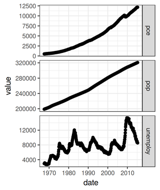
|
a = set_panel_size(p = g2, file = "images/g2sized.png", margin = unit(1, "mm"), width = unit(2, "in"), height = unit(1, "in")) 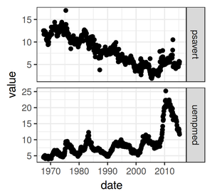
|
Examples
Exploring distributions
Boxplots - geom_boxplot & stat_boxplot
Univariate boxplots
| Basic boxplot | Plain boxplot |
|---|---|
|
|
 |
# Univariate boxplot
ggplot(BOD) + geom_boxplot(aes(y=demand,x="Demand"))
#Conditional boxplot p <- ggplot(BOD) + geom_boxplot(aes(y=demand,x=1)) + scale_y_continuous("Biochemical oxygen demand (mg/l)") + scale_x_continuous(limits=c(0,2),breaks=NULL) p + theme(panel.grid.major = element_blank(), panel.grid.minor = element_blank(), panel.background = element_blank(), panel.border = element_blank(), axis.title.y=element_text(size=15, vjust=0,angle=90), axis.text.y=element_text(size=12), axis.title.x=element_blank(), axis.text.x=element_blank(), axis.line = element_line(), plot.margin=unit(c(0.5,0.5,0.5,2),"lines") ) |
|
Conditional (factorial) boxplots
| Basic factorial boxplot | Plain factorial boxplot |
|---|---|
 |
 |
#Conditional boxplot
ggplot(warpbreaks) + geom_boxplot(aes(y=breaks,x=wool))
#Plain conditional boxplot p <- ggplot(warpbreaks) + geom_boxplot(aes(y=breaks,x=wool)) + scale_y_continuous("Number of wool breaks") + p + theme(panel.grid.major = element_blank(), panel.grid.minor = element_blank(), panel.background = element_blank(), panel.border = element_blank(), axis.title.y=element_text(size=15, vjust=0,angle=90), axis.text.y=element_text(size=12), axis.title.x=element_text(size=15, vjust=-1), axis.text.x=element_text(size=12), axis.line = element_line(), plot.margin=unit(c(0.5,0.5,2,2),"lines") ) |
|
| Basic factorial boxplot | Plain factorial boxplot |
 |
 |
ggplot(warpbreaks) + geom_boxplot(aes(y=breaks,x=wool, fill=tension)) p <- ggplot(warpbreaks) + geom_boxplot(aes(y=breaks,x=wool, fill=tension)) + scale_y_continuous("Number of wool breaks") + scale_x_discrete("Type of wool")+ labels=c("Low","Medium","High"),start=0.5,end=1) p + theme(panel.grid.major = element_blank(), panel.grid.minor = element_blank(), panel.background = element_blank(), panel.border = element_blank(), axis.title.y=element_text(size=15, vjust=0,angle=90), axis.text.y=element_text(size=12), axis.title.x=element_text(size=15, vjust=-1), axis.text.x=element_text(size=12), axis.line = element_line(), legend.position=c(1,1),legend.justification=c(1,1), plot.margin=unit(c(0.5,0.5,2,2),"lines") ) |
|
Violin Plot - geom_violin
| Violin plot | Plain violin plot |
|---|---|
 |
 |
ggplot(warpbreaks, aes(y=breaks, x=wool))+geom_violin() library(grid) library(scales) p<-ggplot(warpbreaks, aes(y=breaks, x=wool))+ geom_violin()+ scale_x_discrete("Wool type")+ scale_y_continuous("Number of breaks", expand=c(0.05,0), labels=comma) p + theme(panel.grid.major = element_blank(), panel.grid.minor = element_blank(), panel.background = element_blank(), panel.border = element_blank(), axis.title.y=element_text(size=15, vjust=0,angle=90), axis.text.y=element_text(size=12), axis.title.x=element_text(size=15,vjust=-1), axis.text.x=element_text(size=10), axis.line = element_line(), legend.position=c(1,0.2),legend.justification=c(1,0), plot.margin=unit(c(0.5,0.5,2,2),"lines"), legend.key=element_blank() ) |
|
Histograms - geom_histogram, geom_bar & stat_bin
Univariate histograms
| Basic histogram | Plain histogram |
|---|---|
|
|
|
ggplot(data=data.frame(rivers)) + geom_bar(aes(x=rivers))
#OR
ggplot(data=data.frame(rivers)) + geom_histogram(aes(x=rivers))
p <- ggplot(data=data.frame(rivers)) + geom_bar(aes(x=rivers),colour='black',fill='gray')+ scale_x_continuous("Length of rivers (miles)")+ scale_y_continuous("Frequency", expand=c(0,0))+ coord_cartesian(xlim=c(0,4000)) p + theme(panel.grid.major = element_blank(), panel.grid.minor = element_blank(), panel.background = element_blank(), panel.border = element_blank(), axis.title.y=element_text(size=15, vjust=0,angle=90), axis.text.y=element_text(size=12), axis.title.x=element_text(size=15,vjust=-1), axis.text.x=element_text(size=12), axis.line = element_line(), plot.margin=unit(c(0.5,0.5,2,2),"lines") ) |
|
| Number of bins | Plain bin width |
 |
|
# Histogram with customized bin widths
ggplot(data=data.frame(rivers)) + geom_bar(aes(x=rivers),binwidth=50)
#OR
ggplot(data=data.frame(rivers)) + geom_bar(aes(x=rivers))
#Plain histogram with custom bin widths #use the expand() to scale the axis zero to 0 p <- ggplot(data=data.frame(rivers)) + geom_bar(aes(x=rivers),binwidth=50,colour='black',fill='gray')+ scale_x_continuous("Length of rivers (miles)", expand=c(0,0))+ scale_y_continuous("Frequency", expand=c(0,0)) p + theme(panel.grid.major = element_blank(), panel.grid.minor = element_blank(), panel.background = element_blank(), panel.border = element_blank(), axis.title.y=element_text(size=15, vjust=0,angle=90), axis.text.y=element_text(size=12), axis.title.x=element_text(size=15,vjust=-1), axis.text.x=element_text(size=12), axis.line = element_line(), plot.margin=unit(c(0.5,0.5,2,2),"lines") ) |
|


| Scaled x-values | Plain transformed x-values |
|---|---|
 |
|
# Histogram on log transformed data
ggplot(data=data.frame(rivers)) + geom_bar(aes(x=rivers)) +scale_x_continuous(trans="log10")
#OR
ggplot(data=data.frame(rivers)) + geom_bar(aes(x=rivers)) +scale_x_log10()
# Plain histogram of log transformed data #define a new axis label formattter p <- ggplot(data=data.frame(rivers)) + geom_bar(aes(x=rivers),colour='black',fill='gray')+ scale_x_continuous("Length of rivers (miles)", expand=c(0,0),trans="log10")+ scale_y_continuous("Frequency", expand=c(0,0)) p + theme(panel.grid.major = element_blank(), panel.grid.minor = element_blank(), panel.background = element_blank(), panel.border = element_blank(), axis.title.y=element_text(size=15, vjust=0,angle=90), axis.text.y=element_text(size=12), axis.title.x=element_text(size=15,vjust=-1), axis.text.x=element_text(size=12), axis.line = element_line(), plot.margin=unit(c(0.5,0.5,2,2),"lines") ) |
|
| Scaled x-axis | Plain transformed x- coordinates |
 |
|
# Histogram of linear data on log transformed axis
ggplot(data=data.frame(rivers)) + geom_bar(aes(x=rivers)) +coord_trans(x="log1p")
# Plain histogram of linear data on log transformed axis #define a new axis label formattter p <- ggplot(data=data.frame(rivers)) + geom_bar(aes(x=rivers),colour='black',fill='gray')+ scale_x_continuous("Length of rivers (miles)", expand=c(0,0))+ coord_trans(x="log1p")+ scale_y_continuous("Frequency", expand=c(0,0)) p + theme(panel.grid.major = element_blank(), panel.grid.minor = element_blank(), panel.background = element_blank(), panel.border = element_blank(), axis.title.y=element_text(size=15, vjust=0,angle=90), axis.text.y=element_text(size=12), axis.title.x=element_text(size=15,vjust=-1), axis.text.x=element_text(size=12), axis.line = element_line(), plot.margin=unit(c(0.5,0.5,2,2),"lines") ) |
|
| Gradient fill | Plain scaled grey gradient fill |
 |
|
ggplot(data=data.frame(rivers)) + geom_bar(aes(x=rivers, fill=..count..)) # Plain histogram with gradient fill #define a new axis label formattter p <- ggplot(data=data.frame(rivers)) + geom_bar(aes(x=rivers,fill=..count..))+ geom_bar(aes(x=rivers, fill=..count..),colour="black",guide=FALSE)+ scale_x_continuous("Length of rivers (miles)", expand=c(0,0))+ scale_y_continuous("Frequency", expand=c(0,0))+ scale_fill_gradient(low="grey90", high="grey40") p + theme(panel.grid.major = element_blank(), panel.grid.minor = element_blank(), panel.background = element_blank(), panel.border = element_blank(), axis.title.y=element_text(size=15, vjust=0,angle=90), axis.text.y=element_text(size=12), axis.title.x=element_text(size=15,vjust=-1), axis.text.x=element_text(size=12), axis.line = element_line(), legend.position=c(1,1),legend.justification=c(1,1), plot.margin=unit(c(0.5,0.5,2,2),"lines") ) |
|


Conditional (factorial) histograms
| Basic histogram | Plain histogram |
|---|---|
 |
 |
ggplot(data=iris) + geom_bar(aes(x=Sepal.Length, fill=Species) , position="identity")
#OR
ggplot(data=iris) + geom_histogram(aes(x=Sepal.Length, fill=Species) , position="identity")
#Conditional histogram p <- ggplot(data=iris) + geom_bar(aes(x=Sepal.Length, fill=Species), position="identity")+ scale_x_continuous("Sepal length (mm)", expand=c(0,0))+ scale_y_continuous("Frequency", expand=c(0,0))+ scale_fill_grey() p + theme(panel.grid.major = element_blank(), panel.grid.minor = element_blank(), panel.background = element_blank(), panel.border = element_blank(), axis.title.y=element_text(size=15, vjust=0,angle=90), axis.text.y=element_text(size=12), axis.title.x=element_text(size=15,vjust=-1), axis.text.x=element_text(size=12), axis.line = element_line(), legend.position=c(1,1),legend.justification=c(1,1), plot.margin=unit(c(0.5,0.5,2,2),"lines") ) |
|
| Basic histogram | Plain histogram |
 |
 |
ggplot(data=iris) + geom_bar(aes(x=Sepal.Length, fill=Species), position="dodge")
#OR
ggplot(data=iris) + geom_histogram(aes(x=Sepal.Length, fill=Species), position="dodge")
#Transparent Conditional Histogram p <-ggplot(data=iris)+ geom_bar(aes(x=Sepal.Length,fill=Species), alpha=0.5, stat="bin", position="identity")+ geom_step(aes(x=Sepal.Length, colour=Species,fill=Species),stat="bin", position=position_identity())+#, scale_x_continuous("Sepal length (mm)", expand=c(0,0))+ scale_y_continuous("Frequency", expand=c(0,0)) p + theme(panel.grid.major = element_blank(), panel.grid.minor = element_blank(), panel.background = element_blank(), panel.border = element_blank(), axis.title.y=element_text(size=15, vjust=0,angle=90), axis.text.y=element_text(size=12), axis.title.x=element_text(size=15,vjust=-1), axis.text.x=element_text(size=12), axis.line = element_line(), legend.position=c(1,1),legend.justification=c(1,1), plot.margin=unit(c(0.5,0.5,2,2),"lines") ) |
|
Density plots - geom_density & stat_density
Univariate density plots
| Basic density plot | Plain density plot |
|---|---|
|
|
|
ggplot(data=data.frame(rivers)) + geom_density(aes(x=rivers)) p <- ggplot(data=data.frame(rivers)) + geom_density(aes(x=rivers),colour='black',fill='grey90')+ scale_x_continuous("Length of rivers (miles)", expand=c(0,0))+ scale_y_continuous(expression(paste("Density (",phantom() %*% 10^-4,")")), expand=c(0,0), labels=function(x){format(x*10000,nsmall=1,scientific=FALSE)}) p + theme(panel.grid.major = element_blank(), panel.grid.minor = element_blank(), panel.background = element_blank(), panel.border = element_blank(), axis.title.y=element_text(size=15, vjust=0,angle=90), axis.text.y=element_text(size=12), axis.title.x=element_text(size=15,vjust=-1), axis.text.x=element_text(size=12), axis.line = element_line(), plot.margin=unit(c(0.5,0.5,2,2),"lines") ) |
|
| Basic smoother density plot | Plain smoother density plot |
 |
|
ggplot(data=data.frame(rivers)) + geom_density(aes(x=rivers), adjust=5) myF <- function(x) { format(x * 10000, nsmall = 1, scientific = FALSE) } p <- ggplot(data = data.frame(rivers)) + geom_density(aes(x = rivers), adjust = 5, colour = "black", fill = "grey90") + scale_x_continuous("Length of rivers (miles)", expand = c(0, 0)) + scale_y_continuous("Density (/10000)", expand = c(0, 0), labels = myF) p + theme(panel.grid.major = element_blank(), panel.grid.minor = element_blank(), panel.background = element_blank(), panel.border = element_blank(), axis.title.y = element_text(size = 15, vjust = 0, angle = 90), axis.text.y = element_text(size = 12), axis.title.x = element_text(size = 15, vjust = -1), axis.text.x = element_text(size = 12), axis.line = element_line(), plot.margin = unit(c(0.5, 0.5, 2, 2), "lines")) |
|


| Basic smoother density plot | Plain smoother density plot |
|---|---|
 |
|
ggplot(data=data.frame(rivers)) + geom_density(aes(x=rivers)) +scale_x_continuous(trans="log10") p <- ggplot(data=data.frame(rivers)) + geom_density(aes(x=rivers),colour='black',fill='grey90')+ scale_x_continuous("Length of rivers (miles)", expand=c(0,0), trans="log10", breaks=c(250,500,1000,2000,3000),label=c(250,500,1000,2000,3000))+ scale_y_continuous("Density", expand=c(0,0)) p + theme(panel.grid.major = element_blank(), panel.grid.minor = element_blank(), panel.background = element_blank(), panel.border = element_blank(), axis.title.y=element_text(size=15, vjust=0,angle=90), axis.text.y=element_text(size=12), axis.title.x=element_text(size=15,vjust=-1), axis.text.x=element_text(size=10), axis.line = element_line(), plot.margin=unit(c(0.5,0.5,2,2),"lines") ) |
|

Factorial density
| Basic factorial density plot | Plain factorial density plot |
|---|---|
 |
 |
ggplot(data=iris) + geom_density(aes(x=Sepal.Length, colour=Species)) # Plain conditional density plot p <- ggplot(data=iris) + geom_density(aes(x=Sepal.Length, colour=Species))+ scale_x_continuous("Sepal length (mm)", expand=c(0,0))+ scale_y_continuous("Density", expand=c(0,0)) p + theme(panel.grid.major = element_blank(), panel.grid.minor = element_blank(), panel.background = element_blank(), panel.border = element_blank(), axis.title.y=element_text(size=15, vjust=0,angle=90), axis.text.y=element_text(size=12), axis.title.x=element_text(size=15,vjust=-1), axis.text.x=element_text(size=10), axis.line = element_line(), legend.position=c(1,1),legend.justification=c(1,1), plot.margin=unit(c(0.5,0.5,2,2),"lines") ) |
|
| Basic factorial density plot | Plain factorial density plot |
 |
 |
# Conditional density plot
ggplot(data=iris) + geom_density(aes(x=Sepal.Length, fill=Species))
# Plain conditional density plot p <- ggplot(data=iris) + geom_density(aes(x=Sepal.Length,fill=Species), alpha=0.4, colour=NA)+ geom_density(aes(x=Sepal.Length,fill=Species, colour=Species), alpha=0.0, show_guide=FALSE)+ scale_x_continuous("Sepal length (mm)", expand=c(0,0))+ scale_y_continuous("Density", expand=c(0,0)) p + theme(panel.grid.major = element_blank(), panel.grid.minor = element_blank(), panel.background = element_blank(), panel.border = element_blank(), axis.title.y=element_text(size=15, vjust=0,angle=90), axis.text.y=element_text(size=12), axis.title.x=element_text(size=15,vjust=-1), axis.text.x=element_text(size=10), axis.line = element_line(), legend.position=c(1,1),legend.justification=c(1,1), plot.margin=unit(c(0.5,0.5,2,2),"lines") ) |
|
Line graphs - geom_line
| Basic line graph | Plain line graph |
|---|---|
|
|
 |
ggplot(BOD) + geom_line(aes(y=demand,x=Time)) # Plain line plot p <- ggplot(data=BOD) + geom_line(aes(y=demand,x=Time),size=2)+ scale_x_continuous("Time (days)", expand=c(0.05,0), limits=c(0,8))+ scale_y_continuous("Demand (mg/l)", expand=c(0.05,0), limits=c(8,20)) p + theme(panel.grid.major = element_blank(), panel.grid.minor = element_blank(), panel.background = element_blank(), panel.border = element_blank(), axis.title.y=element_text(size=15, vjust=0,angle=90), axis.text.y=element_text(size=12), axis.title.x=element_text(size=15,vjust=-1), axis.text.x=element_text(size=10), axis.line = element_line(), legend.position=c(1,1),legend.justification=c(1,1), plot.margin=unit(c(0.5,0.5,2,2),"lines") ) |
|
| Basic line graph | Plain line graph |
|---|---|
 |
 |
ggplot(BOD,aes(y=demand,x=Time)) + geom_line()+geom_point() # Plain line plot p <- ggplot(data=BOD) + geom_line(aes(y=demand,x=Time),size=2)+ scale_x_continuous("Time (days)", expand=c(0.05,0), limits=c(0,8))+ scale_y_continuous("Demand (mg/l)", expand=c(0.05,0), limits=c(8,20)) p + theme(panel.grid.major = element_blank(), panel.grid.minor = element_blank(), panel.background = element_blank(), panel.border = element_blank(), axis.title.y=element_text(size=15, vjust=0,angle=90), axis.text.y=element_text(size=12), axis.title.x=element_text(size=15,vjust=-1), axis.text.x=element_text(size=10), axis.line = element_line(), legend.position=c(1,1),legend.justification=c(1,1), plot.margin=unit(c(0.5,0.5,2,2),"lines") ) |
|
Scatterplots - geom_point, geom_line, geom_smooth, stat_smooth & stat_summary
Simple scatterplots
| Basic scatterplot | Plain scatterplot |
|---|---|
|
|
 |
ggplot(BOD) + geom_point(aes(y=demand,x=Time)) # Plain scatterplot p <- ggplot(data=BOD) + geom_point(aes(y=demand,x=Time),size=3)+ scale_x_continuous("Time (days)", expand=c(0,0), limits=c(0,8))+ scale_y_continuous("Demand (mg/l)", expand=c(0,0), limits=c(8,20)) p + theme(panel.grid.major = element_blank(), panel.grid.minor = element_blank(), panel.background = element_blank(), panel.border = element_blank(), axis.title.y=element_text(size=15, vjust=0,angle=90), axis.text.y=element_text(size=12), axis.title.x=element_text(size=15,vjust=-1), axis.text.x=element_text(size=10), axis.line = element_line(), legend.position=c(1,1),legend.justification=c(1,1), plot.margin=unit(c(0.5,0.5,2,2),"lines") ) |
|
Trends and smoothers
| Linear trend | Plain linear trend with 95% confidence and |
|---|---|
|
|
 |
ggplot(BOD) + geom_point(aes(y=demand,x=Time)) +geom_smooth(aes(y=demand,x=Time), method="lm") # fit linear model (in order to get confidence bands) BOD.lm <- lm(demand~Time, data=BOD) xs <- seq(min(BOD$Time), max(BOD$Time), l=1000) BOD.predict <- predict(BOD.lm, newdata=data.frame(Time=xs),interval='confidence', se=TRUE) BOD.predict <- data.frame(BOD.predict$fit, se=BOD.predict$se.fit,Time=xs) # Create a plain scatterplot with smoother and confidence bands p <- ggplot(data=BOD) + geom_point(aes(y=demand, x=Time),colour='grey',size=2)+ geom_line(aes(y=demand,x=Time),stat="smooth", method="lm")+ scale_x_continuous("Time (days)", limits=c(1,7))+ scale_y_continuous("Demand (mg/l)") p <- p + theme(panel.grid.major = element_blank(), panel.grid.minor = element_blank(), panel.background = element_blank(), panel.border = element_blank(), axis.title.y=element_text(size=15, vjust=0,angle=90), axis.text.y=element_text(size=12), axis.title.x=element_text(size=15,vjust=-1), axis.text.x=element_text(size=10), axis.line = element_line(), legend.position=c(1,1),legend.justification=c(1,1), plot.margin=unit(c(0.5,0.5,2,2),"lines") ) # add the confidence bands p+geom_line(data=BOD.predict, aes(y=upr,x=Time), linetype=2)+ geom_line(data=BOD.predict, aes(y=lwr,x=Time), linetype=2) |
|
| Loess smoother | Plain loess smoother with standard error |
|---|---|
|
|
 |
ggplot(BOD) + geom_point(aes(y=demand,x=Time)) +geom_smooth(aes(y=demand,x=Time),
                method="loess", degree=1,se=TRUE)
# Fit a loess smoother BOD.loess <- loess(demand~Time, data=BOD, degree=1) xs <- seq(min(BOD$Time), max(BOD$Time), l=1000) BOD.predict <- predict(BOD.loess,newdata=data.frame(Time=xs), se=TRUE) BOD.predict <- with(BOD.predict,data.frame(fit,lwr=fit-se.fit,upr=fit+se.fit,Time=xs)) # Plain scatterplot with loess smoother and confidence bands p <- ggplot(data=BOD) + geom_point(aes(y=demand, x=Time),colour='grey',size=2)+ geom_line(data=BOD.predict,aes(y=fit,x=Time))+ scale_x_continuous("Time (days)", limits=c(1,7))+ scale_y_continuous("Demand (mg/l)") p <- p + theme(panel.grid.major = element_blank(), panel.grid.minor = element_blank(), panel.background = element_blank(), panel.border = element_blank(), axis.title.y=element_text(size=15, vjust=0,angle=90), axis.text.y=element_text(size=12), axis.title.x=element_text(size=15,vjust=-1), axis.text.x=element_text(size=10), axis.line = element_line(), legend.position=c(1,1),legend.justification=c(1,1), plot.margin=unit(c(0.5,0.5,2,2),"lines") ) # add confidence bands p+geom_line(data=BOD.predict, aes(y=upr,x=Time), linetype=2)+ geom_line(data=BOD.predict, aes(y=lwr,x=Time), linetype=2) |
|
| Generalized additive model (GAM) | Plain gam with 95% CI
based on 1.96 (dashed; ggplot default) and qt(0.975,df) |
|---|---|
 |
 |
          library(mgcv)
ggplot(CO2, aes(y=uptake, x=conc)) +geom_point()+stat_smooth(geom="smooth",method="gam",formula=y~s(x,k=6))
#manually fit a GAM library(mgcv) CO2.gam <- gam(uptake~s(conc,k=6), data=CO2) xs <- seq(min(CO2$conc), max(CO2$conc), l=1000) CO2.predict <- predict(CO2.gam,newdata=data.frame(conc=xs),se.fit=TRUE) df <- sum(CO2.gam$edf[-1]) #generate 95% CI predictions based on 1.96SE and degrees of freedom CO2.predict1 <-with(CO2.predict,data.frame(fit,lwr=fit-(1.96*se.fit), upr=fit+(1.96*se.fit),conc=xs)) CO2.predict2 <- with(CO2.predict,data.frame(fit,lwr=fit-(qt(0.975,df)*se.fit), upr=fit+(qt(0.975,df)*se.fit),conc=xs)) p <- ggplot(data=CO2) + geom_point(aes(y=uptake, x=conc),colour='grey',size=2)+ #stat_smooth(aes(y=uptake, x=conc),geom="smooth",method="gam",formula=y~s(x,k=6))+ scale_x_continuous(expression(paste("Ambient ",CO[2]," concentration (mg/l)", sep="")))+ scale_y_continuous(expression(paste(CO[2]," uptake rate (",mu*mol/m^2/sec,")", sep=""))) p <- p + theme(panel.grid.major = element_blank(), panel.grid.minor = element_blank(), panel.background = element_blank(), panel.border = element_blank(), axis.title.y=element_text(size=15, vjust=0,angle=90), axis.text.y=element_text(size=12), axis.title.x=element_text(size=15,vjust=-1), axis.text.x=element_text(size=10), axis.line = element_line(), legend.position=c(1,1),legend.justification=c(1,1), plot.margin=unit(c(0.5,0.5,2,2),"lines") ) # add the trendline and confidence bands p+geom_line(data=CO2.predict1, aes(y=fit,x=conc),)+ geom_line(data=CO2.predict1, aes(y=upr,x=conc), linetype=2)+ geom_line(data=CO2.predict1, aes(y=lwr,x=conc), linetype=2)+ geom_line(data=CO2.predict2, aes(y=upr,x=conc), linetype=3)+ geom_line(data=CO2.predict2, aes(y=lwr,x=conc), linetype=3) |
|
| Means plot | Plain gam with 95% CI
based on 1.96 (dashed; ggplot default) and qt(0.975,df) |
|---|---|
 |
 |
p<-ggplot(CO2, aes(y=uptake, x=conc)) +geom_pointrange(stat="summary", fun.data="mean_cl_boot")
p
p <- ggplot(data=CO2, aes(y=uptake, x=conc)) + scale_x_continuous(expression(paste("Ambient ",CO[2]," concentration (mg/l)", sep="")))+ scale_y_continuous(expression(paste(CO[2]," uptake rate (",mu*mol/m^2/sec,")", sep=""))) p <- p + theme(panel.grid.major = element_blank(), panel.grid.minor = element_blank(), panel.background = element_blank(), panel.border = element_blank(), axis.title.y=element_text(size=15, vjust=0,angle=90), axis.text.y=element_text(size=12), axis.title.x=element_text(size=15,vjust=-1), axis.text.x=element_text(size=10), axis.line = element_line(), legend.position=c(1,1),legend.justification=c(1,1), plot.margin=unit(c(0.5,0.5,2,2),"lines") ) # add the errorbars p+geom_pointrange(stat="summary", fun.data="mean_cl_normal") |
|
| Means plot | Plain gam with 95% CI
based on 1.96 (dashed; ggplot default) and qt(0.975,df) |
|---|---|
 |
 |
ggplot(CO2, aes(y=uptake, x=conc)) + geom_errorbar(stat="summary", fun.data="mean_cl_boot")+geom_point(stat="summary",fun.y="mean") p <- ggplot(data=CO2, aes(y=uptake, x=conc)) + stat_smooth(geom="smooth",method="gam",formula=y~s(x,k=6),se=FALSE, colour="gray")+ geom_errorbar(stat="summary", fun.data="mean_cl_boot") +geom_point(stat="summary",fun.y="mean")+ scale_x_continuous(expression(paste("Ambient ",CO[2]," concentration (mg/l)", sep="")))+ scale_y_continuous(expression(paste(CO[2]," uptake rate (",mu*mol/m^2/sec,")", sep=""))) p + theme(panel.grid.major = element_blank(), panel.grid.minor = element_blank(), panel.background = element_blank(), panel.border = element_blank(), axis.title.y=element_text(size=15, vjust=0,angle=90), axis.text.y=element_text(size=12), axis.title.x=element_text(size=15,vjust=-1), axis.text.x=element_text(size=10), axis.line = element_line(), legend.position=c(1,1),legend.justification=c(1,1), plot.margin=unit(c(0.5,0.5,2,2),"lines") ) |
|
Bargraphs (dynamite plots) - geom_bar & stat_summary
Simple bargraphs
| Bargraph | Plain bargraph |
|---|---|
|
|
 |
ggplot(warpbreaks, aes(y=breaks,x=tension))+geom_bar(stat="summary", fun.y=mean)+ geom_errorbar(stat="summary", fun.data="mean_cl_normal", width=0.1) p <- ggplot(data=warpbreaks, aes(y=breaks, x=tension)) + geom_bar(stat="summary", fun.y=mean,color="black",fill="grey80")+ geom_errorbar(stat="summary", fun.data="mean_cl_normal", width=0.1)+ scale_x_discrete("Tension")+ scale_y_continuous("Number of breaks", expand=c(0,0)) p + theme(panel.grid.major = element_blank(), panel.grid.minor = element_blank(), panel.background = element_blank(), panel.border = element_blank(), axis.title.y=element_text(size=15, vjust=0,angle=90), axis.text.y=element_text(size=12), axis.title.x=element_text(size=15,vjust=-1), axis.text.x=element_text(size=10), axis.line = element_line(), legend.position=c(1,1),legend.justification=c(1,1), plot.margin=unit(c(0.5,0.5,2,2),"lines") ) |
|
Conditional (factorial) bargraphs
| Conditional bargraph | Plain conditional bargraph |
|---|---|
|
|
 |
ggplot(warpbreaks, aes(y=breaks,x=tension,group=wool))+
geom_bar(aes(fill=wool),position=position_dodge(0.9),stat="summary", fun.y=mean)+
geom_errorbar(position=position_dodge(0.9),stat="summary", fun.data="mean_cl_normal", width=0.1)
p <- ggplot(data = warpbreaks, aes(y = breaks, x = tension, group = wool)) + geom_bar(aes(fill = wool), position = "dodge", stat = "summary", fun.y = mean) + geom_bar(aes(fill = wool), position = "dodge", stat = "summary", fun.y = mean, color = "black", show_guide = FALSE) + scale_fill_grey("Wool type") + geom_errorbar(position = position_dodge(0.9), stat = "summary", fun.data = "mean_cl_normal", width = 0.1) + scale_x_discrete("Tension") + scale_y_continuous("Number of wool breaks", expand = c(0, 0)) p + theme(panel.grid.major = element_blank(), panel.grid.minor = element_blank(), panel.background = element_blank(), panel.border = element_blank(), axis.title.y = element_text(size = 15, vjust = 0, angle = 90), axis.text.y = element_text(size = 12), axis.title.x = element_text(size = 15, vjust = -1), axis.text.x = element_text(size = 10), axis.line = element_line(), legend.position = c(1, 1), legend.justification = c(1, 1), plot.margin = unit(c(0.5, 0.5, 2, 2), "lines")) |
|
Bar charts - geom_bar
| Stacked barchart | Plain stacked barchart |
|---|---|
|
|
 |
#based on pre-calculated counts
warpbreaks.c<-ddply(warpbreaks,~wool+tension, function(x) data.frame(count=sum(x$breaks)))
ggplot(warpbreaks.c, aes(x=tension,y=count,fill=wool))+geom_bar(stat='identity')+ylab("Number of breaks")
#based on pre-calculated counts warpbreaks.c<-ddply(warpbreaks,~wool+tension, function(x) data.frame(count=sum(x$breaks))) p <- ggplot(warpbreaks.c, aes(x=tension,y=count,fill=wool))+ geom_bar(aes(fill=wool), stat='identity')+ geom_bar(aes(fill=wool), stat='identity', colour="black",show_guide=FALSE)+ scale_fill_grey("Wool type")+ scale_x_discrete("Tension")+ scale_y_continuous("Number of wool breaks", expand=c(0,0)) p + theme(panel.grid.major = element_blank(), panel.grid.minor = element_blank(), panel.background = element_blank(), panel.border = element_blank(), axis.title.y=element_text(size=15, vjust=0,angle=90), axis.text.y=element_text(size=12), axis.title.x=element_text(size=15,vjust=-1), axis.text.x=element_text(size=10), axis.line = element_line(), legend.position=c(1,1),legend.justification=c(1,1), plot.margin=unit(c(0.5,0.5,2,2),"lines") ) |
|
| Horizontal stacked barchart | Plain horizontal stacked barchart |
|---|---|
 |
 |
#based on pre-calculated counts
warpbreaks.c<-ddply(warpbreaks,~wool+tension, function(x) data.frame(count=sum(x$breaks)))
ggplot(warpbreaks.c, aes(x=tension,y=count,fill=wool))+geom_bar(stat='identity')+ylab("Number of breaks") + coord_flip()
#based on pre-calculated counts warpbreaks.c<-ddply(warpbreaks,~wool+tension, function(x) data.frame(count=sum(x$breaks))) p <- ggplot(warpbreaks.c, aes(x=tension,y=count,fill=wool))+ coord_flip()+ geom_bar(aes(fill=wool), stat='identity')+ geom_bar(aes(fill=wool), stat='identity', colour="black",show_guide=FALSE)+ scale_fill_grey("Wool type")+ scale_x_discrete("Tension")+ scale_y_continuous("Number of wool breaks", expand=c(0.05,0)) p + theme(panel.grid.major = element_blank(), panel.grid.minor = element_blank(), panel.background = element_blank(), panel.border = element_blank(), axis.title.y=element_text(size=15, vjust=0,angle=90), axis.text.y=element_text(size=12), axis.title.x=element_text(size=15,vjust=-1), axis.text.x=element_text(size=10), axis.line = element_line(), legend.position=c(1,1),legend.justification=c(1,1), plot.margin=unit(c(0.5,0.5,2,2),"lines") ) |
|
Interaction plots - geom_point, geom_line, geom_smooth
| Interaction plot | Plain interaction plot |
|---|---|
|
|
 |
ggplot(ToothGrowth, aes(y=len, x=dose, colour=supp))+geom_point()+geom_smooth(method="lm") p <- ggplot(ToothGrowth, aes(y = len, x = dose, linetype = supp)) + geom_point(aes(shape = supp)) + geom_smooth(method = "lm") + scale_linetype_manual(name = "Suppliment type", values = c(1, 2), breaks = c("OJ", "VC"), labels = c("Orange juice", "Vitamine C")) + scale_shape_manual(name = "Suppliment type", values = c(21, 16), breaks = c("OJ", "VC"), labels = c("Orange juice", "Vitamine C")) + scale_x_continuous("Dose (mg)", labels = comma) + scale_y_continuous("Tooth length (mm)", expand = c(0.05, 0), labels = comma) p + theme(panel.grid.major = element_blank(), panel.grid.minor = element_blank(), panel.background = element_blank(), panel.border = element_blank(), axis.title.y = element_text(size = 15, vjust = 0, angle = 90), axis.text.y = element_text(size = 12), axis.title.x = element_text(size = 15, vjust = -1), axis.text.x = element_text(size = 10), axis.line = element_line(), legend.position = c(1, 0), legend.justification = c(1, 0), plot.margin = unit(c(0.5, 0.5, 2, 2), "lines")) |
|
| Interaction plot with errorbars | Plain interaction plot with errorbars |
|---|---|
 |
 |
ggplot(ToothGrowth, aes(y=len, x=dose, colour=supp))+geom_errorbar(stat="summary", fun.data="mean_cl_boot")+geom_point(stat="summary", fun.y="mean")+geom_line(stat="summary", fun.y="mean") p <- ggplot(ToothGrowth, aes(y = len, x = dose, group = supp)) + geom_errorbar(stat = "summary", fun.data = "mean_cl_boot", width = 0.05) + geom_line(aes(linetype = supp), stat = "summary", fun.y = "mean") + geom_point(aes(shape = supp, fill = supp), stat = "summary", fun.y = "mean") + scale_shape_manual(name = "Suppliment type", values = c(21, 16), breaks = c("OJ", "VC"), labels = c("Orange juice", "Vitamine C")) + scale_fill_manual(name = "Suppliment type", values = c("white", "black"), breaks = c("OJ", "VC"), labels = c("Orange juice", "Vitamine C")) + scale_linetype_manual(name = "Suppliment type", values = c(1, 2), breaks = c("OJ", "VC"), labels = c("Orange juice", "Vitamine C")) + scale_x_continuous("Dose (mg)", labels = comma) + scale_y_continuous("Tooth length (mm)", expand = c(0.05, 0), labels = comma) p + theme(panel.grid.major = element_blank(), panel.grid.minor = element_blank(), panel.background = element_blank(), panel.border = element_blank(), axis.title.y = element_text(size = 15, vjust = 0, angle = 90), axis.text.y = element_text(size = 12), axis.title.x = element_text(size = 15, vjust = -1), axis.text.x = element_text(size = 10), axis.line = element_line(), legend.position = c(1, 0), legend.justification = c(1, 0), plot.margin = unit(c(0.5, 0.5, 2, 2), "lines"), legend.key = element_blank()) |
|
| Interaction plot with dodge | Plain interaction plot with dodge |
|---|---|
 |
 |
ggplot(ToothGrowth, aes(y=len, x=dose, colour=supp))+geom_errorbar(stat="summary", fun.data="mean_cl_boot", position=position_dodge(0.2))+geom_point(stat="summary", fun.y="mean", position=position_dodge(0.2))+geom_line(stat="summary", fun.y="mean", position=position_dodge(0.2)) p <- ggplot(ToothGrowth, aes(y = len, x = dose, group = supp)) + geom_errorbar(stat = "summary", fun.data = "mean_cl_boot", width = 0.05, position = position_dodge(0.2)) + geom_line(aes(linetype = supp), stat = "summary", fun.y = "mean", position = position_dodge(0.2)) + geom_point(aes(shape = supp, fill = supp), size = 3, stat = "summary", fun.y = "mean", position = position_dodge(0.2)) + scale_shape_manual(name = "Suppliment type", values = c(21, 16), breaks = c("OJ", "VC"), labels = c("Orange juice", "Vitamine C")) + scale_fill_manual(name = "Suppliment type", values = c("white", "black"), breaks = c("OJ", "VC"), labels = c("Orange juice", "Vitamine C")) + scale_linetype_manual(name = "Suppliment type", values = c(1, 2), breaks = c("OJ", "VC"), labels = c("Orange juice", "Vitamine C")) + scale_x_continuous("Dose (mg)", labels = comma) + scale_y_continuous("Tooth length (mm)", expand = c(0.05, 0), labels = comma) p + theme(panel.grid.major = element_blank(), panel.grid.minor = element_blank(), panel.background = element_blank(), panel.border = element_blank(), axis.title.y = element_text(size = 15, vjust = 0, angle = 90), axis.text.y = element_text(size = 12), axis.title.x = element_text(size = 15, vjust = -1), axis.text.x = element_text(size = 10), axis.line = element_line(), legend.position = c(1, 0), legend.justification = c(1, 0), plot.margin = unit(c(0.5, 0.5, 2, 2), "lines"), legend.key = element_blank()) |
|
Scatterplot matrix - ggpairs
| Scatterplot matrix | Plain gam with 95% CI
based on 1.96 (dashed; ggplot default) and qt(0.975,df) |
|
|---|---|---|
|
|
 |
|
library(GGally) ggpairs(iris, colour='Species') |
||
library(GGally) ggpairs(iris, colour = "Species", upper = list(continuous = "density", combo = "box"), diag = list(continuous = "density"), lower = list(continuous = "smooth"), axisLabels = "show") |
||
Multi-panel (facetted) plot - facet_grid & facet_wrap
2D grid of panels - facet_grid
| Grid of panels | Plain grid of panels |
|---|---|
 |
 |
ggplot(CO2,aes(y=uptake,x=conc))+geom_smooth()+geom_point()+facet_grid(Type~Treatment) |
|
library(grid) library(scales) # Create a new instance of the dataset to facilitate more informative panel titles CO2.a <- CO2 # Re-define the factor labels CO2.a$Treatment <- factor(CO2.a$Treatment, labels=c(expression(paste("Non-Chilled ", (symbol("\076")*15 * degree * C), sep="")), expression(paste("Chilled ",(symbol("\074")*5 * degree * C), sep="")))) CO2.a$Type <- factor(CO2.a$Type, labels=c("Origin:Quebec", "Origin:Mississippi")) p<-ggplot(CO2.a,aes(y=uptake,x=conc))+ geom_ribbon(aes(ymin=..ymin.., ymax=..ymax..),linetype=2,fill="transparent",colour="black", stat='smooth',method='loess')+ geom_smooth(se=FALSE)+ geom_point()+ facet_grid(Type~Treatment, labeller=label_parsed)+ scale_x_continuous(expression(paste("Ambient ",CO[2]," concentration (mg/l)", sep="")))+ scale_y_continuous(expression(paste(CO[2]," uptake rate (",mu*mol/m^2/sec,")", sep=""))) p + theme(panel.grid.major = element_blank(), panel.grid.minor = element_blank(), panel.background = element_blank(), panel.border = element_rect(fill="transparent",colour="black"), axis.title.y=element_text(size=15, vjust=1,angle=90), axis.text.y=element_text(size=12), axis.title.x=element_text(size=15,vjust=-1), axis.text.x=element_text(size=10), #axis.line = element_line(), strip.background=element_rect(fill="transparent", colour="black"), #legend.position=c(1,0.2),legend.justification=c(1,0), plot.margin=unit(c(0.5,0.5,2,2),"lines"), legend.key=element_blank() ) |
|
Multiple graphs per graphic
grid.arrange
| Grid of panels | Plain grid of panels |
|---|---|
 |
|
p1 <- ggplot(CO2, aes(y = uptake, x = Treatment, fill = Type)) + geom_boxplot() p2 <- ggplot(CO2, aes(y = uptake, x = conc, colour = Type)) + geom_smooth() p3 <- ggplot(CO2, aes(x = uptake, fill = Type)) + geom_density(alpha = 0.4) + facet_grid(~Treatment) library(gridExtra) grid.arrange(p1, p2, p3, nrow = 2) |
|
p1 <- ggplot(CO2, aes(y = uptake, x = Treatment, fill = Type)) + geom_boxplot() p2 <- ggplot(CO2, aes(y = uptake, x = conc, colour = Type)) + geom_smooth() p3 <- ggplot(CO2, aes(x = uptake, fill = Type)) + geom_density(alpha = 0.4) + facet_grid(~Treatment) + scale_x_continuous("Uptake", expand = c(0, 0)) + scale_y_continuous("Concentration", expand = c(0, 0)) library(gridExtra) myTheme <- theme_classic() + theme(panel.grid.major = element_blank(), panel.grid.minor = element_blank(), panel.background = element_blank(), panel.border = element_blank(), axis.title.y = element_text(size = rel(1.2), vjust = 2, angle = 90), axis.text.y = element_text(size = rel(1)), axis.title.x = element_text(size = rel(1.2), vjust = -1), axis.text.x = element_text(size = rel(0.8)), axis.line = element_line(), legend.position = c(0.5, 1.4), legend.justification = c(0.5), legend.direction = "horizontal", legend.text = element_text(size = rel(0.25)), legend.title = element_text(size = rel(0.5)), legend.key.size = unit(1, "lines"), plot.margin = unit(c(0.5, 0.5, 2, 2), "lines"), legend.key = element_blank(), strip.background = element_blank()) noLegend <- theme(legend.position = "none") p1 <- p1 + myTheme + noLegend p2 <- p2 + myTheme + noLegend grid.newpage() grid.draw(arrangeGrob(arrangeGrob(p1, p2, nrow = 1), p3 + myTheme)) |
|
Viewports
| Grid of panels | Plain grid of panels |
|---|---|
 |
 |
p1 <- ggplot(CO2, aes(y = uptake, x = Treatment, fill = Type)) + geom_boxplot() p2 <- ggplot(CO2, aes(y = uptake, x = conc, colour = Type)) + geom_smooth() p3 <- ggplot(CO2, aes(x = uptake, fill = Type)) + geom_density(alpha = 0.4) + facet_grid(~Treatment) grid.newpage() pushViewport(viewport(layout = grid.layout(4, 5))) pushViewport(viewport(layout.pos.col = 1:2, layout.pos.row = 1:2)) print(p1 + theme(legend.position = "none"), newpage = FALSE) popViewport(1) pushViewport(viewport(layout.pos.col = 3:4, layout.pos.row = 1:2)) print(p2 + theme(legend.position = "none"), newpage = FALSE) popViewport(1) pushViewport(viewport(layout.pos.col = 1:4, layout.pos.row = 3:4)) print(p3 + theme(legend.position = "none"), newpage = FALSE) popViewport(1) library(gridExtra) tmp <- ggplot_gtable(ggplot_build(p3)) leg <- which(sapply(tmp$grobs, function(x) x$name) == "guide-box") legend <- tmp$grobs[[leg]] # legend <- gTree(legend, vp=viewport(layout.pos.col=5, layout.pos.row=1:4)) using grid.arrange for # convenience could also manually push viewports grid.arrange(arrangeGrob(p3 + # theme(legend.position='none'), p2 + theme(legend.position='none'), main ='this is a title', left = # 'This is my global Y-axis title'), legend, widths=unit.c(unit(1, 'npc') - legend$width, # legend$width), nrow=1) pushViewport(viewport(layout.pos.col = 5, layout.pos.row = 1:4)) # print(p3+theme(keep='legend_box'), newpage=FALSE) print(p3+theme(keep='legend_box'), newpage=FALSE) grid.draw(legend) popViewport(0) |
|
#Create a new plain element element_plain <- function (base_size = 12,base_family=""){ # structure(list( axis.line = element_line(), #axis.text.x = element_text(family = base_family, size = base_size * 0.8, vjust = 1, lineheight = 0.9), #axis.text.y = element_text(family = base_family, size = base_size * 0.8, hjust = 1, lineheight = 0.9), #axis.ticks = element_line(colour = "black", size = 0.2), #axis.title.x = element_text(family = base_family, size = base_size, vjust = 0.5), #axis.title.y = element_text(family = base_family, size = base_size, vjust = 0.5, angle = 90), #axis.ticks.length = unit(0.15, "cm"), #axis.ticks.margin = unit(0.1, "cm"), #legend.background=element_blank(), #legend.margin=unit(0.2,"cm"), #legend.key = element_rect(colour = "grey80"), #legend.key.size=unit(1.2,"lines"), #legend.key.height=NULL, #legend.key.width=NULL, #legend.text=element_text(family = base_family, size = base_size * 0.8), #legend.text.align=NULL, #legend.title=element_text(family = base_family, face = "bold", size = base_size * 0.8, hjust = 0), #legend.title.align=NULL, #legend.position = "right", #legend.direction=NULL, #legend.justification="center", #legend.box=NULL, #panel.background = element_blank(), #panel.border = element_blank(), #panel.grid.major = element_blank(), #panel.grid.minor = element_blank(), #panel.margin = unit(0.25, "lines"), #strip.background=element_rect(fill="transparent", colour="black"), #strip.text.x=element_text(family = base_family, size = base_size * 0.8), #strip.text.y=element_text(family = base_family, size = base_size * 0.8, angle = -90), #plot.background = element_blank(), plot.margin=unit(c(0.5,0.5,1,1),"lines"), plot.title=element_blank() ), class = "theme") } element_plain <- theme(text=element_text(size = 12,family=""), axis.line = element_line(), plot.margin=unit(c(0.5,0.5,1,1),"lines"), plot.title=element_blank() ) #Construct the boxplots p1 <- ggplot(CO2, aes(y=uptake,x=Treatment,fill=Type))+ geom_boxplot(alpha=0.4)+scale_fill_manual(values=c("white","grey"))+ element_plain p2 <- ggplot(CO2, aes(y=uptake, x=conc, linetype=Type))+ geom_smooth(color="black",se=FALSE)+ geom_smooth(color="black", show_guide=FALSE)+ scale_linetype()+ element_plain p3<-ggplot(CO2, aes(x=uptake, fill=Type)) + geom_density(alpha=0.4, colour=NA)+ geom_density(alpha=0, show_guide=FALSE)+ facet_grid(~Treatment)+ scale_fill_manual(values=c("white","grey"))+ element_plain library(gridExtra) tmp <- ggplot_gtable(ggplot_build(p3)) leg <- which(sapply(tmp$grobs, function(x) x$name) == "guide-box") legend <- tmp$grobs[[leg]] tmp <- ggplot_gtable(ggplot_build(p2)) leg <- which(sapply(tmp$grobs, function(x) x$name) == "guide-box") legend1 <- tmp$grobs[[leg]] ##legend <- gTree(legend, vp=viewport(layout.pos.col=5, layout.pos.row=1:4)) grid.newpage() pushViewport(viewport(layout=grid.layout(4,5))) pushViewport(viewport(layout.pos.col=1:2, layout.pos.row=1:2)) print(p1+theme(legend.position="none"), newpage=FALSE) popViewport(1) pushViewport(viewport(layout.pos.col=3:4, layout.pos.row=1:2)) print(p2+theme(legend.position="none"), newpage=FALSE) popViewport(1) pushViewport(viewport(layout.pos.col=1:4, layout.pos.row=3:4)) print(p3+theme(legend.position="none"), newpage=FALSE) popViewport(1) pushViewport(viewport(layout.pos.col=5, layout.pos.row=1:4)) grid.draw(legend) grid.draw(legend1) popViewport(0) |
|