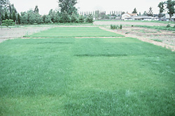
Here is an example from Fowler, Cohen and Parvis (1998). An agriculturalist was interested in the effects of fertilizer load on the yield of grass. Grass seed was sown uniformly over an area and different quantities of commercial fertilizer were applied to each of ten 1 m2 randomly located plots. Two months later the grass from each plot was harvested, dried and weighed. The data are in the file fertilizer.csv.
smokies<-read.csv("../downloads/data/smokies.csv",strip.white=TRUE)head(smokies)dim(smokies)smokies$Date=as.Date(smokies$DATE,format="%m/%d/%Y")#making day a 'Date' objectsmokies=na.exclude(smokies)#remove missing valueslibrary(nlme)plot(maxT~Date,smokies)mod1=gls(maxT~Date,data=smokies,method="ML")summary(mod1)plot(mod1$resid~smokies$Date)#An even better way to detect autocorrelation is with the acf function in the basic stats package:acf(residuals(mod1,type='normalized'))#The y values are the correlation (between -1 and 1) of values separated by 1, 2, 3,… days (the 'lag' in observations, because our predictor variable was Date), and the dashed blue lines are approximate 95% CIs for the lack of autocorrelation. We clearly have a massive autocorrelation problem. The nlme package provides a suite of auto-correlation structures that are easily folded into model construction using gls or lme. Let's try 'lag-1' autocorrelation (corAR1):mod2=gls(maxT~Date,data=smokies,method="ML",correlation=corAR1())summary(mod2)#The first thing you notice is that adding a correlation structure into a maximum likelihood model makes it much more complicated; not only do optimizations take a long time but achieving convergence can be difficult (as our single normal likelihood has now turned into a large multivariate normal likelihood, this makes sense). The second thing to notice is that including the correlation structure reduced the AIC from 21124 to 14051 (!). What the corAR1 term has done has added a variance-covariance matrix accounting for the correlation of observations according to a particular kind of simplified V that assumes correlations between any two years are simply the product of correlations between adjacent years ('lag 1'). That is, if the correlation between adjacent years is 0.94 (about what the acf function showed, and consistent with the fitted correlation parameter Phi=0.942), then the correlation between values two years apart is 0.94^2 (0.88), three years 0.94^3 (0.83), and so forth—that is, constant exponential decay of correlation over time. To see this we can re-examine the initial acf graph, and superpose a line that shows the lag-1 correlation of 0.94 decay according to the AR1 model:#Temporal autocorrelatio#ps2 <- read.csv("../downloads/data/PS2.csv", strip.white=TRUE)#head(ps2)acf(residuals(mod1))lines(c(1:35),.94^(c(1:35)),col="red")#Although the AR1 correlation structure is commonly used for time series models, apparently our correlation doesn't decay quite that fast. You can make the AR1 structure more sophisticated by allowing the auto-regressive (AR) function to use more parameters, or by allowing the correlation structure to involve (separately or in addition) a moving average of error variance (MA models). The corARMA correlation structure does both in one complicated argument, where you can involve different AR parameters (p) and different MA parameters (q). For example, here is a more complicated AR function involving two autocorrelation constants (Phi). (Warning: this took my machine over 20 minutes to optimize!):#arma2 = corARMA(c(.2,.2),p=2,q=0) #mod3 = gls(maxT ~ Date,data=smokies,method="ML",correlation=arma2) #summary(mod3)#Spatial autocorrelation#spdata <- read.table("http://www.ats.ucla.edu/stat/r/faq/thick.csv", header = T, sep = ",")#a <- gls(thick~soil, spdata)#Variogram(a, form=~east+north)#[[http://www.ats.ucla.edu/stat/r/faq/variogram_lme.htm]] [[http://www.ats.ucla.edu/stat/r/faq/variogram.htm]]
Q1-1. List the following
The biological hypothesis of interest
The biological null hypothesis of interest
The statistical null hypothesis of interest
Q1-2. Test the assumptions of simple linear regression using a
scatterplot
of YIELD against FERTILIZER. Add boxplots for each variable to the margins and fit a lowess smoother
through the data. Is there any evidence of violations of the simple linear regression assumptions? (Y or N)
Show code
# get the car packagelibrary(car)scatterplot(YIELD~FERTILIZER,data=fert)
If there is no evidence that the assumptions of simple linear regression have been violated,
fit the linear model
YIELD = intercept + (SLOPE * FERTILIZER). At this stage ignore any output.
Show code
fert.lm<-lm(YIELD~FERTILIZER,data=fert)
Q1-3. Examine the regression diagnostics
(particularly the
residual plot
).
Does the residual plot indicate any potential problems with the data? (Y or N)
Show code
# setup a 2x6 plotting device with small marginspar(mfrow=c(2,3),oma=c(0,0,2,0))plot(fert.lm,ask=F,which=1:6)
Q1-4. If there is no evidence that any of the assumptions have been violated,
examine the regression output
.
Identify and interpret the following;
Show code
summary(fert.lm)
##
## Call:
## lm(formula = YIELD ~ FERTILIZER, data = fert)
##
## Residuals:
##    Min     1Q Median     3Q    Max
##  -22.8  -11.1   -5.0   12.0   29.8
##
## Coefficients:
##             Estimate Std. Error t value Pr(>|t|)
## (Intercept)  51.9333    12.9790     4.0   0.0039 **
## FERTILIZER    0.8114     0.0837     9.7  1.1e-05 ***
## ---
## Signif. codes:  0 '***' 0.001 '**' 0.01 '*' 0.05 '.' 0.1 ' ' 1
##
## Residual standard error: 19 on 8 degrees of freedom
## Multiple R-squared:  0.922,	Adjusted R-squared:  0.912
## F-statistic:   94 on 1 and 8 DF,  p-value: 1.07e-05
sample y-intercept
sample slope
t value for main H0
R2 value
Q1-5. What conclusions (statistical and biological)
would you draw from the analysis?
Q1-6. Significant simple linear regression outcomes are usually accompanied by a scatterpoint that summarizes the relationship between the two population. Construct a
scatterplotwithout marginal boxplots.
Show code
#setup the graphics device with wider marginsopar<-par(mar=c(5,5,0,0))#construct the base plot without axes or labels or even pointsplot(YIELD~FERTILIZER,data=fert,ann=F,axes=F,type="n")# put the points on as solid circles (point character 16)points(YIELD~FERTILIZER,data=fert,pch=16)# calculate predicted valuesxs<-seq(min(fert$FERTILIZER),max(fert$FERTILIZER),l=1000)ys<-predict(fert.lm,newdata=data.frame(FERTILIZER= xs),se=T)lines(xs,ys$fit-ys$se.fit,lty=2)lines(xs,ys$fit+ys$se.fit,lty=2)lines(xs, ys$fit)# draw the x-axisaxis(1)mtext("Fertilizer concentration",1,line=3)# draw the y-axis (labels rotated)axis(2,las=1)mtext("Grass yield",2,line=3)#put an 'L'-shaped box around the plotbox(bty="l")
Christensen et al. (1996) studied the relationships between coarse woody debris (CWD) and, shoreline vegetation and lake development in a sample of 16 lakes. They defined CWD as debris greater than 5cm in diameter and recorded, for a number of plots on each lake, the basal area (m2.km-1) of CWD in the nearshore water, and the density (no.km-1) of riparian trees along the shore. The data are in the file christ.csv and the relevant variables are the response variable, CWDBASAL (coarse woody debris basal area, m2.km-1), and the predictor variable, RIPDENS (riparian tree density, trees.km-1).
Previously in worksheet 2 we analysed these data as a simple linear regression.
Indeed, that was entirely appropriate. However, we will now explore whether a better
model could have been built if rather than assume homogeneity of variance, we
allowed variance to be proportional to the predictor (RIPDENS).
Start off by refitting the linear model (without any specific variance structure)
via generalized least squares (so that we can compare the fit to a model that does define a specific variance structure).
Since we are fitting the model with the intention of comparing it to a similar model that differs only in the
variance structure, we need to use Maximum Likelihood (ML) rather than Restricted Maximum Likelihood (REML).
Q2-2. In the table below, list the assumptions of
simple linear regression along with how violations of each assumption are
diagnosed and/or the risks of violations are minimized.
Assumption
Diagnostic/Risk Minimization
I.
II.
III.
IV.
Q2-3. Draw a scatterplot
of CWDBASAL against RIPDENS. This should include boxplots for each variable to the margins and a fitted lowess smoother through the data HINT.
Is there any evidence of unequal variance? (Y or N)
Q2-4. The main intention of the researchers is to investigate whether there is a linear relationship between the density of riparian vegetation and the size of the logs. They have no of using the model equation for further predictions, not are they particularly interested in the magnitude of the relationship (slope). Is
model I or II regression
appropriate in these circumstances?. Explain?
If there is no evidence that the assumptions of simple linear regression have been violated,
fit the linear model
CWDBASAL = (SLOPE * RIPDENS) + intercept HINT. At this stage ignore any output.
Show code
christ.lm<-lm(CWDBASAL~RIPDENS,data=christ)
Q2-5. Examine the regression diagnostics
(particularly the residual plot)
HINT.
Does the residual plot indicate any potential problems with the data? (Y or N)
Show code
# setup a 2x6 plotting device with small marginspar(mfrow=c(2,3),oma=c(0,0,2,0))plot(christ.lm,ask=F,which=1:6)
Q2-6. At this point, we have no evidence to suggest that the hypothesis tests will not be reliable. Examine the regression output and identify and interpret the following:
Show code
summary(christ.lm)
##
## Call:
## lm(formula = CWDBASAL ~ RIPDENS, data = christ)
##
## Residuals:
##    Min     1Q Median     3Q    Max
##  -38.6  -22.4  -13.3   26.1   61.4
##
## Coefficients:
##             Estimate Std. Error t value Pr(>|t|)
## (Intercept) -77.0991    30.6080   -2.52  0.02455 *
## RIPDENS       0.1155     0.0234    4.93  0.00022 ***
## ---
## Signif. codes:  0 '***' 0.001 '**' 0.01 '*' 0.05 '.' 0.1 ' ' 1
##
## Residual standard error: 36.3 on 14 degrees of freedom
## Multiple R-squared:  0.634,	Adjusted R-squared:  0.608
## F-statistic: 24.3 on 1 and 14 DF,  p-value: 0.000222
sample y-intercept
sample slope
t value for main H0
P-value for main H0
R2 value
Q2-7. What conclusions (statistical and biological)
would you draw from the analysis?
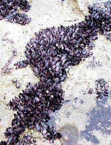
Here is a modified example from Quinn and Keough (2002). Peake & Quinn (1993) investigated the relationship between the number of individuals of invertebrates living in amongst clumps of mussels on a rocky intertidal shore and the area of those mussel clumps.
The relationship between two continuous variables can be analyzed by simple linear regression. As with question 2, note that the levels of the predictor variable were measured, not fixed, and thus parameter estimates should be based on model II RMA regression. Note however, that the hypothesis test for slope is uneffected by whether the predictor variable is fixed or measured.
Before performing the analysis we need to check the assumptions. To evaluate the assumptions of linearity, normality and homogeneity of variance, construct a
scatterplot
of INDIV against AREA (INDIV on y-axis, AREA on x-axis) including a lowess smoother and boxplots on the axes.
Q3-1. Consider the assumptions and suitability of the data for simple linear regression:
In this case, the researchers are interested in investigating whether there is a relationship between the number of invertebrate individuals and mussel clump area as well as generating a predictive model. However, they are not interested in the specific magnitude of the relationship (slope) and have no intension of comparing their slope to any other non-zero values. Is
model I or II regression
appropriate in these circumstances?. Explain?
Is there any evidence that the other assumptions are likely to be violated?
To get an appreciation of what a residual plot would look like when there is some evidence that the assumption of homogeneity of variance assumption has been violated, perform the
simple linear regression (by fitting a linear model)
Show code
peakquinn.lm<-lm(INDIV~AREA,data=peakquinn)
purely for the purpose of
examining the regression diagnostics
(particularly the
residual plot)
Show code
# setup a 2x6 plotting device with small marginspar(mfrow=c(2,3),oma=c(0,0,2,0))plot(peakquinn.lm,ask=F,which=1:6)
Q3-3. What could be done to the data to address the problems highlighted by the scatterplot, boxplots and residuals?
Q3-4. Describe how the scatterplot, axial boxplots and residual plot might appear following successful data transformation.
Transform
both variables to logs (base 10), replot the scatterplot using the transformed data, refit the linear model (again using transformed data) and examine the residual plot.HINT
Q3-5. Would you consider the transformation as successful? (Y or N)
Q3-6. If you are satisfied that the assumptions of the analysis are likely to have been met, perform the linear regression analysis (refit the linear model) HINT, examine the output.
##
## Call:
## lm(formula = log10(INDIV) ~ log10(AREA), data = peakquinn)
##
## Residuals:
##     Min      1Q  Median      3Q     Max
## -0.4335 -0.0646  0.0222  0.1118  0.2682
##
## Coefficients:
##             Estimate Std. Error t value Pr(>|t|)
## (Intercept)  -0.5760     0.2590   -2.22    0.036 *
## log10(AREA)   0.8349     0.0707   11.82    3e-11 ***
## ---
## Signif. codes:  0 '***' 0.001 '**' 0.01 '*' 0.05 '.' 0.1 ' ' 1
##
## Residual standard error: 0.186 on 23 degrees of freedom
## Multiple R-squared:  0.859,	Adjusted R-squared:  0.852
## F-statistic:  140 on 1 and 23 DF,  p-value: 3.01e-11
Test the null hypothesis that the population slope of the regression line between log number of individuals and log clump area is zero - use either the t-test or ANOVA F-test regression output. What are your conclusions (statistical and biological)? HINT
If the relationship is significant construct the regression equation relating the number of individuals in the a clump to the clump size. Remember that parameter estimates should be based on RMA regression not OLS!
DV
=
intercept
+
slope
x
IV
Log10Individuals
Log10Area
Q3-7. Write the results out as though you were writing a research paper/thesis. For example (select the phrase that applies and fill in gaps with your results):
A linear regression of log number of individuals against log clump area showed (choose correct option)
(b = ,
t = ,
df = ,
P =
)
Q3-8. How much of the variation in log individual number is explained by the linear relationship with log clump area? That is , what is the
R2 value?
Q3-9. What number of individuals would you
predict
for a new clump with an area of 8000 mm2?
HINT
Q3-10. Given that in this case both response and predictor variables were measured (the levels of the predictor variable were not specifically set by the researchers), it might be worth presenting the less biased model parameters (y-intercept and slope) from RMA model II regression. Perform the
RMA model II regression
and examine the slope and intercept
## RMA was not requested: it will not be computed.
##
## No permutation test will be performed
peakquinn.lm2
##
## Model II regression
##
## Call: lmodel2(formula = log10(INDIV) ~ log10(AREA), data = peakquinn)
##
## n = 25   r = 0.9266   r-square = 0.8586
## Parametric P-values:   2-tailed = 3.007e-11    1-tailed = 1.504e-11
## Angle between the two OLS regression lines = 4.341 degrees
##
## Regression results
##   Method Intercept  Slope Angle (degrees) P-perm (1-tailed)
## 1    OLS   -0.5760 0.8349           39.86                NA
## 2     MA   -0.7893 0.8937           41.79                NA
## 3    SMA   -0.8160 0.9011           42.02                NA
##
## Confidence intervals
##   Method 2.5%-Intercept 97.5%-Intercept 2.5%-Slope 97.5%-Slope
## 1    OLS         -1.112        -0.04016     0.6887      0.9811
## 2     MA         -1.407        -0.26068     0.7480      1.0640
## 3    SMA         -1.389        -0.32842     0.7667      1.0590
##
## Eigenvalues: 0.502 0.01891
##
## H statistic used for computing C.I. of MA: 0.007567
Q3-11. Significant simple linear regression outcomes are usually accompanied by a scatterpoint that summarizes the relationship between the two population. Construct a
scatterplotwithout a smoother or marginal boxplots.
Consider whether or not transformed or untransformed data should be used in this graph.
Show code
#setup the graphics device with wider marginsopar<-par(mar=c(6,6,0,0))#construct the base plot with log scale axes plot(INDIV~AREA,data=peakquinn,log='xy',ann=F,axes=F,type="n")# put the points on as solid circles (point character 16)points(INDIV~AREA,data=peakquinn,pch=16)# draw the x-axisaxis(1)mtext(expression(paste("Mussel clump area ",(mm^2))),1,line=4,cex=2)# draw the y-axis (labels rotated)axis(2,las=1)mtext("Number of individuals per clump",2,line=4,cex=2)#put in the fitted regression trendlinexs<-seq(min(peakquinn$AREA),max(peakquinn$AREA),l=1000)ys<-10^predict(peakquinn.lm,newdata=data.frame(AREA=xs),interval='c')lines(ys[,'fit']~xs)matlines(xs,ys,lty=2,col=1)# include the equationtext(max(peakquinn$AREA),20,expression(paste(log[10],"INDIV = 0.835.",log[10],"AREA - 0.576")),pos=2)text(max(peakquinn$AREA),17,expression(paste(R^2==0.857)),pos=2)#put an 'L'-shaped box around the plotbox(bty="l")
Nagy, Girard & Brown (1999) investigated the allometric scaling relationships for mammals (79 species), reptiles (55 species) and birds (95 species). The observed relationships between body size and metabolic rates of organisms have attracted a great deal of discussion amongst scientists from a wide range of disciplines recently. Whilst some have sort to explore explanations for the apparently 'universal' patterns, Nagy et al. (1999) were interested in determining whether scaling relationships differed between taxonomic, dietary and habitat groupings.
##                     Species                Common Mass  FMR Taxon Habitat Diet  Class   MASS
## 1 Pipistrellus pipistrellus           Pipistrelle  7.3 29.3    Ch      ND    I Mammal 0.0073
## 2          Plecotus auritus  Brown long-eared bat  8.5 27.6    Ch      ND    I Mammal 0.0085
## 3          Myotis lucifugus      Little brown bat  9.0 29.9    Ch      ND    I Mammal 0.0090
## 4         Gerbillus henleyi Northern pygmy gerbil  9.3 26.5    Ro       D    G Mammal 0.0093
## 5        Tarsipes rostratus          Honey possum  9.9 34.4    Tr      ND    N Mammal 0.0099
## 6           Anoura caudifer   Flower-visiting bat 11.5 51.9    Ch      ND    N Mammal 0.0115
For this example, we will explore the relationships between field metabolic rate (FMR) and body mass (Mass) in grams for the entire data set and then separately for each of the three classes (mammals, reptiles and aves).
Unlike the previous examples in which both predictor and response variables could be considered 'random' (measured not set), parameter estimates should be based on model II RMA regression. However, unlike previous examples, in this example, the primary focus is not hypothesis testing about whether there is a relationship or not. Nor is prediction a consideration. Instead, the researchers are interested in establishing (and comparing) the allometric scaling factors (slopes) of the metabolic rate - body mass relationships. Hence in this case, model II regression is indeed appropriate.
Q4-1. Before performing the analysis we need to check the assumptions. To evaluate the assumptions of linearity, normality and homogeneity of variance, construct a
scatterplot
of FMR against Mass including a lowess smoother and boxplots on the axes.
Show code
library(car)scatterplot(FMR~Mass,data=nagy)
Is there any evidence of non-normality?
Is there any evidence of non-linearity?
Q4-2. Typically, allometric scaling data are treated by a log-log transformation. That is, both predictor and response variables are log10 transformed. This is achieved graphically on a scatterplot by plotting the data on log transformed axes. Produce such a scatterplot (HINT). Does this improve linearity?
Q4-3. Fit the linear models relating log-log transformed FMR and Mass using both the Ordinary Least Squares and Reduced Major Axis methods separately for each of the classes (mammals, reptiles and aves).
##
## Model II regression
##
## Call: lmodel2(formula = log10(FMR) ~ log10(Mass), data = subset(nagy, nagy$Class ==
## "Aves"), range.y = "interval", range.x = "interval", nperm = 99)
##
## n = 95   r = 0.9684   r-square = 0.9378
## Parametric P-values:   2-tailed = 6.736e-58    1-tailed = 3.368e-58
## Angle between the two OLS regression lines = 1.73 degrees
##
## Permutation tests of OLS, MA, RMA slopes: 1-tailed, tail corresponding to sign
## A permutation test of r is equivalent to a permutation test of the OLS slope
## P-perm for SMA = NA because the SMA slope cannot be tested
##
## Regression results
##   Method Intercept  Slope Angle (degrees) P-perm (1-tailed)
## 1    OLS    1.0195 0.6808           34.25              0.01
## 2     MA    0.9912 0.6953           34.81              0.01
## 3    SMA    0.9762 0.7030           35.11                NA
## 4    RMA    0.9718 0.7052           35.19              0.01
##
## Confidence intervals
##   Method 2.5%-Intercept 97.5%-Intercept 2.5%-Slope 97.5%-Slope
## 1    OLS         0.9414           1.097     0.6447      0.7169
## 2     MA         0.9180           1.062     0.6590      0.7328
## 3    SMA         0.9040           1.045     0.6678      0.7400
## 4    RMA         0.8967           1.043     0.6689      0.7437
##
## Eigenvalues: 1.297 0.01835
##
## H statistic used for computing C.I. of MA: 0.0006174
Indicate the following;
OLS
RMA
Class
Slope
Intercept
Slope
Intercept
R2
Mammals (HINT and HINT)
Reptiles (
HINT and
HINT)
Aves (HINT and HINT)
Q4-4. Produce a scatterplot that depicts the relationship between FMR and Mass just for the mammals (HINT)
Fit the OLS regression line to this plot (HINT)
Fit the RMA regression line (in red) to this plot (HINT)
Show code
#setup the graphics device with wider marginsopar<-par(mar=c(6,6,0,0))#construct the base plot with log scale axesplot(FMR~Mass,data=subset(nagy,nagy$Class=="Mammal"),log='xy',ann=F,axes=F,type="n")# put the points on as solid circles (point character 16)points(FMR~Mass,data=subset(nagy,nagy$Class=="Mammal"),pch=16)# draw the x-axisaxis(1)mtext(expression(paste("Mass ",(g))),1,line=4,cex=2)# draw the y-axis (labels rotated)axis(2,las=1)mtext("Field metabolic rate",2,line=4,cex=2)#put in the fitted regression trendlinexs<-with(subset(nagy,nagy$Class=="Mammal"),seq(min(Mass),max(Mass),l=1000))ys<-10^predict(nagy.olsM,newdata=data.frame(Mass=xs),interval='c')lines(ys[,'fit']~xs)matlines(xs,ys,lty=2,col=1)#now include the RMA trendlinecentr.y<-mean(nagy.rmaM$y)centr.x<-mean(nagy.rmaM$x)A<-nagy.rmaM$regression.results[4,2]B<-nagy.rmaM$regression.results[4,3]B1<-nagy.rmaM$confidence.intervals[4,4]A1<-centr.y-B1*centr.xB2<-nagy.rmaM$confidence.intervals[4,5]A2<-centr.y-B2*centr.xlines(10^(A+(log10(xs)*B))~xs,col="red")lines(10^(A1+(log10(xs)*B1))~xs,col="red",lty=2)lines(10^(A2+(log10(xs)*B2))~xs,col="red",lty=2)# include the equation#text(max(peakquinn$AREA), 20, expression(paste(log[10], "INDIV = 0.835.",log[10], "AREA - 0.576")), pos = 2)#text(max(peakquinn$AREA), 17, expression(paste(R^2 == 0.857)), pos = 2)##put an 'L'-shaped box around the plotbox(bty="l")
#reset the parameterspar(opar)
Q4-5. Compare and contrast the OLS and RMA parameter estimates.
Explain which estimates are most appropriate and why the in this case the two methods produce very similar estimates.
Q4-6. To see how the degree of correlation can impact on the difference between OLS and RMA estimates, fit the relationship between FMR and Mass for the entire data set.
##
## Model II regression
##
## Call: lmodel2(formula = log10(FMR) ~ log10(Mass), data = nagy, range.y = "interval",
## range.x = "interval", nperm = 99)
##
## n = 229   r = 0.8455   r-square = 0.7149
## Parametric P-values:   2-tailed = 8.508e-64    1-tailed = 4.254e-64
## Angle between the two OLS regression lines = 9.563 degrees
##
## Permutation tests of OLS, MA, RMA slopes: 1-tailed, tail corresponding to sign
## A permutation test of r is equivalent to a permutation test of the OLS slope
## P-perm for SMA = NA because the SMA slope cannot be tested
##
## Regression results
##   Method Intercept  Slope Angle (degrees) P-perm (1-tailed)
## 1    OLS   0.33568 0.8177           39.27              0.01
## 2     MA   0.03734 0.9612           43.87              0.01
## 3    SMA   0.02507 0.9671           44.04                NA
## 4    RMA   0.06556 0.9476           43.46              0.01
##
## Confidence intervals
##   Method 2.5%-Intercept 97.5%-Intercept 2.5%-Slope 97.5%-Slope
## 1    OLS         0.1763          0.4951     0.7502      0.8852
## 2     MA        -0.1347          0.1962     0.8847      1.0439
## 3    SMA        -0.1202          0.1606     0.9019      1.0369
## 4    RMA        -0.1034          0.2228     0.8720      1.0288
##
## Eigenvalues: 2.239 0.1871
##
## H statistic used for computing C.I. of MA: 0.001702
Complete the following table
OLS
RMA
Class
Slope
Intercept
Slope
Intercept
R2
Entire data set (HINT and HINT)
Produce a scatterplot that depicts the relationship between FMR and Mass for the entire data set (HINT)
Fit the OLS regression line to this plot (HINT)
Fit the RMA regression line (in red) to this plot (HINT)
Compare and contrast the OLS and RMA parameter estimates. Explain which estimates are most appropriate and why the in this case the two methods produce not so similar estimates.
Show code
#setup the graphics device with wider marginsopar<-par(mar=c(6,6,0,0))#construct the base plot with log scale axesplot(FMR~Mass,data=nagy,log='xy',ann=F,axes=F,type="n")# put the points on as solid circles (point character 16)points(FMR~Mass,data=nagy,pch=16)# draw the x-axisaxis(1)mtext(expression(paste("Mass ",(g))),1,line=4,cex=2)# draw the y-axis (labels rotated)axis(2,las=1)mtext("Field metabolic rate",2,line=4,cex=2)#put in the fitted regression trendlinexs<-with(nagy,seq(min(Mass),max(Mass),l=1000))nagy.lm<-lm(log10(FMR)~log10(Mass),data=nagy)ys<-10^predict(nagy.lm,newdata=data.frame(Mass=xs),interval='c')lines(ys[,'fit']~xs)matlines(xs,ys,lty=2,col=1)#now include the RMA trendlinecentr.y<-mean(nagy.rma$y)centr.x<-mean(nagy.rma$x)A<-nagy.rma$regression.results[4,2]B<-nagy.rma$regression.results[4,3]B1<-nagy.rma$confidence.intervals[4,4]A1<-centr.y-B1*centr.xB2<-nagy.rma$confidence.intervals[4,5]A2<-centr.y-B2*centr.xlines(10^(A+(log10(xs)*B))~xs,col="red")lines(10^(A1+(log10(xs)*B1))~xs,col="red",lty=2)lines(10^(A2+(log10(xs)*B2))~xs,col="red",lty=2)#put an 'L'-shaped box around the plotbox(bty="l")