ggplot
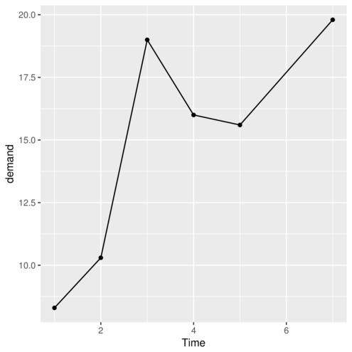
> ggplot(data=BOD, map=aes(y=demand,x=Time)) + geom_point()+geom_line()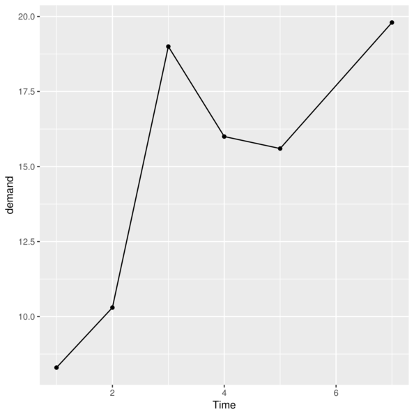
> p<-ggplot(data=BOD)> p<-p + geom_point(aes(y=demand, x=Time))
> p
> p<-ggplot(data=BOD)> p<-p + geom_point(aes(y=demand, x=Time))> p <- p + scale_x_sqrt(name="Time")
> p
geom_> ggplot(data=BOD, aes(y=demand, x=Time)) + geom_point()
> #OR
> ggplot(data=BOD) + geom_point(aes(y=demand, x=Time))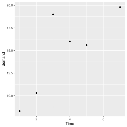
geom_point> ggplot(CO2)+geom_point(aes(x=conc,y=uptake), colour="red")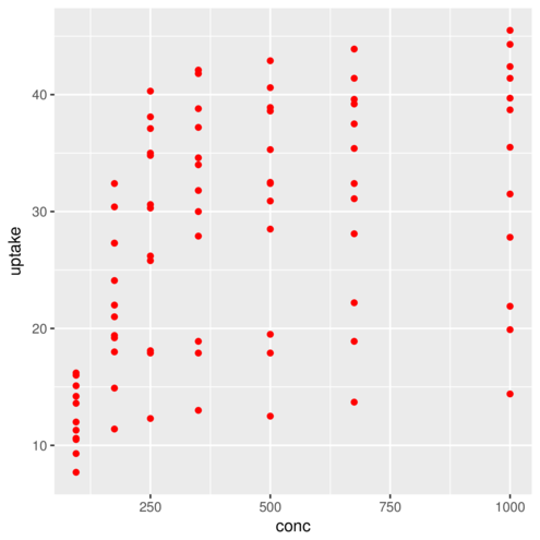
geom_point> ggplot(CO2)+geom_point(aes(x=conc,y=uptake, colour=Type))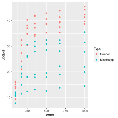
geom_point> ggplot(CO2)+geom_point(aes(x=conc,y=uptake),
+ stat="summary",fun.y=mean)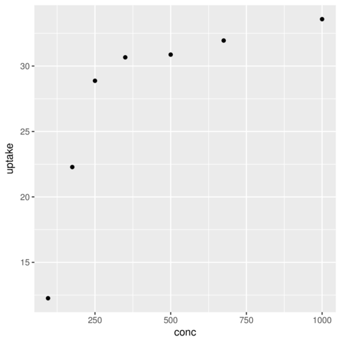
geom_bar| Feature | geom | stat | position |
|---|---|---|---|
| Histogram | _bar |
_bin |
stack |
> ggplot(diamonds) + geom_bar(aes(x = carat))
geom_bar| Feature | geom | stat | position |
|---|---|---|---|
| Barchart | _bar |
_bin |
stack |
> ggplot(diamonds) + geom_bar(aes(x = cut))
geom_bar| Feature | geom | stat | position |
|---|---|---|---|
| barchart | _bar |
_bin |
stack |
> ggplot(diamonds) + geom_bar(aes(x = cut, fill = clarity))
geom_bar| Feature | geom | stat | position |
|---|---|---|---|
| barchart | _bar |
_bin |
stack |
> ggplot(diamonds) + geom_bar(aes(x = cut, fill = clarity))
geom_bar| Feature | geom | stat | position |
|---|---|---|---|
| barchart | _bar |
_bin |
dodge |
> ggplot(diamonds) + geom_bar(aes(x = cut, fill = clarity),
+   position='dodge')
geom_boxplot| Feature | geom | stat | position |
|---|---|---|---|
| boxplot | _boxplot |
_boxplot |
dodge |
> ggplot(diamonds) + geom_boxplot(aes(x = "carat", y = carat))
geom_boxplot| Feature | geom | stat | position |
|---|---|---|---|
| boxplot | _boxplot |
_boxplot |
dodge |
> ggplot(diamonds) + geom_boxplot(aes(x = cut, y = carat))
geom_line| Feature | geom | stat | position |
|---|---|---|---|
| line | _line |
_identity |
identity |
> head(CO2, 3) Plant Type Treatment conc uptake
1 Qn1 Quebec nonchilled 95 16.0
2 Qn1 Quebec nonchilled 175 30.4
3 Qn1 Quebec nonchilled 250 34.8> ggplot(CO2) + geom_line(aes(x = conc, y = uptake))
geom_line| Feature | geom | stat | position |
|---|---|---|---|
| line | _line |
_identity |
identity |
> head(CO2, 3) Plant Type Treatment conc uptake
1 Qn1 Quebec nonchilled 95 16.0
2 Qn1 Quebec nonchilled 175 30.4
3 Qn1 Quebec nonchilled 250 34.8> ggplot(CO2) + geom_line(aes(x = conc, y = uptake, group=Plant))
geom_line| Feature | geom | stat | position |
|---|---|---|---|
| line | _line |
_identity |
identity |
> head(CO2, 3) Plant Type Treatment conc uptake
1 Qn1 Quebec nonchilled 95 16.0
2 Qn1 Quebec nonchilled 175 30.4
3 Qn1 Quebec nonchilled 250 34.8> ggplot(CO2) + geom_line(aes(x = conc, y = uptake, color=Plant))
geom_line| Feature | geom | stat | position |
|---|---|---|---|
| line | _line |
_summary |
identity |
> head(CO2, 3) Plant Type Treatment conc uptake
1 Qn1 Quebec nonchilled 95 16.0
2 Qn1 Quebec nonchilled 175 30.4
3 Qn1 Quebec nonchilled 250 34.8> ggplot(CO2) + geom_line(aes(x = conc, y = uptake),
+ stat = "summary", fun.y = mean, color='blue')
geom_point| Feature | geom | stat | position |
|---|---|---|---|
| point | _point |
_identity |
identity |
> head(CO2, 3) Plant Type Treatment conc uptake
1 Qn1 Quebec nonchilled 95 16.0
2 Qn1 Quebec nonchilled 175 30.4
3 Qn1 Quebec nonchilled 250 34.8> ggplot(CO2) + geom_point(aes(x = conc, y = uptake))
geom_point| Feature | geom | stat | position |
|---|---|---|---|
| point | _point |
_identity |
identity |
> head(CO2, 3) Plant Type Treatment conc uptake
1 Qn1 Quebec nonchilled 95 16.0
2 Qn1 Quebec nonchilled 175 30.4
3 Qn1 Quebec nonchilled 250 34.8> ggplot(CO2) + geom_point(aes(x = conc, y = uptake, fill=Treatment),
+ shape=21)
geom_smooth| Feature | geom | stat | position |
|---|---|---|---|
| smoother | _smooth |
_smooth |
identity |
> head(CO2, 3) Plant Type Treatment conc uptake
1 Qn1 Quebec nonchilled 95 16.0
2 Qn1 Quebec nonchilled 175 30.4
3 Qn1 Quebec nonchilled 250 34.8> ggplot(CO2) + geom_smooth(aes(x = conc, y = uptake), method='lm')
geom_smooth| Feature | geom | stat | position |
|---|---|---|---|
| smoother | _smooth |
_smooth |
identity |
> head(CO2, 3) Plant Type Treatment conc uptake
1 Qn1 Quebec nonchilled 95 16.0
2 Qn1 Quebec nonchilled 175 30.4
3 Qn1 Quebec nonchilled 250 34.8> ggplot(CO2) + geom_smooth(aes(x = conc, y = uptake, fill=Treatment))
geom_polygon| Feature | geom | stat | position |
|---|---|---|---|
| polygon | _polygon |
_identity |
identity |
> library(maps)
> library(mapdata)
> aus <- map_data("worldHires", region="Australia")
> head(aus,3)
long lat group order region subregion
1 142.1461 -10.74943 1 1 Australia Prince of Wales Island
2 142.1430 -10.74525 1 2 Australia Prince of Wales Island
3 142.1406 -10.74113 1 3 Australia Prince of Wales Island> ggplot(aus, aes(x=long, y=lat, group=group)) +
+ geom_polygon()
geom_tile| Feature | geom | stat | position |
|---|---|---|---|
| tile | _tile |
_identity |
identity |
> head(faithfuld,3) # A tibble: 3 x 3
eruptions waiting density
<dbl> <dbl> <dbl>
1 1.600000 43 0.003216159
2 1.647297 43 0.003835375
3 1.694595 43 0.004435548> ggplot(faithfuld, aes(waiting, eruptions)) +
+ geom_tile(aes(fill = density))
geom_raster| Feature | geom | stat | position |
|---|---|---|---|
| raster | _raster |
_identity |
identity |
> head(faithfuld,3)# A tibble: 3 x 3
eruptions waiting density
<dbl> <dbl> <dbl>
1 1.600000 43 0.003216159
2 1.647297 43 0.003835375
3 1.694595 43 0.004435548> ggplot(faithfuld, aes(waiting, eruptions)) +
+ geom_raster(aes(fill = density))
geom_errorbar| Feature | geom | stat | position |
|---|---|---|---|
| errorbar | _identity |
_identity |
identity |
> library(dplyr)
> library(gmodels)
> warpbreaks.sum <- warpbreaks %>% group_by(wool) %>%
+     summarise(Mean=mean(breaks), Lower=ci(breaks)[2], Upper=ci(breaks)[3])
> warpbreaks.sum
# A tibble: 2 x 4
wool Mean Lower Upper
<fctr> <dbl> <dbl> <dbl>
1 A 31.03704 24.76642 37.30765
2 B 25.25926 21.57994 28.93858geom_errorbar| Feature | geom | stat | position |
|---|---|---|---|
| errorbar | _identity |
_identity |
identity |
> ggplot(warpbreaks.sum) +
+     geom_errorbar(aes(x = wool, ymin = Lower, ymax = Upper))
geom_errorbar| Feature | geom | stat | position |
|---|---|---|---|
| errorbar | _identity |
_summary |
identity |
> head(warpbreaks,3) breaks wool tension
1 26 A L
2 30 A L
3 54 A L> ggplot(warpbreaks) + geom_errorbar(aes(x = wool, y = breaks),
+ stat = "summary", fun.data = "mean_cl_boot")
> head(CO2,3) Plant Type Treatment conc uptake
1 Qn1 Quebec nonchilled 95 16.0
2 Qn1 Quebec nonchilled 175 30.4
3 Qn1 Quebec nonchilled 250 34.8> ggplot(CO2)+geom_point(aes(x=conc,y=uptake))+
+ coord_cartesian() #default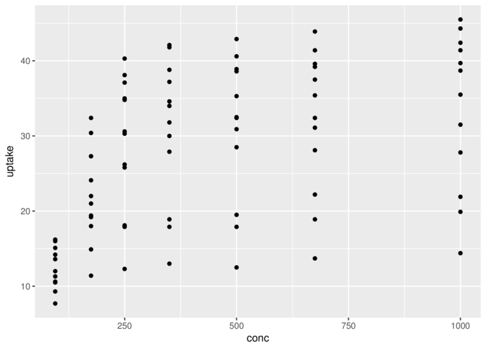
> head(CO2,3) Plant Type Treatment conc uptake
1 Qn1 Quebec nonchilled 95 16.0
2 Qn1 Quebec nonchilled 175 30.4
3 Qn1 Quebec nonchilled 250 34.8> ggplot(CO2)+geom_point(aes(x=conc,y=uptake))+
+ coord_polar()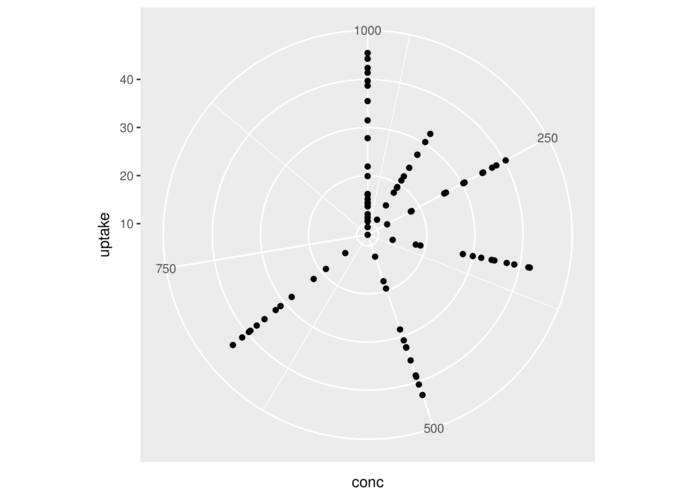
> head(CO2,3) Plant Type Treatment conc uptake
1 Qn1 Quebec nonchilled 95 16.0
2 Qn1 Quebec nonchilled 175 30.4
3 Qn1 Quebec nonchilled 250 34.8> ggplot(CO2)+geom_point(aes(x=conc,y=uptake))+
+ coord_flip()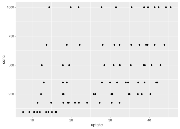
> #Orthographic coordinates
> library(maps)
> library(mapdata)
> aus <- map_data("worldHires", region="Australia")
> ggplot(aus, aes(x=long, y=lat, group=group)) +
+   coord_map("ortho", orientation=c(-20,125,23.5))+
+   geom_polygon()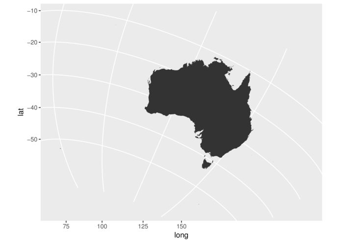
scale_x_ and scale_y_Axis titles
> head(CO2,2) Plant Type Treatment conc uptake
1 Qn1 Quebec nonchilled 95 16.0
2 Qn1 Quebec nonchilled 175 30.4> ggplot(CO2, aes(y=uptake,x=conc)) + geom_point()+
+ scale_x_continuous(name="CO2 conc")
scale_x_ and scale_y_Axis titles with math
> head(CO2,2) Plant Type Treatment conc uptake
1 Qn1 Quebec nonchilled 95 16.0
2 Qn1 Quebec nonchilled 175 30.4> ggplot(CO2, aes(y=uptake,x=conc)) + geom_point()+
+ scale_x_continuous(name=expression(Ambient~CO[2]~concentration~(mg/l)))
scale_x_ and scale_y_Axis more padding
> ggplot(CO2, aes(y=uptake,x=conc)) + geom_point()+
+   scale_x_continuous(name="CO2 conc", expand=c(0,200))
scale_x_ and scale_y_Axis on a log scale
> ggplot(CO2, aes(y=uptake,x=conc)) + geom_point()+
+   scale_x_log10(name="CO2 conc",
+     breaks=as.vector(c(1,2,5,10) %o% 10^(-1:2)))
scale_x_ and scale_y_Axis representing categorical data
> ggplot(CO2, aes(y=uptake,x=Treatment)) + geom_point()+
+   scale_x_discrete(name="Treatment")
scale_sizeSize according to continuous variable
> state=data.frame(state.x77,state.region, state.division,state.center) %>%
+     select(Illiteracy,state.region,x,y)
> head(state,2)
Illiteracy state.region x y
Alabama 2.1 South -86.7509 32.5901
Alaska 1.5 West -127.2500 49.2500> ggplot(state, aes(y=y,x=x)) + geom_point(aes(size=Illiteracy))
scale_sizeDiscrete sizes ranging in size from 2 to 4
> head(state,2) Illiteracy state.region x y
Alabama 2.1 South -86.7509 32.5901
Alaska 1.5 West -127.2500 49.2500> ggplot(state, aes(y=y,x=x)) + geom_point(aes(size=state.region))+
+ scale_size_discrete(name="Region", range=c(2,10))
scale_sizeManual sizes (2 and 4)
> head(state,2) Illiteracy state.region x y
Alabama 2.1 South -86.7509 32.5901
Alaska 1.5 West -127.2500 49.2500> ggplot(state, aes(y=y,x=x)) + geom_point(aes(size=state.region))+
+ scale_size_manual(name="Region", values=c(2,5,6,10))
scale_shape> head(CO2,2) Plant Type Treatment conc uptake
1 Qn1 Quebec nonchilled 95 16.0
2 Qn1 Quebec nonchilled 175 30.4> ggplot(CO2, aes(y=uptake,x=conc)) + geom_point(aes(shape=Treatment))
scale_shape> CO2 = CO2 %>% mutate(Comb=interaction(Type, Treatment))
> ggplot(CO2, aes(y=uptake,x=conc)) + geom_point(aes(shape=Comb))+
+ scale_shape_discrete(name="Type",
+ breaks=c("Quebec.nonchilled","Quebec.chilled",
+ "Mississippi.nonchilled","Mississippi.chilled"),
+ labels=c("Quebec non-chilled","Quebec chilled",
+ "Miss. non-chilled","Miss. chilled"))
scale_linetype> head(CO2,2) Plant Type Treatment conc uptake Comb
1 Qn1 Quebec nonchilled 95 16.0 Quebec.nonchilled
2 Qn1 Quebec nonchilled 175 30.4 Quebec.nonchilled> ggplot(CO2, aes(y=uptake,x=conc)) + geom_smooth(aes(linetype=Comb))+
+ scale_linetype_discrete(name="Type")
scale_linetype> head(CO2,2) Plant Type Treatment conc uptake Comb
1 Qn1 Quebec nonchilled 95 16.0 Quebec.nonchilled
2 Qn1 Quebec nonchilled 175 30.4 Quebec.nonchilled> ggplot(CO2, aes(y=uptake,x=conc)) + geom_smooth(aes(linetype=Treatment))+
+ scale_linetype_manual(name="Treatment", values=c("dashed","dotted"))
scale_fill and scale_color> head(faithfuld,2)# A tibble: 2 x 3
eruptions waiting density
<dbl> <dbl> <dbl>
1 1.600000 43 0.003216159
2 1.647297 43 0.003835375> ggplot(faithfuld, aes(waiting, eruptions)) +
+ geom_raster(aes(fill = density)) +
+ scale_fill_continuous(low='red',high='blue')
> ggplot(CO2)+geom_point(aes(x=conc,y=uptake, colour=Type))+
+ facet_wrap(~Plant)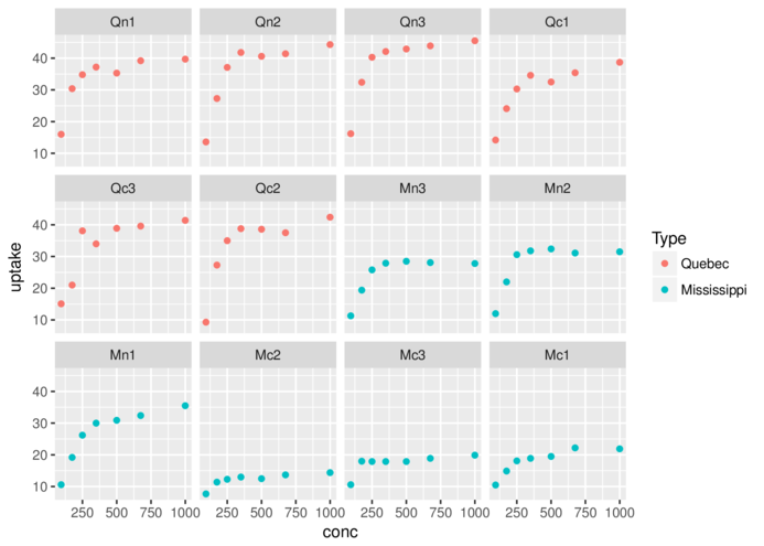
> ggplot(CO2)+geom_line(aes(x=conc,y=uptake, colour=Type))+
+ facet_wrap(~Plant, scales='free_y')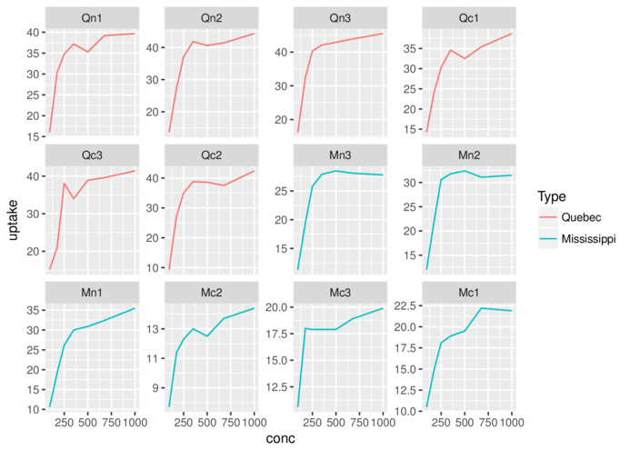
> ggplot(CO2)+geom_point(aes(x=conc,y=uptake, colour=Type))+
+ facet_grid(Type~Treatment)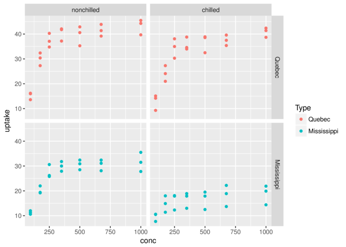
theme_classic> ggplot(CO2, aes(y = uptake, x = conc)) + geom_smooth() +
+ geom_point() + theme_classic()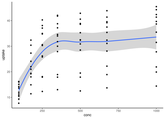
theme_bw> ggplot(CO2, aes(y = uptake, x = conc)) + geom_smooth() +
+ geom_point() + theme_bw()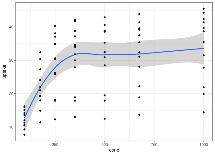
theme_grey> ggplot(CO2, aes(y = uptake, x = conc)) + geom_smooth() +
+ geom_point() + theme_grey()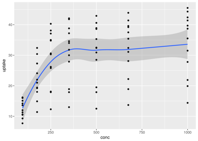
theme_minimal> ggplot(CO2, aes(y = uptake, x = conc)) + geom_smooth() +
+ geom_point() + theme_minimal()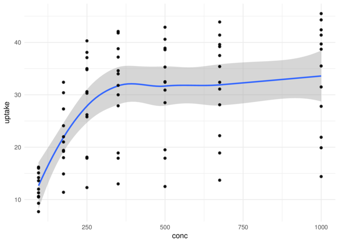
theme_linedraw> ggplot(CO2, aes(y = uptake, x = conc)) + geom_smooth() +
+ geom_point() + theme_linedraw()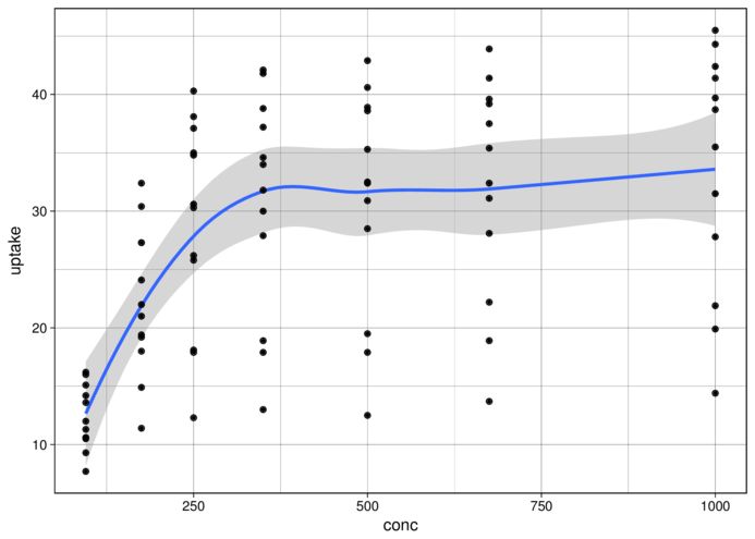
theme_light> ggplot(CO2, aes(y = uptake, x = conc)) + geom_smooth() +
+ geom_point() + theme_light()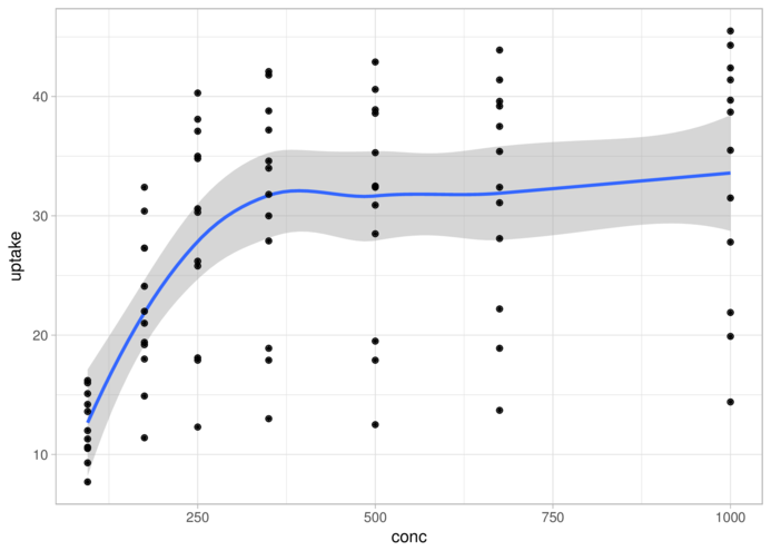
> head(state) Illiteracy state.region x y
Alabama 2.1 South -86.7509 32.5901
Alaska 1.5 West -127.2500 49.2500
Arizona 1.8 West -111.6250 34.2192
Arkansas 1.9 South -92.2992 34.7336
California 1.1 West -119.7730 36.5341
Colorado 0.7 West -105.5130 38.6777> library(gmodels)
> state.sum = state %>% group_by(state.region) %>%
+ summarise(Mean=mean(Illiteracy), Lower=ci(Illiteracy)[2],
+ Upper=ci(Illiteracy)[3])
> state.sum# A tibble: 4 x 4
state.region Mean Lower Upper
<fctr> <dbl> <dbl> <dbl>
1 Northeast 1.000000 0.7860119 1.2139881
2 South 1.737500 1.4431367 2.0318633
3 North Central 0.700000 0.6101452 0.7898548
4 West 1.023077 0.6553719 1.3907819> ggplot(state.sum, aes(y=Mean, x=state.region)) + geom_point() +
+ geom_errorbar(aes(ymin=Lower, ymax=Upper), width=0.1)
> ggplot(state.sum, aes(y=Mean, x=state.region)) + geom_point() +
+ geom_errorbar(aes(ymin=Lower, ymax=Upper), width=0.1) +
+ scale_x_discrete('Region') +
+ scale_y_continuous('Illiteracy rate (%)')+
+ theme_classic() +
+ theme(axis.line.y=element_line(),axis.line.x=element_line())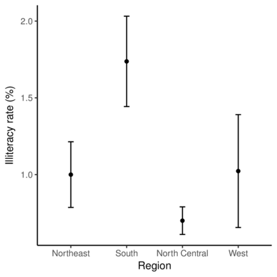
Overlay illiteracy data onto map of US
> library(mapdata)
> US <- map_data("worldHires", region="USA")
> ggplot(US) +
+     geom_polygon(aes(x=long, y=lat, group=group)) +
+         geom_point(data=state,aes(y=y,x=x, size=Illiteracy),color='red')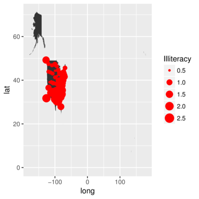
Overlay illiteracy data onto map of US
> library(mapdata)
> US <- map_data("worldHires", region="USA")
> ggplot(US) +
+     geom_polygon(aes(x=long, y=lat, group=group)) +
+         geom_point(data=state,aes(y=y,x=x, size=Illiteracy),color='red')+
+             coord_map(xlim=c(-150,-50),ylim=c(20,60)) + theme_minimal()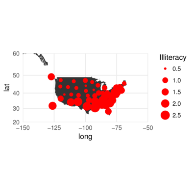
Calculate the mean and standard error of GST and plot mean and confidence bars
> library(gmodels)
> ci(MACNALLY$GST)
Estimate CI lower CI upper Std. Error
4.878378 4.035292 5.721465 0.415704 > MACNALLY.agg = MACNALLY %>% group_by(HABITAT) %>%
+ summarize(Mean=mean(GST), Lower=ci(GST)[2], Upper=ci(GST)[3])
> ggplot(MACNALLY.agg, aes(y=Mean, x=HABITAT)) +
+ geom_errorbar(aes(ymin=Lower, ymax=Upper), width=0.1)+
+ geom_point() + theme_classic()
You can also use ggplot’s summary
> library(tidyverse)
> MACNALLY.melt = MACNALLY %>% gather(key=variable, value=value,-HABITAT)
> ggplot(MACNALLY.melt, aes(y=value, x=HABITAT)) +
+    stat_summary(fun.y='mean', geom='point')+
+    stat_summary(fun.data='mean_cl_normal', geom='errorbar', width=0.1)+
+        facet_grid(~variable)
> #and bootstrapped means..
> ggplot(MACNALLY.melt, aes(y=value, x=HABITAT)) +
+    stat_summary(fun.y='mean', geom='point')+
+    stat_summary(fun.data='mean_cl_boot', geom='errorbar', width=0.1)+
+        facet_grid(~variable)