Jump to main navigation


Workshop 14.3 - Correspondence Analysis (CA)

14 Jan 2013

Basic statistics references

  • Legendre and Legendre
  • Quinn & Keough (2002) - Chpt 17

Correspondence Analysis (CA)

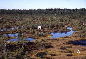
In Workshop 14.2 we introduced a dataset of Gittens(1985) in which the abundances of 8 species of plants were measured from 45 sites within 3 habitat types. Essentially, the plant ecologist wanted to be able to compare the sites according to their plant communities. In Workshop 14.2 we performed PCA on these data.

In the current workshop, we will instead start by assuming that the sampling spans multiple communities (the species of which are likely to display unimodal abundance distributions) and there are strong environmental gradients operating across the landscape that are likely to drive strong associations between species abundances and sites.

This approach will thus quantify the contributions of the relative frequencies to a $\chi^2$ statistic.

Download veg data set
Format of veg.csv data file
SITEHABITATSP1...SP8
1A4..68
2B92..4
3A9..68
4A52..24
5C99..0
6A12..68
7C72..8
8C80..8
9B80..0
10C92..0

SITEA number or name given to each quadrat (site)
HABITATA letter or name given to each habitat type
SP1, SP2, .., SP8Number of individuals of each plant species found in each quadrat
Saltmarsh

Open the veg data set.
Show code
> veg <- read.csv("../downloads/data/veg.csv")
> veg
   SITE HABITAT SP1 SP2 SP3 SP4 SP5 SP6 SP7 SP8
1     1       A   4   0   0  36  28  24  99  68
2     2       B  92  84   0   8   0   0  84   4
3     3       A   9   0   0  52   4  40  96  68
4     4       A  52   0   0  52  12  28  96  24
5     5       C  99   0  36  88  52   8  72   0
6     6       A  12   0   0  20  40  40  88  68
7     7       C  72   0  20  72  24  20  72   8
8     8       C  80   0   0  48  16  28  92   8
9     9       B  80  76   4   8  12   0  84   0
10   10       C  92   0  40  72  36  12  84   0
11   11       A  28   4   0  16  56  28  96  56
12   12       A   8   0   0  36  68   8  99  28
13   13       C  99  12   4  84  36  12  88   8
14   14       A  40   0   0  68  12   8  88  24
15   15       A  28   0   0  36  64  28  99  56
16   16       A  28   0   0  28  44  20  88  32
17   17       C  80   0   0  52  20  32  96  20
18   18       C  84   0   0  76  44  16  96   0
19   19       B  88  40  12   8  24   8  92   0
20   20       C  99   0  60  88  28   0  80   0
21   21       A  12   0   0  36  16  12  88  76
22   22       A   0   0   0  20   8   0  99  60
23   23       C  88   0  12  72  32  16  88   0
24   24       C  56   0   4  32  56   4  96  16
25   25       C  99   0  40  60  20   4  56   4
26   26       A  12   0   0  28   4   4  99  72
27   27       A  28   0   0  48  64   4  99  28
28   28       B  92  52   0  40  64   8  96   4
29   29       C  80   0   0  68  40  12  80   8
30   30       A  32   0   0  56  28  36  84  24
31   31       A  40   0   0  60   8  36  96  56
32   32       A  44   0   0  44   8  20  96  24
33   33       A  48   0   0  72  20  12  99  32
34   34       A  48   0   0   8  44   8  92  56
35   35       B  99  36  20  56   8   4  24   0
36   36       A  15   0   4  36   4  28  99  44
37   37       A   8   0   0  20  16  12  99  56
38   38       A  28   0   0  24  16  12  99  36
39   39       A  52   0   0  48  12  28  99  32
40   40       C  92   0   4  56  12  16  70   4
41   41       C  92   0   8  52  56   8  99   4
42   42       A   4   0   0  44  24   4  99  60
43   43       A  16   0   0  36   0  24  99  76
44   44       A  76   0   0  48  12  36  96  32
45   45       B  96  36   4  28  28   8  88   4
  1. Use correspondence analysis (CA) explore the trends in plant communities amongst sites (and habitats)
    Show code
    > library(vegan)
    > veg.ca <- cca(veg[, c(-1, -2)])
    > summary(veg.ca, display = NULL)
    
    Call:
    cca(X = veg[, c(-1, -2)]) 
    
    Partitioning of mean squared contingency coefficient:
                  Inertia Proportion
    Total            0.55          1
    Unconstrained    0.55          1
    
    Eigenvalues, and their contribution to the mean squared contingency coefficient 
    
    Importance of components:
                            CA1   CA2    CA3    CA4    CA5    CA6     CA7
    Eigenvalue            0.260 0.156 0.0532 0.0456 0.0179 0.0109 0.00652
    Proportion Explained  0.473 0.283 0.0968 0.0829 0.0326 0.0198 0.01185
    Cumulative Proportion 0.473 0.756 0.8528 0.9358 0.9684 0.9881 1.00000
    
    Scaling 2 for species and site scores
    * Species are scaled proportional to eigenvalues
    * Sites are unscaled: weighted dispersion equal on all dimensions
    
    1. Examine the eigenvalues for each new component (group). They represent the contribution of each new component to the overall $\chi^2$. The sum of these values should add up to the $\chi^2$ value (also known as inertia). If there were absolutely no associations between the species and sites, then you would expect each new component to have a eigenvalue of $innertia/n$. What do the eigenvalues indicate in this case?
      Show code
      > veg.ca$CA$eig
      
           CA1      CA2      CA3      CA4      CA5      CA6      CA7 
      0.260083 0.155846 0.053240 0.045632 0.017940 0.010865 0.006518 
      
      > sum(veg.ca$CA$eig)
      
      [1] 0.5501
      
    2. Calculate the percentage of total $\chi^2$ explained by each of the new principal components. How much of the total original variation is explained by principal component 1 (as a percentage)?
      Show code
      > 100 * veg.ca$CA$eig/sum(veg.ca$CA$eig)
      
         CA1    CA2    CA3    CA4    CA5    CA6    CA7 
      47.277 28.329  9.678  8.295  3.261  1.975  1.185 
      
    3. Calculate the cumulative sum of these percentages. How much of the total $\chi^2$ is explained by the first three principal components (as a percentage)?
      Show code
      > cumsum(100 * veg.ca$CA$eig/sum(veg.ca$CA$eig))
      
         CA1    CA2    CA3    CA4    CA5    CA6    CA7 
       47.28  75.61  85.28  93.58  96.84  98.82 100.00 
      
    4. Using the eigenvalues and a screeplot, determine how many principal components are necessary to represent the original variables (species) . How many principal components are necessary?
      Show code
      > screeplot(veg.ca)
      > int <- veg.ca$tot.chi/length(veg.ca$CA$eig)
      > abline(a = int, b = 0)
      
      plot of chunk ws14.3Q1.1d
  2. Generate a a quick biplot ordination (scatterplot of correspondence components) with correspondence component 1 on the x-axis and correspondence component 2 on the y-axis. Are the patterns of sites associated with any particular species?
    Show code
    > plot(veg.ca, scaling = 2)
    
    plot of chunk ws14.3Q1.2a
  3. Whilst the above biplot illustrates some of the patterns, it does not allow us to directly see whether the communities change in the different habitats. So lets instead construct the plot at a lower level.
    1. Create the base ordination plot and add the sites (colored according to habitat). Since we are more interested in the habitats than the actual sites, we can just label the points according to their habitat rather than their site names.
      Show code
      > veg.ord <- ordiplot(veg.ca, type = "n")
      > text(veg.ord, "sites", lab = veg$HABITAT, col = as.numeric(veg$HABITAT))
      
      plot of chunk ws14.3Q1.3a
    2. Lets now add the species correlation vectors (component loadings). This will yield a biplot similar to the previous question.
      Show code
      > veg.ord <- ordiplot(veg.ca, type = "n")
      > text(veg.ord, "sites", lab = veg$HABITAT, col = as.numeric(veg$HABITAT))
      > data.envfit <- envfit(veg.ca, veg[, 3:8])
      > plot(data.envfit, col = "grey")
      
      plot of chunk ws14.3Q1.3b
    3. Now lets fit the habitat vectors onto this ordination. Before environmental variables can he added to an ordination plot, they must first be numeric representations. If we wish to display the orientation of each habitat on the ordination plot, then we need to convert the habitat variable into dummy variables.
      Show code
      > veg.ord <- ordiplot(veg.ca, type = "n")
      > text(veg.ord, "sites", lab = veg$HABITAT, col = as.numeric(veg$HABITAT))
      > data.envfit <- envfit(veg.ca, veg[, 3:8])
      > plot(data.envfit, col = "grey")
      > # dummy code the habitat factor
      > habitat <- model.matrix(~-1 + HABITAT, veg)
      > data.envfit <- envfit(veg.ca, env = habitat)
      > data.envfit
      
      ***VECTORS
      
                  CA1    CA2   r2 Pr(>r)    
      HABITATA -0.904  0.427 0.75  0.001 ***
      HABITATB  0.841  0.541 0.84  0.001 ***
      HABITATC  0.334 -0.942 0.63  0.001 ***
      ---
      Signif. codes:  0 '***' 0.001 '**' 0.01 '*' 0.05 '.' 0.1 ' ' 1 
      P values based on 999 permutations.
      
      > plot(data.envfit, col = "blue")
      
      plot of chunk ws14.3Q1.3c
    To ensure you appreciate the patterns displayed in this ordination plot, answer the following questions.
    1. Species 1 in primarily associated with principal component (axis)?
    2. Species 2 in primarily associated with principal component (axis)?
    3. Species 5 in primarily associated with principal component (axis)?
    4. Habitat A aligns primarily with the
    5. Habitat C strongly reflects the abundances of It is also interesting to note that the sites predominantly line up along very narrow trajectories.
  4. The environmental fit procedure above included a permutation test that explored the relationship between each of the habitat types and the reduced ordination space communities (as defined by CA1 and CA2). What conclusions would you draw from this analysis?
    Show code
    > data.envfit <- envfit(veg.ca, env = habitat)
    > data.envfit
    
    ***VECTORS
    
                CA1    CA2   r2 Pr(>r)    
    HABITATA -0.904  0.427 0.75  0.001 ***
    HABITATB  0.841  0.541 0.84  0.001 ***
    HABITATC  0.334 -0.942 0.63  0.001 ***
    ---
    Signif. codes:  0 '***' 0.001 '**' 0.01 '*' 0.05 '.' 0.1 ' ' 1 
    P values based on 999 permutations.
    
    1. Habitat A is?
    2. Habitat B is?
    3. Habitat C is?

Correspondence Analysis (CA)

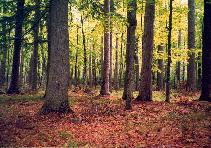
We will also return to the data of Peet & Loucks (1977) that examined the abundances of 8 species of trees (Bur oak, Black oak, White oak, Red oak, American elm, Basswood, Ironwood, Sugar maple) at 10 forest sites in southern Wisconsin, USA. The data (given below) are the mean measurements of canopy cover for eight species of north American trees in 10 samples (quadrats).

Download wisc data set
Format of wisc.csv data file
QUAD.BUROAKBLACKOAKWHITEOAKREDOAKELMBASSWOODIRONWOODMAPLE
198532000
289442000
338904000
457965000
560796200
600785765
750475674
800660648
900042768
1000235659

Saltmarsh
QUADRATA number or name given to each quadrat
BUROAK, BLACKOAK,....Number of individuals of each tree species found in each quadrat

Open the wisc data set.
Show code
> wisc <- read.csv("../downloads/data/wisc.csv")
> wisc
   QUADRAT BUROAK BLACKOAK WHITEOAK REDOAK ELM BASSWOOD IRONWOOD MAPLE
1        1      9        8        5      3   2        0        0     0
2        2      8        9        4      4   2        0        0     0
3        3      3        8        9      0   4        0        0     0
4        4      5        7        9      6   5        0        0     0
5        5      6        0        7      9   6        2        0     0
6        6      0        0        7      8   5        7        6     5
7        7      5        0        4      7   5        6        7     4
8        8      0        0        6      6   0        6        4     8
9        9      0        0        0      4   2        7        6     8
10      10      0        0        2      3   5        6        5     9
  1. Use correspondence analysis (CA), to generate new groups (components) and explore the trends in tree communities amongst quadrats.
    Show code
    > library(vegan)
    > wisc.ca <- cca(wisc[, -1])
    > summary(wisc.ca, display = NULL)
    
    Call:
    cca(X = wisc[, -1]) 
    
    Partitioning of mean squared contingency coefficient:
                  Inertia Proportion
    Total           0.716          1
    Unconstrained   0.716          1
    
    Eigenvalues, and their contribution to the mean squared contingency coefficient 
    
    Importance of components:
                            CA1    CA2    CA3    CA4    CA5     CA6      CA7
    Eigenvalue            0.532 0.0858 0.0553 0.0237 0.0125 0.00519 0.000869
    Proportion Explained  0.744 0.1199 0.0773 0.0332 0.0174 0.00725 0.001210
    Cumulative Proportion 0.744 0.8637 0.9409 0.9741 0.9915 0.99879 1.000000
    
    Scaling 2 for species and site scores
    * Species are scaled proportional to eigenvalues
    * Sites are unscaled: weighted dispersion equal on all dimensions
    
    1. Examine the eigenvalues for each new component (group). What do the eigenvalues indicate in this case?
      Show code
      > wisc.ca$CA$eig
      
            CA1       CA2       CA3       CA4       CA5       CA6       CA7 
      0.5323741 0.0858155 0.0553136 0.0237462 0.0124801 0.0051924 0.0008694 
      
      > sum(wisc.ca$CA$eig)
      
      [1] 0.7158
      
    2. Calculate the percentage of total $\chi^2$ explained by each of the new principal components. How much of the total original $\chi^2$ is explained by correspondence component 1 (as a percentage)?
      Show code
      > 100 * wisc.ca$CA$eig/sum(wisc.ca$CA$eig)
      
          CA1     CA2     CA3     CA4     CA5     CA6     CA7 
      74.3756 11.9889  7.7276  3.3175  1.7435  0.7254  0.1215 
      
    3. Calculate the cumulative sum of these percentages. How much of the total $\chi^2$ is explained by the first three correspondence components (as a percentage)?
      Show code
      > cumsum(100 * wisc.ca$CA$eig/sum(wisc.ca$CA$eig))
      
         CA1    CA2    CA3    CA4    CA5    CA6    CA7 
       74.38  86.36  94.09  97.41  99.15  99.88 100.00 
      
    4. Using the eigenvalues and a screeplot, determine how many correspondence components are necessary to represent the original variables (species) . How many correspondence components are necessary?
      Show code
      > screeplot(wisc.ca)
      > int <- veg.ca$tot.chi/length(veg.ca$CA$eig)
      > abline(a = int, b = 0)
      
      plot of chunk ws14.3Q2.2d
  2. Generate a a quick biplot ordination (scatterplot of correspondence components) with correspondence component 1 on the x-axis and correspondence component 2 on the y-axis. Are the patterns of quadrats associated with any particular tree species?
    Show code
    > plot(wisc.ca, scaling = 2)
    
    plot of chunk ws14.3Q2.3a


  Quitting R

There are two ways to quit R elegantly
  1. Goto the RGui File menu and select Quit
  2. In the R Console, type
    > q()
    
Either way you will be prompted to save the workspace, generally this is not necessary or even desirable.

End of instructions

  The R working directory

The R working directory is the location that R looks in to read/write files. When you load R, it initially sets the working directory to a location within the R subdirectory of your computer (Windows and MacOSX) or the location from which you executed R (Linux). However, we can alter the working directory so that it points to another location. This not only prevents having to search for files, it also negates the need to specify a path as well as a filename in various operations.
The working directory can be altered by specifying a path (full or relative) as an argument to the setwd() function. Note that R uses Unix path slashes ("/") irrespective of what operating system.
> setwd("/Work/Analyses/Project1")  #change the working directory

Alternatively, on Windows:
  1. Goto the RGui File menu
  2. Select the Change dir submenu
  3. Locate the directory that contains your data and/or scripts
  4. Click OK

End of instructions

  Read in (source) an R script

There are two ways to read in (source) a R script
  1. Goto the RGui File menu and select Source R code
  2. In the R Console, type

    > source('filename')

    where 'filename' is the name of the R script file.
All commands in the file will be executed sequentially starting at the first line. Note that R will ignore everything that is on a line following the '#' character. This provides a way of inserting comments into script files (a practice that is highly encouraged as it provides a way of reminding yourself what each line of syntax does).

Note that there is an alternative way of using scripts

  1. Goto the RGui File menu and select the Open script submenu
  2. This will display the R script file in the R Editor window
  3. Syntax can then be directly cut and paste into the R Console. Again,each line will be executed sequentially and comments are ignored.
When working with multi-step analyses, it is recommended that you have the R Editor open and that syntax is entered directly into the editor and then pasted into the R Console. Then provided the R script is saved regularly, your data and analyses are safe from computer disruptions.

End of instructions

  R workspace

The R workspace stores all the objects that are created during an R session. To view a list of objects occupying the current R workshpace

> ls()

The workspace is cabable of storing huge numbers of objects, and thus it can become cluttered (with objects that you have created, but forgotten about, or many similar objects that contain similar contents) very rapidly. Whilst this does not affect the performance of R, it can lead to chronic confusion. It is advisable that you remove all unwanted objects when you have finished with them. To remove and object;

> rm(object name)

where object name is the name of the object to be removed.

When you exit R, you will be prompted for whether you want to save the workspace. You can also save the current workspace at any time by; A saved workspace is not in easily readable text format. Saving a workspace enables you to retrieve an entire sessions work instantly, which can be useful if you are forced to perform you analyses over multiple sittings. Furthermore, by providing different names, it is possible to maintain different workspaces for different projects.

End of instructions

  Removing objects

To remove an object

> rm(object name)

where object name is the name of the object to be removed.

End of instructions

  R indexing

A vector is simply a array (list) of entries of the same type. For example, a numeric vector is just a list of numbers. A vector has only a single dimension - length - and thus the first entry in the vector has an index of 1 (is in position 1), the second has an index of 2 (position 2), etc. The index of an entry provides a convenient way to access entries. If a vector contained the numbers 10, 5, 8, 3.1, then the entry with index 1 is 10, at index 4 is the entry 3.1. Consider the following examples
> var <- c(4, 8, 2, 6, 9, 2)
> var
[1] 4 8 2 6 9 2
> var[5]
[1] 9
> var[3:5]
[1] 2 6 9

A data frame on the other hand is not a single vector, but rather a collection of vectors. It is a matrix, consisting of columns and rows and therefore has both length and width. Consequently, each entry has a row index and a column index. Consider the following examples
> dv <- c(4, 8, 2, 6, 9, 2)
> iv <- c("a", "a", "a", "b", "b", "b")
> data <- data.frame(iv, dv)
> data
  iv dv
1  a  4
2  a  8
3  a  2
4  b  6
5  b  9
6  b  2
> # The first column (preserve frame)
> data[1]
  iv
1  a
2  a
3  a
4  b
5  b
6  b
> # The second column (preserve frame)
> data[2]
  dv
1  4
2  8
3  2
4  6
5  9
6  2
> # The first column (as vector)
> data[, 1]
[1] a a a b b b
Levels: a b
> # The first row (as vector)
> data[1, ]
  iv dv
1  a  4
> # list the entry in row 3, column 2
> data[3, 2]
[1] 2

End of instructions

  R 'fix()' function

The 'fix()' function provides a very rudimentary spreadsheet for data editing and entry.

> fix(data frame name)

The spreadsheet (Data Editor) will appear. A new variable can be created by clicking on a column heading and then providing a name fo r the variable as well as an indication of whether the contents are expected to be numeric (numbers) or character (contain some letters). Data are added by clicking on a cell and providing an entry. Closing the Data Editor will cause the changes to come into affect.

End of instructions

  R transformations

The following table illustrates the use of common data transmformation functions on a single numeric vector (old_var). In each case a new vector is created (new_var)

TransformationSyntax
loge

> new_var <- log(old_var)

log10

> new_var <- log10(old_var)

square root

> new_var <- sqrt(old_var)

arcsin

> new_var <- asin(sqrt(old_var))

scale (mean=0, unit variance)

> new_var <- scale(old_var)

where old_var is the name of the original variable that requires transformation and new_var is the name of the new variable (vector) that is to contain the transformed data. Note that the original vector (variable) is not altered.

End of instructions

  Data transformations


Essentially transforming data is the process of converting the scale in which the observations were measured into another scale.

I will demonstrate the principles of data transformation with two simple examples.
Firstly, to illustrate the legality and frequency of data transformations, imagine you had measured water temperature in a large number of streams. Naturally, you would have probably measured the temperature in ° C. Supposing you later wanted to publish your results in an American journal and the editor requested that the results be in ° F. You would not need to re-measure the stream temperature. Rather, each of the temperatures could be converted from one scale (° C) to the other (° F). Such transformations are very common.

To further illustrate the process of transformation, imagine a botanist wanted to examine the size of a particular species leaves for some reason. The botanist decides to measure the length of a random selection of leaves using a standard linear, metric ruler and the distribution of sample observations as represented by a histogram and boxplot are as follows.


The growth rate of leaves might be expected to be greatest in small leaves and decelerate with increasing leaf size. That is, the growth rate of leaves might be expected to be logarithmic rather than linear. As a result, the distribution of leaf sizes using a linear scale might also be expected to be non-normal (log-normal). If, instead of using a linear scale, the botanist had used a logarithmic ruler, the distribution of leaf sizes may have been more like the following.


If the distribution of observations is determined by the scale used to measure of the observations, and the choice of scale (in this case the ruler) is somewhat arbitrary (a linear scale is commonly used because we find it easier to understand), then it is justifiable to convert the data from one scale to another after the data has been collected and explored. It is not necessary to re-measure the data in a different scale. Therefore to normalize the data, the botanist can simply convert the data to logarithms.

The important points in the process of transformations are;
  1. The order of the data has not been altered (a large leaf measured on a linear scale is still a large leaf on a logarithmic scale), only the spacing of the data
  2. Since the spacing of the data is purely dependent on the scale of the measuring device, there is no reason why one scale is more correct than any other scale
  3. For the purpose of normalization, data can be converted from one scale to another following exploration

End of instructions

  R writing data

To export data into R, we read the empty the contents a data frame into a file. The general format of the command for writing data in from a data frame into a file is

> write.data(data frame name, 'filename.csv', quote=F, sep=',')

where data frame name is a name of the data frame to be saved and filename.csv is the name of the csv file that is to be created (or overwritten). The argument quote=F indicates that quotation marks should not be placed around entries in the file. The argument sep=',' indicates that entries in the file are separated by a comma (hence a comma delimited file).

As an example

> write.data(LEAVES, 'leaves.csv', quote=F, sep=',')

End of instructions

  Exporting from Excel

End of instructions

  Reading data into R

Ensure that the working directory is pointing to the path containing the file to be imported before proceeding.
To import data into R, we read the contents of a file into a data frame. The general format of the command for reading data into a data frame is

> name <- read.table('filename.csv', header=T, sep=',', row.names=column, strip.white=T)

where name is a name you wish the data frame to be referred to as, filename.csv is the name of the csv file that you created in excel and column is the number of the column that had row labels (if there were any). The argument header=T indicates that the variable (vector) names will be created from the names supplied in the first row of the file. The argument sep=',' indicates that entries in the file are separated by a comma (hence a comma delimited file). If the data file does not contain row labels, or you are not sure whether it does, it is best to omit the row.names=column argument. The strip.white=T arguement ensures that no leading or trailing spaces are left in character names (these can be particularly nasty in categorical variables!).

As an example
> phasmid <- read.data("phasmid.csv", header = T, sep = ",", row.names = 1, strip.white = T)

End of instructions

  Cutting and pasting data into R

To import data into R via the clipboard, copy the data in Excel (including a row containing column headings - variable names) to the clipboard (CNTRL-C). Then in R use a modification of the read.table function:

> name <- read.table('clipboard', header=T, sep='\t', row.names=column, strip.white=T)

where name is a name you wish the data frame to be referred to as, clipboard is used to indicate that the data are on the clipboard, and column is the number of the column that had row labels (if there were any). The argument header=T indicates that the variable (vector) names will be created from the names supplied in the first row of the file. The argument sep='\t' indicates that entries in the clipboard are separated by a TAB. If the data file does not contain row labels, or you are not sure whether it does, it is best to omit the row.names=column argument. The strip.white=T arguement ensures that no leading or trailing spaces are left in character names (these can be particularly nasty in categorical variables!).

As an example
> phasmid <- read.data("clipboard", header = T, sep = "\t", row.names = 1, strip.white = T)

End of instructions

  Writing a copy of the data to an R script file

> phasmid <- dump('data', "")

where 'data' is the name of the object that you wish to be stored.
Cut and paste the output of this command directly into the top of your R script. In future, when the script file is read, it will include a copy of your data set, preserved exactly.

End of instructions

  Frequency histogram

> hist(variable)

where variable is the name of the numeric vector (variable) for which the histogram is to be constructed.

End of instructions

  Summary Statistics

# mean
> mean(variable)
# variance
> var(variable)
# standard deviation
> sd(variable)
# variable length
> length(variable)
# median
> median(variable)
# maximum
> max(variable)
# minimum
> min(variable)
# standard error of mean
> sd(variable)/sqrt(length(variable))
# interquartile range
> quantile(variable, c(.25,.75))
# 95% confidence interval
> qnorm(0.975,0,1)*(sd(variable)/sqrt(length(variable)))

where variable is the name of the numeric vector (variable).

End of instructions

  Normal probabilities

> pnorm(c(value), mean=mean, sd=sd, lower.tail=FALSE)

this will calculate the area under a normal distribution (beyond the value of value) with mean of mean and standard deviation of sd. The argument lower.tail=FALSE indicates that the area is calculated for values greater than value. For example

> pnorm(c(2.9), mean=2.025882, sd=0.4836265, lower.tail=FALSE)

End of instructions

  Boxplots

A boxplot is a graphical representation of the distribution of observations based on the 5-number summary that includes the median (50%), quartiles (25% and 75%) and data range (0% - smallest observation and 100% - largest observation). The box demonstrates where the middle 50% of the data fall and the whiskers represent the minimum and maximum observations. Outliers (extreme observations) are also represented when present.
The figure below demonstrates the relationship between the distribution of observations and a boxplot of the same observations. Normally distributed data results in symmetrical boxplots, whereas skewed distributions result in asymmetrical boxplots with each segment getting progressively larger (or smaller).


End of instructions

  Boxplots

> boxplot(variable)

where variable is the name of the numeric vector (variable)

End of instructions

  Observations, variables & populations

Observations are the sampling units (e.g quadrats) or experimental units (e.g. individual organisms, aquaria) that make up the sample.

Variables are the actual properties measured by the individual observations (e.g. length, number of individuals, rate, pH, etc). Random variables (those variables whose values are not known for sure before the onset of sampling) can be either continuous (can theoretically be any value within a range, e.g. length, weight, pH, etc) or categorical (can only take on certain discrete values, such as counts - number of organisms etc).

Populations are defined as all the possible observations that we are interested in.

A sample represents a collected subset of the population's observations and is used to represent the entire population. Sample statistics are the characteristics of the sample (e.g. sample mean) and are used to estimate population parameters.


End of instructions

  Population & sample

A population refers to all possible observations. Therefore, population parameters refer to the characteristics of the whole population. For example the population mean.

A sample represents a collected subset of the population's observations and is used to represent the entire population. Sample statistics are the characteristics of the sample (e.g. sample mean) and are used to estimate population parameters.


End of instructions

  Standard error and precision

A good indication of how good a single estimate is likely to be is how precise the measure is. Precision is a measure of how repeatable an outcome is. If we could repeat the sampling regime multiple times and each time calculate the sample mean, then we could examine how similar each of the sample means are. So a measure of precision is the degree of variability between the individual sample means from repeated sampling events.

Sample number Sample mean
112.1
212.7
312.5
Mean of sample means12.433
> SD of sample means0.306

The table above lists three sample means and also illustrates a number of important points;
  1. Each sample yields a different sample mean
  2. The mean of the sample means should be the best estimate of the true population mean
  3. The more similar (consistent) the sample means are, the more precise any single estimate of the population mean is likely to be
The standard deviation of the sample means from repeated sampling is called the Standard error of the mean.

It is impractical to repeat the sampling effort multiple times, however, it is possible to estimate the standard error (and therefore the precision of any individual sample mean) using the standard deviation (SD) of a single sample and the size (n) of this single sample.

The smaller the standard error (SE) of the mean, the more precise (and possibly more reliable) the estimate of the mean is likely to be.

End of instructions

  Confidence intervals


A 95% confidence interval is an interval that we are 95% confident will contain the true population mean. It is the interval that there is a less than 5% chance that this interval will not contain the true population mean, and therefore it is very unlikely that this interval will not contain the true mean. The frequentist approach to statistics dictates that if multiple samples are collected from a population and the interval is calculated for each sample, 95% of these intervals will contain the true population mean and 5% will not. Therefore there is a 95% probability that any single sample interval will contain the population mean.

The interval is expressed as the mean ± half the interval. The confidence interval is obviously affected by the degree of confidence. In order to have a higher degree of confidence that an interval is likely to contain the population mean, the interval would need to be larger.

End of instructions

  Successful transformations


Since the objective of a transformation is primarily to normalize the data (although variance homogeneity and linearization may also be beneficial side-effects) the success of a transformation is measured by whether or not it has improved the normality of the data. It is not measured by whether the outcome of a statistical analysis is more favorable!

End of instructions

  Selecting subsets of data

# select the first 5 entries in the variable
> variable[1:5]
# select all but the first entry in the variable
> variable[-1]
# select all cases of variable that are less than num
> variable[variablenum]
# select all cases of variable that are equal to 'Big'
> variable1[variablelabel]

where variable is the name of a numeric vector (variable) and num is a number. variable1 is the name of a character vector and label is a character string (word). 5. In the Subset expression box enter a logical statement that indicates how the data is to be subsetted. For example, exclude all values of DOC that are greater than 170 (to exclude the outlier) and therefore only include those values that are less that 170, enter DOC < 170. Alternatively, you could chose to exclude the outlier using its STREAM name. To exclude this point enter STREAM. != 'Santa Cruz'.

End of instructions

  Summary Statistics by groups

> tapply(dv,factor,func)

the tapply() function applies the function func to the numeric vector dv for each level of the factor factor. For example

# calculate the mean separately for each group
> tapply(dv,factor,mean)
# calculate the mean separately for each group
> tapply(dv,factor,var)

End of instructions

  EDA - Normal distribution

Parametric statistical hypothesis tests assume that the population measurements follow a specific distribution. Most commonly, statistical hypothesis tests assume that the population measurements are normally distributed (Question 4 highlights the specific reasoning for this).

While it is usually not possible to directly examine the distribution of measurements in the whole population to determine whether or not this requirement is satisfied or not (for the same reasons that it is not possible to directly measure population parameters such as population mean), if the sampling is adequate (unbiased and sufficiently replicated), the distribution of measurements in a sample should reflect the population distribution. That is a sample of measurements taken from a normally distributed population should be normally distributed.

Tests on data that do not meet the distributional requirements may not be reliable, and thus, it is essential that the distribution of data be examined routinely prior to any formal statistical analysis.


End of instructions

  Factorial boxplots

> boxplot(dv~factor,data=data)

where dv is the name of the numeric vector (dependent variable), factor is the name of the factor (categorical or factor variable) and data is the name of the data frame (data set). The '~' is used in formulas to represent that the left hand side is proportional to the right hand side.

End of instructions

  EDA - Linearity

The most common methods for analysing the relationship or association between variables.assume that the variables are linearly related (or more correctly, that they do not covary according to some function other than linear). For example, to examine for the presence and strength of the relationship between two variables (such as those depicted below), it is a requirement of the more basic statistical tests that the variables not be related by any function other than a linear (straight line) function if any function at all.

There is no evidence that the data represented in Figure (a) are related (covary) according to any function other than linear. Likewise, there is no evidence that the data represented in Figure (b) are related (covary) according to any function other than linear (if at all). However, there is strong evidence that the data represented in Figure (c) are not related linearly. Hence Figure (c) depicts evidence for a violation in the statistical necessity of linearity.


End of instructions

  EDA - Scatterplots

Scatterplots are constructed to present the relationships, associations and trends between continuous variables. By convention, dependent variables are arranged on the Y-axis and independent variables on the X-axis. The variable measurements are used as coordinates and each replicate is represented by a single point.

Figure (c) above displays a linear smoother (linear `line-of-best-fit') through the data. Different smoothers help identify different trends in data.


End of instructions

  Scatterplots

# load the 'car' library
> library(car)
# generate a scatterplot
> scatterplot(dv~iv,data=data)

where dv is the dependent variable, iv is the independent variable and data is the data frame (data set).

End of instructions

  Plotting y against x


The statement 'plot variable1 against variable2' is interpreted as 'plot y against x'. That is variable1 is considered to be the dependent variable and is plotted on the y-axis and variable2 is the independent variable and thus is plotted on the x-axis.

End of instructions

  Scatterplot matrix (SPLOM)

# make sure the car package is loaded > library(car)
> scatterplot.matrix(~var1 + var2 + var3, data=data, diagonal='boxplot')
#OR > pairs(~var1 + var2 + var3, data=data)

where var1, var2 etc are the names of numeric vectors in the data data frame (data set)

End of instructions

  EDA - Homogeneity of variance

Many statistical hypothesis tests assume that the populations from which the sample measurements were collected are equally varied with respect to all possible measurements. For example, are the growth rates of one population of plants (the population treated with a fertilizer) more or less varied than the growth rates of another population (the control population that is purely treated with water). If they are, then the results of many statistical hypothesis tests that compare means may be unreliable. If the populations are equally varied, then the tests are more likely to be reliable.
Obviously, it is not possible to determine the variability of entire populations. However, if sampling is unbiased and sufficiently replicated, then the variability of samples should be directly proportional to the variability of their respective populations. Consequently, samples that have substantially different degrees of variability provide strong evidence that the populations are likely to be unequally varied.
There are a number of options available to determine the likelihood that populations are equally varied from samples.
1. Calculate the variance or standard deviation of the populations. If one sample is more than 2 times greater or less than the other sample(s), then there is some evidence for unequal population variability (non-homogeneity of variance)
2. Construct boxplots of the measurements for each population, and compare the lengths of the boxplots. The length of a symmetrical (and thus normally distributed) boxplot is a robust measure of the spread of values, and thus an indication of the spread of population values. Therefore if any of the boxplots are more than 2 times longer or shorter than the other boxplot(s), then there is again, some evidence for unequal population variability (non-homogeneity of variance)


End of instructions

  t test

The frequentist approach to hypothesis testing is based on estimating the probability of collecting the observed sample(s) when the null hypothesis is true. That is, how rare would it be to collect samples that displayed the observed degree of difference if the samples had been collected from identical populations. The degree of difference between two collected samples is objectively represented by a t statistic.

Where y1 and y2 are the sample means of group 1 and 2 respectively and √s²/n1 + s²/n2 represents the degree of precision in the difference between means by taking into account the degree of variability of each sample.
If the null hypothesis is true (that is the mean of population 1 and population 2 are equal), the degree of difference (t value) between an unbiased sample collected from population 1 and an unbiased sample collected from population 2 should be close to zero (0). It is unlikely that an unbiased sample collected from population 1 will have a mean substantially higher or lower than an unbiased sample from population 2. That is, it is unlikely that such samples could result in a very large (positive or negative) t value if the null hypothesis (of no difference between populations) was true. The question is, how large (either positive or negative) does the t value need to be, before we conclude that the null hypothesis is unlikely to be true?.

What is needed is a method by which we can determine the likelihood of any conceivable t value when null hypothesis is true. This can be done via simulation. We can simulate the collection of random samples from two identical populations and calculate the proportion of all possible t values.

Lets say a vivoculturalist was interested in comparing the size of Eucalyptus regnans seedlings grown under shade and full sun conditions. In this case we have two populations. One population represents all the possible E. regnans seedlings grown in shade conditions, and the other population represents all the possible E. regnans seedlings grown in full sun conditions. If we had grown 200 seedlings under shade conditions and 200 seedlings under full sun conditions, then these samples can be used to assess the null hypothesis that the mean size of an infinite number (population) of E. regnans seedlings grown under shade conditions is the same as the mean size of an infinite number (population) of E. regnans seedlings grown under full sun conditions. That is that the population means are equal.

We can firstly simulate the sizes of 200 seedlings grown under shade conditions and another 200 seedlings grown under full sun conditions that could arise naturally when shading has no effect on seedling growth. That is, we can simulate one possible outcome when the null hypothesis is true and shading has no effect on seedling growth
Now we can calculate the degree of difference between the mean sizes of seedlings grown under the two different conditions taking into account natural variation (that is, we can calculate a t value using the formula from above). From this simulation we may have found that the mean size of seedling grown in shade and full sun was 31.5cm and 33.7cm respectively and the degree of difference (t value) was 0.25. This represents only one possible outcome (t value). We now repeat this simulation process a large number of times (1000) and generate a histogram (or more correctly, a distribution) of the t value outcomes that are possible when the null hypothesis is true.

It should be obvious that when the null hypothesis is true (and the two populations are the same), the majority of t values calculated from samples containing 200 seedlings will be close to zero (0) - indicating only small degrees of difference between the samples. However, it is also important to notice that it is possible (albeit less likely) to have samples that are quit different from one another (large positive or negative t values) just by pure chance (for example t values greater than 2).

It turns out that it is not necessary to perform these simulations each time you test a null hypothesis. There is a mathematical formulae to estimate the t distribution appropriate for any given sample size (or more correctly, degrees of freedom) when the null hypothesis is true. In this case, the t distribution is for (200-1)+(200-1)=398 degrees of freedom.

At this stage we would calculate the t value from our actual observed samples (the 200 real seedlings grown under each of the conditions). We then compare this t value to our distribution of all possible t values (t distribution) to determine how likely our t value is when the null hypothesis is true. The simulated t distribution suggests that very large (positive or negative) t values are unlikely. The t distribution allows us to calculate the probability of obtaining a value greater than a specific t value. For example, we could calculate the probability of obtaining a t value of 2 or greater when the null hypothesis is true, by determining the area under the t distribution beyond a value of 2.

If the calculated t value was 2, then the probability of obtaining this t value (or one greater) when the null hypothesis is true is 0.012 (or 1.2%). Since the probability of obtaining our t value or one greater (and therefore the probability of having a sample of 200 seedlings grown in the shade being so much different in size than a sample of 200 seedlings grown in full sun) is so low, we would conclude that the null hypothesis of no effect of shading on seedling growth is likely to be false. Thus, we have provided some strong evidence that shading conditions do effect seedling growth!


End of instructions

  t-test degrees of freedom

Degrees of freedom is the number of observations that are free to vary when estimating a parameter. For a t-test, df is calculated as
df = (n1-1)+(n2-1)
where n1 is population 1 sample size and n2 is the sample size of population 2.

End of instructions

  One-tailed critical t-value

One-tail critical t-values are just calculated from a t distribution (of given df). The area under the t distribution curve above (or below) this value is 0.05 (or some other specified probability). Essentially we calculate a quantile of a specified probability from a t distribution of df degrees of freedom

# calculate critical t value (&alpha =0.05) for upper tail (e.g. A larger than B)
> qt(0.05,df=df,lower.tail=F)
# calculate critical t value (&alpha =0.05) for lower tail (e.g. B larger than A)
> qt(0.05,df=df,lower.tail=T)

where 0.05 is the specified &alpha value and df is the specified degrees of freedom. Note that it is not necessary to have collected the data before calculating the critical t-value, you only need to know sample sizes (to get df).

It actually doesn't matter whether you select Lower tail is TRUE or FALSE. The t-distribution is a symmetrical distribution, centered around 0, therefore, the critical t-value is the same for both Lower tail (e.g. population 2 greater than population 1) and Upper tail (e.g. population 1 greater than population 2), except that the Lower tail is always negative. As it is often less confusing to work with positive values, it is recommended that you use Upper tail values. An example of a t-distribution with Upper tail for a one-tailed test is depicted below. Note that this is not part of the t quantiles output!


End of instructions

  Two-tailed critical t-value

Two-tail critical t-values are just calculated from a t distribution (of given df). The area under the t distribution curve above and below the positive and negative of this value respectively is 0.05 (or some other specified probability). Essentially we calculate a quantile of a specified probability from a t distribution of df degrees of freedom. In a two-tailed test, half of the probability is associated with the area above the positive critical t-value and the other half is associated with the area below the negative critical t-value. Therefore when we use the quantile to calculate this critical t-value, we specify the probability as &alpha/2 - since &alpha/2 applies to each tail.

# calculate critical t value (&alpha =0.05) for upper tail (e.g. A different to B)
> qt(0.05/2,df=df, lower.tail=T)

where 0.05 is the specified &alpha value and df is the specified degrees of freedom. Note that it is not necessary to have collected the data before calculating the critical t-value, you only need to know sample sizes (to get df).

Again, it actually doesn't matter whether you select Lower tail as either TRUE or FALSE. For a symmetrical distribution, centered around 0, the critical t-value is the same for both Lower tail (e.g. population 2 greater than population 1) and Upper tail (e.g. population 1 greater than population 2), except that the Lower tail is always negative. As it is often less confusing to work with positive values, it is recommended that you use Upper tail values. An example of a t-distribution with Upper tail for a two-tailed test is depicted below. Note that this is not part of the t quantiles output!

End of instructions

  Basic steps of Hypothesis testing


Step 1 - Clearly establish the statistical null hypothesis. Therefore, start off by considering the situation where the null hypothesis is true - e.g. when the two population means are equal

Step 2 - Establish a critical statistical criteria (e.g. alpha = 0.05)

Step 3 - Collect samples consisting of independent, unbiased samples

Step 4 - Assess the assumptions relevant to the statistical hypothesis test. For a t test:
  1.  Normality
  2.  Homogeneity of variance

Step 5 - Calculate test statistic appropriate for null hypothesis (e.g. a t value)


Step 6 - Compare observed test statistic to a probability distribution for that test statistic when the null hypothesis is true for the appropriate degrees of freedom (e.g. compare the observed t value to a t distribution).

Step 7 - If the observed test statistic is greater (in magnitude) than the critical value for that test statistic (based on the predefined critical criteria), we conclude that it is unlikely that the observed samples could have come from populations that fulfill the null hypothesis and therefore the null hypothesis is rejected, otherwise we conclude that there is insufficient evidence to reject the null hypothesis. Alternatively, we calculate the probability of obtaining the observed test statistic (or one of greater magnitude) when the null hypothesis is true. If this probability is less than our predefined critical criteria (e.g. 0.05), we conclude that it is unlikely that the observed samples could have come from populations that fulfill the null hypothesis and therefore the null hypothesis is rejected, otherwise we conclude that there is insufficient evidence to reject the null hypothesis.

End of instructions

  Pooled variance t-test

> t.test(dv~factor,data=data,var.equal=T)

where dv is the name of the dependent variable, factor is the name of the categorical/factorial variable and data is the name of the data frame (data set). The argument var.equal=T indicates a pooled variances t-test

End of instructions

  Separate variance t-test

> t.test(dv~factor,data=data,var.equal=F)

where dv is the name of the dependent variable, factor is the name of the categorical/factorial variable and data is the name of the data frame (data set). The argument var.equal=F indicates a separate variances t-test

End of instructions

  Output of t-test


The following output are based on a simulated data sets;
1.  Pooled variance t-test for populations with equal (or nearly so) variances

2.  Separate variance t-test for population with unequal variances

End of instructions

  Paired t-test

> t.test(cat1, cat2, data=data, paired=T)

where cat1 and cat2 are two numeric vectors (variables) in the data data frame (data set). The argument paired=T indicates a paired t-test)

End of instructions

  Non-parametric tests

Non-parametric tests do not place any distributional limitations on data sets and are therefore useful when the assumption of normality is violated. There are a number of alternatives to parametric tests, the most common are;

1. Randomization tests - rather than assume that a test statistic calculated from the data follows a specific mathematical distribution (such as a normal distribution), these tests generate their own test statistic distribution by repeatedly re-sampling or re-shuffling the original data and recalculating the test statistic each time. A p value is subsequently calculated as the proportion of random test statistics that are greater than or equal to the test statistic based on the original (un-shuffled) data.

2. Rank-based tests - these tests operate not on the original data, but rather data that has first been ranked (each observation is assigned a ranking, such that the largest observation is given the value of 1, the next highest is 2 and so on). It turns out that the probability distribution of any rank based test statistic for a is identical.

End of instructions

  Wilcoxon test

> wilcox.test(dv ~ factor, data=data)

where dv is the dependent variable and factor is the categorical variable from the data data frame (data set).

End of instructions

  Randomization (permutation) tests

The basis of hypothesis testing (when comparing two populations) is to determine how often we would expect to collect a specific sample (or more one more unusual) if the populations were identical. That is, would our sample be considered unusual under normal circumstances? To determine this, we need to estimate what sort of samples we would expect under normal circumstances. The theoretical t-distribution mimics what it would be like to randomly resample repeatedly (with a given sample size) from such identical populations.

A single sample from the (proposed) population(s) provides a range of observations that are possible. Completely shuffling those data (or labels), should mimic the situation when there is no effect (null hypothesis true situation), since the data are then effectively assigned randomly with respect to the effect. In the case of a t-test comparing the means of two groups, randomly shuffling the data is likely to result similar group means. This provides one possible outcome (t-value) that might be expected when the null hypothesis true. If this shuffling process is repeated multiple times, a distribution of all of the outcomes (t-values) that are possible when the null hypothesis is true can be generated. We can now determine how unusual our real (unshuffled) t-value is by comparing it to the built up t-distribution. If the real t-value is expected to occur less than 5% of the time, we reject the null hypothesis.

Randomization tests - rather than assume that a test statistic calculated from the data follows a specific mathematical distribution (such as a normal distribution), these tests generate their own test statistic distribution by repeatedly re-sampling or re-shuffling the original data and recalculating the test statistic each time. A p value is subsequently calculated as the proportion of random test statistics that are greater than or equal to the test statistic based on the original (un-shuffled) data.

End of instructions

  Defining the randomization statistic

> stat <- function(data, indices) {
+     t <- t.test(data[, 2] ~ data[, 1])$stat
+     t
+ }
The above function takes a data set (data) and calculates a test statistic (in this case a t-statistic). The illustrated function uses the t.test() function to perform a t-test on column 2 ([,2]) against column 1 ([,1]). The value of the t-statistic is stored in an object called 't'. The function returns the value of this object. The indentations are not important, they are purely used to improve human readability.

End of instructions

  Defining the data shuffling procedure

> rand.gen <- function(data, mle) {
+     out <- data
+     out[, 1] <- sample(out[, 1], replace = F)
+     out
+ }
The above function defines how the data should be shuffled. The first line creates a temporary object (out) that stores the original data set (data) so that any alterations do not effect the original data set. The second line uses the sample() function to shuffle the first column (the group labels). The third line of the function just returns the shuffled data set.

End of instructions

  Perform randomization test (bootstrapping)

> library(boot)
> coots.boot <- boot(coots, stat, R = 100, sim = "parametric", ran.gen = rand.gen)
Error: object 'coots' not found
The sequence begins by ensuring that the boot package has been loaded into memory. Then the boot() function is used to repeatedly (R=100: repeat 100 times) perform the defined statistical procedure (stat). The ran.gen=rand.gen parameter defines how the data set should be altered prior to performing the statistical procedure, and the sim="parametric" parameter indicates that all randomizations are possible (as opposed to a permutation where each configuration can only occur once). The outcome of the randomization test (bootstrap) is stored in an object called coots.boot

End of instructions

  Calculating p-value from randomization test

> p.length <- length(coots.boot$t[coots.boot$t >= coots.boot$t0]) + 1
Error: object 'coots.boot' not found
> print(p.length/(coots.boot$R + 1))
Error: object 'p.length' not found
The coots.boot object contains a list of all of the t-values calculated from the resampling (shuffling and recalculating) procedure (coots.boot$t)as well as the actual t-value from the actual data set (coots.boot$t0). It also stores the number of randomizations that it performed (coots.boot$R).

The first line in the above sequence determines how many of the possible t values (including the actual t-value) are greater or equal to the actual t-value. It does this by specifying a list of coots.boot$t values that are greater or equal to the coots.boot$t0 value. (coots.boot$t[coots.boot$t >= coots.boot$t0]) and calculating the length of this list using the length() function. One (1) is added to this length, since the actual t-value must be included as a possible t-value.
The second line expresses the number of randomization t-values greater or equal to the actual t-value as a fraction of the total number of randomizations (again adding 1 to account for the actual situation). This is interpreted as any other p-value - the probability of obtaining our sample statistic (and thus our observations) when the null hypothesis is true.

End of instructions

  Calculating p-value from randomization test

In a t-test, the effect size is the absolute difference between the expected population means. Therefore if the expected population means of population A and B are 10 and 16 respectively, then the effect size is 6.

Typically, effect size is estimated by considering the magnitude of an effect that is either likely or else what magnitude of effect would be regarded biologically significant. For example, if the overall population mean was estimated to be 12 and the researches regarded a 15% increase to be biologically significant, then the effect size is the difference between 12 and a mean 15% greater than 12 (12+(12*.15)=13.8). Therefore the effect size is (13.8-12=1.8).

End of instructions