Tutorial 7.4a - Single factor ANOVA
29 Jun 2019
Preliminaries
The following packages will be used in this tutorial:
library(car)
library(effects)
library(emmeans)
library(ggfortify)
library(ggeffects)
library(broom)
library(tidyverse)
Overview
Single factor Analysis of Variance (ANOVA, also known as single factor classification) is used to investigate the effect of single factor comprising of two or more groups (treatment levels) from a completely randomized design (see Figures below). Completely randomized refers to the absence of restrictions on the random allocation of experimental or sampling units to factor levels.
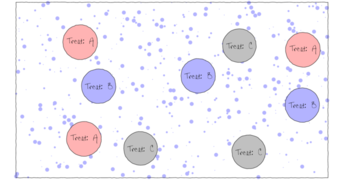
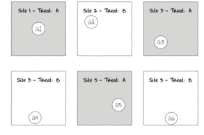
The upper figure depicts a situation in which three types of treatments (A, B and C) are applied to replicate sampling units (quadrats) across the sampling domain (such as the landscape). The underlying (unknown) conditions within this domain are depicted by the variable sized dots. Importantly, the treatments are applied at the scale of the quadrats and the treatments applied to each quadrat do not extend to any other neighbouring quadrats.
The lower figure represents the situation where the scale of a treatment is far larger than that of a sampling unit (quadrat). This design features two treatments, each replicated three times. Note that additional quadrats within each Site (the scale at which the treatment occurs) would NOT constitute additional replication. Rather, these would be sub-replicates. That is, they would be replicates of the Sites, not the treatments (since the treatments occur at the level of whole sites). In order to genuinely increase the number of replicates, it is necessary to have more Sites.
The random (haphazard) allocation of sampling units (such as quadrats) within the sampling domain (such as population) is appropriate provided either the underlying response is reasonably homogenous throughout the domain, or else, there are a large number of sampling units. If the conditions are relatively hetrogenous (very patchy), then the exact location of the sampling units is likely to be highly influential and may mask any detectable effects of treatments.
Fixed vs Random factors (effects)
From a frequentist perspective, fixed factors are factors whose levels represent the specific populations of interest. For example, a factor that comprises `high', `medium' and `low' temperature treatments is a fixed factor -- we are only interested in comparing those three populations. Conclusions about the effects of a fixed factor are restricted to the specific treatment levels investigated and for any subsequent experiments to be comparable, the same specific treatments of the factor would need to be used.
By contrast, Random factors are factors whose levels are randomly chosen from all the possible levels of populations and are used as random representatives of the populations. For example, five random temperature treatments could be used to represent a full spectrum of temperature treatments. In this case, conclusions are extrapolated to all the possible treatment (temperature) levels and for subsequent experiments, a new random set of treatments of the factor would be selected.
Other common examples of random factors include sites and subjects - factors for which we are attempting to generalize over. Furthermore, the nature of random factors means that we have no indication of how a new level of that factor (such as another subject or site) are likely to respond and thus it is not possible to predict new observations from random factors.
These differences between fixed and random factors are reflected in the way their respective null hypotheses are formulated and interpreted. Whilst fixed factors contrast the effects of the different levels of the factor, random factors are modelled as the amount of additional variability they introduce. Random factors are modelled with a mean of 0 and their variance is estimated as the effect coefficient.
Linear model
Recall from Tutorial 7.1 that the linear model for single factor classification is similar to that of multiple linear regression. The linear model can thus be represented by either:
- Means parameterization - in which the regression slopes represent the means of each treatment group and the intercept is removed (to prevent over-parameterization). $$y_{ij}=\beta_1(level_1)_{ij}+\beta_2(level_2)_{ij}+ ... + \varepsilon_{ij}$$ where $\beta_1$ and $\beta_2$ respectively represent the means response of treatment level 1 and 2 respectively. This is often simplified to: $$y_{ij}=\alpha_{i}+ \varepsilon_{ij}$$
- Effects parameterization - the intercept represents a property such as the mean of one of the treatment groups (treatment contrasts) or the overall mean (sum contrasts) etc, and the slope parameters represent effects (differences between each other group and the reference mean for example). $$y_{ij}=\mu+\beta_2(level_2)_{ij}+\beta_3(level_3)_{ij}+ ... + \varepsilon_{ij}$$ where $\mu$ could represent the mean of the first treatment group and $\beta_2$ and $\beta_3$ respectively represent the effects (change from level 1) of level 2 and 3 on the mean response. This is often simplified to: $$y_{ij}=\mu+\alpha_{i}+ \varepsilon_{ij}$$ where $\alpha_1 = 0$.
Null hyoptheses
Fixed factor
We can associate a null hypothesis test with each estimated parameter. For example, in a cell for each estimated mean in a means model we could test a null hypothesis that the population mean is equal to zero (e.g. H$_0$: $\alpha_1 = 0$, H$_0$: $\alpha_2 = 0$, ...). However, this rarely would be of much interest.
By contrast, individual null hypotheses associated with each parameter of the effects model can be used to investigate the differences between each group and a reference group (for example).
In addition to the individual null hypothesis tests, a single fixed factor ANOVA tests the collective H$_0$ that there are no differences between the population group means:
| H$_0$ : $\mathbf{\mu_1 = \mu_2 = ... = \mu_i = \mu}$ | (the population group means are all equal) |
If the effect of the $i^{th}$ group is the difference between the $i^{th}$ group mean and the mean of the first group ($\alpha_i = \mu_i - \mu_1$) then the H$_0$ can alternatively be written as:
| H$_0$: $\alpha_2 = \alpha_3 = ... = \alpha_i = 0$ | (the effect of each group equals zero) |
Random factor
The collective H$_0$ for a random factor is that the variance between all possible treatment groups equals zero:
| H$_0$: $\sigma_\alpha^2 = 0$ | (added variance due to this factor equals zero) |
| Term | Fixed/random | Description | Null hypothesis |
|---|---|---|---|
| $\alpha_i$ | fixed | the effect of the $i^{th}$ group | $\alpha_i=0$ (no effect of factor A) |
| random | random variable | $\sigma_\alpha^2=0$ (variances between all possible levels of A are equal) |
Note that whilst the null hypotheses for fixed and random factors are different (fixed: population group means all equal, random: variances between populations all equal zero), the linear model fitted for fixed and random factors in single factor ANOVA models is identical. For more complex multi-factor ANOVA models however, the distinction between fixed and random factors has important consequences for building and interpreting statistical models and null hypotheses.
Analysis of Variance
When the null hypothesis is true (and the populations are identical), the amount of variation among observations within groups should be similar to the amount of variation in observations between groups. However, when the null hypothesis is false (and some means are different from other means), the amount of variation among observations might be expected to be less than the amount of variation within groups.
Analysis of variance, or ANOVA, partitions the total variance in the response (dependent) variable into a component of the variance that is explained by combinations of one or more categorical predictor variables (called factors) and a component of the variance that cannot be explained (residual), see Figure below.
In effect, these are the variances among observations between and within groups respectively. The variance ratio (F-ratio) from this partitioning can then be used to test the null hypothesis (H$_0$) that the population group or treatment means are all equal.
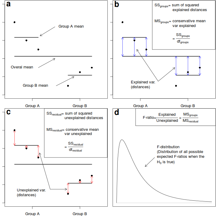
Fictitious data illustrating the partitioning of total variation into components explained by the groups ($MS_{groups}$) and and unexplained ($MS_{residual}$) by the groups. The gray arrows in b) depict the relative amounts explained by the groups. The proposed groupings generally explain why the first few points are higher on the y-axis than the last three points. The gray arrows in c) depict the relative amounts unexplained (the residuals) by the groups. The proposed groupings fail to explain the differences within the first three points and within the last three points. The probability of collecting our sample, and thus generating the sample ratio of explained to unexplained variation (or one more extreme), when the null hypothesis is true (and population means are equal) is the area under the F-distribution (d) beyond our sample -ratio.
When the null hypothesis is true (and the test assumptions have not been violated), the ratio (F-ratio) of explained to unexplained variance follows a theoretical probability distribution (F-distribution, see Sub-figure d above. When the null hypothesis is true, and there is no affect of the treatment on the response variable, the ratio of explained variability to unexplained variability is expected to be $\leq$ 1. Since the denominator should represent the expected numerator in the absence of an effect.
Importantly, the denominator in an F-ratio calculation essentially represents what we would expect the numerator to be in the absence of a treatment effect. For simple analyses, identifying the what these expected values are is relatively straight forward (equivalent to the degree of within group variability). However, in more complex designs (particularly involving random factors and hierarchical treatment levels), the logical "groups" can be more difficult (and in some cases impossible) to identify. In such cases, nominating the appropriate F-ratio denominator for estimating an specific effect requires careful consideration (see Tutorials 7.6-7.9).
The following table depicts the anatomy of the single factor ANOVA table and corresponding R syntax.
| Factor | d.f. | MS | F-ratio |
|---|---|---|---|
| A | $a-1$ | $MS_{A}$ | $\frac{MS_{A}}{MS_{Resid}}$ |
| Residual (=N$^\prime$(A)) | $(n-1)a$ | $MS_{Resid}$ | |
anova(lm(DV ~ A, dataset)) # OR anova(aov(DV ~ A, dataset)) |
|||
An F-ratio substantially greater than 1 suggests that the model relating the response variable to the categorical variable explains substantially more variability than is left unexplained. In turn, this implies that the linear model does represent the data well and that differences between observations can be explained largely by differences in treatment levels rather than purely the result of random variation.
If the probability of getting the observed (sample) F-ratio or one more extreme is less than some predefined critical value (typically 5% or 0.05), we conclude that it is highly unlikely that the observed samples could have been collected from populations in which the treatment has no effect and therefore we would reject the null hypothesis.
Assumptions
An F-ratio from real data can only reliably relate to a theoretical F-distribution when the data conform to certain assumptions. Hypothesis testing for a single factor ANOVA model assumes that the residuals (and therefore the response variable for each of the treatment levels) are all:
- normally distributed - although ANOVA is robust to non-normality provided sample sizes and variances are equal. Boxplots should be used to explore normality, skewness, bimodality and outliers. In the event of homogeneity of variance issues (see below), a Q-Q normal plot can also be useful for exploring normality (as this might be the cause of non-homogeneity). Scale transformations are often useful.
- equally varied - provided sample sizes are equal and the largest to smallest variance ratio does not exceed 3:1 (9:1 for sd), ANOVA is reasonably robust to this assumption, however, relationships between variance and mean and/or sample size are of particular concern as they elevate the Type I error rate. Boxplots and plots of means against variance should be used to explore the spread of values. Residual plots should reveal no patterns. Since unequal variances are often the result of non-normality, transformations that improve normality will also improve variance homogeneity.
- independent of one another - this assumption must be addressed at the design and collection stages and cannot be compensated for later (unless a model is used that specifically accounts for particular types of non-independent data, such as that introduced with hierarchical designs or autocorrelation - see Tutorials 7.7-7.9).
ANOVA in R
Scenario and Data
Imagine we has designed an experiment in which we had measured the response ($y$) under five different treatments ($x$), each replicated 10 times ($n=10$). As this section is mainly about the generation of artificial data (and not specifically about what to do with the data), understanding the actual details are optional and can be safely skipped. Consequently, I have folded (toggled) this section away.
- the sample size per treatment=10
- the categorical $x$ variable with 5 levels
- the population means associated with the 5 treatment levels are 40, 45, 55, 40, 35 ($\alpha_1=40$, $\alpha_2=45$, $\alpha_3=55$, $\alpha_4=40$, $\alpha_5=30$)
- the data are drawn from normal distributions with a mean of 0 and standard deviation of 3 ($\sigma^2=9$)
set.seed(1)
ngroups <- 5  #number of populations
nsample <- 10  #number of reps in each
pop.means <- c(40, 45, 55, 40, 30)  #population mean length
sigma <- 3  #residual standard deviation
n <- ngroups * nsample  #total sample size
eps <- rnorm(n, 0, sigma)  #residuals
x <- gl(ngroups, nsample, n, lab = LETTERS[1:5])  #factor
means <- rep(pop.means, rep(nsample, ngroups))
X <- model.matrix(~x - 1)  #create a design matrix
y <- as.numeric(X %*% pop.means + eps)
data <- data.frame(y, x)
head(data)  #print out the first six rows of the data set
         y x
1 38.12064 A
2 40.55093 A
3 37.49311 A
4 44.78584 A
5 40.98852 A
6 37.53859 A
Exploratory data analysis
Normality and Homogeneity of variance
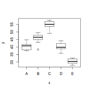
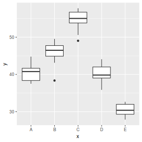
Conclusions:
- there is no evidence that the response variable is consistently non-normal across all populations - each boxplot is approximately symmetrical
- there is no evidence that variance (as estimated by the height of the boxplots) differs between the five populations. . More importantly, there is no evidence of a relationship between mean and variance - the height of boxplots does not increase with increasing position along the y-axis. Hence it there is no evidence of non-homogeneity
- transform the scale of the response variables (to address normality etc). Note transformations should be applied to the entire response variable (not just those populations that are skewed).
Model fitting or statistical analysis
In R, simple ANOVA models (being regression models) are fit using the lm() function. The most important (=commonly used) parameters/arguments for simple regression are:
- formula: the linear model relating the response variable to the linear predictor
- data: the data frame containing the data
data.lm <- lm(y ~ x, data)
# OR for a means model
data.means.lm <- lm(y ~ -1 + x, data)
Model evaluation
Prior to exploring the model parameters, it is prudent to confirm that the model did indeed fit the assumptions and was an appropriate fit to the data.
Whilst ANOVA models are multiple regression models, some of the regression usual diagnostics are not relevant. For example, an observation cannot logically be an outlier in x-space - it must be in one of the categories. In this case, each observation comes from one of five treatment groups. No observation can be outside of these categories and thus there are no opportunities for outliers in x-space. Consequently, Leverage (and thus Cook's D) diagnostics have no real meaning in ANOVA.
Residuals
As the residuals are the differences between the observed and predicted values along a vertical plane, they provide a measure of how much of an outlier each point is in y-space (on y-axis). Outliers are identified by relatively large residual values. Residuals can also standardized and studentized, the latter of which can be compared across different models and follow a t distribution enabling the probability of obtaining a given residual can be determined. The patterns of residuals against predicted y values (residual plot) are also useful diagnostic tools for investigating linearity and homogeneity of variance assumptions.
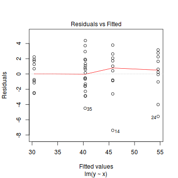
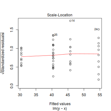
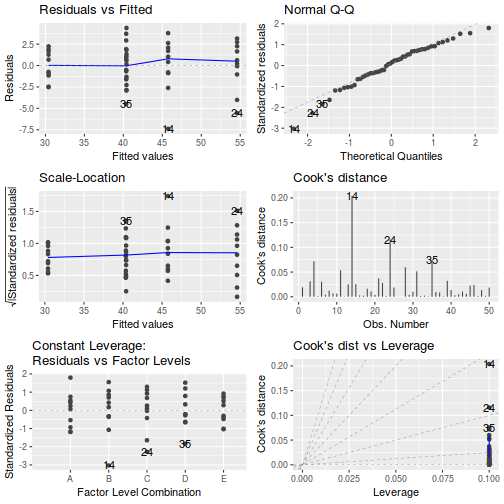
- there are no obvious patterns in the residuals (first plot). Specifically, there is no obvious 'wedge-shape' suggesting that we still have no evidence of non-homogeneity of variance
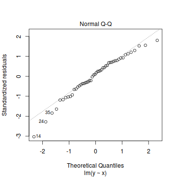
- Whilst the data do appear to deviate slightly from normality according to the Q-Q normal plot, it is only a mild deviation and given the robustness of linear models to mild non-normality, the Q-Q normal plot is really only of interest when there is also a wedge in the residuals (as it could suggest that non-homogeneity of variance could be due to non-normality and that perhaps normalizing could address both issues).
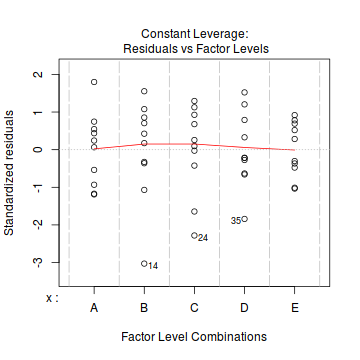
- The lower two figures are re-representations of the residual plot and therefore don't provide any additional insights
Extractor functions
There are a number of extractor functions (functions that extract or derive specific information from a model) available including:| Extractor | Description |
|---|---|
| residuals() | Extracts the residuals from the model |
| fitted() | Extracts the predicted (expected) response values (on the link scale) at the observed levels of the linear predictor |
| predict() | Extracts the predicted (expected) response values (on either the link, response or terms (linear predictor) scale) |
| coef() | Extracts the model coefficients |
| confint() | Calculate confidence intervals for the model coefficients |
| summary() | Summarizes the important output and characteristics of the model |
| anova() | Computes an analysis of variance (variance partitioning) from the model |
| plot() | Generates a series of diagnostic plots from the model |
| effect() | effects package - estimates the marginal (partial) effects of a factor (useful for plotting) |
| avPlot() | car package - generates partial regression plots |
Partial effects plots
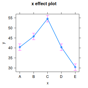
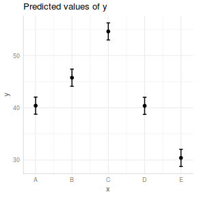
Effects plots display the modelled effects and are useful to refer to when attempting to interpret any model outputs.
library(effects)
plot(effect("x", data.lm))
library(ggeffects)
ggeffect(data.lm, ~x) %>% plot
library(ggeffects)
ggpredict(data.lm, ~x) %>% plot(rawdata = TRUE)
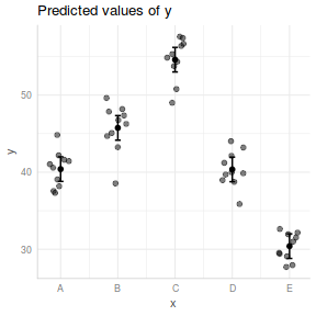
library(ggeffects)
ggemmeans(data.lm, ~x) %>% plot

Exploring the model parameters, test hypotheses
If there was any evidence that the assumptions had been violated, then we would need to reconsider the model and start the process again. In this case, there is no evidence that the test will be unreliable so we can proceed to explore the test statistics.
There are two broad hypothesis testing perspectives we could take:
- We could explore the individual effects. By default, the lm() function
dummy codes the categorical variable for treatment contrasts (where each of the groups are compared to the first group).
summary(data.lm)
Call: lm(formula = y ~ x, data = data) Residuals: Min 1Q Median 3Q Max -7.3906 -1.2752 0.3278 1.7931 4.3892 Coefficients: Estimate Std. Error t value Pr(>|t|) (Intercept) 40.39661 0.81333 49.668 < 2e-16 *** xB 5.34993 1.15023 4.651 2.91e-05 *** xC 14.20237 1.15023 12.347 4.74e-16 *** xD -0.03442 1.15023 -0.030 0.976 xE -9.99420 1.15023 -8.689 3.50e-11 *** --- Signif. codes: 0 '***' 0.001 '**' 0.01 '*' 0.05 '.' 0.1 ' ' 1 Residual standard error: 2.572 on 45 degrees of freedom Multiple R-squared: 0.9129, Adjusted R-squared: 0.9052 F-statistic: 117.9 on 4 and 45 DF, p-value: < 2.2e-16tidy(data.lm)
# A tibble: 5 x 5
  term        estimate std.error statistic  p.value
  <chr>          <dbl>     <dbl>     <dbl>    <dbl>
1 (Intercept)  40.4        0.813   49.7    5.94e-41
2 xB            5.35       1.15     4.65   2.91e- 5
3 xC           14.2        1.15    12.3    4.74e-16
4 xD           -0.0344     1.15    -0.0299 9.76e- 1
5 xE           -9.99       1.15    -8.69   3.50e-11
Conclusions:
- The row in the Coefficients table labeled (Intercept)
represents the first treatment group. So the Estimate for this
row represents the estimated population mean for the first treatment group (A).
So the mean of population A is estimated to be
40.397with a standard error (precision) of0.813. Note that the rest of the columns (t value and Pr(>|t|))represent the outcome of hypothesis tests. For the first row, this hypothesis test has very little meaning as it is testing the null hypothesis that the mean of population A is zero. - Each of the subsequent rows represent the estimated effects of each of the other populations from population A.
For example, the Estimate for the row labeled xB represents the estimated difference in means
between group B (for factor x) and the reference group (group A). Hence, the population mean of group B is estimated to be
5.35units higher than the mean of group B and this 'effect' is statistically significant (at the 0.05 level). - Groups C and E means are
49.668and9.994units higher and lower than the mean of group A respectively. Those null hypotheses would also be rejected ($p<0.05$) - The mean of group D was not found to differ significantly from the mean of group A ($p>0.05$)
- The $R^2$ value is
0.91suggesting that approximately91% of the total variance in $y$ can be explained by the groupings of $x$. The $R^2$ value is thus a measure of the strength of the relationship.Alternatively, we could calculate the 95% confidence intervals for the parameter estimates.
confint(data.lm)
                 2.5 %    97.5 %
(Intercept)  38.758468 42.034749
xB            3.033246  7.666607
xC           11.885691 16.519053
xD           -2.351098  2.282263
xE          -12.310879 -7.677518
- The row in the Coefficients table labeled (Intercept)
represents the first treatment group. So the Estimate for this
row represents the estimated population mean for the first treatment group (A).
So the mean of population A is estimated to be
-
In addition (or alternatively), we could explore the collective null hypothesis (that all the population means are equal)
by partitioning the variance into explained and unexplained components (in an ANOVA table).
anova(data.lm)
Analysis of Variance Table

Response: y
          Df  Sum Sq Mean Sq F value    Pr(>F)
x          4 3120.74  780.19  117.94 < 2.2e-16 ***
Residuals 45  297.68    6.62
---
Signif. codes:  0 '***' 0.001 '**' 0.01 '*' 0.05 '.' 0.1 ' ' 1
Conclusions:
- The ratio of mean explained to mean unexplained variance is
117.939- which is substantially higher than what would be expected if the null hypothesis was true. We would reject the null hypothesis that all the population means are equal ($p<0.05$). At least one of the populations is different from the others. - Overall, there is an effect of treatment on the response.
- The ratio of mean explained to mean unexplained variance is
Predictions
As with other regressions, we can predict new responses. However, if predictions can only be made for fixed factors and of course we can only predict responses for treatment levels that were incorporated in the fitted model. For example, in this case, we could not predict a response to an unmeasured treatment (such as group F).
Given that we can only predict values for the groups we already have, these predictions are just the means of treatment groups. Nevertheless, it might be useful to be able to calculate the predicted means and intervals associated with each population.
predict(data.lm, newdata = data.frame(x = c("A", "B")), interval = "prediction")
       fit      lwr      upr
1 40.39661 34.96351 45.82971
2 45.74653 40.31344 51.17963
Prediction intervals represent the intervals associated with predicting any single new observation. Confidence intervals on the other hand, represent intervals associated with the estimated means. In essence the are the confidence in a mean of values rather than a single value. Consequently, confidence intervals are narrower than prediction intervals.
Note that confidence intervals of each population can alternatively have been achieved by fitting a means model and calculating the confidence intervals for the parameter estimates.
predict(data.lm, newdata = data.frame(x = LETTERS[1:5]), interval = "confidence")
       fit      lwr      upr
1 40.39661 38.75847 42.03475
2 45.74653 44.10839 47.38468
3 54.59898 52.96084 56.23712
4 40.36219 38.72405 42.00033
5 30.40241 28.76427 32.04055
# OR
confint(lm(y ~ -1 + x, data))
      2.5 %   97.5 %
xA 38.75847 42.03475
xB 44.10839 47.38468
xC 52.96084 56.23712
xD 38.72405 42.00033
xE 28.76427 32.04055
For simple lm models, the predict function works well. However, for many more complex models, the predict function does not yield confidence intervals, without which, predictions are of limited use. It is therefore worth exploring alternative routines that can be applied to a wider range of models. We will therefore repeat the predictions above via two additional approaches:
- emmeans
- manually
emmeans(data.lm, ~x)
 x emmean    SE df lower.CL upper.CL
 A   40.4 0.813 45     38.8     42.0
 B   45.7 0.813 45     44.1     47.4
 C   54.6 0.813 45     53.0     56.2
 D   40.4 0.813 45     38.7     42.0
 E   30.4 0.813 45     28.8     32.0

Confidence level used: 0.95
newdata = with(data, data.frame(x = levels(x)))
Xmat = model.matrix(~x, data = newdata)
coefs = coef(data.lm)
fit = as.vector(coefs %*% t(Xmat))
se = sqrt(diag(Xmat %*% vcov(data.lm) %*% t(Xmat)))
Q = qt(0.975, df = df.residual(data.lm))
newdata = cbind(newdata, data.frame(fit = fit, lower = fit - Q * se, upper = fit + Q * se))
newdata
  x      fit    lower    upper
1 A 40.39661 38.75847 42.03475
2 B 45.74653 44.10839 47.38468
3 C 54.59898 52.96084 56.23712
4 D 40.36219 38.72405 42.00033
5 E 30.40241 28.76427 32.04055
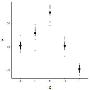
Graphical Summaries
## generate a prediction data frame
newdata <- data.frame(x = levels(data$x))
fit <- predict(data.lm, newdata = newdata, interval = "confidence")
fit <- data.frame(newdata, fit)

library(ggplot2)
ggplot(fit, aes(y = fit, x = x)) + geom_pointrange(aes(ymin = lwr,
    ymax = upr)) + scale_y_continuous("Y") + scale_x_discrete("X") +
    theme_classic() + theme(axis.title.y = element_text(vjust = 1,
    size = rel(1.25)), axis.title.x = element_text(vjust = -1,
    size = rel(1.25)))
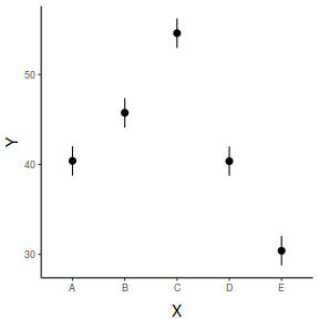
## And if we wished to add the observed values to this
## figure.</p>
library(ggplot2)
ggplot(fit, aes(y = fit, x = x)) + geom_point(data = data, aes(y = y),
    col = "grey") + geom_pointrange(aes(ymin = lwr, ymax = upr)) +
    scale_y_continuous("Y") + scale_x_discrete("X") + theme_classic() +
    theme(axis.title.y = element_text(vjust = 1, size = rel(1.25)),
        axis.title.x = element_text(vjust = -1, size = rel(1.25)))

## generate a prediction data frame
newdata = ref_grid(data.lm, ~x) %>% confint %>% data.frame

library(ggplot2)
ggplot(newdata, aes(y = prediction, x = x)) + geom_pointrange(aes(ymin = lower.CL,
    ymax = upper.CL)) + scale_y_continuous("Y") + scale_x_discrete("X") +
    theme_classic() + theme(axis.title.y = element_text(vjust = 1,
    size = rel(1.25)), axis.title.x = element_text(vjust = -1,
    size = rel(1.25)))

## And if we wished to add the observed values to this
## figure.</p>
library(ggplot2)
ggplot(newdata, aes(y = prediction, x = x)) + geom_point(data = data,
    aes(y = y), col = "grey") + geom_pointrange(aes(ymin = lower.CL,
    ymax = upper.CL)) + scale_y_continuous("Y") + scale_x_discrete("X") +
    theme_classic() + theme(axis.title.y = element_text(vjust = 1,
    size = rel(1.25)), axis.title.x = element_text(vjust = -1,
    size = rel(1.25)))
## generate a prediction data frame
newdata <- data.frame(x = levels(data$x))
Xmat = model.matrix(~x, data = newdata)
coefs = coef(data.lm)
fit = as.vector(coefs %*% t(Xmat))
se = sqrt(diag(Xmat %*% vcov(data.lm) %*% t(Xmat)))
Q = qt(0.975, df = df.residual(data.lm))
newdata = cbind(newdata, data.frame(fit = fit, lower = fit -
    Q * se, upper = fit + Q * se))

library(ggplot2)
ggplot(newdata, aes(y = fit, x = x)) + geom_pointrange(aes(ymin = lower,
    ymax = upper)) + scale_y_continuous("Y") + scale_x_discrete("X") +
    theme_classic() + theme(axis.title.y = element_text(vjust = 1,
    size = rel(1.25)), axis.title.x = element_text(vjust = -1,
    size = rel(1.25)))

## And if we wished to add the observed values to this
## figure.</p>
library(ggplot2)
ggplot(newdata, aes(y = fit, x = x)) + geom_point(data = data,
    aes(y = y), col = "grey") + geom_pointrange(aes(ymin = lower,
    ymax = upper)) + scale_y_continuous("Y") + scale_x_discrete("X") +
    theme_classic() + theme(axis.title.y = element_text(vjust = 1,
    size = rel(1.25)), axis.title.x = element_text(vjust = -1,
    size = rel(1.25)))

Robust ANOVA
There are a number of alternatives to ANOVA that are more robust (less sensitive) to conditions of either non-normality or unequal variance.
- Welch's test adjusts the degrees of freedom to maintain test reliability in
situations where populations are normally distributed but
unequally varied.
oneway.test(y ~ x, var.equal = FALSE, data = data)
One-way analysis of means (not assuming equal variances)

data:  y and x
F = 132.36, num df = 4.000, denom df = 22.251, p-value = 3.587e-15
# xmat <- model.matrix(~x, data) library(MASS) data.rlm <- rlm(y~-1+xmat, data=data)
# summary(data.rlm)
-
Alternatively, Randomization tests repeatedly shuffle the observations randomly,
each time calculating a specific
test statistic so as to build up a unique probability distribution for the test statistic
for the collected data and thus make no assumptions
about the distribution of the underlying population.
Such tests do not assume observations were collected via random sampling, however they
do assume that populations are equally varied.
library(boot)
stat <- function(data, indices) {
    f.ratio <- anova(lm(y ~ x, data))$"F value"[1]
    f.ratio
}

rand.gen <- function(data, mle) {
    out <- data
    out$x <- sample(out$x, replace = F)
    out
}

data.boot <- boot(data, stat, R = 5000, sim = "parametric", ran.gen = rand.gen)

plot(data.boot)
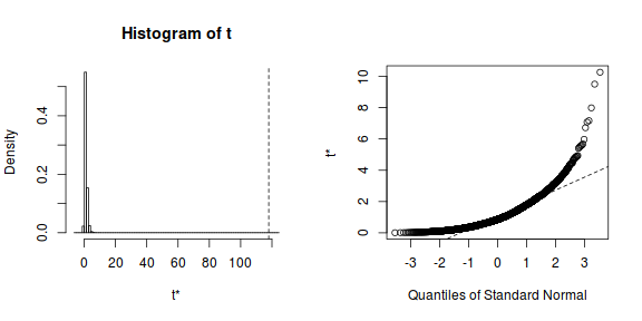
print(data.boot)
PARAMETRIC BOOTSTRAP


Call:
boot(data = data, statistic = stat, R = 5000, sim = "parametric",
    ran.gen = rand.gen)


Bootstrap Statistics :
    original    bias    std. error
1* 117.9394 -116.8752   0.8302328
f <- length(data.boot[data.boot$t >= data.boot$t0]) + 1 print(f/(data.boot$R + 1))
[1] 0.00019996
-
Non-parametric (rank-based) tests such as the Kruskal-Wallis test use ranks of
the observations to calculate test statistics rather
than the actual observations and thus do not assume that the underlying populations
are normally distributed. They test the null hypothesis
that population medians are equal and are useful in situations where there are outliers.
Although technically these tests still assume that
the populations are equally varied, violations of this assumption apparently have
little impact.
kruskal.test(y ~ x, data = data)
Kruskal-Wallis rank sum test

data:  y by x
Kruskal-Wallis chi-squared = 42.173, df = 4, p-value = 1.536e-08
- Many issues can also be more appropriately addressed by fitting models that specifically incorporate alternative error distributions, variance and correlation structures. These will be the focus of later tutorials.
Tests of trends and means comparisons
Rejecting the null hypothesis that all of population group means are equal only indicates that at least one of the population group means differs from the others, it does not indicate which groups differ from which other groups.
Furthermore, the individual parameter null hypothesis tests typically only cover a subset of all possible pairwise comparisons (this is strictly enforced to maintain the integrity of the model).
Consequently, following ANOVA, researchers often wish to examine patterns of differences among all groups. However, this requires multiple comparisons of group means and multiple comparisons lead to two statistical problems.
- First, multiple significance tests increase the probability of Type I errors
($\alpha$, the probability of falsely rejecting H$_0$).
If the decision criteria for any single hypothesis test is 0.05 (5%), then we are accepting that there is a 5% chance of committing a Type I error (falsely rejecting the null hypothesis). As a result, if many related hypothesis tests are conducted, then the overall Type I error rate (family-wise Type I error rate; probability of making at least one Type I error) compounds to unacceptably high levels.
For example, testing for differences between 5 groups requires ten pairwise comparisons. If the $\alpha$ for each test is 0.05 (5%), then the probability of at least one Type I error for the family of 10 tests is approximately 0.4 (40%).
- Second, the outcome of each test is not statitically independent (orthogonal). For example, if tests reveals that the population mean of group A is significantly different from the population mean of group B (A>B) and B>C then we already know the result of A vs. C.
Post-hoc unplanned pairwise comparisons
Multiple pairwise contrasts compare all possible pairs of group means and are useful in an exploratory fashion to reveal differences between groups when it is not possible to justify any specific comparisons over other comparisons prior to the collection and analysis of data. There are a variety of procedures available to control the family-wise Type I error rate (e.g. Bonferroni and Tukey's test, thereby minimizing the probability of making Type I errors.
However, these procedures reduce the power of each individual pairwise comparison (increase Type II error), and the reduction in power is directly related to the number of groups (and hence number of comparisons) being compared.
Furthermore, for ordered factors (e.g. temperature: 10, 15, 20,...), multiple pairwise comparisons (in which each level is compared to each other level) are arguably less informative than an investigation of the overall trends across the set of factor levels.
The glht() (general linear hypothesis test) function in R provides an extensive interface into a wide range of linear hypotheses following on from a fitted linear model. The glht()) function takes two primary arguments:
- the fitted model
- a linear function that defines a series of contrasts
The glht object can then be summarised using the method with a range of p-value adjustments including Bonferroni, modifed-Bonferroni (Holm) and Tukey's HSD adjustments.
library(multcomp)
# Bonferroni corrections
summary(glht(data.lm, linfct = mcp(x = "Tukey")), test = adjusted("bonferroni"))
 Simultaneous Tests for General Linear Hypotheses

Multiple Comparisons of Means: Tukey Contrasts


Fit: lm(formula = y ~ x, data = data)

Linear Hypotheses:
            Estimate Std. Error t value Pr(>|t|)
B - A == 0   5.34993    1.15023   4.651 0.000291 ***
C - A == 0  14.20237    1.15023  12.347 4.44e-15 ***
D - A == 0  -0.03442    1.15023  -0.030 1.000000
E - A == 0  -9.99420    1.15023  -8.689 3.50e-10 ***
C - B == 0   8.85245    1.15023   7.696 9.57e-09 ***
D - B == 0  -5.38434    1.15023  -4.681 0.000264 ***
E - B == 0 -15.34412    1.15023 -13.340  < 2e-16 ***
D - C == 0 -14.23679    1.15023 -12.377 4.44e-15 ***
E - C == 0 -24.19657    1.15023 -21.036  < 2e-16 ***
E - D == 0  -9.95978    1.15023  -8.659 3.87e-10 ***
---
Signif. codes:  0 '***' 0.001 '**' 0.01 '*' 0.05 '.' 0.1 ' ' 1
(Adjusted p values reported -- bonferroni method)
# Modified Bonferroni (Holm) corrections
summary(glht(data.lm, linfct = mcp(x = "Tukey")), test = adjusted("holm"))
 Simultaneous Tests for General Linear Hypotheses

Multiple Comparisons of Means: Tukey Contrasts


Fit: lm(formula = y ~ x, data = data)

Linear Hypotheses:
            Estimate Std. Error t value Pr(>|t|)
B - A == 0   5.34993    1.15023   4.651 7.92e-05 ***
C - A == 0  14.20237    1.15023  12.347 3.55e-15 ***
D - A == 0  -0.03442    1.15023  -0.030    0.976
E - A == 0  -9.99420    1.15023  -8.689 2.10e-10 ***
C - B == 0   8.85245    1.15023   7.696 3.83e-09 ***
D - B == 0  -5.38434    1.15023  -4.681 7.92e-05 ***
E - B == 0 -15.34412    1.15023 -13.340  < 2e-16 ***
D - C == 0 -14.23679    1.15023 -12.377 3.55e-15 ***
E - C == 0 -24.19657    1.15023 -21.036  < 2e-16 ***
E - D == 0  -9.95978    1.15023  -8.659 2.10e-10 ***
---
Signif. codes:  0 '***' 0.001 '**' 0.01 '*' 0.05 '.' 0.1 ' ' 1
(Adjusted p values reported -- holm method)
# Tukey's test
summary(glht(data.lm, linfct = mcp(x = "Tukey")))
 Simultaneous Tests for General Linear Hypotheses

Multiple Comparisons of Means: Tukey Contrasts


Fit: lm(formula = y ~ x, data = data)

Linear Hypotheses:
            Estimate Std. Error t value Pr(>|t|)
B - A == 0   5.34993    1.15023   4.651 0.000287 ***
C - A == 0  14.20237    1.15023  12.347  < 1e-04 ***
D - A == 0  -0.03442    1.15023  -0.030 1.000000
E - A == 0  -9.99420    1.15023  -8.689  < 1e-04 ***
C - B == 0   8.85245    1.15023   7.696  < 1e-04 ***
D - B == 0  -5.38434    1.15023  -4.681 0.000239 ***
E - B == 0 -15.34412    1.15023 -13.340  < 1e-04 ***
D - C == 0 -14.23679    1.15023 -12.377  < 1e-04 ***
E - C == 0 -24.19657    1.15023 -21.036  < 1e-04 ***
E - D == 0  -9.95978    1.15023  -8.659  < 1e-04 ***
---
Signif. codes:  0 '***' 0.001 '**' 0.01 '*' 0.05 '.' 0.1 ' ' 1
(Adjusted p values reported -- single-step method)
library(emmeans)
# Bonferroni corrections
emmeans(data.lm, pairwise ~ x) %>% confint(adjust = "bonferroni")
$emmeans
 x emmean    SE df lower.CL upper.CL
 A   40.4 0.813 45     38.2     42.6
 B   45.7 0.813 45     43.6     47.9
 C   54.6 0.813 45     52.4     56.8
 D   40.4 0.813 45     38.2     42.5
 E   30.4 0.813 45     28.2     32.6

Confidence level used: 0.95
Conf-level adjustment: bonferroni method for 5 estimates

$contrasts
 contrast estimate   SE df lower.CL upper.CL
 A - B     -5.3499 1.15 45    -8.75    -1.95
 A - C    -14.2024 1.15 45   -17.60   -10.81
 A - D      0.0344 1.15 45    -3.36     3.43
 A - E      9.9942 1.15 45     6.60    13.39
 B - C     -8.8524 1.15 45   -12.25    -5.46
 B - D      5.3843 1.15 45     1.99     8.78
 B - E     15.3441 1.15 45    11.95    18.74
 C - D     14.2368 1.15 45    10.84    17.63
 C - E     24.1966 1.15 45    20.80    27.59
 D - E      9.9598 1.15 45     6.56    13.36

Confidence level used: 0.95
Conf-level adjustment: bonferroni method for 10 estimates
emmeans(data.lm, pairwise ~ x) %>% summary(adjust = "bonferroni")
$emmeans
 x emmean    SE df lower.CL upper.CL
 A   40.4 0.813 45     38.2     42.6
 B   45.7 0.813 45     43.6     47.9
 C   54.6 0.813 45     52.4     56.8
 D   40.4 0.813 45     38.2     42.5
 E   30.4 0.813 45     28.2     32.6

Confidence level used: 0.95
Conf-level adjustment: bonferroni method for 5 estimates

$contrasts
 contrast estimate   SE df t.ratio p.value
 A - B     -5.3499 1.15 45  -4.651 0.0003
 A - C    -14.2024 1.15 45 -12.347 <.0001
 A - D      0.0344 1.15 45   0.030 1.0000
 A - E      9.9942 1.15 45   8.689 <.0001
 B - C     -8.8524 1.15 45  -7.696 <.0001
 B - D      5.3843 1.15 45   4.681 0.0003
 B - E     15.3441 1.15 45  13.340 <.0001
 C - D     14.2368 1.15 45  12.377 <.0001
 C - E     24.1966 1.15 45  21.036 <.0001
 D - E      9.9598 1.15 45   8.659 <.0001

P value adjustment: bonferroni method for 10 tests
# Modified Bonferroni (Holm) corrections
emmeans(data.lm, pairwise ~ x) %>% confint(adjust = "holm")
$emmeans
 x emmean    SE df lower.CL upper.CL
 A   40.4 0.813 45     38.2     42.6
 B   45.7 0.813 45     43.6     47.9
 C   54.6 0.813 45     52.4     56.8
 D   40.4 0.813 45     38.2     42.5
 E   30.4 0.813 45     28.2     32.6

Confidence level used: 0.95
Conf-level adjustment: bonferroni method for 5 estimates

$contrasts
 contrast estimate   SE df lower.CL upper.CL
 A - B     -5.3499 1.15 45    -8.75    -1.95
 A - C    -14.2024 1.15 45   -17.60   -10.81
 A - D      0.0344 1.15 45    -3.36     3.43
 A - E      9.9942 1.15 45     6.60    13.39
 B - C     -8.8524 1.15 45   -12.25    -5.46
 B - D      5.3843 1.15 45     1.99     8.78
 B - E     15.3441 1.15 45    11.95    18.74
 C - D     14.2368 1.15 45    10.84    17.63
 C - E     24.1966 1.15 45    20.80    27.59
 D - E      9.9598 1.15 45     6.56    13.36

Confidence level used: 0.95
Conf-level adjustment: bonferroni method for 10 estimates
emmeans(data.lm, pairwise ~ x) %>% summary(adjust = "holm")
$emmeans
 x emmean    SE df lower.CL upper.CL
 A   40.4 0.813 45     38.2     42.6
 B   45.7 0.813 45     43.6     47.9
 C   54.6 0.813 45     52.4     56.8
 D   40.4 0.813 45     38.2     42.5
 E   30.4 0.813 45     28.2     32.6

Confidence level used: 0.95
Conf-level adjustment: bonferroni method for 5 estimates

$contrasts
 contrast estimate   SE df t.ratio p.value
 A - B     -5.3499 1.15 45  -4.651 0.0001
 A - C    -14.2024 1.15 45 -12.347 <.0001
 A - D      0.0344 1.15 45   0.030 0.9763
 A - E      9.9942 1.15 45   8.689 <.0001
 B - C     -8.8524 1.15 45  -7.696 <.0001
 B - D      5.3843 1.15 45   4.681 0.0001
 B - E     15.3441 1.15 45  13.340 <.0001
 C - D     14.2368 1.15 45  12.377 <.0001
 C - E     24.1966 1.15 45  21.036 <.0001
 D - E      9.9598 1.15 45   8.659 <.0001

P value adjustment: holm method for 10 tests
# Tukey's test
emmeans(data.lm, pairwise ~ x) %>% confint
$emmeans
 x emmean    SE df lower.CL upper.CL
 A   40.4 0.813 45     38.8     42.0
 B   45.7 0.813 45     44.1     47.4
 C   54.6 0.813 45     53.0     56.2
 D   40.4 0.813 45     38.7     42.0
 E   30.4 0.813 45     28.8     32.0

Confidence level used: 0.95

$contrasts
 contrast estimate   SE df lower.CL upper.CL
 A - B     -5.3499 1.15 45    -8.62    -2.08
 A - C    -14.2024 1.15 45   -17.47   -10.93
 A - D      0.0344 1.15 45    -3.23     3.30
 A - E      9.9942 1.15 45     6.73    13.26
 B - C     -8.8524 1.15 45   -12.12    -5.58
 B - D      5.3843 1.15 45     2.12     8.65
 B - E     15.3441 1.15 45    12.08    18.61
 C - D     14.2368 1.15 45    10.97    17.51
 C - E     24.1966 1.15 45    20.93    27.46
 D - E      9.9598 1.15 45     6.69    13.23

Confidence level used: 0.95
Conf-level adjustment: tukey method for comparing a family of 5 estimates
emmeans(data.lm, pairwise ~ x) %>% summary
$emmeans
 x emmean    SE df lower.CL upper.CL
 A   40.4 0.813 45     38.8     42.0
 B   45.7 0.813 45     44.1     47.4
 C   54.6 0.813 45     53.0     56.2
 D   40.4 0.813 45     38.7     42.0
 E   30.4 0.813 45     28.8     32.0

Confidence level used: 0.95

$contrasts
 contrast estimate   SE df t.ratio p.value
 A - B     -5.3499 1.15 45  -4.651 0.0003
 A - C    -14.2024 1.15 45 -12.347 <.0001
 A - D      0.0344 1.15 45   0.030 1.0000
 A - E      9.9942 1.15 45   8.689 <.0001
 B - C     -8.8524 1.15 45  -7.696 <.0001
 B - D      5.3843 1.15 45   4.681 0.0002
 B - E     15.3441 1.15 45  13.340 <.0001
 C - D     14.2368 1.15 45  12.377 <.0001
 C - E     24.1966 1.15 45  21.036 <.0001
 D - E      9.9598 1.15 45   8.659 <.0001

P value adjustment: tukey method for comparing a family of 5 estimates
Planned comparisons (contrasts)
Planned contrasts are specific comparisons that are usually planned during the design stage of the experiment. Most textbooks recommend that multiple comparisons can be made (each at $\alpha=0.05$) provided each comparison is:
- independent of (orthogonal to) other comparisons
- no more than $p-1$ (where $p$ is the number of groups) comparisons are made
Occasionally, the comparisons of greatest interest are not independent (non-orthogonal). In such circumstances, some statisticians recommend performing each of the individual comparisons separately before applying a Dunn-Sidak p-value correction.
Of course this is all irrelevant within a Bayesian framework. Since the question (contrast) being asked has no bearing on the posterior distribution, any number and nature of contrast can be performed.
Specific comparisons are defined via a set of contrast coefficients associated with a linear combination of the treatment means: $$\bar{y}_1(C_{1}) + \bar{y}_2(C_{2}) + ... + \bar{y}_p(C_p)$$ where $p$ is the number of groups in the factor.
The contrast coefficients for a specific comparison must sum to zero (except treatment contrasts - which are a special case) and the groups being contrasted should have opposing signs. In addition to facilitating specific comparisons between individual groups, it is also possible to compare multiple groups to other groups or multiples and investigate polynomial trends.
By way of a simple example, lets suppose that we had a categorical variable with three levels (groups). Regular treatment contrasts would parameterize the linear model such that the means of groups 2 and 3 were compared to group 1.
|
The contrasts act as multipliers. So a value of 0 indicates that the group is not involved in the estimation of that particular parameter.
Treatment contrasts thus indicate that the first parameter (not specified, $\mu$ - the intercept) should estimate the mean of the first group
. The second parameter ($\alpha_2$) involves only group 2 - so this group is compared to the intercept (group 1). Similarly, the third parameter ($\alpha_3$) involves only group 3 and thus group 3 is compared to group 1. |
| Group | $\mu$ | $\alpha_2$ | $\alpha_3$ |
|---|---|---|---|
| Group 1 | 1 | 0 | 0 |
| Group 2 | 1 | 1 | 0 |
| Group 3 | 1 | 0 | 1 |
The dummy code matrix ($\textbf{D}$) representing the factor are thus multiplied by the contrast matrix ($\textbf{C}$) to yield the model matrix ($\textbf{X} = \textbf{D}\times\textbf{C}$).
$$\underbrace{\begin{pmatrix} 1&0&0\\1&0&0\\1&0&0\\1&1&0\\1&1&0\\1&1&0\\1&0&1\\1&0&1\\1&0&1 \end{pmatrix}}_{\substack{\text{Model matrix}\\[0.2em]\textbf{X}}} = \underbrace{\begin{pmatrix} 1&0&0\\1&0&0\\1&0&0\\0&1&0\\0&1&0\\0&1&0\\0&0&1\\0&0&1\\0&0&1 \end{pmatrix}}_{\substack{\text{Dummy codes}\\[0.2em]\textbf{D}}} \times \underbrace{\begin{pmatrix} 1&0&0\\1&1&0\\1&0&1 \end{pmatrix}}_{\substack{\text{Contrast matrix}\\[0.2em]\textbf{C}}} $$Ultimately, the product of the dummy and contrast matrices (the model matrix) is used in the full matrix algebra to estimate the parameters ($\mu$, $\alpha_2$, $\alpha_3$, etc).
$$\underbrace{\begin{pmatrix} 2\\3\\4\\6\\7\\8\\10\\11\\12 \end{pmatrix}}_\text{Response vector}_\textbf{Y} = \underbrace{\begin{pmatrix} 1&0&0\\1&0&0\\1&0&0\\1&1&0\\1&1&0\\1&1&0\\1&0&1\\1&0&1\\1&0&1 \end{pmatrix}}_\text{Model matrix}_\textbf{X} \times \underbrace{\begin{pmatrix} \mu\\\alpha_2\\\alpha_3 \end{pmatrix}}_\text{Parameter vector}_{\beta} + \underbrace{\begin{pmatrix} \varepsilon_1\\\varepsilon_2\\\varepsilon_3\\\varepsilon_4&\\\varepsilon_5\\\varepsilon_6\\\varepsilon_7&\\\varepsilon_8\\\varepsilon_9 \end{pmatrix}}_\text{Residual vector}_\mathbf{\varepsilon} $$Hence, the contrast matrix provides a way that we can alter the definition of each of the estimated parameters. For example, to instead specify that $\alpha_2$ represents a comparison of groups 2 and 3 and $\alpha_3$ represents the comparison of group 1 to the average of groups 2 and 3, we could define our contrast matrix as:
| Group | $\alpha_2$ | $\alpha_2$ |
|---|---|---|
| Group 1 | 0 | 1 |
| Group 2 | 1 | -0.5 |
| Group 2 | -1 | -0.5 |
There are a couple of important things to note:
- As this pertains to an effects model (that is one that has an intercept), we can only specify a maximum of $p-1$ contrasts (comparisons), where $p$ is the number of groups.
- Each column must sum to zero
- The groups to contrast, must have apposing signs
- The positive numbers must add up to 1 and the negative numbers must add up to -1
- For any two comparisons to be independent (orthogonal), the sum of their row products must be equal to zero. Hence for all the contrasts to be independent, the off-diagonals of the cross-products of the contrast matrix, must all be zeros.
- Note, this is a human readable contrast matrix. In order to actually use this properly, it first must be decomposed. This will compile a true contrast matrix that reflects the comparisons defined. Note also, that the intercept will often just represent the overall mean (mean of all groups).
| Group | $\alpha_2$ | $\alpha_3$ |
|---|---|---|
| Group 1 | 0 | 0.666 |
| Group 2 | 0.5 | -0.333 |
| Group 3 | -0.5 | -0.333 |
The resulting model matrix would thus look like: $$\underbrace{\begin{pmatrix} 1&0&0.666\\1&0&0.666\\1&0&0.666\\1&0.5&-0.333\\1&0.5&-0.333\\1&0.5&-0.333\\1&-0.5&-0.333\\1&-0.5&-0.333\\1&-0.5&-0.333 \end{pmatrix}}_{\substack{\text{Model matrix}\\[0.2em]\textbf{X}}} = \underbrace{\begin{pmatrix} 1&0&0\\1&0&0\\1&0&0\\0&1&0\\0&1&0\\0&1&0\\0&0&1\\0&0&1\\0&0&1 \end{pmatrix}}_{\substack{\text{Dummy codes}\\[0.2em]\textbf{D}}} \times \underbrace{\begin{pmatrix} 1&0&0.666\\1&0.5&-0.333\\1&-0.5&-0.333 \end{pmatrix}}_{\substack{\text{Contrast matrix}\\[0.2em]\textbf{C}}} $$
Note that polynomial trends assume that factor levels are ordered according to a natural gradient or progression (e.g. low, medium, high) and that the factor levels are evenly spaced along this gradient. If you have reason to suspect that this is not the case, consider either weighting the contrast coefficients to better represent the increments between treatment levels. For a linear trend, weighted coefficients can be calculated by providing numerical representations of each of the factor levels and then subtracting the mean of these levels from each numeric level, or else regression analysis (see Tutorial 7.2) as an alternative.
Returning to our feature dataset (containing the response of y and a factor x with five levels), let us assume that as an alternative to the regular treatment contrasts, we are particularly interested in exploring the following two specific contrasts amongst out five groups:
- Comparing groups 3 and 5
- Comparing the mean of groups 1 and 2 with the mean of groups 3, 4 and 5
| Group | $\alpha_2$ | $\alpha_3$ | $\alpha_4$ | $\alpha_5$ |
|---|---|---|---|---|
| Group 1 | 0 | 0.5 | ||
| Group 2 | 0 | 0.5 | ||
| Group 3 | 1 | -1/3 | ||
| Group 4 | 0 | -1/3 | ||
| Group 5 | -1 | -1/3 |
There are numerous ways in which to perform planned contrasts in R. I will focus on just two of those methods as they permit the greatest range of possible comparison types.
- Planned comparisons by redefining the contrasts and re-fitting the model
- Start by defining the human readable contrasts
# Compare group 3 and 5 as well as average of group 1 and 2 to groups 3, 4 and 5
cmat <- rbind(c(0, 0, 1, 0, -1), c(1/2, 1/2, -1/3, -1/3, -1/3))
- Ensure that these contrasts are orthogonal (all contrasts are independent of one another).
We do this by examining the cross-products of the (transposed) contrast matrix. All the off-diagonals must have a value of zero.
As the off-diagonals are all zeros, the two defined contrasts are independent of one another.
round(crossprod(t(cmat)), 1)
     [,1] [,2]
[1,]    2  0.0
[2,]    0  0.8
-
Convert these human readable contrasts into genuine contrasts
# Convert these human readable contrasts into genuine contrasts
library(gmodels)
cmat <- make.contrasts(cmat)
- Make these the contrasts for the categorical variable.
# Redefine the contrasts for the categorical variable to the new contrasts
contrasts(data$x) <- cmat
- Refit the linear model so that these new contrasts will be incorporated
# Refit the linear model incorporating the new contrasts
data.lm1 <- lm(y ~ x, data)
- Examine the estimated (contrast) parameters
# View estimated contrast parameters
summary(data.lm1)
Call:
lm(formula = y ~ x, data = data)

Residuals:
    Min      1Q  Median      3Q     Max
-7.3906 -1.2752  0.3278  1.7931  4.3892

Coefficients:
            Estimate Std. Error t value Pr(>|t|)
(Intercept)  42.3013     0.3637 116.297  < 2e-16 ***
xC1          24.1966     1.1502  21.036  < 2e-16 ***
xC2           1.2837     0.7425   1.729   0.0907 .
xC3          -0.3213     0.8133  -0.395   0.6947
xC4           4.1541     0.8133   5.107 6.43e-06 ***
---
Signif. codes:  0 '***' 0.001 '**' 0.01 '*' 0.05 '.' 0.1 ' ' 1

Residual standard error: 2.572 on 45 degrees of freedom
Multiple R-squared:  0.9129,	Adjusted R-squared:  0.9052
F-statistic: 117.9 on 4 and 45 DF,  p-value: < 2.2e-16
# View as an ANOVA table summary(aov(data.lm1), split = list(x = list(`Grp 3 vs 5` = 1, `Grp 1,2 vs 3,4,5` = 2)))
                      Df Sum Sq Mean Sq F value Pr(>F)
x                      4 3120.7   780.2 117.939 <2e-16 ***
  x: Grp 3 vs 5        1 2927.4  2927.4 442.526 <2e-16 ***
  x: Grp 1,2 vs 3,4,5  1   19.8    19.8   2.989 0.0907 .
Residuals             45  297.7     6.6
---
Signif. codes:  0 '***' 0.001 '**' 0.01 '*' 0.05 '.' 0.1 ' ' 1
So on average the response associated with Group 'C' is approximately
Alternatively, if you are only interested in the ANOVA output and dont need the estimates and standard errors, human-readable contrasts are adequate.24.2units higher than that of Group 'E' and Groups 'A' and 'B' are on average1.28units higher than Groups 'C', 'D' and 'E'. Note, we only defined two planned contrasts yet as there are five groups, the model requires exactly five contrasts (although with an effects model, one is reserved for the intercept). In this case, the '(Intercept)' represents the overall mean response. The remaining two contrasts are defined to ensure the model is fully parameterized, yet they are unlikely to have any ecological interpretation (as they purely represent combinations of groups that are orthogonal to the other contrasts).However, the estimated parameter values (in a coefficients table) will not reflect your intended comparisons.# Alternatively, if only interested in the ANOVA table, human readable contrasts are adequate contrasts(data$x) <- cbind(c(0, 0, 1, 0, -1), c(1/2, 1/2, -1/3, -1/3, -1/3)) data.lm2 <- lm(y ~ x, data) summary(aov(data.lm2), split = list(x = list(`Grp 3 vs 5` = 1, `Grp 1,2 vs 3,4,5` = 2)))
                      Df Sum Sq Mean Sq F value Pr(>F)
x                      4 3120.7   780.2 117.939 <2e-16 ***
  x: Grp 3 vs 5        1 2927.4  2927.4 442.526 <2e-16 ***
  x: Grp 1,2 vs 3,4,5  1   19.8    19.8   2.989 0.0907 .
Residuals             45  297.7     6.6
---
Signif. codes:  0 '***' 0.001 '**' 0.01 '*' 0.05 '.' 0.1 ' ' 1
# HOWEVER, THE ESTIMATED PARAMETER VALUES WILL NOT REFLECT YOUR INTENDED COMPARISONS!
summary(data.lm2)
Call:
lm(formula = y ~ x, data = data)

Residuals:
    Min      1Q  Median      3Q     Max
-7.3906 -1.2752  0.3278  1.7931  4.3892

Coefficients:
            Estimate Std. Error t value Pr(>|t|)
(Intercept)  42.3013     0.3637 116.297  < 2e-16 ***
x1           12.0983     0.5751  21.036  < 2e-16 ***
x2            1.5405     0.8910   1.729   0.0907 .
x3           -0.3213     0.8133  -0.395   0.6947
x4            4.1541     0.8133   5.107 6.43e-06 ***
---
Signif. codes:  0 '***' 0.001 '**' 0.01 '*' 0.05 '.' 0.1 ' ' 1

Residual standard error: 2.572 on 45 degrees of freedom
Multiple R-squared:  0.9129,	Adjusted R-squared:  0.9052
F-statistic: 117.9 on 4 and 45 DF,  p-value: < 2.2e-16
- Start by defining the human readable contrasts
- Planned comparisons via the glht function.
This method imposes a set of new contrasts on a fitted model to derive a new set of isolated comparisons.
By isolated, I mean that while it is possible to define and return multiple contrasts in a single statement,
all of the contrasts are performed separately and then returned as a single output for convenience.
Note, as this is a reshuffle of an already fitted model, human readable contrasts are adequate.
Technically, when the planned comparisons are non-orthogonal either because there are more than $p-1$ of them or else just because the subset of comparisons defined are not independent, we need to correct for multiple comparisons (similar to multiple pairwise comparisons outlined above). A Dunn-Sidak or Holm p-value correction is recommended.
# Construct a human readable contrast matrix Compare group 3 and 5 as well as average of group 1 and
# 2 to groups 3, 4 and 5
library(multcomp)
cmat <- rbind(c(0, 0, 1, 0, -1), c(1/2, 1/2, -1/3, -1/3, -1/3))
cmat
     [,1] [,2]       [,3]       [,4]       [,5]
[1,]  0.0  0.0  1.0000000  0.0000000 -1.0000000
[2,]  0.5  0.5 -0.3333333 -0.3333333 -0.3333333
cmat <- cbind(0, cmat %*% contr.treatment(5))
cmat
         2          3          4          5
[1,] 0 0.0  1.0000000  0.0000000 -1.0000000
[2,] 0 0.5 -0.3333333 -0.3333333 -0.3333333
rownames(cmat) <- c("Grp 3 vs 5", "Grp 1,2 vs 3,4,5")
summary(glht(data.lm, linfct = cmat))
 Simultaneous Tests for General Linear Hypotheses

Fit: lm(formula = y ~ x, data = data)

Linear Hypotheses:
                      Estimate Std. Error t value Pr(>|t|)
Grp 3 vs 5 == 0        24.1966     1.1502  21.036   <1e-10 ***
Grp 1,2 vs 3,4,5 == 0   1.2837     0.7425   1.729    0.172
---
Signif. codes:  0 '***' 0.001 '**' 0.01 '*' 0.05 '.' 0.1 ' ' 1
(Adjusted p values reported -- single-step method)
# Or via confidence intervals confint(glht(data.lm, linfct = cmat))
 Simultaneous Confidence Intervals

Fit: lm(formula = y ~ x, data = data)

Quantile = 2.3112
95% family-wise confidence level


Linear Hypotheses:
                      Estimate lwr     upr
Grp 3 vs 5 == 0       24.1966  21.5381 26.8550
Grp 1,2 vs 3,4,5 == 0  1.2837  -0.4323  2.9997
cmat <- cbind(`Grp 3 vs Gp 5` = c(0, 0, 1, 0, -1), `Grp 1,2 vs 3,4,5` = c(1/2, 1/2, -1/3, -1/3, -1/3)) cmat
     Grp 3 vs Gp 5 Grp 1,2 vs 3,4,5
[1,]             0        0.5000000
[2,]             0        0.5000000
[3,]             1       -0.3333333
[4,]             0       -0.3333333
[5,]            -1       -0.3333333
emmeans(data.lm, ~x, contr = list(x = cmat))
$emmeans
 x emmean    SE df lower.CL upper.CL
 A   40.4 0.813 45     38.8     42.0
 B   45.7 0.813 45     44.1     47.4
 C   54.6 0.813 45     53.0     56.2
 D   40.4 0.813 45     38.7     42.0
 E   30.4 0.813 45     28.8     32.0

Confidence level used: 0.95

$contrasts
 contrast           estimate    SE df t.ratio p.value
 x.Grp 3 vs Gp 5       24.20 1.150 45 21.036  <.0001
 x.Grp 1,2 vs 3,4,5     1.28 0.742 45  1.729  0.0907
emmeans(data.lm, ~x, contr = list(x = cmat)) %>% confint
$emmeans
 x emmean    SE df lower.CL upper.CL
 A   40.4 0.813 45     38.8     42.0
 B   45.7 0.813 45     44.1     47.4
 C   54.6 0.813 45     53.0     56.2
 D   40.4 0.813 45     38.7     42.0
 E   30.4 0.813 45     28.8     32.0

Confidence level used: 0.95

$contrasts
 contrast           estimate    SE df lower.CL upper.CL
 x.Grp 3 vs Gp 5       24.20 1.150 45   21.880    26.51
 x.Grp 1,2 vs 3,4,5     1.28 0.742 45   -0.212     2.78

Confidence level used: 0.95
cmat <- rbind(`Grp 3 vs Gp 5` = c(0, 0, 1, 0, -1), `Grp 1,2 vs 3,4,5` = c(1/2, 1/2, -1/3, -1/3, -1/3))
cmat <- cbind(0, cmat %*% contr.treatment(5))
cmat
                     2          3          4          5
Grp 3 vs Gp 5    0 0.0  1.0000000  0.0000000 -1.0000000
Grp 1,2 vs 3,4,5 0 0.5 -0.3333333 -0.3333333 -0.3333333
coefs = coef(data.lm)
fit = as.vector(coefs %*% t(cmat))
se = sqrt(diag(cmat %*% vcov(data.lm) %*% t(cmat)))
Q = qt(0.975, df = df.residual(data.lm))
data.frame(fit = fit, lower = fit - Q * se, upper = fit + Q * se)
                       fit      lower     upper
Grp 3 vs Gp 5    24.196570 21.8798895 26.513251
Grp 1,2 vs 3,4,5  1.283711 -0.2116997  2.779122
# Construct a human readable contrast matrix Compare the average of groups 1 and 4 with group 5 as
# well as average of group 1 and 2 to groups 3, 4 and 5
library(multcomp)
cmat <- rbind(c(0.5, 0, 0, 0.5, -1), c(1/2, 1/2, -1/3, -1/3, -1/3))
cmat
     [,1] [,2]       [,3]       [,4]       [,5]
[1,]  0.5  0.0  0.0000000  0.5000000 -1.0000000
[2,]  0.5  0.5 -0.3333333 -0.3333333 -0.3333333
round(crossprod(t(cmat)), 1)
     [,1] [,2]
[1,]  1.5  0.4
[2,]  0.4  0.8
cmat <- cbind(0, cmat %*% contr.treatment(5))
cmat
         2          3          4          5
[1,] 0 0.0  0.0000000  0.5000000 -1.0000000
[2,] 0 0.5 -0.3333333 -0.3333333 -0.3333333
rownames(cmat) <- c("Grp 1,4 vs 5", "Grp 1,2 vs 3,4,5")
summary(glht(data.lm, linfct = cmat), test = adjusted("holm"))
Simultaneous Tests for General Linear Hypotheses Fit: lm(formula = y ~ x, data = data) Linear Hypotheses: Estimate Std. Error t value Pr(>|t|) Grp 1,4 vs 5 == 0 9.9770 0.9961 10.016 9.9e-13 *** Grp 1,2 vs 3,4,5 == 0 1.2837 0.7425 1.729 0.0907 . --- Signif. codes: 0 '***' 0.001 '**' 0.01 '*' 0.05 '.' 0.1 ' ' 1 (Adjusted p values reported -- holm method)confint(glht(data.lm, linfct = cmat))
 Simultaneous Confidence Intervals

Fit: lm(formula = y ~ x, data = data)

Quantile = 2.2968
95% family-wise confidence level


Linear Hypotheses:
                      Estimate lwr     upr
Grp 1,4 vs 5 == 0      9.9770   7.6891 12.2649
Grp 1,2 vs 3,4,5 == 0  1.2837  -0.4216  2.9890
cmat <- cbind(`Grp 1,4 vs 5` = c(0.5, 0, 0, 0.5, -1), `Grp 1,2 vs 3,4,5` = c(1/2, 1/2, -1/3, -1/3, -1/3)) round(crossprod(cmat), 1)
                 Grp 1,4 vs 5 Grp 1,2 vs 3,4,5
Grp 1,4 vs 5              1.5              0.4
Grp 1,2 vs 3,4,5          0.4              0.8
emmeans(data.lm, ~x, contr = list(x = cmat)) %>% summary(adjust = "holm")
$emmeans
 x emmean    SE df lower.CL upper.CL
 A   40.4 0.813 45     38.2     42.6
 B   45.7 0.813 45     43.6     47.9
 C   54.6 0.813 45     52.4     56.8
 D   40.4 0.813 45     38.2     42.5
 E   30.4 0.813 45     28.2     32.6

Confidence level used: 0.95
Conf-level adjustment: bonferroni method for 5 estimates

$contrasts
 contrast           estimate    SE df t.ratio p.value
 x.Grp 1,4 vs 5         9.98 0.996 45 10.016  <.0001
 x.Grp 1,2 vs 3,4,5     1.28 0.742 45  1.729  0.0907

P value adjustment: holm method for 2 tests
emmeans(data.lm, ~x, contr = list(x = cmat)) %>% confint(adjust = "holm")
$emmeans
 x emmean    SE df lower.CL upper.CL
 A   40.4 0.813 45     38.2     42.6
 B   45.7 0.813 45     43.6     47.9
 C   54.6 0.813 45     52.4     56.8
 D   40.4 0.813 45     38.2     42.5
 E   30.4 0.813 45     28.2     32.6

Confidence level used: 0.95
Conf-level adjustment: bonferroni method for 5 estimates

$contrasts
 contrast           estimate    SE df lower.CL upper.CL
 x.Grp 1,4 vs 5         9.98 0.996 45    7.667    12.29
 x.Grp 1,2 vs 3,4,5     1.28 0.742 45   -0.438     3.01

Confidence level used: 0.95
Conf-level adjustment: bonferroni method for 2 estimates
cmat <- rbind(`Grp 1,4 vs 5` = c(0.5, 0, 0, 0.5, -1), `Grp 1,2 vs 3,4,5` = c(1/2, 1/2, -1/3, -1/3, -1/3))
cmat <- cbind(0, cmat %*% contr.treatment(5))
cmat
                     2          3          4          5
Grp 1,4 vs 5     0 0.0  0.0000000  0.5000000 -1.0000000
Grp 1,2 vs 3,4,5 0 0.5 -0.3333333 -0.3333333 -0.3333333
coefs = coef(data.lm)
fit = as.vector(coefs %*% t(cmat))
se = sqrt(diag(cmat %*% vcov(data.lm) %*% t(cmat)))
Q = qt(0.975, df = df.residual(data.lm))
data.frame(fit = fit, lower = fit - Q * se, upper = fit + Q * se)
                      fit      lower     upper
Grp 1,4 vs 5     9.976989  7.9706850 11.983294
Grp 1,2 vs 3,4,5 1.283711 -0.2116997  2.779122
Dealing with heterogeneity
As mentioned previously, the variance of residuals in each group is expected to be similar. If this is not the case, the hypothesis tests are unreliable. When variance is related to mean (as is often the case when data are non-normal), normalizing the data can improve variance homogeneity.
However, this does change the nature of the estimated parameters and hypothesis. Furthermore, it does not do anything to improve situations where groups have different variances, yet the variances are unrelated to means.
Certain types of response data (particularly count data) are not well suited to the typical linear model assumptions of normality and homogeneity of variance. For example, count data (such as number of individuals in a quadrat or site), tend to follow a Poisson distribution rather than a normal distribution. In theory (though rarely in practice), the variance of such data are equal to the mean (this is a property of the Poisson distribution). Consequently, it is advisable that models are chosen that suitably reflect the likely underlying distributional properties of the response variable. For example, a linear model that incorporates a Poisson or negative binomial is likely to be more appropriate for count data than one that assumes normality and homogeneity of variance.
Yet, what do we do about the situations where the data are normally distributed, and yet we have issues with homogeneity of variance. Actually, for biological and ecological data, this situation is arguably the rule rather than the exception.
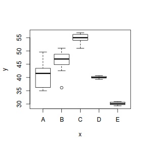
To assist us in the following demonstration, we will generate another data set - one that has heteroscedasticity (unequal variance) by design.
set.seed(1)
ngroups <- 5  #number of populations
nsample <- 10  #number of reps in each
pop.means <- c(40, 45, 55, 40, 30)  #population mean length
sigma <- rep(c(6, 4, 2, 0.5, 1), each = nsample)  #residual standard deviation
n <- ngroups * nsample  #total sample size
eps <- rnorm(n, 0, sigma)  #residuals
x <- gl(ngroups, nsample, n, lab = LETTERS[1:5])  #factor
means <- rep(pop.means, rep(nsample, ngroups))
X <- model.matrix(~x - 1)  #create a design matrix
y <- as.numeric(X %*% pop.means + eps)
data1 <- data.frame(y, x)
boxplot(y ~ x, data1)

plot(lm(y ~ x, data1), which = 3)
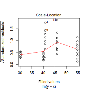
It turns out that if we switch over to maximum (log) likelihood estimation methods, we can model in a within-group heteroscedasticity structure rather than just assume one very narrow form of variance structure.
Lets take a step back and reflect on our simple ANOVA (regression) model that has five groups each with 10 observations: $$y = \mu + \alpha_i + \varepsilon, \quad \varepsilon \sim \mathcal{N}(0,\sigma^2)$$ This is shorthand notation to indicate that the response variable is being modelled against a specific linear predictor and that the residuals follow a normal distribution with a certain variance (that is the same for each group).
Rather than assume that the variance of each group is the same, we could relax this a little so as to permit different levels of variance per group: $$\varepsilon \sim \mathcal{N}(0,\sigma_i^2)$$
To achieve this, we actually multiply the variance matrix by a weighting matrix, where the weights associated with each group are determined by the inverse of the ratio of each group to the first (reference) group: $$\varepsilon \sim \mathcal{N}(0,\sigma_i^2\times \omega)$$
So returning to our five groups of 10 observations example, the weights would be determined as:
data1.sd <- with(data1, tapply(y, x, sd))
1/(data1.sd[1]/data1.sd)
         A          B          C          D          E
1.00000000 0.91342905 0.40807277 0.08632027 0.12720488
In order to incorporate these weights, we need to shift over to a different linear modelling function (gls within the nlme package). This function fits analogous models to lm(), yet allows us to describe the within-group heteroscedasticity and correlation structure.
library(nlme)
# Fit the standard linear model (assuming homogeneity of variances)
data1.gls <- gls(y ~ x, data = data1)
# Fit a linear model with different relative variance weights for each group.
data1.gls1 <- gls(y ~ x, data = data1, weights = varIdent(form = ~1 | x))
To determine whether allowing for separate variances per group, we can either:
- compare the fit of the two models (with and without separate variances)
- investigate the following hypothesis (that the variances of each groups are equal): $$\text{H}_0: \sigma_1^2 = \sigma_2^2 = \sigma_3^2 = \sigma_4^2 = \sigma_5^2 = \sigma^2$$
AIC(data1.gls, data1.gls1)
           df      AIC
data1.gls   6 249.4968
data1.gls1 10 199.2087
anova(data1.gls, data1.gls1)
           Model df      AIC      BIC     logLik   Test  L.Ratio p-value
data1.gls      1  6 249.4968 260.3368 -118.74841
data1.gls1     2 10 199.2087 217.2753  -89.60435 1 vs 2 58.28812  <.0001
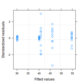
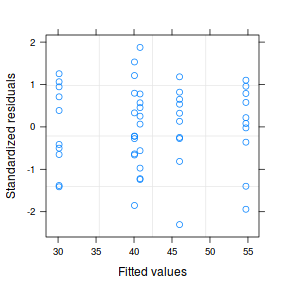
Both approaches offer the same conclusion: that the model allowing separate variances per group is substantially better. We can further confirm this, by exploring the standardized residuals.
plot(data1.gls1)

At this point, it might also be instruction to compare the two models (equal and separate variances) side by side:
summary(data1.gls) Generalized least squares fit by REML
Model: y ~ x
Data: data1
AIC BIC logLik
249.4968 260.3368 -118.7484
Coefficients:
Value Std.Error t-value p-value
(Intercept) 40.79322 0.9424249 43.28538 0.0000
xB 5.20216 1.3327901 3.90321 0.0003
xC 13.93944 1.3327901 10.45884 0.0000
xD -0.73285 1.3327901 -0.54986 0.5851
xE -10.65908 1.3327901 -7.99757 0.0000
Correlation:
(Intr) xB xC xD
xB -0.707
xC -0.707 0.500
xD -0.707 0.500 0.500
xE -0.707 0.500 0.500 0.500
Standardized residuals:
Min Q1 Med Q3 Max
-3.30653942 -0.24626108 0.06468242 0.39046918 2.94558782
Residual standard error: 2.980209
Degrees of freedom: 50 total; 45 residual
plot(data1.gls)  |
summary(data1.gls1) Generalized least squares fit by REML
Model: y ~ x
Data: data1
AIC BIC logLik
199.2087 217.2753 -89.60435
Variance function:
Structure: Different standard deviations per stratum
Formula: ~1 | x
Parameter estimates:
A B C D E
1.00000000 0.91342373 0.40807003 0.08631969 0.12720393
Coefficients:
Value Std.Error t-value p-value
(Intercept) 40.79322 1.481066 27.543153 0.0000
xB 5.20216 2.005924 2.593399 0.0128
xC 13.93944 1.599634 8.714142 0.0000
xD -0.73285 1.486573 -0.492981 0.6244
xE -10.65908 1.493000 -7.139371 0.0000
Correlation:
(Intr) xB xC xD
xB -0.738
xC -0.926 0.684
xD -0.996 0.736 0.922
xE -0.992 0.732 0.918 0.988
Standardized residuals:
Min Q1 Med Q3 Max
-2.3034239 -0.6178652 0.1064904 0.7596732 1.8743230
Residual standard error: 4.683541
Degrees of freedom: 50 total; 45 residual
plot(data1.gls1)  |
- Notice that allowing for separate variances per group has had no influence on the parameter estimates, only the standard deviation (and thus standard error) of these estimates. Note that each parameter has a unique standard error.
- The variance structure is provided for the separate variances - these are the weights.
A more thorough explanation follows
However, a more accurate way of writing the model would be to use matrix or vector notation:
$$\mathbf{Y}_{i} \sim \mathcal{N}(\mathbf{X}_i\times \boldsymbol{\beta}, \mathbf{V}_{i})$$
In other words, the values of Y are expected to be drawn from a normal distribution with an expected value equal to the linear predictor
($\mathbf{X}_i\times \boldsymbol{\beta}$) and a standard deviation of V.
where $i$ denotes each of the groups and thus $V_i$ represents the variance matrix for associated with the observations of each of the groups.
Let us focus more on the $\varepsilon \sim \mathcal{N}(0,\sigma^2)$.
Actually, the $\sigma^2$ should really be
- normally distributed
- independent
- equally varied - note that in the above representation there is only a single $\sigma^2$ (variance) term. This implies that there is a single variance that represents the variance for each observation (and thus within each group).
The bold symbols represent:
- $\mathbf{X}$ - the model matrices for the data in each group. The first column of each matrix is a vector or 1's and then there are additional columns for each of the effects ($\alpha_2$, $\alpha_3$, ...).
- $\boldsymbol{\beta}_i$ - the regression parameter associated with $i^{th}$ group.
- $\mathbf{V}_i$ - the variance matrix for the observations within each of the $i$ groups
In the above variance-covariance matrix, all of the off-diagonals are 0. This reflects the independence assumption. That is
set.seed(1) ngroups <- 5 #number of populations nsample <- 10 #number of reps in each pop.means <- c(40, 45, 55, 40, 30) #population mean length sigma <- rep(c(6, 4, 2, 0.5, 1), each = nsample) #residual standard deviation n <- ngroups * nsample #total sample size eps <- rnorm(n, 0, sigma) #residuals x <- gl(ngroups, nsample, n, lab = LETTERS[1:5]) #factor means <- rep(pop.means, rep(nsample, ngroups)) X <- model.matrix(~x - 1) #create a design matrix y <- as.numeric(X %*% pop.means + eps) data1 <- data.frame(y, x) head(data1) #print out the first six rows of the data set
y x 1 36.24128 A 2 41.10186 A 3 34.98623 A 4 49.57168 A 5 41.97705 A 6 35.07719 A
boxplot(y ~ x, data1)
data1.gls <- gls(y ~ x, data = data1) data1.gls1 <- gls(y ~ x, data = data1, weights = varIdent(form = ~1 | x)) anova(data1.gls, data1.gls1)
Model df AIC BIC logLik Test L.Ratio p-value data1.gls 1 6 249.4968 260.3368 -118.74841 data1.gls1 2 10 199.2087 217.2753 -89.60435 1 vs 2 58.28812 <.0001
par(mfrow = c(2, 1)) plot(data1.gls)
plot(data1.gls1)
summary(data1.gls)
Generalized least squares fit by REML
  Model: y ~ x
  Data: data1
       AIC      BIC    logLik
  249.4968 260.3368 -118.7484

Coefficients:
                Value Std.Error  t-value p-value
(Intercept)  40.79322 0.9424249 43.28538  0.0000
xB            5.20216 1.3327901  3.90321  0.0003
xC           13.93944 1.3327901 10.45884  0.0000
xD           -0.73285 1.3327901 -0.54986  0.5851
xE          -10.65908 1.3327901 -7.99757  0.0000

 Correlation:
   (Intr) xB     xC     xD
xB -0.707
xC -0.707  0.500
xD -0.707  0.500  0.500
xE -0.707  0.500  0.500  0.500

Standardized residuals:
        Min          Q1         Med          Q3         Max
-3.30653942 -0.24626108  0.06468242  0.39046918  2.94558782

Residual standard error: 2.980209
Degrees of freedom: 50 total; 45 residual
summary(data1.gls1)
Generalized least squares fit by REML
  Model: y ~ x
  Data: data1
       AIC      BIC    logLik
  199.2087 217.2753 -89.60435

Variance function:
 Structure: Different standard deviations per stratum
 Formula: ~1 | x
 Parameter estimates:
         A          B          C          D          E
1.00000000 0.91342373 0.40807003 0.08631969 0.12720393

Coefficients:
                Value Std.Error   t-value p-value
(Intercept)  40.79322  1.481066 27.543153  0.0000
xB            5.20216  2.005924  2.593399  0.0128
xC           13.93944  1.599634  8.714142  0.0000
xD           -0.73285  1.486573 -0.492981  0.6244
xE          -10.65908  1.493000 -7.139371  0.0000

 Correlation:
   (Intr) xB     xC     xD
xB -0.738
xC -0.926  0.684
xD -0.996  0.736  0.922
xE -0.992  0.732  0.918  0.988

Standardized residuals:
       Min         Q1        Med         Q3        Max
-2.3034239 -0.6178652  0.1064904  0.7596732  1.8743230

Residual standard error: 4.683541
Degrees of freedom: 50 total; 45 residual
anova(data1.gls1)
Denom. DF: 45
            numDF   F-value p-value
(Intercept)     1 131101.37  <.0001
x               4    696.75  <.0001
Worked Examples
- Logan (2010) - Chpt 10-11
- Quinn & Keough (2002) - Chpt 8-9
ANOVA and Tukey's test
Here is a modified example from Quinn and Keough (2002). Day and Quinn (1989) described an experiment that examined how rock surface type affected the recruitment of barnacles to a rocky shore. The experiment had a single factor, surface type, with 4 treatments or levels: algal species 1 (ALG1), algal species 2 (ALG2), naturally bare surfaces (NB) and artificially scraped bare surfaces (S). There were 5 replicate plots for each surface type and the response (dependent) variable was the number of newly recruited barnacles on each plot after 4 weeks.
Download Day data set| Format of day.csv data files | |||||||||||||||||||||||
|---|---|---|---|---|---|---|---|---|---|---|---|---|---|---|---|---|---|---|---|---|---|---|---|
|
 |
||||||||||||||||||||||
Open
the day data file.day <- read.table("../downloads/data/day.csv", header = T, sep = ",", strip.white = T) head(day)
  TREAT BARNACLE
1  ALG1       27
2  ALG1       19
3  ALG1       18
4  ALG1       23
5  ALG1       25
6  ALG2       24
Note that as with independent t-tests, variables are in columns with levels of the categorical variable listed repeatedly. Day and Quinn (1989) were interested in whether substrate type influenced barnacle recruitment. This is a biological question. To address this question statistically, it is first necessary to re-express the question from a statistical perspective.
- From a classical hypothesis testing point of view, what is the statistical question they are investigating? That is, what is their statistical H0?
- The appropriate statistical test for comparing the means of more than two groups, is an ANOVA. In the table below, list the assumptions of
ANOVA
along with how violations of each assumption
are diagnosed and/or the risks of violations are minimized.
Assumption Diagnostic/Risk Minimization I. II. III. - Check the assumption of homogeneity of variances by
plotting the sample (group) means against sample variances.
A strong relationship (positive or negative) between mean and variance suggests that the assumption of homogeneity of variances is likely to be violated.Show base graphics codemeans <- with(day, tapply(BARNACLE, TREAT, mean)) vars <- with(day, tapply(BARNACLE, TREAT, var)) plot(means, vars)
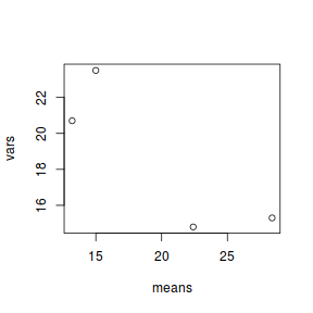 Show ggplot code
day.sum = day %>% group_by(TREAT) %>% summarize(Mean = mean(BARNACLE), Var = var(BARNACLE)) ggplot(day.sum, aes(y = Mean, x = Var)) + geom_point() + theme_classic()
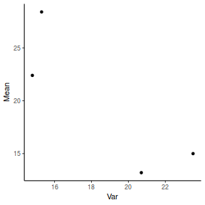
- Any evidence of non-homogeneity? (Y or N)
- Any evidence of non-homogeneity? (Y or N)
- Fit a linear model (ANOVA)
single factor ANOVA
HINT
Show code
contrasts(day$TREAT)
ALG2 NB S ALG1 0 0 0 ALG2 1 0 0 NB 0 1 0 S 0 0 1
day.lm <- lm(BARNACLE ~ TREAT, data = day)
- As with regression analysis, it is also a good habit to
examine the resulting diagnostics
(note that Leverage and thus Cook's D have no useful meaning for categorical X variables) and residual plot. If there are no obvious problems, then the analysis is likely to be reliable.
Show code - diagnostics
# setup a 2x6 plotting device with small margins par(mfrow = c(2, 3), oma = c(0, 0, 2, 0)) plot(day.lm, ask = F, which = 1:6)
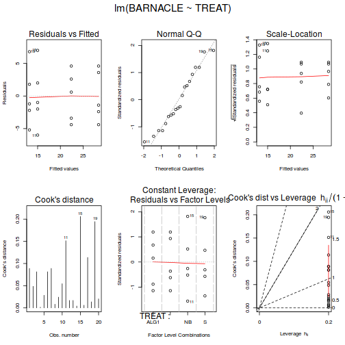 Show autoplot code - diagnostics
autoplot(day.lm, which = c(1, 2, 3, 5))
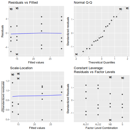
- Prior to exploring the fitted model, it is often useful to produce
partial effects plots. This will give us a graphical overview of the model. We can use
this is help interpret the parameter estimates and also evaluate how well the model
reflects the observed data.
Show effect code
effect("TREAT", day.lm) %>% plot
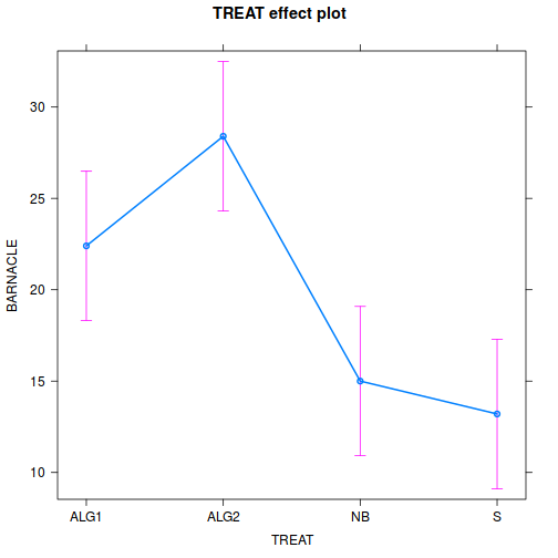 Show ggeffect code
ggeffect(day.lm, ~TREAT) %>% plot
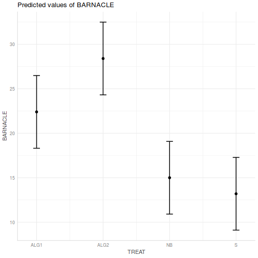 Show ggpredict code
ggpredict(day.lm, ~TREAT) %>% plot(rawdata = TRUE)
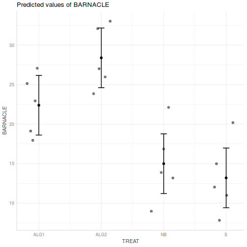 Show ggemmeans code
ggemmeans(day.lm, ~TREAT) %>% plot

- Test the null hypothesis that the population group means are equal.
Examine the ANOVA table
HINT.
Show code - coefficient table
summary(day.lm)
Call: lm(formula = BARNACLE ~ TREAT, data = day) Residuals: Min 1Q Median 3Q Max -6.00 -2.65 -1.10 2.85 7.00 Coefficients: Estimate Std. Error t value Pr(>|t|) (Intercept) 22.400 1.927 11.622 3.27e-09 *** TREATALG2 6.000 2.726 2.201 0.04275 * TREATNB -7.400 2.726 -2.715 0.01530 * TREATS -9.200 2.726 -3.375 0.00386 ** --- Signif. codes: 0 '***' 0.001 '**' 0.01 '*' 0.05 '.' 0.1 ' ' 1 Residual standard error: 4.31 on 16 degrees of freedom Multiple R-squared: 0.7125, Adjusted R-squared: 0.6586 F-statistic: 13.22 on 3 and 16 DF, p-value: 0.0001344confint(day.lm)
2.5 % 97.5 % (Intercept) 18.3140235 26.485977 TREATALG2 0.2215566 11.778443 TREATNB -13.1784434 -1.621557 TREATS -14.9784434 -3.421557
Show code - ANOVA tableanova(day.lm)
Analysis of Variance Table Response: BARNACLE Df Sum Sq Mean Sq F value Pr(>F) TREAT 3 736.55 245.517 13.218 0.0001344 *** Residuals 16 297.20 18.575 --- Signif. codes: 0 '***' 0.001 '**' 0.01 '*' 0.05 '.' 0.1 ' ' 1 - Identify
the important items from the ANOVA output
and fill out the following ANOVA table.
Source of Variation SS df MS F-ratio Between groups Residual (within groups) - What is the probability that the observed samples (and the degree of differences in barnacle recruitment between them) or ones more extreme, could be collected from populations in which there are no differences in barnacle recruitment. That is, what is the probability of having the above F-ratio or one more extreme when the null hypothesis is true?
- What statistical conclusion would you draw?
- Write the results out as though you were writing a research paper/thesis. For example (select the phrase that applies and fill in gaps with your results):
The mean number of barnacles recruiting was (choose the correct option)
(F =
, df =
,
, P =
)
different from the mean metabolic rate of female fulmars. To see how these results could be incorporated into a report, copy and paste the ANOVA table from the R Console into Word and add an appropriate table caption . - Such a result would normally be accompanied by a graph to illustrate the mean (and variability or precision thereof) barnacle recruitment on each substrate type. Construct such a
bar graph
showing the mean barnacle recruitment on each substrate type and an indication of the precision of the means with error bars. To see how these results could be incorporated into a report,
copy and paste the graph (as a metafile) into Word.
Show code - bargraph (dynamite plot)
# calculate the means and standard deviations for each group # separately library(dplyr) dat = day %>% group_by(TREAT) %>% summarize(means = mean(BARNACLE), ses = sd(BARNACLE)/sqrt(length(BARNACLE))) ## configure the margins for the figure par(mar = c(6, 10, 1, 1)) ## plot the bars xs <- barplot(dat$means, beside = T, axes = F, ann = F, ylim = c(0, max(dat$means + dat$ses))) # put on the error bars arrows(xs, dat$means - dat$ses, xs, dat$means + dat$ses, ang = 90, code = 3, length = 0.1) # put on the axes axis(1, at = xs, lab = levels(day$TREAT)) mtext("Substrate type", 1, line = 4, cex = 2) axis(2, las = 1) mtext("Mean number of newly\nrecruited barnacles", 2, line = 4, cex = 2) box(bty = "l")
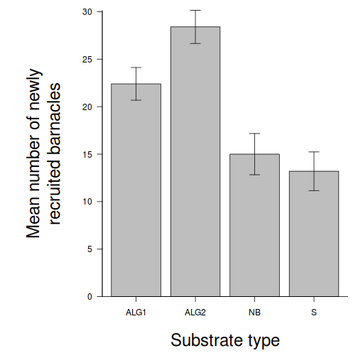 Show code - ggplot from raw data
# calculate the means and standard deviations for each group separately library(dplyr) dat = day %>% group_by(TREAT) %>% summarize(means=mean(BARNACLE), ses=sd(BARNACLE)/sqrt(length(BARNACLE))) library(ggplot2) library(grid) ggplot(dat,aes(x=TREAT,y=means))+ #plot the base plot scale_y_continuous("Mean number of newly recruited barnacles")+ #y-axis label scale_x_discrete("Substrate type")+ #x-axis label geom_pointrange(aes(ymax=means+2*ses, ymin=means-2*ses), position="dodge")+ #error bars theme_classic()+ coord_cartesian(ylim = c(0,35))+ theme(plot.margin=unit(c(0,0,2,2),"lines"), #plotting margins (top,right,bottom,left) axis.title.x=element_text(vjust=-2, size=rel(1.25)), #x-axis title format axis.title.y=element_text(vjust=1,size=rel(1.25),angle = 90)) #y-axis title format
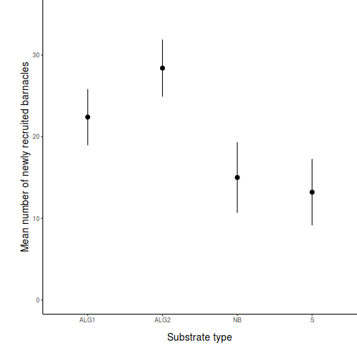 Show code - ggplot from modelled (predict) data
# model based means and confidence intervals newdata <- data.frame(TREAT=levels(day$TREAT)) fit <- predict(day.lm, newdata=newdata, interval='confidence') fit <- data.frame(newdata, fit) library(ggplot2) library(grid) ggplot(fit,aes(x=TREAT,y=fit))+ #plot the base plot scale_y_continuous("Mean number of newly recruited barnacles")+ #y-axis label scale_x_discrete("Substrate type")+ #x-axis label geom_pointrange(aes(ymax=upr, ymin=lwr), position="dodge")+ #error bars theme_classic()+ coord_cartesian(ylim = c(0,35))+ theme(plot.margin=unit(c(0,0,2,2),"lines"), #plotting margins (top,right,bottom,left) axis.title.x=element_text(vjust=-2, size=rel(1.25)), #x-axis title format axis.title.y=element_text(vjust=1,size=rel(1.25),angle = 90)) #y-axis title format
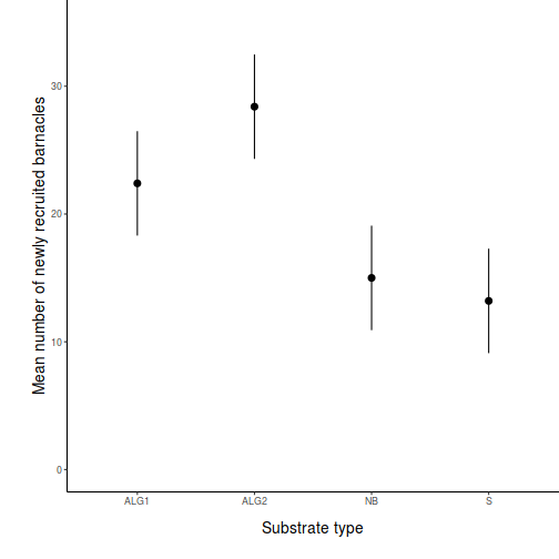 Show code - ggplot from modelled (emmeans) data
day.list = list(TREAT=levels(day$TREAT)) day.grid=ref_grid(day.lm, ~TREAT, at=day.list, cov.reduce=FALSE) newdata = day.grid %>% confint ggplot(newdata,aes(x=TREAT,y=prediction))+ #plot the base plot scale_y_continuous("Mean number of newly recruited barnacles")+ #y-axis label scale_x_discrete("Substrate type")+ #x-axis label geom_pointrange(aes(ymax=upper.CL, ymin=lower.CL), position="dodge")+ #error bars theme_classic()+ coord_cartesian(ylim = c(0,35))+ theme(plot.margin=unit(c(0,0,2,2),"lines"), #plotting margins (top,right,bottom,left) axis.title.x=element_text(vjust=-2, size=rel(1.25)), #x-axis title format axis.title.y=element_text(vjust=1,size=rel(1.25),angle = 90)) #y-axis title format
 Show code - ggplot from modelled (manually) data
newdata <- data.frame(TREAT=levels(day$TREAT)) Xmat = model.matrix(~TREAT, data=newdata) coefs = coef(day.lm) fit = as.vector(coefs %*% t(Xmat)) se = sqrt(diag(Xmat %*% vcov(day.lm) %*% t(Xmat))) Q = qt(0.975, df = df.residual(day.lm)) newdata = cbind(newdata, data.frame(fit = fit, lower = fit - Q * se, upper = fit + Q * se)) ggplot(newdata,aes(x=TREAT,y=fit))+ #plot the base plot scale_y_continuous("Mean number of newly recruited barnacles")+ #y-axis label scale_x_discrete("Substrate type")+ #x-axis label geom_pointrange(aes(ymax=upper, ymin=lower), position="dodge")+ #error bars theme_classic()+ coord_cartesian(ylim = c(0,35))+ theme(plot.margin=unit(c(0,0,2,2),"lines"), #plotting margins (top,right,bottom,left) axis.title.x=element_text(vjust=-2, size=rel(1.25)), #x-axis title format axis.title.y=element_text(vjust=1,size=rel(1.25),angle = 90)) #y-axis title format

- Although we have now established that there is a statistical difference between the group means, we do not yet know which group(s) are different from which other(s). For this data a
Tukey's multiple comparison test
(to determine which surface type groups are different from each other, in terms of number of barnacles) is appropriate.
Complete the following table for Tukey's pairwise comparison of group means:
(HINT) include differences between group means and Tukey's adjusted P-values (in brackets) for each pairwise comparison.
Show glht code
library(multcomp) summary(glht(day.lm, linfct = mcp(TREAT = "Tukey")))
Simultaneous Tests for General Linear Hypotheses Multiple Comparisons of Means: Tukey Contrasts Fit: lm(formula = BARNACLE ~ TREAT, data = day) Linear Hypotheses: Estimate Std. Error t value Pr(>|t|) ALG2 - ALG1 == 0 6.000 2.726 2.201 0.1650 NB - ALG1 == 0 -7.400 2.726 -2.715 0.0660 . S - ALG1 == 0 -9.200 2.726 -3.375 0.0181 * NB - ALG2 == 0 -13.400 2.726 -4.916 <0.001 *** S - ALG2 == 0 -15.200 2.726 -5.576 <0.001 *** S - NB == 0 -1.800 2.726 -0.660 0.9104 --- Signif. codes: 0 '***' 0.001 '**' 0.01 '*' 0.05 '.' 0.1 ' ' 1 (Adjusted p values reported -- single-step method)Show emmeans codeemmeans(day.lm, pairwise ~ TREAT) %>% summary
$emmeans TREAT emmean SE df lower.CL upper.CL ALG1 22.4 1.93 16 18.31 26.5 ALG2 28.4 1.93 16 24.31 32.5 NB 15.0 1.93 16 10.91 19.1 S 13.2 1.93 16 9.11 17.3 Confidence level used: 0.95 $contrasts contrast estimate SE df t.ratio p.value ALG1 - ALG2 -6.0 2.73 16 -2.201 0.1651 ALG1 - NB 7.4 2.73 16 2.715 0.0660 ALG1 - S 9.2 2.73 16 3.375 0.0182 ALG2 - NB 13.4 2.73 16 4.916 0.0008 ALG2 - S 15.2 2.73 16 5.576 0.0002 NB - S 1.8 2.73 16 0.660 0.9103 P value adjustment: tukey method for comparing a family of 4 estimates
emmeans(day.lm, pairwise ~ TREAT) %>% confint
$emmeans TREAT emmean SE df lower.CL upper.CL ALG1 22.4 1.93 16 18.31 26.5 ALG2 28.4 1.93 16 24.31 32.5 NB 15.0 1.93 16 10.91 19.1 S 13.2 1.93 16 9.11 17.3 Confidence level used: 0.95 $contrasts contrast estimate SE df lower.CL upper.CL ALG1 - ALG2 -6.0 2.73 16 -13.799 1.8 ALG1 - NB 7.4 2.73 16 -0.399 15.2 ALG1 - S 9.2 2.73 16 1.401 17.0 ALG2 - NB 13.4 2.73 16 5.601 21.2 ALG2 - S 15.2 2.73 16 7.401 23.0 NB - S 1.8 2.73 16 -5.999 9.6 Confidence level used: 0.95 Conf-level adjustment: tukey method for comparing a family of 4 estimates
ALG1 ALG2 NB s ALG1 0.000 (1.00) ALG2 6.000 (0.165) 0.000 (1.000) NB (
)
(
)
0.000 (1.000) S (
)
(
)
(
)
0.000 (1.000) - What are your conclusions from the Tukey's tests?
- A way of representing/summarizing the results of multiple comparison tests is to
incorporate symbols
into the bargraph such that
similarities and differences in the symbols associated with bars reflect
statistical outcomes. Modify the bargraph
(HINT) so as to incorporate
the Tukey's test results. Finally, generate an appropriate caption to accompany
this figure.
Show code - bargraph with alphabet soup
# calculate the means and standard deviations for each group separately library(dplyr) dat = day %>% group_by(TREAT) %>% summarize(means = mean(BARNACLE), ses = sd(BARNACLE)/sqrt(length(BARNACLE))) ## configure the margins for the figure par(mar = c(6, 10, 1, 1)) ## plot the bars xs <- barplot(dat$means, beside = T, axes = F, ann = F, ylim = c(0, max(dat$means + 2 * dat$ses))) # put on the error bars arrows(xs, dat$means - dat$ses, xs, dat$means + dat$ses, ang = 90, code = 3, length = 0.1) # put on the axes axis(1, at = xs, lab = levels(day$TREAT)) mtext("Substrate type", 1, line = 4, cex = 2) axis(2, las = 1) mtext("Mean number of newly\nrecruited barnacles", 2, line = 4, cex = 2) # add spaghetti to the graph text(xs, dat$means + dat$ses, lab = c("A", "A", "AC", "BC"), pos = 3) box(bty = "l")
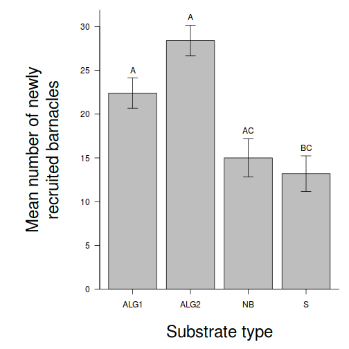
Using boxplots
(HINT), examine the assumptions of normality and homogeneity of variance. Note that when sample sizes are small (as is the case with this data set), these ANOVA assumptions cannot reliably be checked using boxplots since boxplots require at least 5 replicates (and preferably more), from which to calculate the median and quartiles. As with regression analysis, it is the assumption of homogeneity of variances (and in particular, whether there is a relationship between the mean and variance) that is of most concern for ANOVA.boxplot(BARNACLE ~ TREAT, data = day)
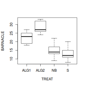
library(ggplot2)
ggplot(day, aes(y = BARNACLE, x = TREAT)) + geom_boxplot() + theme_classic()
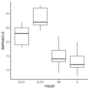
ANOVA and Tukey's test
Here is a modified example from Quinn and Keough (2002). Medley & Clements (1998) studied the response of diatom communities to heavy metals, especially zinc, in streams in the Rocky Mountain region of Colorado, U.S.A.. As part of their study, they sampled a number of stations (between four and seven) on six streams known to be polluted by heavy metals. At each station, they recorded a range of physiochemical variables (pH, dissolved oxygen etc.), zinc concentration, and variables describing the diatom community (species richness, species diversity H and proportion of diatom cells that were the early-successional species, Achanthes minutissima). One of their analyses was to ignore streams and partition the 34 stations into four zinc-level categories: background (< 20µg.l-1, 8 stations), low (21-50µg.l-1, 8 stations), medium (51-200µg.l-1, 9 stations), and high (> 200µg.l-1, 9 stations) and test null hypotheses that there we no differences in diatom species diversity between zinc-level groups, using stations as replicates. We will also use these data to test the null hypotheses that there are no differences in diatom species diversity between streams, again using stations as replicates.
Download Medley data set| Format of medley.csv data files | ||||||||||||||||||||||||||||||||||
|---|---|---|---|---|---|---|---|---|---|---|---|---|---|---|---|---|---|---|---|---|---|---|---|---|---|---|---|---|---|---|---|---|---|---|
|
 |
|||||||||||||||||||||||||||||||||
Open the medley data file.
medley <- read.table("../downloads/data/medley.csv", header = T, sep = ",", strip.white = T)
head(medley)
  STATION   ZINC DIVERSITY
1     ER1   BACK      2.27
2     ER2   HIGH      1.25
3     ER3   HIGH      1.15
4     ER4 MEDIUM      1.62
5     FC1   BACK      1.70
6     FC2   HIGH      0.63
Most statistical packages automatically order the levels of categorical variables alphabetically. Therefore, the levels of the ZINC categorical variable will automatically be ordered as (BACK, HIGH, LOW, MEDIUM). For some data sets the ordering of factors is not important. However, in the medley data set, it would make more sense if the factors were in the following order (BACK, LOW, MEDIUM, HIGH) as this would more correctly represent the relationships between the levels. Note that the ordering of a factor has no bearing on any analyses, it just makes the arrangement of data summaries within some graphs and tables more logical. It is therefore recommended that whenever a data set includes categorical variables, reorder the levels of these variables
into a logical order. HINTlevels(medley$ZINC)
[1] "BACK" "HIGH" "LOW" "MEDIUM"
medley$ZINC <- factor(medley$ZINC, levels = c("HIGH", "MEDIUM", "LOW", "BACK"))
levels(medley$ZINC)
[1] "HIGH" "MEDIUM" "LOW" "BACK"
- Check the ANOVA assumptions using a
boxplots
HINT. Any evidence of skewness? Outliers? Does the spread of data look homogeneous between the different Zinc levels?
Show codeboxplot(DIVERSITY ~ ZINC, data = medley)
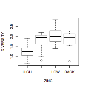 Show ggplot code
library(ggplot2)
ggplot(medley, aes(y = DIVERSITY, x = ZINC)) + geom_boxplot() + theme_classic()
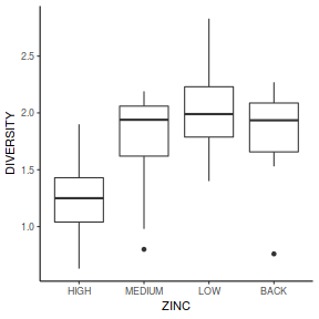
- If the assumptions seem reasonable, fit the linear model
Show code
medley.lm <- lm(DIVERSITY ~ ZINC, data = medley)
- Check the
residuals
(HINT).
Show code
# setup a 2x6 plotting device with small margins
par(mfrow = c(2, 3), oma = c(0, 0, 2, 0))
plot(medley.lm, ask = F, which = 1:6)
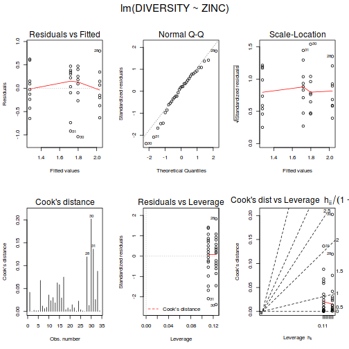 Show autoplot code
autoplot(medley.lm, which = c(1, 2, 3, 5))
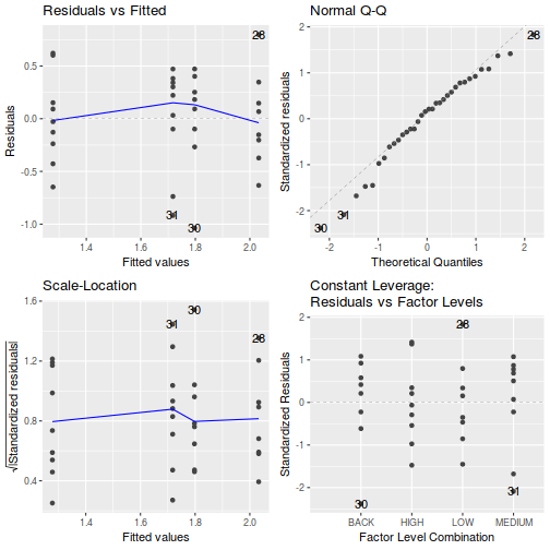
- If still there is no clear indication of problems,
examine the ANOVA table
(HINT).
Show code
summary(medley.lm)
Call: lm(formula = DIVERSITY ~ ZINC, data = medley) Residuals: Min 1Q Median 3Q Max -1.03750 -0.22896 0.07986 0.33222 0.79750 Coefficients: Estimate Std. Error t value Pr(>|t|) (Intercept) 1.2778 0.1554 8.225 3.51e-09 *** ZINCMEDIUM 0.4400 0.2197 2.003 0.0543 . ZINCLOW 0.7547 0.2265 3.333 0.0023 ** ZINCBACK 0.5197 0.2265 2.295 0.0289 * --- Signif. codes: 0 '***' 0.001 '**' 0.01 '*' 0.05 '.' 0.1 ' ' 1 Residual standard error: 0.4661 on 30 degrees of freedom Multiple R-squared: 0.2826, Adjusted R-squared: 0.2108 F-statistic: 3.939 on 3 and 30 DF, p-value: 0.01756anova(medley.lm)
Analysis of Variance Table Response: DIVERSITY Df Sum Sq Mean Sq F value Pr(>F) ZINC 3 2.5666 0.85554 3.9387 0.01756 * Residuals 30 6.5164 0.21721 --- Signif. codes: 0 '***' 0.001 '**' 0.01 '*' 0.05 '.' 0.1 ' ' 1tidy(medley.lm)
# A tibble: 4 x 5
  term        estimate std.error statistic       p.value
  <chr>          <dbl>     <dbl>     <dbl>         <dbl>
1 (Intercept)    1.28      0.155      8.22 0.00000000351
2 ZINCMEDIUM     0.44      0.220      2.00 0.0543
3 ZINCLOW        0.755     0.226      3.33 0.00230
4 ZINCBACK       0.520     0.226      2.29 0.0289
- Write the results out as though you were writing a research paper/thesis. For example (select the phrase that applies and fill in gaps with your results):
The mean diatom diversity was (choose the correct option)
(F =
, df =
,
, P =
)
different between the four zinc level groups.
This can be abbreviated to FdfGroups,dfResidual=fratio, P=pvalue.To see how the full anova table might be included in a report/thesis, Copy and paste the ANOVA table into Word and add an appropriate table caption . - Such a result would normally be accompanied by a graph to illustrate the means as well as an indication of the precision of the means.
Copy and paste the graph (as a metafile) into Word
.
Show code - bargraph (dynamite plot)
# calculate the means and standard deviations for each group
# separately
library(dplyr)
dat = medley %>% group_by(ZINC) %>% summarize(means = mean(DIVERSITY),
    ses = sd(DIVERSITY)/sqrt(length(DIVERSITY)))
## configure the margins for the figure
par(mar = c(6, 10, 1, 1))
## plot the bars
xs <- barplot(dat$means, beside = T, axes = F, ann = F, ylim = c(0,
    max(dat$means + dat$ses)))
# put on the error bars
arrows(xs, dat$means - dat$ses, xs, dat$means + dat$ses, ang = 90,
    code = 3, length = 0.1)
# put on the axes
axis(1, at = xs, lab = levels(medley$ZINC))
mtext("Zinc level", 1, line = 4, cex = 2)
axis(2, las = 1)
mtext("Diatom diversity", 2, line = 4, cex = 2)
box(bty = "l")
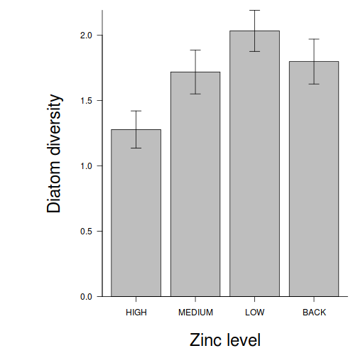 Show code - ggplot from raw data
# calculate the means and standard deviations for each group
# separately
library(dplyr)
dat = medley %>% group_by(ZINC) %>% summarize(means = mean(DIVERSITY),
    ses = sd(DIVERSITY)/sqrt(length(DIVERSITY)))
library(ggplot2)
library(grid)
ggplot(dat, aes(x = ZINC, y = means)) + scale_y_continuous("Diatom diversity") +
    scale_x_discrete("Zinc level") + geom_pointrange(aes(ymax = means +
    2 * ses, ymin = means - 2 * ses), position = "dodge") + theme_classic() +
    coord_cartesian(ylim = c(0, 2.5)) + theme(plot.margin = unit(c(0.5,
    0.5, 2, 2), "lines"), axis.title.x = element_text(vjust = -2,
    size = rel(1.25)), axis.title.y = element_text(vjust = 1,
    size = rel(1.25), angle = 90))
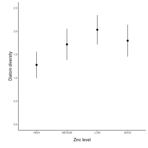 Show code - ggplot from modelled data
# model based means and confidence intervals
newdata <- data.frame(ZINC = levels(medley$ZINC))
fit <- predict(medley.lm, newdata = newdata, interval = "confidence")
fit <- data.frame(newdata, fit)
fit$ZINC <- factor(fit$ZINC, levels = c("HIGH", "MEDIUM", "LOW",
    "BACK"))
library(ggplot2)
library(grid)
ggplot(fit, aes(x = ZINC, y = fit)) + scale_y_continuous("Diatom diversity") +
    scale_x_discrete("Zinc level") + geom_pointrange(aes(ymax = upr,
    ymin = lwr), position = "dodge") + theme_classic() + coord_cartesian(ylim = c(0,
    2.5)) + theme(plot.margin = unit(c(0.5, 0.5, 2, 2), "lines"),
    axis.title.x = element_text(vjust = -2, size = rel(1.25)),
    axis.title.y = element_text(vjust = 1, size = rel(1.25),
        angle = 90))
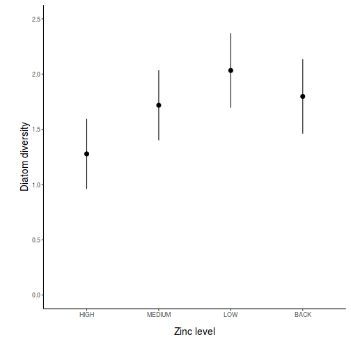 Show code - ggplot from modelled (predict) data
                                          # model based means and confidence intervals
                                          newdata <- data.frame(ZINC=levels(medley$ZINC))
                                          fit <- predict(medley.lm, newdata=newdata, interval='confidence')
                                          fit <- data.frame(newdata, fit)
                                          library(ggplot2)
                                          library(grid)
                                          ggplot(fit,aes(x=ZINC,y=fit))+                  #plot the base plot
                                          scale_y_continuous("Diatom diversity")+ #y-axis label
                                          scale_x_discrete("Zinc level")+                           #x-axis label
                                          geom_pointrange(aes(ymax=upr, ymin=lwr), position="dodge")+  #error bars
                                          theme_classic()+
                                          coord_cartesian(ylim = c(0,2.5))+
                                          theme(plot.margin=unit(c(0.5,0.5,2,2),"lines"),
                                          axis.title.x=element_text(vjust=-2, size=rel(1.25)),
                                          axis.title.y=element_text(vjust=1,size=rel(1.25),angle = 90))
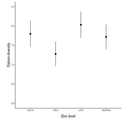 Show code - ggplot from modelled (emmeans) data
                                          medley.list = list(ZINC=levels(medley$ZINC))
                                          medley.grid=ref_grid(medley.lm, ~ZINC, at=medley.list, cov.reduce=FALSE)
                                          newdata = medley.grid %>% confint
                                          ggplot(newdata,aes(x=ZINC,y=prediction))+                  #plot the base plot
                                          scale_y_continuous("Diatom diversity")+ #y-axis label
                                          scale_x_discrete("Zinc level")+                           #x-axis label
                                          geom_pointrange(aes(ymax=upper.CL, ymin=lower.CL), position="dodge")+  #error bars
                                          theme_classic()+
                                          coord_cartesian(ylim = c(0,2.5))+
                                          theme(plot.margin=unit(c(0.5,0.5,2,2),"lines"),
                                          axis.title.x=element_text(vjust=-2, size=rel(1.25)),
                                          axis.title.y=element_text(vjust=1,size=rel(1.25),angle = 90))
 Show code - ggplot from modelled (manually) data
                                          newdata <- data.frame(ZINC=levels(medley$ZINC))
                                          Xmat = model.matrix(~ZINC, data=newdata)
                                          coefs = coef(medley.lm)
                                          fit = as.vector(coefs %*% t(Xmat))
                                          se = sqrt(diag(Xmat %*% vcov(medley.lm) %*% t(Xmat)))
                                          Q = qt(0.975, df = df.residual(medley.lm))
                                          newdata = cbind(newdata, data.frame(fit = fit, lower = fit -
                                          Q * se, upper = fit + Q * se))

                                          ggplot(newdata,aes(x=ZINC,y=fit))+                  #plot the base plot
                                          scale_y_continuous("Diatom diversity")+ #y-axis label
                                          scale_x_discrete("Zinc level")+                           #x-axis label
                                          geom_pointrange(aes(ymax=upper, ymin=lower), position="dodge")+  #error bars
                                          theme_classic()+
                                          coord_cartesian(ylim = c(0,2.5))+
                                          theme(plot.margin=unit(c(0.5,0.5,2,2),"lines"),
                                          axis.title.x=element_text(vjust=-2, size=rel(1.25)),
                                          axis.title.y=element_text(vjust=1,size=rel(1.25),angle = 90))
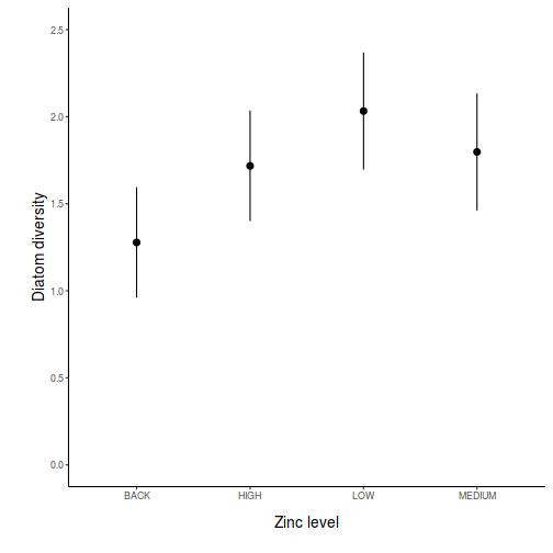
- Now determine which
zinc level groups were different from each other, in terms of diatom
species diversity, using a
Tukey's multiple comparison test
(HINT).
Show glht code
library(multcomp)
summary(glht(medley.lm, linfct = mcp(ZINC = "Tukey")))
 Simultaneous Tests for General Linear Hypotheses

Multiple Comparisons of Means: Tukey Contrasts


Fit: lm(formula = DIVERSITY ~ ZINC, data = medley)

Linear Hypotheses:
                   Estimate Std. Error t value Pr(>|t|)
MEDIUM - HIGH == 0  0.44000    0.21970   2.003   0.2097
LOW - HIGH == 0     0.75472    0.22647   3.333   0.0119 *
BACK - HIGH == 0    0.51972    0.22647   2.295   0.1219
LOW - MEDIUM == 0   0.31472    0.22647   1.390   0.5152
BACK - MEDIUM == 0  0.07972    0.22647   0.352   0.9847
BACK - LOW == 0    -0.23500    0.23303  -1.008   0.7457
---
Signif. codes:  0 '***' 0.001 '**' 0.01 '*' 0.05 '.' 0.1 ' ' 1
(Adjusted p values reported -- single-step method)
Show emmeans codeemmeans(medley.lm, pairwise ~ ZINC) %>% summary
$emmeans
 ZINC   emmean    SE df lower.CL upper.CL
 HIGH     1.28 0.155 30    0.961     1.60
 MEDIUM   1.72 0.155 30    1.401     2.04
 LOW      2.03 0.165 30    1.696     2.37
 BACK     1.80 0.165 30    1.461     2.13

Confidence level used: 0.95

$contrasts
 contrast      estimate    SE df t.ratio p.value
 HIGH - MEDIUM  -0.4400 0.220 30 -2.003  0.2096
 HIGH - LOW     -0.7547 0.226 30 -3.333  0.0117
 HIGH - BACK    -0.5197 0.226 30 -2.295  0.1219
 MEDIUM - LOW   -0.3147 0.226 30 -1.390  0.5153
 MEDIUM - BACK  -0.0797 0.226 30 -0.352  0.9847
 LOW - BACK      0.2350 0.233 30  1.008  0.7457

P value adjustment: tukey method for comparing a family of 4 estimates
emmeans(medley.lm, pairwise ~ ZINC) %>% confint
$emmeans
 ZINC   emmean    SE df lower.CL upper.CL
 HIGH     1.28 0.155 30    0.961     1.60
 MEDIUM   1.72 0.155 30    1.401     2.04
 LOW      2.03 0.165 30    1.696     2.37
 BACK     1.80 0.165 30    1.461     2.13

Confidence level used: 0.95

$contrasts
 contrast      estimate    SE df lower.CL upper.CL
 HIGH - MEDIUM  -0.4400 0.220 30   -1.037   0.1574
 HIGH - LOW     -0.7547 0.226 30   -1.371  -0.1389
 HIGH - BACK    -0.5197 0.226 30   -1.136   0.0961
 MEDIUM - LOW   -0.3147 0.226 30   -0.931   0.3011
 MEDIUM - BACK  -0.0797 0.226 30   -0.696   0.5361
 LOW - BACK      0.2350 0.233 30   -0.399   0.8686

Confidence level used: 0.95
Conf-level adjustment: tukey method for comparing a family of 4 estimates
ANOVA and planned comparisons (contrasts)
Here is a modified example from Quinn and Keough (2002). Partridge and Farquhar (1981) set up an experiment to examine the effect of reproductive activity on longevity (response variable) of male fruitflies (Drosophila sp.). A total of 125 male fruitflies were individually caged and randomly assigned to one of five treatment groups. Two of the groups were used to to investigate the effects of the number of partners (potential matings) on male longevity, and thus differed in the number of female partners in the cages (8 vs 1). There were two corresponding control groups containing eight and one newly pregnant female partners (with which the male flies cannot mate), which served as controls for any potential effects of competition between males and females for food or space on male longevity. The final group had no partners, and was used as an overall control to determine the longevity of un-partnered male fruitflies.
Download Partridge data set| Format of partridge.csv data files | |||||||||||||||||||||||||||
|---|---|---|---|---|---|---|---|---|---|---|---|---|---|---|---|---|---|---|---|---|---|---|---|---|---|---|---|
|
 |
||||||||||||||||||||||||||
Open the partridge data file.
partridge <- read.table("../downloads/data/partridge.csv", header = T, sep = ",", strip.white = T)
head(partridge)
  GROUP LONGEVITY
1 PREG8        35
2 PREG8        37
3 PREG8        49
4 PREG8        46
5 PREG8        63
6 PREG8        39
- When comparing the mean male longevity of each group, what is the null hypothesis?
- Before performing the ANOVA, check the assumptions (Boxplots, scatterplot of Mean vs Variance) using the variable GROUP as the grouping (IV) variable for the X-axes. Is there any evidence that the ANOVA assumptions have been violated (Y or N)?
- In addition to the global ANOVA, we will address two specific questions by planned comparisons.
- "Is longevity affected by the presence of a large number of potential mates (8 virgin females compared to 1 virgin females)?" (contrast coefficients: 0, 0, 0, -1, 1)
- "Is longevity affected by the presence of any number of potential mates compared with either no partners or pregnant partners?" (contrast coefficients: -2, -2, -2, 3, 3)
These specific (planned) comparisons are performed by altering the contrast coefficients used in the model fitting. By default, when coding your factorial variable into numeric dummy variables, the contrast coefficients are defined as;
- the intercept is the mean of the first group
- the first contrast is the difference between the means of the first and second group
- the second contrast is the difference between the means and the third group
- ...
Show codelibrary(gmodels) cmat <- make.contrasts(rbind(c(0, 0, 0, 1, -1), c(-1/3, -1/3, -1/3, 1/2, 1/2))) cmat
     C1   C2            C3            C4
V1  0.0 -0.4 -1.859644e-01 -7.950370e-01
V2  0.0 -0.4 -5.955401e-01  5.585684e-01
V3  0.0 -0.4  7.815045e-01  2.364686e-01
V4  0.5  0.6 -6.938894e-17  5.551115e-17
V5 -0.5  0.6  9.714451e-17  0.000000e+00
# Check that the defined contrasts are orthogonal
round(crossprod(cmat), 2)
    C1  C2 C3 C4
C1 0.5 0.0  0  0
C2 0.0 1.2  0  0
C3 0.0 0.0  1  0
C4 0.0 0.0  0  1
# A contrast is considered orthogonal to others if the value
# corresponding to it and another in the lower (or upper) triangle of
# the cross product matrix is 0. Non-zero values indicate
# non-orthogonality.
contrasts(partridge$GROUP) <- cmat
# In order to incorporate planned comparisons in the anova table, it is
# necessary to convert linear model fitted via lm into aov objects
partridge.lm <- lm(LONGEVITY ~ GROUP, data = partridge)
summary(aov(partridge.lm), split = list(GROUP = list(`8virg vs 1virg` = 1,
    `Partners vs Controls` = 2)))
                               Df Sum Sq Mean Sq F value   Pr(>F)
GROUP                           4  11939    2985   13.61 3.52e-09 ***
  GROUP: 8virg vs 1virg         1   4068    4068   18.55 3.40e-05 ***
  GROUP: Partners vs Controls   1   7841    7841   35.76 2.36e-08 ***
Residuals                     120  26314     219
---
Signif. codes:  0 '***' 0.001 '**' 0.01 '*' 0.05 '.' 0.1 ' ' 1
# It is also possible to make similar conclusions via the t-tests<br>
# The above contrast F-tests correspond to the first two t-tests
# (GROUP1 and GROUP2)<br> Note that F=t<sup>2</sup><br>
summary(partridge.lm)
Call:
lm(formula = LONGEVITY ~ GROUP, data = partridge)

Residuals:
   Min     1Q Median     3Q    Max
-35.76  -8.76   0.20  11.20  32.44

Coefficients:
            Estimate Std. Error t value Pr(>|t|)
(Intercept)  57.4400     1.3245  43.368  < 2e-16 ***
GROUPC1      18.0400     4.1884   4.307 3.40e-05 ***
GROUPC2     -16.1667     2.7036  -5.980 2.36e-08 ***
GROUPC3      -0.8948     2.9616  -0.302    0.763
GROUPC4       0.6453     2.9616   0.218    0.828
---
Signif. codes:  0 '***' 0.001 '**' 0.01 '*' 0.05 '.' 0.1 ' ' 1

Residual standard error: 14.81 on 120 degrees of freedom
Multiple R-squared:  0.3121,	Adjusted R-squared:  0.2892
F-statistic: 13.61 on 4 and 120 DF,  p-value: 3.516e-09
Show contrasts codelibrary(multcomp) ## ensure that the contrasts are reset to the default contrasts(partridge$GROUP) <- contr.treatment partridge.lm <- lm(LONGEVITY ~ GROUP, data = partridge) cmat = rbind(c(0, 0, 0, 1, -1), c(-1/3, -1/3, -1/3, 1/2, 1/2)) # Check that the defined contrasts are orthogonal round(crossprod(cmat), 2)
      [,1]  [,2]  [,3]  [,4]  [,5]
[1,]  0.11  0.11  0.11 -0.17 -0.17
[2,]  0.11  0.11  0.11 -0.17 -0.17
[3,]  0.11  0.11  0.11 -0.17 -0.17
[4,] -0.17 -0.17 -0.17  1.25 -0.75
[5,] -0.17 -0.17 -0.17 -0.75  1.25
cmat = cbind(0, cmat %*% contr.treatment(5))
summary(glht(partridge.lm, linfct = cmat))
Simultaneous Tests for General Linear Hypotheses Fit: lm(formula = LONGEVITY ~ GROUP, data = partridge) Linear Hypotheses: Estimate Std. Error t value Pr(>|t|) 1 == 0 18.040 4.188 4.307 6.80e-05 *** 2 == 0 -16.167 2.704 -5.980 4.73e-08 *** --- Signif. codes: 0 '***' 0.001 '**' 0.01 '*' 0.05 '.' 0.1 ' ' 1 (Adjusted p values reported -- single-step method)confint(glht(partridge.lm, linfct = cmat))
 Simultaneous Confidence Intervals

Fit: lm(formula = LONGEVITY ~ GROUP, data = partridge)

Quantile = 2.264
95% family-wise confidence level


Linear Hypotheses:
       Estimate lwr      upr
1 == 0  18.0400   8.5577  27.5223
2 == 0 -16.1667 -22.2875 -10.0459
Show emmeans codelibrary(emmeans) ## ensure that the contrasts are reset to the default contrasts(partridge$GROUP) <- contr.treatment partridge.lm <- lm(LONGEVITY ~ GROUP, data = partridge) cmat = cbind(c(0, 0, 0, 1, -1), c(-1/3, -1/3, -1/3, 1/2, 1/2)) # Check that the defined contrasts are orthogonal round(crossprod(cmat), 2)
     [,1] [,2]
[1,]    2 0.00
[2,]    0 0.83
emmeans(partridge.lm, ~GROUP, contr = list(GROUP = cmat))
$emmeans
 GROUP   emmean   SE  df lower.CL upper.CL
 NONE0     63.6 2.96 120     57.7     69.4
 PREG1     64.8 2.96 120     58.9     70.7
 PREG8     63.4 2.96 120     57.5     69.2
 VIRGIN1   56.8 2.96 120     50.9     62.6
 VIRGIN8   38.7 2.96 120     32.9     44.6

Confidence level used: 0.95

$contrasts
 contrast estimate   SE  df t.ratio p.value
 GROUP.1      18.0 4.19 120  4.307  <.0001
 GROUP.2     -16.2 2.70 120 -5.980  <.0001
emmeans(partridge.lm, ~GROUP, contr = list(GROUP = cmat)) %>% confint
$emmeans
 GROUP   emmean   SE  df lower.CL upper.CL
 NONE0     63.6 2.96 120     57.7     69.4
 PREG1     64.8 2.96 120     58.9     70.7
 PREG8     63.4 2.96 120     57.5     69.2
 VIRGIN1   56.8 2.96 120     50.9     62.6
 VIRGIN8   38.7 2.96 120     32.9     44.6

Confidence level used: 0.95

$contrasts
 contrast estimate   SE  df lower.CL upper.CL
 GROUP.1      18.0 4.19 120     9.75     26.3
 GROUP.2     -16.2 2.70 120   -21.52    -10.8

Confidence level used: 0.95
- Present the results of the planned comparisons as part of the following ANOVA table:
Source of Variation SS df MS F-ratio Pvalue Between groups 8 virgin vs 1 virgin Partners vs Controls Residual (within groups) - Summarize the conclusions (statistical and biological) from the analyses.
- Summarize the conclusions (statistical and biological) from the analyses.
- Global null hypothesis (H0: population group means all equal)
- Planned comparison 1 (H0: population mean of 8PREG group is equal to that of 1PREG)
- Planned comparison 2 (H0: population mean of average of 1PREG and 8PREG groups are equal to the population mean of average of CONTROL, 1VIRGIN and 8VIRGIN groups)
- Global null hypothesis (H0: population group means all equal)
- List any other specific comparisons that may have been of interest to this study. Remember that the total number of comparisons should not exceed the global degrees of freedom (4 in this case) and each outcome of each comparison should be independent of all other comparisons.
- Attempt to redefine the set of contrasts including any additional ones you thought of from Q3-8 above. Assess whether or not orthogonality is still met. If it is, refit the linear model.
- Finally, construct an appropriate bargraph or other graphic to
accompany the above analyses.
Show code - bargraph (dynamite plot)
# calculate the means and standard deviations for each group separately
library(dplyr)
dat = partridge %>% group_by(GROUP) %>% summarize(means = mean(LONGEVITY),
    ses = sd(LONGEVITY)/sqrt(length(LONGEVITY)))
## configure the margins for the figure
par(mar = c(6, 10, 1, 1))
## plot the bars
xs <- barplot(dat$means, beside = T, axes = F, ann = F, ylim = c(0, max(dat$means +
    dat$ses)))
# put on the error bars
arrows(xs, dat$means - dat$ses, xs, dat$means + dat$ses, ang = 90, code = 3,
    length = 0.1)
# put on the axes
axis(1, at = xs, lab = levels(partridge$GROUP))
mtext("Mating group", 1, line = 4, cex = 2)
axis(2, las = 1)
mtext("Male fruitfly longevity", 2, line = 4, cex = 2)
box(bty = "l")
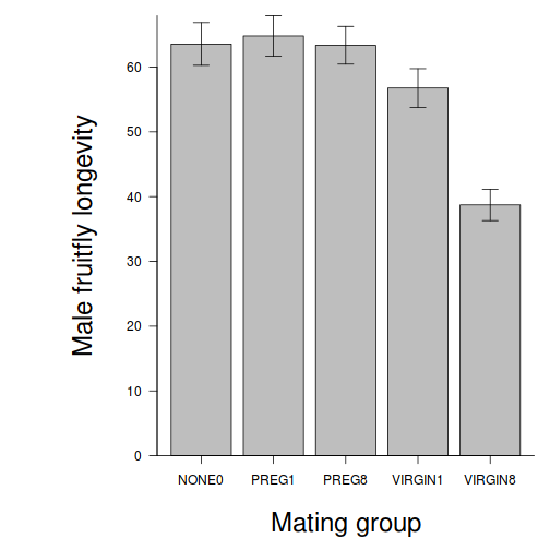 Show code - ggplot from raw data
# calculate the means and standard deviations for each group separately
dat <- ddply(partridge, ~GROUP, function(x) return(c(means = mean(x$LONGEVITY),
    ses = sd(x$LONGEVITY)/sqrt(length(x$LONGEVITY)))))
Error in ddply(partridge, ~GROUP, function(x) return(c(means = mean(x$LONGEVITY), : could not find function "ddply"
library(ggplot2)
library(grid)
ggplot(dat, aes(x = GROUP, y = means)) + scale_y_continuous("Male fruitfly longevity (medleys)") +
    scale_x_discrete("Group", labels = c("None", "1 Preg", "8 Preg", "1 Virgin",
        "8 Virgins")) + geom_pointrange(aes(ymax = means + 2 * ses, ymin = means -
    2 * ses), position = "dodge") + theme_classic() + coord_cartesian(ylim = c(0,
    80)) + theme(plot.margin = unit(c(0.5, 0.5, 2, 2), "lines"), axis.title.x = element_text(vjust = -2,
    size = rel(1.25)), axis.title.y = element_text(vjust = 1, size = rel(1.25),
    angle = 90))
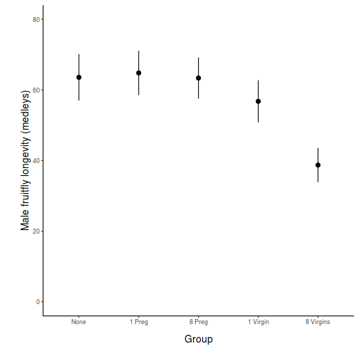 Show code - ggplot from modelled data
# model based means and confidence intervals
newdata <- data.frame(GROUP = levels(partridge$GROUP))
fit <- predict(partridge.lm, newdata = newdata, interval = "confidence")
fit <- data.frame(newdata, fit)
library(ggplot2)
library(grid)
ggplot(fit, aes(x = GROUP, y = fit)) + scale_y_continuous("Male fruitfly longevity (days)") +
    scale_x_discrete("Group", labels = c("None", "1 Preg", "8 Preg", "1 Virgin",
        "8 Virgins")) + geom_pointrange(aes(ymax = upr, ymin = lwr), position = "dodge") +
    theme_classic() + coord_cartesian(ylim = c(0, 80)) + theme(plot.margin = unit(c(0.5,
    0.5, 2, 2), "lines"), axis.title.x = element_text(vjust = -2, size = rel(1.25)),
    axis.title.y = element_text(vjust = 1, size = rel(1.25), angle = 90))
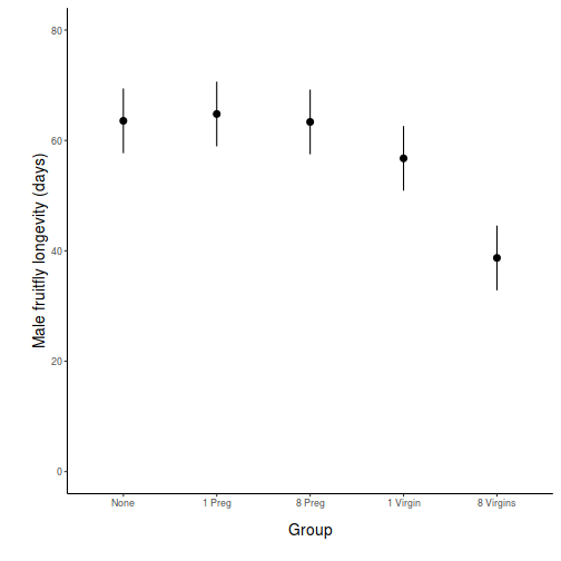
Note, normally we might like to adjust the ordering of the levels of the categorical variable (GROUP), however, in this case, the alphabetical ordering also results in the most logical ordering of levels.
In addition to the global ANOVA in which the overall effect of the factor on male fruit fly longevity is examined, a number of other comparisons can be performed to identify differences between specific groups. As with the previous question, we could perform Tukey's post-hoc pairwise comparisons to examine the differences between each group. Technically, it is only statistically legal to perform n-1 pairwise comparisons, where n is the number of groups. This is because if each individual comparison excepts a 5% (&alpha=0.05) probability of falsely rejecting the H0, then the greater the number of tests performed the greater the risk eventually making a statistical error. Post-hoc tests protect against such an outcome by adjusting the &alpha values for each individual comparison down. Consequently, the power of each comparison is greatly reduced.
This particular study was designed with particular comparisons in mind, while other pairwise comparisons would have very little biological meaning or importance. For example, in the context of the project aims, comparing group 1 with group 2 would not yield anything meaningful. As we have five groups (df=4), we can do four planned comparisons.
Note that the Residual (within groups) term is common to each planned comparison as well as the original global ANOVA.
ANOVA and planned comparisons
Snodgrass et al. (2000) were interested in how the assemblages of larval amphibians varied between depression wetlands in South Carolina, USA, with different hydrological regimes. A secondary question was whether the presence of fish, which only occurred in wetlands with long hydroperiods, also affected the assemblages of larval amphibians. They sampled 22 wetlands in 1997 (they originally had 25 but three dried out early in the study) and recorded the species richness and total abundance of larval amphibians as well as the abundance of individual taxa. Wetlands were also classified into three hydroperiods: short (6 wetlands), medium (5) and long (11) - the latter being split into those with fish (5) and those without (6). The short and medium hydroperiod wetlands did not have fish.
The overall question of interest is whether species richness differed between the four groups of wetlands. However, there are also specific questions related separately to hydroperiod and fish. Is there a difference in species richness between long hydroperiod wetlands with fish and those without? Is there a difference between the hydroperiods for wetlands without fish? We can address these questions with a single factor fixed effects ANOVA and planned contrasts using species richness of larval amphibians as the response variable and hydroperiod/fish category as the predictor (grouping variable).
Download Snodgrass data set| Format of snodgrass.csv data files | |||||||||||||||||||||||
|---|---|---|---|---|---|---|---|---|---|---|---|---|---|---|---|---|---|---|---|---|---|---|---|
|
 |
||||||||||||||||||||||
Open the snodgrass data file.
snodgrass <- read.table("../downloads/data/snodgrass.csv", header = T, sep = ",", strip.white = T)
head(snodgrass)
  HYDROPERIOD RICHNESS
1       Short        3
2       Short        7
3       Short        2
4       Short        3
5       Short        3
6       Short        5
- Examine the group means and variances
and boxplots
for species richness across the wetland categories HINT.
Show codeIs there any evidence that any of the assumptions have been violated? ('Y' or 'N')
means <- with(snodgrass, tapply(RICHNESS, HYDROPERIOD, mean))
vars <- with(snodgrass, tapply(RICHNESS, HYDROPERIOD, var))
plot(vars ~ means)
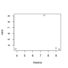
boxplot(RICHNESS ~ HYDROPERIOD, data = snodgrass)
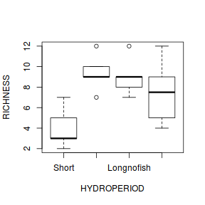
- Now fit a single factor ANOVA model
(HINT) and
examine the residuals
(HINT).
Show codeAny evidence of skewness or unequal variances? Any outliers? Any evidence of violations? ('Y' or 'N')
snodgrass.lm <- lm(RICHNESS ~ HYDROPERIOD, data = snodgrass)
# setup a 2x6 plotting device with small margins
par(mfrow = c(2, 3), oma = c(0, 0, 2, 0))
plot(snodgrass.lm, ask = F, which = 1:6)
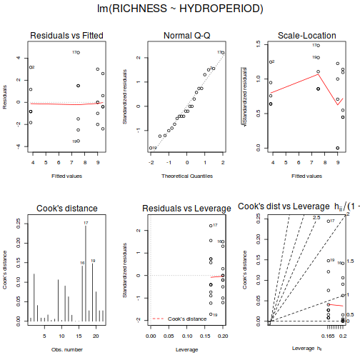
- As well as the overall analysis, Snodgrass et al. (2000) were particularly interested in two specific comparisons a) whether there was a difference in species richness between the long hydroperiod wetlands with and without fish, and b) whether there was a difference in species richness between permanent wetlands (long hydroperiods) and temporary wetlands (short and medium hydroperiods). What specific null hypotheses are being tested;
- Define the appropriate contrast coefficients (and thus comparisons)
(HINT),
check orthogonality (HINT),
define the contrast labels (HINT) and
refit the linear model incorporating these contrasts.
Show code
# define contrasts
library(gmodels)
cmat <- make.contrasts(rbind(c(0, 0, -1, 1), c(1/2, 1/2, -1/2, -1/2)))
round(crossprod(cmat), 2)
    C1 C2 C3
C1 0.5  0  0
C2 0.0  1  0
C3 0.0  0  1
contrasts(snodgrass$HYDROPERIOD) <- cmat
round(crossprod(contrasts(snodgrass$HYDROPERIOD)), 2)
    C1 C2 C3
C1 0.5  0  0
C2 0.0  1  0
C3 0.0  0  1
# define contrast labels
snodgrass.list <- list(HYDROPERIOD = list(`Long with vs Long without` = 1, `Permanent vs Temporary` = 2))
# refit model
snodgrass.lm <- lm(RICHNESS ~ HYDROPERIOD, data = snodgrass)
- Perform the
ANOVA
with specific comparisons
using the appropriate contrasts (HINT). Fill in the following table (HINT):
Show code
summary(snodgrass.lm)
Call: lm(formula = RICHNESS ~ HYDROPERIOD, data = snodgrass) Residuals: Min 1Q Median 3Q Max -3.500 -1.375 -0.400 1.417 4.500 Coefficients: Estimate Std. Error t value Pr(>|t|) (Intercept) 7.4333 0.4775 15.568 6.91e-12 *** HYDROPERIODC1 -1.5000 1.3505 -1.111 0.28131 HYDROPERIODC2 -1.6333 0.9549 -1.710 0.10437 HYDROPERIODC3 -3.9362 0.9549 -4.122 0.00064 *** --- Signif. codes: 0 '***' 0.001 '**' 0.01 '*' 0.05 '.' 0.1 ' ' 1 Residual standard error: 2.23 on 18 degrees of freedom Multiple R-squared: 0.5486, Adjusted R-squared: 0.4734 F-statistic: 7.293 on 3 and 18 DF, p-value: 0.00211summary(aov(snodgrass.lm), split = snodgrass.list)
                                         Df Sum Sq Mean Sq F value  Pr(>F)
HYDROPERIOD                               3 108.83   36.28   7.293 0.00211 **
  HYDROPERIOD: Long with vs Long without  1   4.83    4.83   0.971 0.33756
  HYDROPERIOD: Permanent vs Temporary     1  19.49   19.49   3.918 0.06327 .
Residuals                                18  89.53    4.97
---
Signif. codes:  0 '***' 0.001 '**' 0.01 '*' 0.05 '.' 0.1 ' ' 1
Source of Variation SS df MS F-ratio Pvalue Between groups Long with vs nofish Permanent vs Temporary Residual (within groups) - What statistical conclusions would you draw from the overall ANOVA and the two specific contrasts and what do they mean biologically?
- Finally, construct an appropriate
graphic
to accompany the above analyses.
Show code - bargraph (dynamite plot)
# calculate the means and standard deviations for each group separately
library(dplyr)
dat = snodgrass %>% group_by(HYDROPERIOD) %>% summarize(means = mean(RICHNESS),
    ses = sd(RICHNESS)/sqrt(length(RICHNESS)))
## configure the margins for the figure
par(mar = c(6, 10, 1, 1))
## plot the bars
xs <- barplot(dat$means, beside = T, axes = F, ann = F, ylim = c(0, max(dat$means +
    dat$ses)))
# put on the error bars
arrows(xs, dat$means - dat$ses, xs, dat$means + dat$ses, ang = 90, code = 3,
    length = 0.1)
# put on the axes
axis(1, at = xs, lab = levels(snodgrass$HYDROPERIOD))
mtext("Hydroperiod", 1, line = 4, cex = 2)
axis(2, las = 1)
mtext("Amphibian larval richness", 2, line = 4, cex = 2)
box(bty = "l")
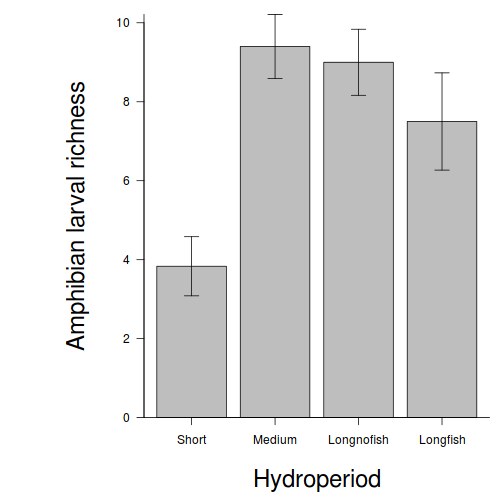 Show code - ggplot from raw data
# calculate the means and standard deviations for each group separately
dat = snodgrass %>% group_by(HYDROPERIOD) %>% summarize(means = mean(RICHNESS),
    ses = sd(RICHNESS)/sqrt(length(RICHNESS)))
library(ggplot2)
library(grid)
ggplot(dat, aes(x = HYDROPERIOD, y = means)) + scale_y_continuous("Amphibian larval richness") +
    scale_x_discrete("Hydroperiod", labels = c("Short", "Medium", "Long - no fish",
        "Long - with fish")) + geom_pointrange(aes(ymax = means + 2 * ses,
    ymin = means - 2 * ses), position = "dodge") + theme_classic() + coord_cartesian(ylim = c(0,
    12)) + theme(plot.margin = unit(c(0.5, 0.5, 2, 2), "lines"), axis.title.x = element_text(vjust = -2,
    size = rel(1.25)), axis.title.y = element_text(vjust = 1, size = rel(1.25),
    angle = 90))
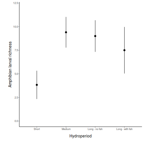 Show code - ggplot from modelled data
# model based means and confidence intervals
newdata <- data.frame(HYDROPERIOD = levels(snodgrass$HYDROPERIOD))
fit <- predict(snodgrass.lm, newdata = newdata, interval = "confidence")
fit <- data.frame(newdata, fit)
library(ggplot2)
library(grid)
ggplot(fit, aes(x = HYDROPERIOD, y = fit)) + scale_y_continuous("Amphibian larval richness") +
    scale_x_discrete("Hydroperiod", breaks = c("Short", "Medium", "Longnofish",
        "Longfish"), labels = c("Short", "Medium", "Long - no fish", "Long - with fish")) +
    geom_pointrange(aes(ymax = upr, ymin = lwr), position = "dodge") +
    theme_classic() + coord_cartesian(ylim = c(0, 12)) + theme(plot.margin = unit(c(0.5,
    0.5, 2, 2), "lines"), axis.title.x = element_text(vjust = -2, size = rel(1.25)),
    axis.title.y = element_text(vjust = 1, size = rel(1.25), angle = 90))
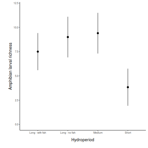
Reorder the factor levels
of HYDROPERIOD into a more logical order (e.g. Short, Medium, Longnofish, Longfish) HINTsnodgrass$HYDROPERIOD <- factor(snodgrass$HYDROPERIOD, levels = c("Short", "Medium", "Longnofish", "Longfish"))
ANOVA and power analysis
Laughing kookaburras (Dacelo novaguineae) live in coorperatively breeding groups of between two and eight individuals in which a dominant pair is assisted by their offspring from previous seasons. Their helpers are involved in all aspects of clutch, nestling and fledgling care. An ornithologist was interested in investigating whether there was an effect of group size on fledgling success. Previous research on semi captive pairs (without helpers) yielded a mean fledgling success rate of 1.65 (fledged young per year) with a standard deviation of 0.51. The ornithologist is planning to measure the success of breeding groups containing either two, four, six or eight individuals.
| Cooperative breading in kookaburras | |
|---|---|
 |
|
- When designing an experiment or sampling regime around an ANOVA, it is necessary to consider the nature in which groups could differ from each other and the overall mean. Typically, following on from a significant ANOVA, the patterns are further explored via either multiple pairwise comparisons, or if possible, more preferably via planned contrasts (see Exercises 1-4 above).
- Do we wish to detect the situation where just one group differs from all the others?
- Do we wish to be able to detect the situation where two of the groups differ from others?
- Do we wish to be able to detect
e situation where the groups differ according to some polynomial trend, or some other combination? - For the purpose of example, we are going to consider the design implications of a number of potential scenarios. In each case we will try to accommodate an effect size of 50% (we wish to be able to detect a change of at least 50% in response variable - mean fledgling success rate), a power of 0.8 and a significance criteria of 0.05. Calculate the expected sample sizes necessary to detect the following:
- The mean fledgling success rate of pairs in groups of two individuals is 50% less than the mean fledgling success rate of individuals in groups with larger numbers of individuals - that is,
µTWO<µFOUR=µSIX=µEIGHT
HINT
Show code
mean1 <- 1.65
sd1 <- 0.51
es <- 0.5
mean2 <- mean1 + (mean1 * es)
b.var <- var(c(mean1, mean2, mean2, mean2))
power.anova.test(group = 4, power = 0.8, between.var = b.var, within.var = sqrt(sd1))
Balanced one-way analysis of variance power calculation groups = 4 n = 16.26341 between.var = 0.1701562 within.var = 0.7141428 sig.level = 0.05 power = 0.8 NOTE: n is number in each group - The mean fledgling success rate of pairs in small groups (two and four) are equal and 50% less than the mean fledgling success rate of individuals in larger groups (six and eight)
- that is, µTWO=µFOUR<µSIX=µEIGHT
Show code
mean1 <- 1.65
sd1 <- 0.51
es <- 0.5
delta <- mean1 + (mean1 * es)
b.var <- var(c(mean1, mean1, mean2, mean2))
power.anova.test(group = 4, power = 0.8, between.var = b.var, within.var = sqrt(sd1))
Balanced one-way analysis of variance power calculation groups = 4 n = 12.46095 between.var = 0.226875 within.var = 0.7141428 sig.level = 0.05 power = 0.8 NOTE: n is number in each group - The mean fledgling success rate increases linearly by 50% with increasing group size.
Show code
mean1 <- 1.65
sd1 <- 0.51
es <- 0.5
delta <- mean1 + (mean1 * es)
b.var <- var(seq(mean1, mean2, l = 4))
power.anova.test(group = 4, power = 0.8, between.var = b.var, within.var = sqrt(sd1))
     Balanced one-way analysis of variance power calculation

         groups = 4
              n = 21.59329
    between.var = 0.1260417
     within.var = 0.7141428
      sig.level = 0.05
          power = 0.8

NOTE: n is number in each group
- The mean fledgling success rate of pairs in groups of two individuals is 50% less than the mean fledgling success rate of individuals in groups with larger numbers of individuals - that is,
µTWO<µFOUR=µSIX=µEIGHT
HINT
- Often when designing an experiment or survey it is useful to be able to estimate the relationship between power and sample size for a range of sample sizes and a range of outcomes so as to make more informed choices.
This can be done by plotting a power envelope
. Plot such an power envelope.
Show code
x <- seq(3, 30, l = 100)
b.var <- var(c(mean1, mean1, mean2, mean2))
plot(x, power.anova.test(group = 4, n = x, between.var = b.var, within.var = sqrt(sd1))$power, ylim = c(0,
    1), ylab = "power", xlab = "n", type = "l")
abline(0.8, 0, lty = 2)
m <- mean(c(mean1, mean2))
b.var <- var(c(mean1, m, m, mean2))
points(x, power.anova.test(group = 4, n = x, between.var = b.var, within.var = sqrt(sd1))$power, type = "l",
    lty = 2)
b.var <- var(c(mean1, mean2, mean2, mean2))
points(x, power.anova.test(group = 4, n = x, between.var = b.var, within.var = sqrt(sd1))$power, type = "l",
    lty = 3)
b.var <- var(seq(mean1, mean2, l = 4))
points(x, power.anova.test(group = 4, n = x, between.var = b.var, within.var = sqrt(sd1))$power, type = "l",
    lty = 4)

bw <- c(var(c(mean1, mean1, mean2, mean2)), var(c(mean1, m, m, mean2)))
points(x, power.anova.test(group = 4, n = x, between.var = bw, within.var = sqrt(sd1))$power, type = "l",
    col = "gray")
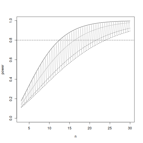
The ability (power) to detect an effect of a factor depends on sample size as well as levels of within an between group variation. While ANOVA assumes that all groups are equally varied, levels of between group variability are dependent on the nature of the trends that we wish to detect.
Note that we would not normally be contemplating accommodating both polynomial as well as non-polynomial contrasts or pairwise contrasts. We did so in Exercise 5-1 above purely for illustrative purposes!

