Tutorial 14.1 - Axis rotation and eigenanalysis
10 Jun 2015
> library(vegan)
> library(ggplot2)
> library(grid)
> #define my common ggplot options
> murray_opts <- opts(panel.grid.major=theme_blank(),
+                            panel.grid.minor=theme_blank(),
+                            panel.border = theme_blank(),
+                            panel.background = theme_blank(),
+                            axis.title.y=theme_text(size=15, vjust=0,angle=90),
+                            axis.text.y=theme_text(size=12),
+                            axis.title.x=theme_text(size=15, vjust=-1),
+                            axis.text.x=theme_text(size=12),
+                            axis.line = theme_segment(),
+                            plot.margin=unit(c(0.5,0.5,1,2),"lines")
+ )
Error: Use 'theme' instead. (Defunct; last used in version 0.9.1)
Recall that R-mode analyses are those analyses that re-organize multivariate data on the basis of variable associations. The majority of these analyses re-express a the original variables into a new orthogonal set of variables via a process of axis rotation (towards the planes of greatest fit) and re-projection in multidimensional space.
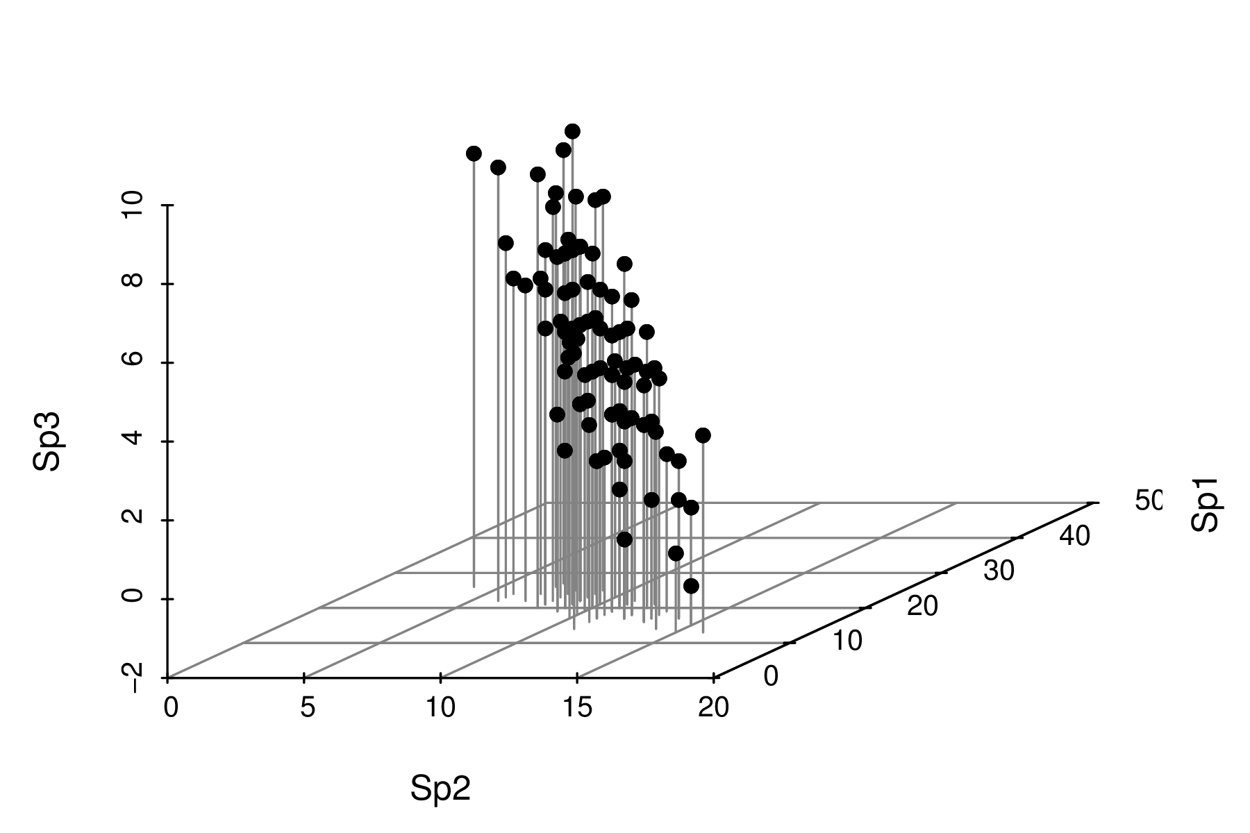
The following data will form the motivation for this section. The data are a simulated the abundances of three species from a total of 100 sites (or quadrats). Note, as only the first 10 rows are displayed in the table. Note also that the values are rounded versions of samples are drawn from a multivariate normal distribution. Therefore they are atypical of most species abundance data in that the variables will be normally distributed, linearly related and devoid of zeros.
> set.seed(1)
> COR <- matrix(c(
+ 1,-0.8,0.8,
+ -0.8,1,-0.8,
+ 0.8,-0.8,1.0
+ ),3,3,byrow=T)
>
> SD <- matrix(c(
+ 7.0,6,5,
+ 6,5,5,
+ 5,5,6
+ ),3,3,byrow=T)
>
> SIGMA <- COR * SD
> MEANS <- c(20,10,5)
> library(mvtnorm)
> X <- rmvnorm(n = 100, mean = MEANS, sigma = SIGMA)
> X<- round(X)
> colnames(X) <- paste("Sp",1:3,sep="")
|
 |
Axis rotation
Lets first explore the species abundance data in three dimensions (one for each variable).
|
|
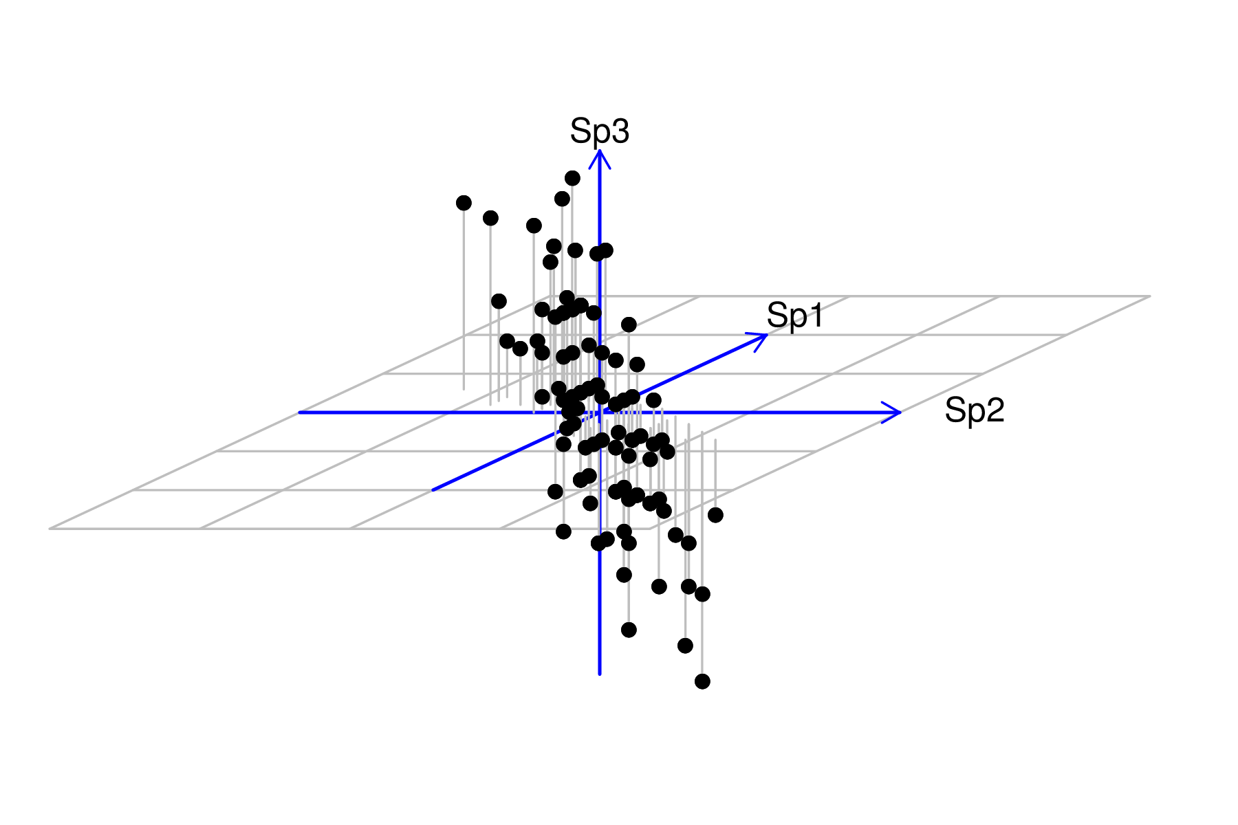
The first stage of axis rotation is to center the data. Centering places the axes origin through the middle of the data cloud. Centering is achieved by subtracting the row means from each of the observations. Alternatively, when there are also differences in the degree of variability in the variables, the data may be normalized to a mean of 0 (centering) and standard deviation of 1 (scaling).
|
|
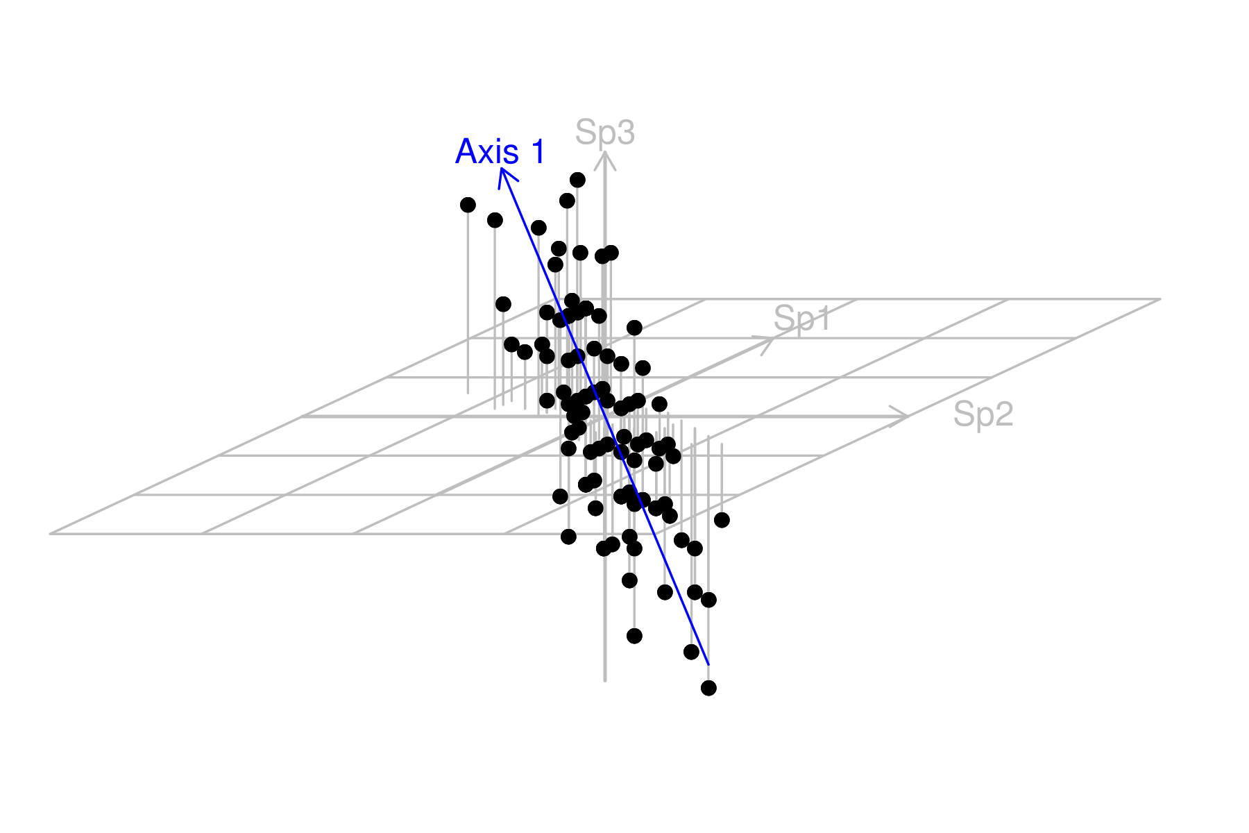
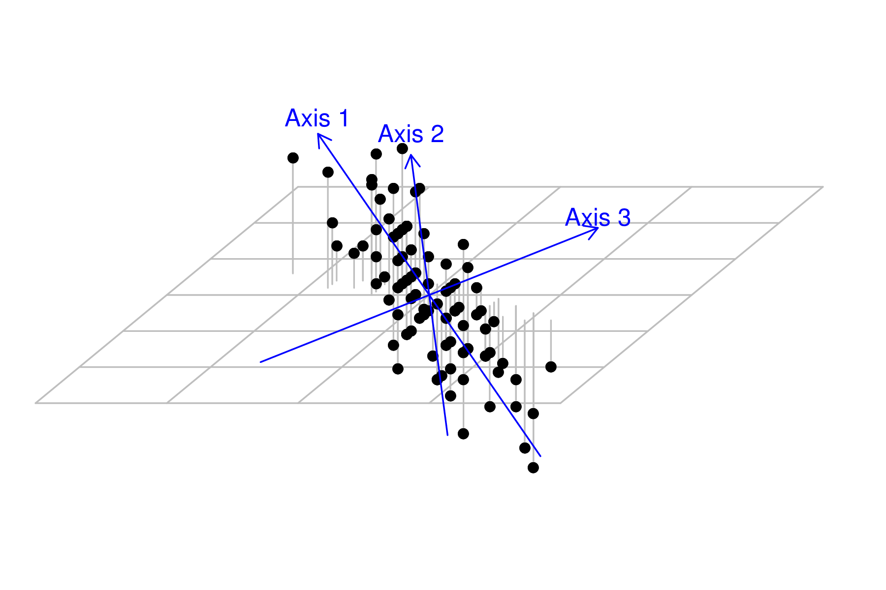
We now want to reorient (rotate) the axes such that the first axes follows the orientation of greatest variance (the greatest trend in the multivariate data). This should be a plane sloping from the back left to the front right.
|
|
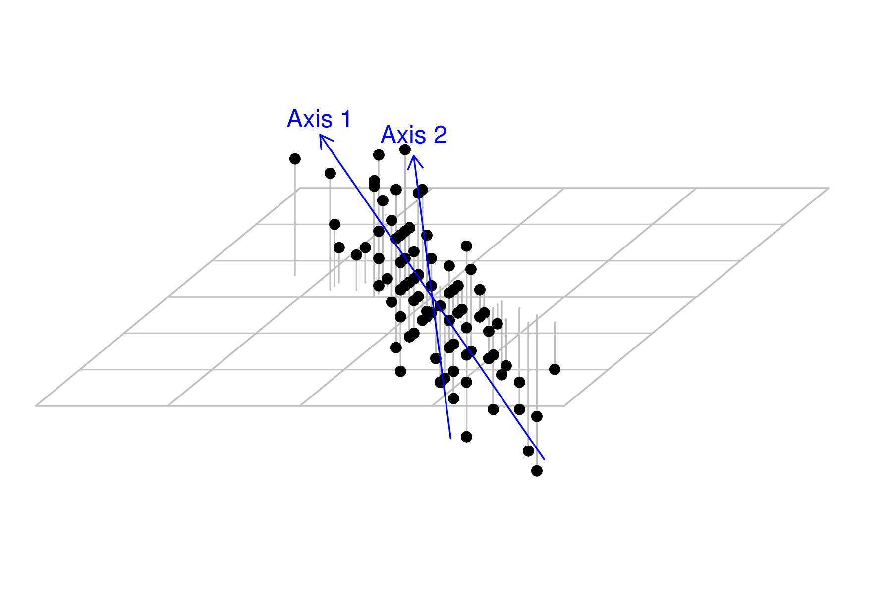
The next new axis should be orthogonal (perpendicular at right angles) to the first.
As there are three dimensions (since there are three variables), and we have already selected the orientation of one of those (axis 1), the next axis is free to be orientated at any right angle to the first. Imagine a disc centered at the 0,0,0 and perpendicular to the first new axis. The second new axis can be orientated towards any point around the edge of this arc. Choice of the exact orientation is such it is towards the next greatest amount of scatter (not accounted for by the first axis).
In order to see this new axis, we need to adjust the angle of the scatterplot slightly.
|
|
Of the three original dimensions, two new one have been locked in to new orientation. Therefore, in order to be orthogonal (at right angles) to both axis 1 and 2, there is only one possible orientation for axis 3. It will of course absorb any of the scatter not explained by axis 1 and 2.
|
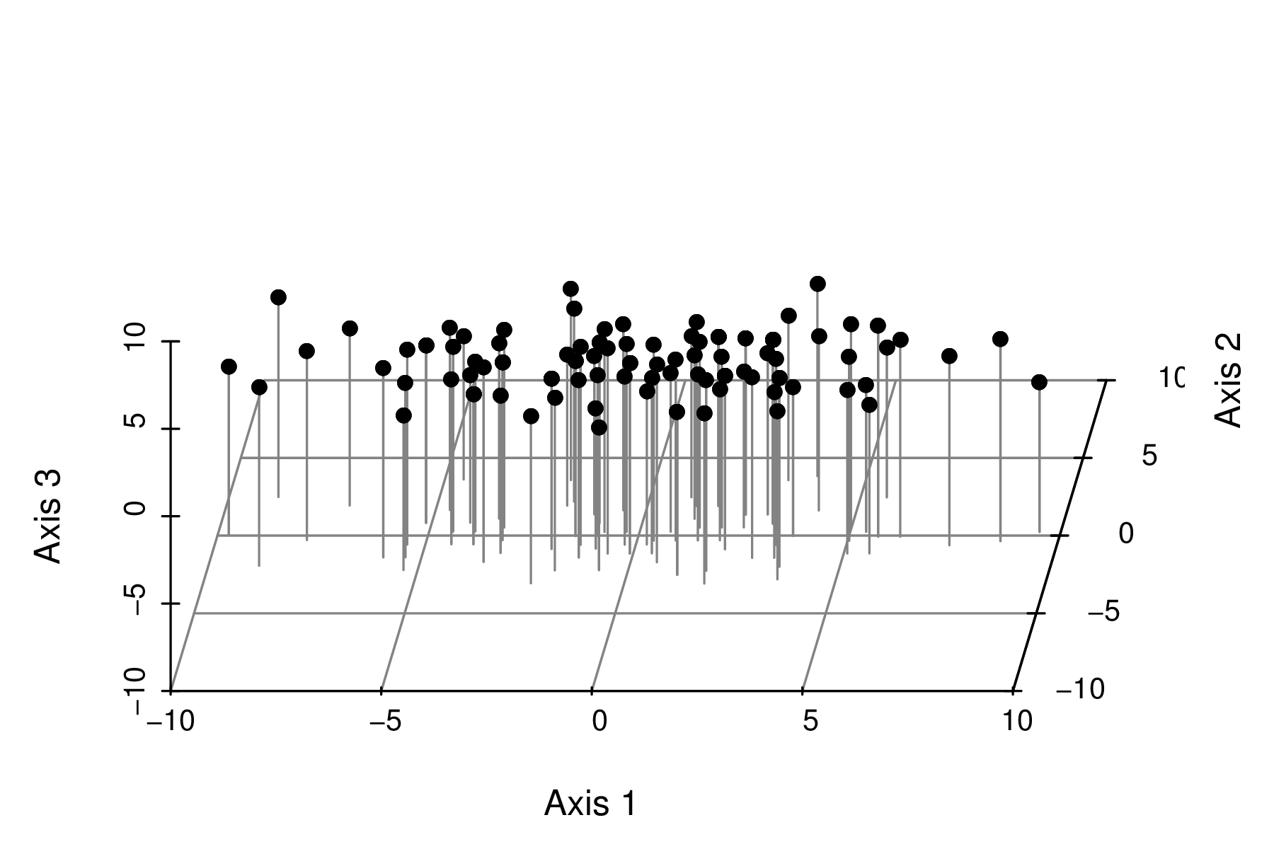
Hence the entire process is just a process of rotating the original axes and then reprojecting the points onto the new coordinate system.
|
It is quite evident that most of the variability is captured by the first axis (variable). The major spatial trends demonstrated by the three individual species in the original data set can be encapsulated within a single variable (that represent the community trends). It is likely that there is a single major environmental gradient present. |
Eigenvectors and eigenvalues
So how are the multidimensional trendlines fitted? Just as matrix algebra is used to find a line of best fit (which is analogous to a rotated axis) in simple regression, finding multidimensional trendlines (rotated axes) is also a matrix algebra process (albeit more complex).
The original vectors ($y_{i1}$, $y_{i2}$, etc, the variables) of the data matrix ($\textbf{Y}$) are mapped as a linear combination of the new matrix ($\textbf{X}$), $$\textbf{X} = c_0 + c_{1}y_{i1}+c_2y_{i2}+...+c_jy_{ij}$$ where $c_0$ is a constant analogous to the y-intercept in multiple regression and $c_1$, $c_2$ etc are weighting constants.
In this way, the original matrix ($\textbf{X}$) can be decomposed into matrices of scaled weights (eigenvectors, derived from the weights $c_1$, $c_2$ etc) and eigenvalues (amounts of original variances explained by each new variable) from which the new matrix of variables can be derived.
The eigenvectors indicate how much each of the original variables contribute (=correlate to) the new variables. The eigenvectors are scaled (typically so that the sum of their squares equals 1) to ensure that the variance explained by each new variable is restricted. There is an eigenvector value associated with each of the new variables and old variable pairing.
The eigenvalues (or latent roots) indicate how much of the original variance is explained by each of the new derived variables. Hence, there is one eigenvalue associated with each of the original variables. Typically, the new variables are listed in decreasing order of eigenvalues such that the variable that explains most of the original variation is listed first.
There are two ways to decompose.
- spectral (eigen) decomposition of a square ($m\times m$) symmetrical association matrix ($\textbf{A}=\textbf{YY'}$, such as a correlation or covariance matrix)
$$\textbf{A} = \textbf{U}\textbf{D}\textbf{U'} \hspace{1cm} \text{where},$$
- $\textbf{D}$ is a diagonal matrix of eigenvalues in units of variance. The values represent the lengths (and thus strengths) of the new axes (variables).
- $\textbf{U}$ is an orthogonal matrix of eigenvectors (correlations of the old variables to the new variables). Scaled versions of these eigenvectors are used as the weights ($c_1$, $c_2$) in the linear mapping to derive the new variables. The values represent the scaled coordinates of the old axes in the new projection and thus act as scaling factors to re-project points from the original coordinate system to the new coordinate system.
- single value decomposition of a $n\times p$ rectangular data matrix ($\textbf{Y}$)
$$\textbf{Y} = \textbf{U}\textbf{D}\textbf{V'}\hspace{1cm} \text{where},$$
- $\textbf{V}$ is an orthogonal matrix of principle component (variable) axes scores for each of the objects
- $\textbf{D}$ is a diagonal matrix of singular values - the eigenvalues in units of standard deviations
- $\textbf{U}$ is a orthogonal matrix of object (site) scores
- when $\textbf{A}$ is a sums-of-squares-and-cross-products matrix and $\textbf{Y}$ contains the original raw data
- when $\textbf{A}$ is a covariance matrix and $\textbf{Y}$ contains centered data
- when $\textbf{A}$ is a correlation matrix and $\textbf{Y}$ contains centered and standardized data