Workshop 9.4a - Analysis of Variance
9 June 2011
Basic ANOVA references
- Logan (2010) - Chpt 10-11
- Quinn & Keough (2002) - Chpt 8-9
ANOVA and Tukey's test
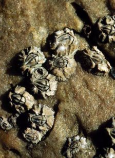
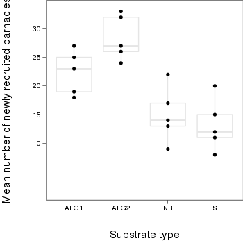
Here is a modified example from Quinn and Keough (2002). Day and Quinn (1989) described an experiment that examined how rock surface type affected the recruitment of barnacles to a rocky shore. The experiment had a single factor, surface type, with 4 treatments or levels: algal species 1 (ALG1), algal species 2 (ALG2), naturally bare surfaces (NB) and artificially scraped bare surfaces (S). There were 5 replicate plots for each surface type and the response (dependent) variable was the number of newly recruited barnacles on each plot after 4 weeks.
Download Day data set
| Format of day.csv data files | |||||||||||||||||||||||
|---|---|---|---|---|---|---|---|---|---|---|---|---|---|---|---|---|---|---|---|---|---|---|---|
|
 |
||||||||||||||||||||||
> day <- read.table("../downloads/data/day.csv", header = T, sep = ",",
+     strip.white = T)
> head(day)
  TREAT BARNACLE
1  ALG1       27
2  ALG1       19
3  ALG1       18
4  ALG1       23
5  ALG1       25
6  ALG2       24
Note that as with independent t-tests, variables are in columns with levels of the categorical variable listed repeatedly. Day and Quinn (1989) were interested in whether substrate type influenced barnacle recruitment. This is a biological question. To address this question statistically, it is first necessary to re-express the question from a statistical perspective.
| Assumption | Diagnostic/Risk Minimization |
|---|---|
| I. | |
| II. | |
| III. |
> boxplot(BARNACLE ~ TREAT, data = day)

> means <- with(day, tapply(BARNACLE, TREAT, mean))
> vars <- with(day, tapply(BARNACLE, TREAT, var))
> plot(means, vars)

- Any evidence of non-homogeneity? (Y or N)
> contrasts(day$TREAT)
     ALG2 NB S
ALG1    0  0 0
ALG2    1  0 0
NB      0  1 0
S       0  0 1
> day.lm <- lm(BARNACLE ~ TREAT, data = day)
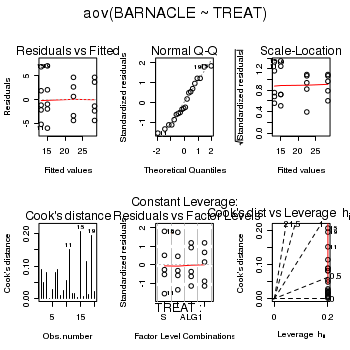
> day.aov <- lm(BARNACLE ~ TREAT, data = day)
> #OR
> day.aov <- aov(BARNACLE ~ TREAT, data = day)
> # setup a 2x6 plotting device with small margins
> par(mfrow = c(2, 3), oma = c(0, 0, 2, 0))
> plot(day.aov, ask = F, which = 1:6)
> anova(day.aov)
Analysis of Variance Table

Response: BARNACLE
          Df Sum Sq Mean Sq F value  Pr(>F)
TREAT      3    737   245.5    13.2 0.00013 ***
Residuals 16    297    18.6
---
Signif. codes:  0 '***' 0.001 '**' 0.01 '*' 0.05 '.' 0.1 ' ' 1
| Source of Variation | SS | df | MS | F-ratio |
|---|---|---|---|---|
| Between groups | ||||
| Residual (within groups) |
The mean number of barnacles recruiting was (choose the correct option)
different from the mean metabolic rate of female fulmars. To see how these results could be incorporated into a report, copy and paste the ANOVA table from the R Console into Word and add an appropriate table caption .
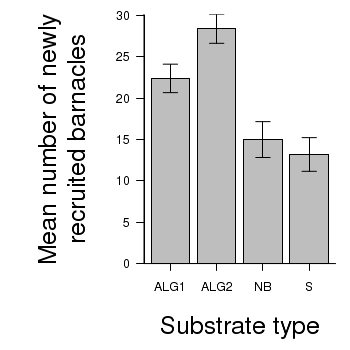
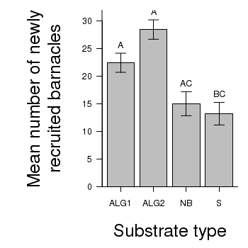
> # calculate the means and standard deviations for each group separately
> library(plyr)
> dat <- ddply(day, "TREAT", function(x) return(c(means = mean(x$BARNACLE),
+     ses = sd(x$BARNACLE)/sqrt(length(x$BARNACLE)))))
> ## configure the margins for the figure
> par(mar = c(6, 10, 1, 1))
> ## plot the bars
> xs <- barplot(dat$means, beside = T, axes = F, ann = F, ylim = c(0,
+     max(dat$means + dat$ses)))
> #put on the error bars
> arrows(xs, dat$means - dat$ses, xs, dat$means + dat$ses, ang = 90,
+     code = 3, length = 0.1)
> #put on the axes
> axis(1, at = xs, lab = levels(day$TREAT))
> mtext("Substrate type", 1, line = 4, cex = 2)
> axis(2, las = 1)
> mtext("Mean number of newly\nrecruited barnacles", 2, line = 4, cex = 2)
> box(bty = "l")
> # calculate the means and standard deviations for each group separately
> dat <- ddply(day,"TREAT", function(x)
+            return(c(means=mean(x$BARNACLE),ses=sd(x$BARNACLE)/sqrt(length(x$BARNACLE))))
+            )
> library(ggplot2)
> library(grid)
> plot.day<-ggplot(dat,aes(x=TREAT,y=means))+                  #plot the base plot
+                    geom_bar()+                                       #add the bars
+                    ylab("Mean number of newly recruited barnacles")+ #y-axis label
+                    xlab("Substrate type")+                           #x-axis label
+                    geom_linerange(aes(ymax=means+ses, ymin=means), position="dodge")+  #error bars
+                    theme_bw()+
+                    coord_cartesian(ylim = c(0,35))+
+                    opts(plot.margin=unit(c(0,0,2,2),"lines"),        #plotting margins (top,right,bottom,left)
+                          panel.grid.major = theme_blank(),               # switch off major gridlines
+              panel.grid.minor = theme_blank(),               # switch off minor gridlines,
+                      axis.title.x=theme_text(vjust=-3, size=15),      #x-axis title format
+                      axis.title.y=theme_text(vjust=-0.5,size=15,angle = 90))  #y-axis title format
> print(plot.day)
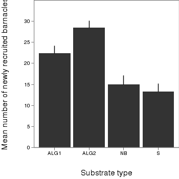
> library(ggplot2)
> plot.day<-ggplot(day,aes(x=factor(TREAT),y=BARNACLE))+                  #plot the base plot
+                    geom_boxplot(color="grey90")+                                          #add the bars
+                    geom_point()+
+                    ylab("Mean number of newly recruited barnacles")+ #y-axis label
+                    xlab("Substrate type")+                           #x-axis label
+                    theme_bw()+
+                    coord_cartesian(ylim = c(0,35))+
+                    opts(plot.margin=unit(c(0,0,2,2),"lines"),        #plotting margins (top,right,bottom,left)
+                          panel.grid.major = theme_blank(),               # switch off major gridlines
+              panel.grid.minor = theme_blank(),               # switch off minor gridlines,
+                      axis.title.x=theme_text(vjust=-3, size=15),      #x-axis title format
+                      axis.title.y=theme_text(vjust=-0.5,size=15,angle = 90))  #y-axis title format
> print(plot.day)
> library(multcomp)
> summary(glht(day.aov, linfct = mcp(TREAT = "Tukey")))
	 Simultaneous Tests for General Linear Hypotheses

Multiple Comparisons of Means: Tukey Contrasts


Fit: aov(formula = BARNACLE ~ TREAT, data = day)

Linear Hypotheses:
                 Estimate Std. Error t value Pr(>|t|)
ALG2 - ALG1 == 0     6.00       2.73    2.20    0.165
NB - ALG1 == 0      -7.40       2.73   -2.71    0.066 .
S - ALG1 == 0       -9.20       2.73   -3.38    0.018 *
NB - ALG2 == 0     -13.40       2.73   -4.92   <0.001 ***
S - ALG2 == 0      -15.20       2.73   -5.58   <0.001 ***
S - NB == 0         -1.80       2.73   -0.66    0.910
---
Signif. codes:  0 '***' 0.001 '**' 0.01 '*' 0.05 '.' 0.1 ' ' 1
(Adjusted p values reported -- single-step method)
| ALG1 | ALG2 | NB | s | |
|---|---|---|---|---|
| ALG1 | 0.000 (1.00) | |||
| ALG2 | 6.000 (0.165) | 0.000 (1.000) | ||
| NB | 0.000 (1.000) | |||
| S | 0.000 (1.000) |
> # calculate the means and standard deviations for each group separately
> library(plyr)
> dat <- ddply(day, "TREAT", function(x) return(c(means = mean(x$BARNACLE),
+     ses = sd(x$BARNACLE)/sqrt(length(x$BARNACLE)))))
> ## configure the margins for the figure
> par(mar = c(6, 10, 1, 1))
> ## plot the bars
> xs <- barplot(dat$means, beside = T, axes = F, ann = F, ylim = c(0,
+     max(dat$means + 2 * dat$ses)))
> #put on the error bars
> arrows(xs, dat$means - dat$ses, xs, dat$means + dat$ses, ang = 90,
+     code = 3, length = 0.1)
> #put on the axes
> axis(1, at = xs, lab = levels(day$TREAT))
> mtext("Substrate type", 1, line = 4, cex = 2)
> axis(2, las = 1)
> mtext("Mean number of newly\nrecruited barnacles", 2, line = 4, cex = 2)
> #add spaghetti to the graph
> text(xs, dat$means + dat$ses, lab = c("A", "A", "AC", "BC"), pos = 3)
> box(bty = "l")
ANOVA and Tukey's test
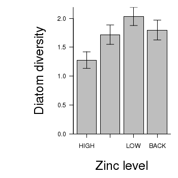
Here is a modified example from Quinn and Keough (2002). Medley & Clements (1998) studied the response of diatom communities to heavy metals, especially zinc, in streams in the Rocky Mountain region of Colorado, U.S.A.. As part of their study, they sampled a number of stations (between four and seven) on six streams known to be polluted by heavy metals. At each station, they recorded a range of physiochemical variables (pH, dissolved oxygen etc.), zinc concentration, and variables describing the diatom community (species richness, species diversity H and proportion of diatom cells that were the early-successional species, Achanthes minutissima). One of their analyses was to ignore streams and partition the 34 stations into four zinc-level categories: background (< 20µg.l-1, 8 stations), low (21-50µg.l-1, 8 stations), medium (51-200µg.l-1, 9 stations), and high (> 200µg.l-1, 9 stations) and test null hypotheses that there we no differences in diatom species diversity between zinc-level groups, using stations as replicates. We will also use these data to test the null hypotheses that there are no differences in diatom species diversity between streams, again using stations as replicates.
Download Medley data set
| Format of medley.csv data files | ||||||||||||||||||||||||||||||||||
|---|---|---|---|---|---|---|---|---|---|---|---|---|---|---|---|---|---|---|---|---|---|---|---|---|---|---|---|---|---|---|---|---|---|---|
|
 |
|||||||||||||||||||||||||||||||||
Open the medley data file.
> medley <- read.table("../downloads/data/medley.csv", header = T,
+     sep = ",", strip.white = T)
> head(medley)
  STATION   ZINC DIVERSITY
1     ER1   BACK      2.27
2     ER2   HIGH      1.25
3     ER3   HIGH      1.15
4     ER4 MEDIUM      1.62
5     FC1   BACK      1.70
6     FC2   HIGH      0.63
> levels(medley$ZINC)
[1] "BACK" "HIGH" "LOW" "MEDIUM"
> medley$ZINC <- factor(medley$ZINC, levels = c("HIGH", "MEDIUM", "LOW",
+     "BACK"))
> levels(medley$ZINC)
[1] "HIGH" "MEDIUM" "LOW" "BACK"
> boxplot(DIVERSITY ~ ZINC, data = medley)

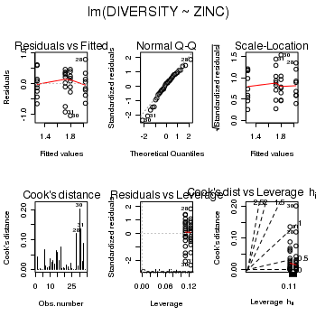
> medley.lm <- lm(DIVERSITY ~ ZINC, data = medley)
> # setup a 2x6 plotting device with small margins
> par(mfrow = c(2, 3), oma = c(0, 0, 2, 0))
> plot(medley.lm, ask = F, which = 1:6)
> anova(medley.lm)
Analysis of Variance Table

Response: DIVERSITY
          Df Sum Sq Mean Sq F value Pr(>F)
ZINC       3   2.57   0.856    3.94  0.018 *
Residuals 30   6.52   0.217
---
Signif. codes:  0 '***' 0.001 '**' 0.01 '*' 0.05 '.' 0.1 ' ' 1
The mean diatom diversity was (choose the correct option)
different between the four zinc level groups.
This can be abbreviated to FdfGroups,dfResidual=fratio, P=pvalue.To see how the full anova table might be included in a report/thesis, Copy and paste the ANOVA table into Word and add an appropriate table caption .
> # calculate the means and standard deviations for each group separately
> library(plyr)
> dat <- ddply(medley, "ZINC", function(x) return(c(means = mean(x$DIVERSITY),
+     ses = sd(x$DIVERSITY)/sqrt(length(x$DIVERSITY)))))
> ## configure the margins for the figure
> par(mar = c(6, 10, 1, 1))
> ## plot the bars
> xs <- barplot(dat$means, beside = T, axes = F, ann = F, ylim = c(0,
+     max(dat$means + dat$ses)))
> #put on the error bars
> arrows(xs, dat$means - dat$ses, xs, dat$means + dat$ses, ang = 90,
+     code = 3, length = 0.1)
> #put on the axes
> axis(1, at = xs, lab = levels(medley$ZINC))
> mtext("Zinc level", 1, line = 4, cex = 2)
> axis(2, las = 1)
> mtext("Diatom diversity", 2, line = 4, cex = 2)
> box(bty = "l")
> library(multcomp)
> summary(glht(medley.lm, linfct = mcp(ZINC = "Tukey")))
	 Simultaneous Tests for General Linear Hypotheses

Multiple Comparisons of Means: Tukey Contrasts


Fit: lm(formula = DIVERSITY ~ ZINC, data = medley)

Linear Hypotheses:
                   Estimate Std. Error t value Pr(>|t|)
MEDIUM - HIGH == 0   0.4400     0.2197    2.00    0.209
LOW - HIGH == 0      0.7547     0.2265    3.33    0.012 *
BACK - HIGH == 0     0.5197     0.2265    2.29    0.122
LOW - MEDIUM == 0    0.3147     0.2265    1.39    0.515
BACK - MEDIUM == 0   0.0797     0.2265    0.35    0.985
BACK - LOW == 0     -0.2350     0.2330   -1.01    0.746
---
Signif. codes:  0 '***' 0.001 '**' 0.01 '*' 0.05 '.' 0.1 ' ' 1
(Adjusted p values reported -- single-step method)
ANOVA and planned comparisons
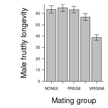
Here is a modified example from Quinn and Keough (2002). Partridge and Farquhar (1981) set up an experiment to examine the effect of reproductive activity on longevity (response variable) of male fruitflies (Drosophila sp.). A total of 125 male fruitflies were individually caged and randomly assigned to one of five treatment groups. Two of the groups were used to to investigate the effects of the number of partners (potential matings) on male longevity, and thus differed in the number of female partners in the cages (8 vs 1). There were two corresponding control groups containing eight and one newly pregnant female partners (with which the male flies cannot mate), which served as controls for any potential effects of competition between males and females for food or space on male longevity. The final group had no partners, and was used as an overall control to determine the longevity of un-partnered male fruitflies.
Download Partridge data set
| Format of partridge.csv data files | |||||||||||||||||||||||||||
|---|---|---|---|---|---|---|---|---|---|---|---|---|---|---|---|---|---|---|---|---|---|---|---|---|---|---|---|
|
 |
||||||||||||||||||||||||||
Open the partridge data file.
> partridge <- read.table("../downloads/data/partridge.csv", header = T,
+     sep = ",", strip.white = T)
> head(partridge)
  GROUP LONGEVITY
1 PREG8        35
2 PREG8        37
3 PREG8        49
4 PREG8        46
5 PREG8        63
6 PREG8        39
Note, normally we might like to adjust the ordering of the levels of the categorical variable (GROUP), however, in this case, the alphabetical ordering also results in the most logical ordering of levels.
In addition to the global ANOVA in which the overall effect of the factor on male fruit fly longevity is examined, a number of other comparisons can be performed to identify differences between specific groups. As with the previous question, we could perform Tukey's post-hoc pairwise comparisons to examine the differences between each group. Technically, it is only statistically legal to perform n-1 pairwise comparisons, where n is the number of groups. This is because if each individual comparison excepts a 5% (&alpha=0.05) probability of falsely rejecting the H0, then the greater the number of tests performed the greater the risk eventually making a statistical error. Post-hoc tests protect against such an outcome by adjusting the &alpha values for each individual comparison down. Consequently, the power of each comparison is greatly reduced.
This particular study was designed with particular comparisons in mind, while other pairwise comparisons would have very little biological meaning or importance. For example, in the context of the project aims, comparing group 1 with group 2 would not yield anything meaningful. As we have five groups (df=4), we can do four planned comparisons.- "Is longevity affected by the presence of a large number of potential mates (8 virgin females compared to 1 virgin females)?" (contrast coefficients: 0, 0, 0, -1, 1)
- "Is longevity affected by the presence of any number of potential mates compared with either no partners or pregnant partners?" (contrast coefficients: -2, -2, -2, 3, 3)
These specific (planned) comparisons are performed by altering the contrast coefficients used in the model fitting. By default, when coding your factorial variable into numeric dummy variables, the contrast coefficients are defined as;
- the intercept is the mean of the first group
- the first contrast is the difference between the means of the first and second group
- the second contrast is the difference between the means and the third group
- ...
> contrasts(partridge$GROUP) <- cbind(c(0, 0, 0, 1, -1), c(-2, -2,
+     -2, 3, 3))
> #Check that the defined contrasts are orthogonal
> round(crossprod(contrasts(partridge$GROUP)), 2)
     [,1] [,2] [,3] [,4]
[1,]    2    0    0    0
[2,]    0   30    0    0
[3,]    0    0    1    0
[4,]    0    0    0    1
> #A contrast is considered orthogonal to others if the value corresponding
> #   to it and another in the lower (or upper) triangle of the cross
> #   product matrix is 0. Non-zero values indicate non-orthogonality.
> #In order to incorporate planned comparisons in the anova table, it is
> #   necessary to convert linear model fitted via lm into aov objects
> partridge.lm <- lm(LONGEVITY ~ GROUP, data = partridge)
> summary(aov(partridge.lm), split = list(GROUP = list(`8virg vs 1virg` = 1,
+     `Partners vs Controls` = 2)))
                               Df Sum Sq Mean Sq F value  Pr(>F)
GROUP                           4  11939    2985    13.6 3.5e-09 ***
  GROUP: 8virg vs 1virg         1   4068    4068    18.6 3.4e-05 ***
  GROUP: Partners vs Controls   1   7841    7841    35.8 2.4e-08 ***
Residuals                     120  26314     219
---
Signif. codes:  0 '***' 0.001 '**' 0.01 '*' 0.05 '.' 0.1 ' ' 1
> #It is also possible to make similar conclusions via the t-tests<br>
> #The above contrast F-tests correspond to the first two t-tests (GROUP1
> #   and GROUP2)<br>
> #Note that F=t<sup>2</sup><br>
> summary(partridge.lm)
Call:
lm(formula = LONGEVITY ~ GROUP, data = partridge)

Residuals:
   Min     1Q Median     3Q    Max
-35.76  -8.76   0.20  11.20  32.44

Coefficients:
            Estimate Std. Error t value Pr(>|t|)
(Intercept)   57.440      1.324   43.37  < 2e-16 ***
GROUP1         9.020      2.094    4.31  3.4e-05 ***
GROUP2        -3.233      0.541   -5.98  2.4e-08 ***
GROUP3        -0.895      2.962   -0.30     0.76
GROUP4         0.645      2.962    0.22     0.83
---
Signif. codes:  0 '***' 0.001 '**' 0.01 '*' 0.05 '.' 0.1 ' ' 1

Residual standard error: 14.8 on 120 degrees of freedom
Multiple R-squared: 0.312,	Adjusted R-squared: 0.289
F-statistic: 13.6 on 4 and 120 DF,  p-value: 3.52e-09
| Source of Variation | SS | df | MS | F-ratio | Pvalue |
|---|---|---|---|---|---|
| Between groups | |||||
| 8 virgin vs 1 virgin | |||||
| Partners vs Controls | |||||
| Residual (within groups) |
Note that the Residual (within groups) term is common to each planned comparison as well as the original global ANOVA.
- Global null hypothesis (H0: population group means all equal)
- Planned comparison 1 (H0: population mean of 8PREG group is equal to that of 1PREG)
- Planned comparison 2 (H0: population mean of average of 1PREG and 8PREG groups are equal to the population mean of average of CONTROL, 1VIRGIN and 8VIRGIN groups)
> # calculate the means and standard deviations for each group separately
> library(plyr)
> dat <- ddply(partridge, "GROUP", function(x) return(c(means = mean(x$LONGEVITY),
+     ses = sd(x$LONGEVITY)/sqrt(length(x$LONGEVITY)))))
> ## configure the margins for the figure
> par(mar = c(6, 10, 1, 1))
> ## plot the bars
> xs <- barplot(dat$means, beside = T, axes = F, ann = F, ylim = c(0,
+     max(dat$means + dat$ses)))
> #put on the error bars
> arrows(xs, dat$means - dat$ses, xs, dat$means + dat$ses, ang = 90,
+     code = 3, length = 0.1)
> #put on the axes
> axis(1, at = xs, lab = levels(partridge$GROUP))
> mtext("Mating group", 1, line = 4, cex = 2)
> axis(2, las = 1)
> mtext("Male fruitfly longevity", 2, line = 4, cex = 2)
> box(bty = "l")
ANOVA and planned comparisons
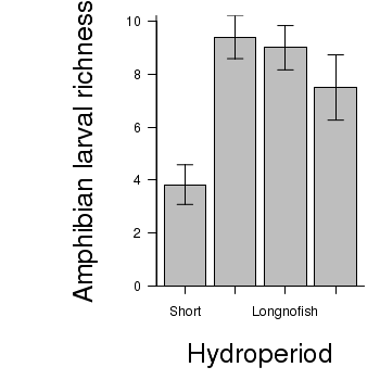
Snodgrass et al. (2000) were interested in how the assemblages of larval amphibians varied between depression wetlands in South Carolina, USA, with different hydrological regimes. A secondary question was whether the presence of fish, which only occurred in wetlands with long hydroperiods, also affected the assemblages of larval amphibians. They sampled 22 wetlands in 1997 (they originally had 25 but three dried out early in the study) and recorded the species richness and total abundance of larval amphibians as well as the abundance of individual taxa. Wetlands were also classified into three hydroperiods: short (6 wetlands), medium (5) and long (11) - the latter being split into those with fish (5) and those without (6). The short and medium hydroperiod wetlands did not have fish.
The overall question of interest is whether species richness differed between the four groups of wetlands. However, there are also specific questions related separately to hydroperiod and fish. Is there a difference in species richness between long hydroperiod wetlands with fish and those without? Is there a difference between the hydroperiods for wetlands without fish? We can address these questions with a single factor fixed effects ANOVA and planned contrasts using species richness of larval amphibians as the response variable and hydroperiod/fish category as the predictor (grouping variable).
Download Snodgrass data set
| Format of snodgrass.csv data files | |||||||||||||||||||||||
|---|---|---|---|---|---|---|---|---|---|---|---|---|---|---|---|---|---|---|---|---|---|---|---|
|
 |
||||||||||||||||||||||
Open the snodgrass data file.
> snodgrass <- read.table("../downloads/data/snodgrass.csv", header = T,
+     sep = ",", strip.white = T)
> head(snodgrass)
  HYDROPERIOD RICHNESS
1       Short        3
2       Short        7
3       Short        2
4       Short        3
5       Short        3
6       Short        5
> snodgrass$HYDROPERIOD <- factor(snodgrass$HYDROPERIOD, levels = c("Short",
+     "Medium", "Longnofish", "Longfish"))
> means <- with(snodgrass, tapply(RICHNESS, HYDROPERIOD, mean))
> vars <- with(snodgrass, tapply(RICHNESS, HYDROPERIOD, var))
> plot(vars ~ means)

> boxplot(RICHNESS ~ HYDROPERIOD, data = snodgrass)

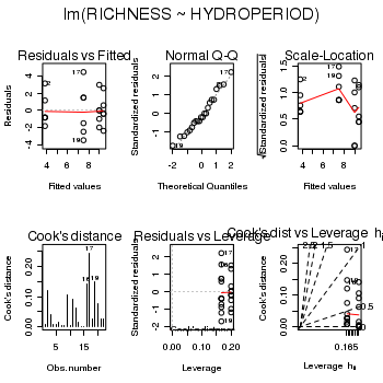
> snodgrass.lm <- lm(RICHNESS ~ HYDROPERIOD, data = snodgrass)
> # setup a 2x6 plotting device with small margins
> par(mfrow = c(2, 3), oma = c(0, 0, 2, 0))
> plot(snodgrass.lm, ask = F, which = 1:6)
> #define contrasts
> contrasts(snodgrass$HYDROPERIOD) <- cbind(c(0, 0, -1, 1), c(1, 1,
+     -1, -1))
> round(crossprod(contrasts(snodgrass$HYDROPERIOD)), 2)
     [,1] [,2] [,3]
[1,]    2    0    0
[2,]    0    4    0
[3,]    0    0    1
> #define contrast labels
> snodgrass.list <- list(HYDROPERIOD = list(`Long with vs Long without` = 1,
+     `Permanent vs Temporary` = 2))
> #refit model
> snodgrass.lm <- lm(RICHNESS ~ HYDROPERIOD, data = snodgrass)
> summary(aov(snodgrass.lm), split = snodgrass.list)
                                         Df Sum Sq Mean Sq F value Pr(>F)
HYDROPERIOD                               3  108.8    36.3    7.29 0.0021 **
  HYDROPERIOD: Long with vs Long without  1    4.8     4.8    0.97 0.3376
  HYDROPERIOD: Permanent vs Temporary     1   19.5    19.5    3.92 0.0633 .
Residuals                                18   89.5     5.0
---
Signif. codes:  0 '***' 0.001 '**' 0.01 '*' 0.05 '.' 0.1 ' ' 1
| Source of Variation | SS | df | MS | F-ratio | Pvalue |
|---|---|---|---|---|---|
| Between groups | |||||
| Long with vs nofish | |||||
| Permanent vs Temporary | |||||
| Residual (within groups) |
> # calculate the means and standard deviations for each group separately
> library(plyr)
> dat <- ddply(snodgrass, "HYDROPERIOD", function(x) return(c(means = mean(x$RICHNESS),
+     ses = sd(x$RICHNESS)/sqrt(length(x$RICHNESS)))))
> ## configure the margins for the figure
> par(mar = c(6, 10, 1, 1))
> ## plot the bars
> xs <- barplot(dat$means, beside = T, axes = F, ann = F, ylim = c(0,
+     max(dat$means + dat$ses)))
> #put on the error bars
> arrows(xs, dat$means - dat$ses, xs, dat$means + dat$ses, ang = 90,
+     code = 3, length = 0.1)
> #put on the axes
> axis(1, at = xs, lab = levels(snodgrass$HYDROPERIOD))
> mtext("Hydroperiod", 1, line = 4, cex = 2)
> axis(2, las = 1)
> mtext("Amphibian larval richness", 2, line = 4, cex = 2)
> box(bty = "l")
ANOVA and power analysis
Laughing kookaburras (Dacelo novaguineae) live in coorperatively breeding groups of between two and eight individuals in which a dominant pair is assisted by their offspring from previous seasons. Their helpers are involved in all aspects of clutch, nestling and fledgling care. An ornithologist was interested in investigating whether there was an effect of group size on fledgling success. Previous research on semi captive pairs (without helpers) yielded a mean fledgling success rate of 1.65 (fledged young per year) with a standard deviation of 0.51. The ornithologist is planning to measure the success of breeding groups containing either two, four, six or eight individuals.
| Cooperative breading in kookaburras | |
|---|---|
 |
|
The ability (power) to detect an effect of a factor depends on sample size as well as levels of within an between group variation. While ANOVA assumes that all groups are equally varied, levels of between group variability are dependent on the nature of the trends that we wish to detect.
- Do we wish to detect the situation where just one group differs from all the others?
- Do we wish to be able to detect the situation where two of the groups differ from others?
- Do we wish to be able to detect
e situation where the groups differ according to some polynomial trend, or some other combination?
- The mean fledgling success rate of pairs in groups of two individuals is 50% less than the mean fledgling success rate of individuals in groups with larger numbers of individuals - that is,
µTWO<µFOUR=µSIX=µEIGHT
HINT
Show code
> mean1 <- 1.65
> sd1 <- 0.51
> es <- 0.5
> mean2 <- mean1 + (mean1 * es)
> b.var <- var(c(mean1, mean2, mean2, mean2))
> power.anova.test(group = 4, power = 0.8, between.var = b.var, within.var = sqrt(sd1))
Balanced one-way analysis of variance power calculation groups = 4 n = 16.26 between.var = 0.1702 within.var = 0.7141 sig.level = 0.05 power = 0.8 NOTE: n is number in each group - The mean fledgling success rate of pairs in small groups (two and four) are equal and 50% less than the mean fledgling success rate of individuals in larger groups (six and eight)
- that is, µTWO=µFOUR<µSIX=µEIGHT
Show code
> mean1 <- 1.65
> sd1 <- 0.51
> es <- 0.5
> delta <- mean1 + (mean1 * es)
> b.var <- var(c(mean1, mean1, mean2, mean2))
> power.anova.test(group = 4, power = 0.8, between.var = b.var, within.var = sqrt(sd1))
Balanced one-way analysis of variance power calculation groups = 4 n = 12.46 between.var = 0.2269 within.var = 0.7141 sig.level = 0.05 power = 0.8 NOTE: n is number in each group - The mean fledgling success rate increases linearly by 50% with increasing group size.
Show code
> mean1 <- 1.65
> sd1 <- 0.51
> es <- 0.5
> delta <- mean1 + (mean1 * es)
> b.var <- var(seq(mean1, mean2, l = 4))
> power.anova.test(group = 4, power = 0.8, between.var = b.var, within.var = sqrt(sd1))
     Balanced one-way analysis of variance power calculation

         groups = 4
              n = 21.59
    between.var = 0.126
     within.var = 0.7141
      sig.level = 0.05
          power = 0.8

 NOTE: n is number in each group
Note that we would not normally be contemplating accommodating both polynomial as well as non-polynomial contrasts or pairwise contrasts. We did so in Exercise 5-1 above purely for illustrative purposes!
> x <- seq(3, 30, l = 100)
> b.var <- var(c(mean1, mean1, mean2, mean2))
> plot(x, power.anova.test(group = 4, n = x, between.var = b.var, within.var = sqrt(sd1))$power,
+     ylim = c(0, 1), ylab = "power", xlab = "n", type = "l")
> abline(0.8, 0, lty = 2)
> m <- mean(c(mean1, mean2))
> b.var <- var(c(mean1, m, m, mean2))
> points(x, power.anova.test(group = 4, n = x, between.var = b.var,
+     within.var = sqrt(sd1))$power, type = "l", lty = 2)
> b.var <- var(c(mean1, mean2, mean2, mean2))
> points(x, power.anova.test(group = 4, n = x, between.var = b.var,
+     within.var = sqrt(sd1))$power, type = "l", lty = 3)
> b.var <- var(seq(mean1, mean2, l = 4))
> points(x, power.anova.test(group = 4, n = x, between.var = b.var,
+     within.var = sqrt(sd1))$power, type = "l", lty = 4)
>
> bw <- c(var(c(mean1, mean1, mean2, mean2)), var(c(mean1, m, m, mean2)))
> points(x, power.anova.test(group = 4, n = x, between.var = bw, within.var = sqrt(sd1))$power,
+     type = "l", col = "gray")